Making A Single Price Grid Component, Using H.T.M.L and C.S.S.
Hello everyone I'm here with another design I feel every beginner should try out, before going for the really complex designs.
In this post, I will be sharing with you the design, the approach I took to overcome each step, and definitely the code for whoever needs it as a form of guidance.
Also in the post, I will be focusing majorly on the way the design looks on large screens, and most likely in my next post, I will talk about the steps to take in order to twitch it and make it look good on small screens too.
Click here to view the original design, which I will be trying to recreate using the knowledge I have on HTML and CSS.

A) My first step is always to put down the html pre-code, because in the pre-code, I have the spaces for slotting in my title, css, and even my JavaScript;
1       <!DOCTYPE html>
2       <html lang="en">
3
4       <head>
5       <meta charset= "UTF-8">
6       <meta name= "viewport" content= "width-device-width, initial-scale =1.0">
7       <title> Document </title>
8       </head>
9       <body>
10
11  </body>
12  </html>
B) Next was to link my already created stylesheet with the name " stylesheet", to my HTML code, in this format;
<link rel="stylesheet" href="./stylesheet.css">
I usually just alternate between style.css, and stylesheet.css, and sometimes with upper and lower cases.
C) The next was to add the fonts needed, in the form of links. This link was auto generated, by Googlefonts, and was just copied and pasted to my code. Another way to add your font style, Is by first downloading the font style, and then using path to source it, but I prefer the method I use, Cause it's faster, and i don't need to download the font style.
    <link rel="preconnect" href="https://fonts.googleapis.com">
<link rel="preconnect" href="https://fonts.gstatic.com" crossorigin>
<link href="https://fonts.googleapis.com/css2?family=Karla:wght@400;700&display=swap" rel="stylesheet">
D) I moved on to give the webpage a name/title which was already given in the design challenge;
<title>Frontend Mentor | Single Price Grid Component</title>
NB; All these were added to the head part of the html....now let's move over to the body part of the work, which obviously, will house 99.9% of our design.
E) Here, I first created a section;
<body>
      <section>
      </section>
<body>
In the section, I added two divs, and named the first and second div, "first-div", and "second-div", respectively;
<body>
      <section>
             <div class= "first-div">
             </div>
             <div class= "second-div">
             </div>
      </section>
<body>
F) Still in the "second-div", I created again, 2 divs;
             <div class= "second-div">
                      <div> </div>
                      <div> </div>
             </div>
In these two divs, I could decide to use class for them, but chose not to. Why?? Because I usually run out of names to give them🥲.
G) I filled up the "first-div", with it's required texts;
        <div class="first-div">
            <h2>Join our community</h2>
            <h3>30-day, hassle-free money back guarantee</h3>
            <p>Gain access to our full library of tutorials along with expert code reviews.
                Perfect for any developers who are serious about honing their skills.</p>
        </div>
I repeated same for the "second-div" too;
<div class="second-div">
<div>
<h4>Monthly Subscription</h4>
<p class="span-holder"><span>$29</span>per month</p>
<p>Full access for less than $1 a day</p>
<button>Sign Up</button>
</div>
<div>
<h4> Why Us</h4>
<p class="ppp">Tutorials by industry experts</p>
<p class="ppp">Peer & expert code review</p>
<p class="ppp">Coding exercises</p>
<p class="ppp">Access to our GitHub repos
<p class="ppp">Community forum</p>
<p class="ppp">Flashcard decks</p>
<p>New videos every week</p>
</div>
</div>
With all this done, I moved over to my css to begin the styling of the webpage.
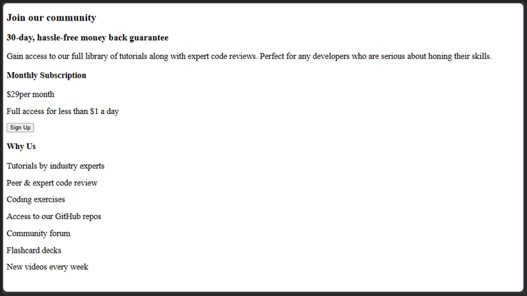
H) Before I began styling, I moved to the Webpage, to see what it already looked like, and thus was what it did look like;
With this, i added my css pre-code;
* {
    margin: 0;
    padding: 0;
    box-sizing: border-box;
}
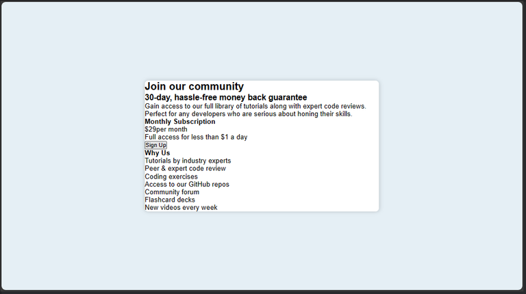
After saving the changes, I went back to the Webpage, and this was what it now looked like ;

I) I started with styling the body of my webpage, giving it a background color, and centering the whole content in it. For centering the content of the body, there are many ways to do that, but this is one of the best way to do that;
body{
    display: flex;
    justify-content: center;
    align-items: center;
    height: 100vh;
    background-color: hsl(204, 43%, 93%);
}
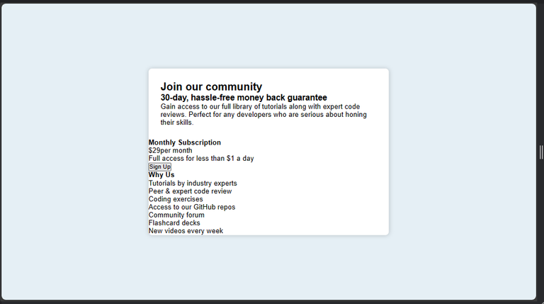
The above code gave this output;

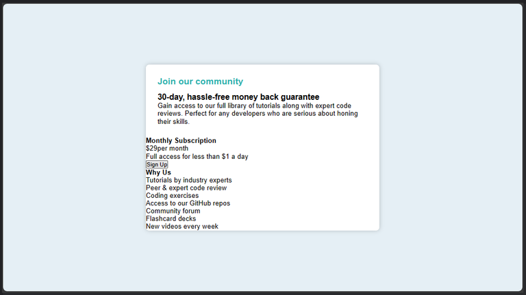
J) Here, I specified the width the section should have, the background color it should have, I also gave it a box shadow effect, font style, and border radius, to make the edges look smooth and curved;
section{
    width: 45%;
    margin: 0 auto;
    background-color: white;
    font-family: 'Karla', sans-serif;
    box-shadow: 0 0 10px rgba(0, 0, 0, 0.2);
    border-radius: 0.5rem;
}
The output;
K) I targeted the "first-div" box, and gave it an internal distancing/padding from the section border;
.first-div{
    padding: 5%;
}
The output;
L) I targeted the h2, which carried the text " Join Our Community", and gave it a font size, color, and distanced it a bit from the text just below it;
h2{
    font-size: 1.3rem;
    margin-bottom: 3%;
    color: hsl(179, 62%, 43%)
}
Output;
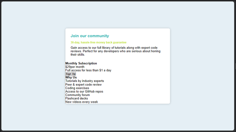
M) Next, I targeted the h3, which is the text just below the h2, and also gave it a font-size, and color...I also distanced it from the text just after it, using the margin-bottom: ; command...Next on the line, was to give font thickness to my texts as can be seen below;
h3{
    font-size: 0.9rem;
    margin-bottom: 2%;
    color:hsl(71, 73%, 54%);
}
h2, h3,h4,button{
    font-weight: 700;
}
p, span{
    font-weight: 400;
}
Output;
N) I gave all text with the paragraph tag, a color which is more like ash. I also went on to split the "second-div", using the display:flex; property, I gave the text within it a color of white, and gave it same border-radius so as to rhyme with the curviness of the section box;
.first-div>p{
    max-width: 30rem;
    color:hsl(218, 22%, 67%);
}
.second-div{
    display: flex;
    color: white;
    border-radius:0 0 0.5rem 0.5rem;
}
The output;
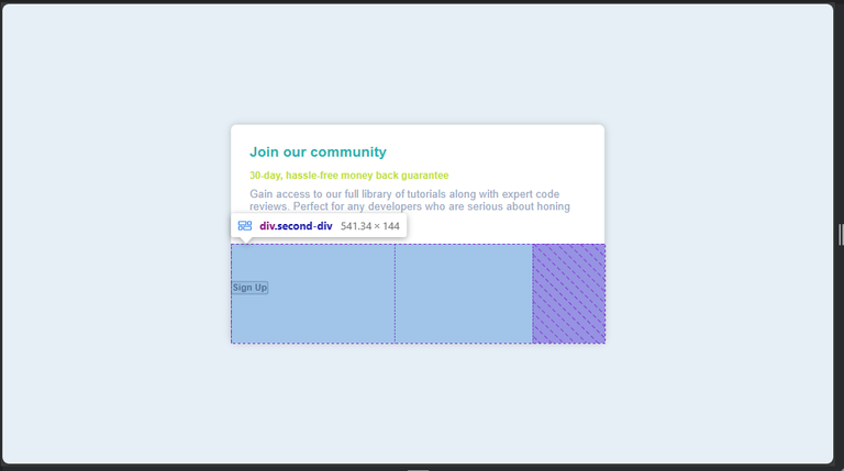
You can clearly see from the above, that the text in the second-div seems to have disappeared...actually, they are still there it's just that the color I gave them, is exactly the same with their background color, which now makes them invisible and that's why I highlighted the whole of the second-div, so you can see what I'm talking about...well, not too worry, they will become visible very soon lol.
O) The next on the line, was to give the 2 inner/children divs, if the "second-div", equal spaces;
.second-div>div:nth-child(1),.second-div>div:nth-child(2){
    width: 50%;
}
The output;

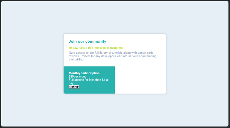
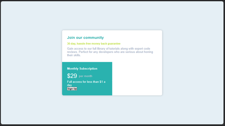
P) The next in line, was to give the first child of the "second-div", a background color (This will perform the magic of making the texts on the left hand side visible again), padding, and border-radius;
.second-div>div:nth-child(1){
    background-color: hsl(179, 62%, 43%);
    padding: 5%;
    border-radius: 0 0 0 0.5rem;
}
Output;
Q) I moved to distance the " monthly Subscription" from the other texts, just below it. I also increased the font-size of the span, which houses the price text;
h4{
    margin-bottom: 6%;
}
span{
    font-size: 2rem;
    color: white;
}
The output;

R) Here I noticed the texts around the price weren't really well centered as they should with respect to the price, so i decided to apply the display flex, just so that I could distance them horizontally, and also center then vertically;
.span-holder{
    display: flex;
    align-items: center;
    gap: 5%;
    margin-bottom: 2%;
    font-size: 1rem;
    color: hsl(218, 16%, 80%);
}
Output;
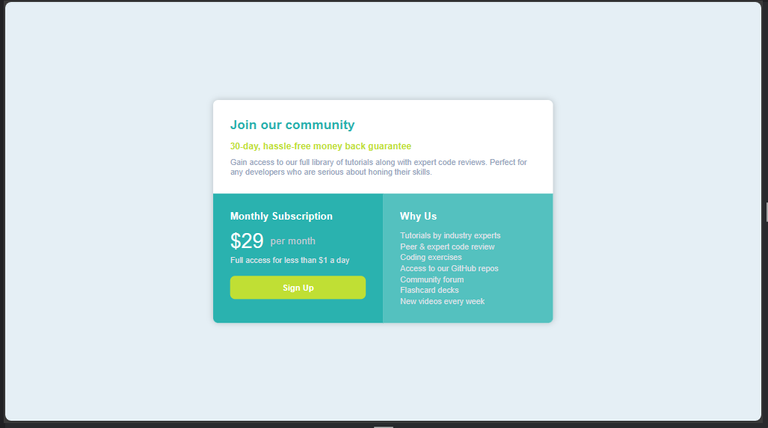
S) I began to style the second child of the "second-div"...here I started with giving it a background color ( This will also make the white text on the right hand side become visible too). I then moved on to give it padding and border radius;
.second-div>div:nth-child(2){
    background-color: hsla(179, 62%, 43%, 0.8);
    padding: 5% 0 5% 5%;
    border-radius: 0 0 0.5rem 0;
}
Output;

T) Nothing much happened here actually I majorly just updated the color i gave the texts in paragraph tags, to ash, and a little bit of distancing;
p{
    color:hsl(216, 19%, 89%);
    font-size: 0.8rem;
}
.ppp{
    margin-bottom: 1%;
}
Output;
U) I usually and deliberately always push my button design to the bottom of my code...I actually don't know why😅😅. So basically in this stage, I designed my button, and gave it a width and padding;
button{

margin-top: 8%;

width: 100%;

padding: 5% 0;

color: white;

border-radius: 0.5rem;

border: none;

background-color:hsl(71, 73%, 54%);

font-weight: 700;

}
In the above code, I gave the button lemon color, gave the text in it a thickness, and made the edges of the button curved.
The output;
V) But with all this, there was no sign that the button was functioning, so I decided to give it a slight color difference when I hover on It, and when I click on it;
button:hover{
    background-color:hsla(71, 73%, 54%, 0.8);
}
button:active{
    background-color:hsla(71, 73%, 54%, 0.6);
}
Output;
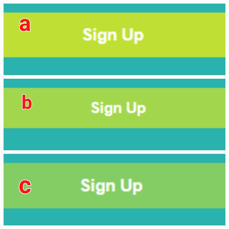
The above is what the button looks like for each of the following instances;
a) Inactive
b) Hovered upon
c) Active
With the above code, I can actually say my design looks good for large screens, but here once again, comes the issue with smaller screen devices🤦🏻♂️😂.
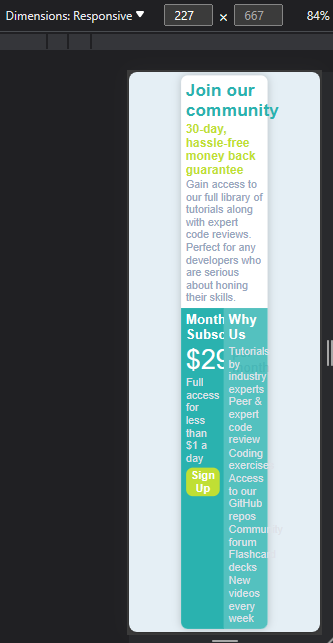
This is the final state of my design on a big/medium screen;
But below are the pictures of the same design on smaller screens😩😂,
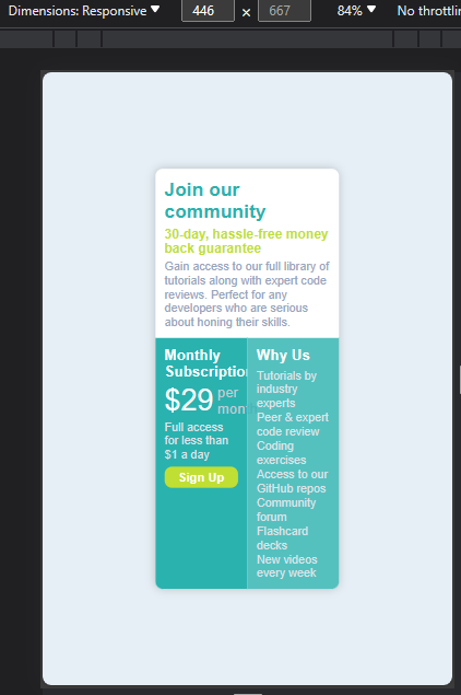
that means as a good developer, or someone aspiring to be one someday, I'm not done with my design but I can say I'm approximately 70% done. So I will begin to tackle the code, and try to restructure it for mobile devices, and will be sharing the results in my next post.
All photo Used Here Are Mine Except Stated Otherwise
Thanks For Reading💻📱.
Yay! 🤗
Your content has been boosted with Ecency Points, by @timix648.
Use Ecency daily to boost your growth on platform!
Support Ecency
Vote for new Proposal
Delegate HP and earn more
Congratulations @timix648! You received a personal badge!
Wait until the end of Power Up Day to find out the size of your Power-Bee.
May the Hive Power be with you!
You can view your badges on your board and compare yourself to others in the Ranking
Check out our last posts:
Congratulations @timix648! You received a personal badge!
Participate in the next Power Up Day and try to power-up more HIVE to get a bigger Power-Bee.
May the Hive Power be with you!
You can view your badges on your board and compare yourself to others in the Ranking
Check out our last posts: