Designing a Grid Layout Using H.T.M.L, And C.S.S. [Pt.1]
Hello everyone! This is actually my first time making a post here🙂.
I started learning frontend development some months ago, and since then I've been trying out several designs I come across, since they say "practice makes perfect. "
Well, just yesterday, I came across this grid design on Google,

and tried to attempt a grid for the first time after reading to an extent about the topic (grid).
So I would like you to take a look at the steps I took, to conquer each stage of the grid development. And would really like to hear your view, and correction if any, to make me a better front end developer.

A) I employed the pre code for html, which can be seen below. I actually learnt that most programming languages, and mark-up languages have pre code, which helps define and probably tell more about the programming language in question.
Here is the pre -code for HTML;
<!DOCTYPE html>
<html lang="en">
<head>
<meta charset="UTF -8">
<meta name="viewport" content="width=device -width, initial -scale=1.0">
<title>Document</title>
</head>
<body>

</body>
</html>
B) Next, I created a css style sheet, with the name "stylesheet.css", and linked it to my html, in the head section, so as to reflect any design I make on my style sheet, I also gave the web page a name too!
NB; This is what the link for the css will look like👇
<link rel="stylesheet" href="./STYLESHEET.CSS">
I inserted the above code, into the <head> section:
<head>
<meta charset="UTF -8">
<meta name="viewport" content="width=device -width, initial -scale=1.0">
<link rel="stylesheet" href=". /STYLESHEET.CSS">
<title>@timix648| GRID -PRACTICE </title>
</head>
The output/display;
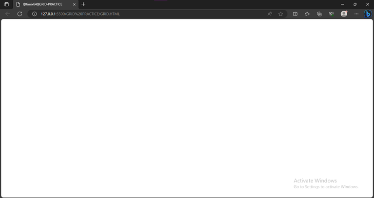
From the above picture, we can see just very little detail on the Web page, with the content majorly around the head section, which is the title.
C) I created a section inside the body (the body, just like the name implies carries the body of the screen that is the part displaying a white blank page);
<body>
<section>
</section>
</body>
</html>
D) Inside this section, which I believe functions like a <div>, I created several <div>, which was just enough for the designing of the grid;
9      <body>
10    <section>
11    <div class= "div -1">  </div>
12    <div class="div -2">  </div>
13    <div class="div -3">  </div>
14    <div class="div -4"> </div>
15    <div class="div -5"> </div>
16    <div class="div -6"> </div>
17    <div class="div -7"> </div>
18    <div class="div -8"> </div>
19    </section>
20  </body>
21  </html>
My full html code after the process?👇
1     <!DOCTYPE html>
2     <html lang="en">
3     <head>
4     <meta charset= " UTF -8">
5     <meta name="viewport" content="width=device -width, initial -scale=1.0">
6     <link rel=" stylesheet" href=". /STYLESHEET.CSS">
7     <title>@timix648| GRID -PRACTICE </title>
8     </head>
9     <body>
10   <section>
11   <div class="div -1">  </div>
12   <div class="div -2">  </div>
13   <div class="div -3">  </div>
14   <div class="div -4">  </div>
15   <div class="div -5">  </div>
16   <div class="div -6">  </div>
17   <div class="div -7">  </div>
18   <div class="div -8">  </div>
19   </section>
20   </body>
21   </html>
E) After adding divs to the section, I went over to the css, to begin styling the divs…in my css, I once again started with a pre code;
1    *{
2        padding: 0;
3        margin: 8;
4        box -sizing: border -box;
5        }
F) Next, I called the section, which housed all the divs, and gave it some properties, such as the size, the color, And even the number of rows and columns;
1   *{

2        padding: 0;

3        margin: 8;

4      box -sizing: border -box;

5     }

6  section{

7          width: 600px;

8          height: 300px;

9          background -color:hsl(233, 47%, 7%);

10        display: grid;

11        grid -template -columns: repeat(4, 1fr);
12        grid - template -rows: repeat(3, 1fr);

13        grid - gap: 8px;

         }
Implementing this above code, gave me just a plane rectangular box,
which is clearly far from home lol....So I continued.
G) I went over, to giving each of the divs a color to match the design I saw, and so I started with the first div "div -1";
        .div-1{
    background -color: rgb(52, 126,  2);

    grid -column: 1/2;

    grid-row: 1/4;

       }
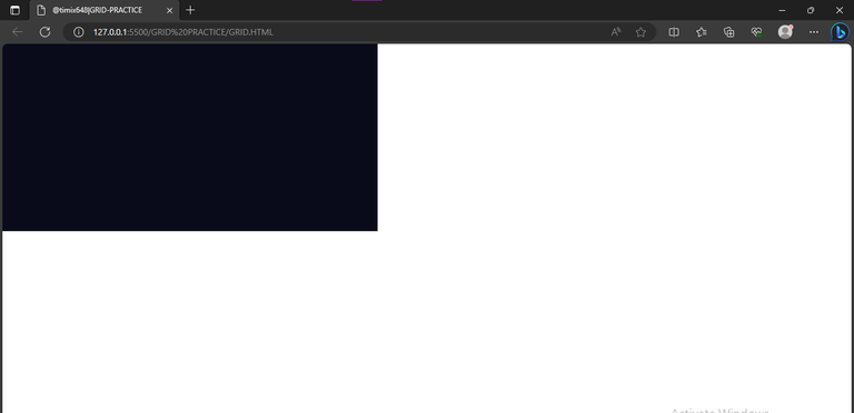
In the above code, the aim is just to position the first div and give it a green color. Which can be seen below

I was able to properly position the div, with the help of the browsers, inbuilt developer's tool. I first clicked on inspect, which brought up the developer section, thereafter, I selected the layout option,
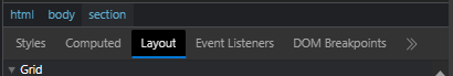
which then took me to this part where I clicked on "section",

which now easily highlights the grid box with the numbers I can use to navigate easily;

H) The rest were more like repetition with little adjustments...so basically, I positioned every other div, and gave them colors that could differentiate them from each other;
26.   .div -3{
27.         background -color: rgb(211, 191, 13);
28.         grid - column: 2/3;
29.         grid -row: 2/3;
30.   }
31.   .div -4{
32.         background -color:rgb(233, 29, 29);
33.         grid - column: 2/3;
34.         grid -row: 3/4;
35.  }
36.          .div -5{
37.         background -color: rgb(233, 29, 29);
38.         grid column: 3/4;
39.         grid -row: 2/3;
40.  }
41.   .div -6{
42.         background -color: rgb(211, 191, 13);
43.         grid - column: 3/4;
44.         grid -row: 3/4;
45.   }
46.    .div -7{
47.         background -color: rgb(233, 29, 29);
48.         grid - column: 4/5;
49.         grid -row: 1/2;
50.   }
51.    .div -8{
52.          background -color: rgb(52, 126, 2);
53.          grid - column: 4/5;
54.          grid -row: 2/4;
55.   }
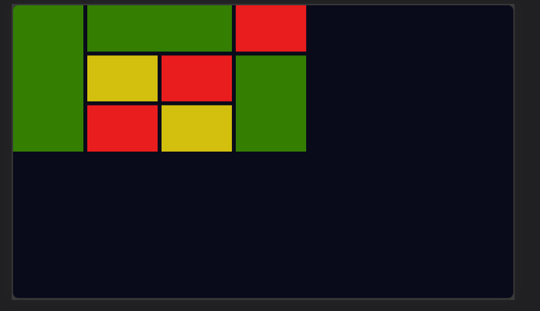
After doing this, it gave me this as output;

I) I proceeded to giving the webpage body a background -color, similar to what I saw in the example grid, with the code;
body{
    background -color: hsl(233, 47%, 7%);
}
And below was the output
Looking at this, there's only one thing left, which is to place my design at the center and to do this, I made use of the code below;
 body{
          display: flex;
          background -color: hsl(233, 47%, 7%);
          justify -content: center;
          align - items: center;
          height: 100vh;
             }
Which in turn gave a satisfying output;

All images used here are mine, except stated otherwise.
Thanks for reading.
Post manually reviewed. 😊
Thanks!
Yay! 🤗
Your content has been boosted with Ecency Points, by @timix648.
Use Ecency daily to boost your growth on platform!
Support Ecency
Vote for new Proposal
Delegate HP and earn more
Thanks for your contribution to the STEMsocial community. Feel free to join us on discord to get to know the rest of us!
Please consider delegating to the @stemsocial account (85% of the curation rewards are returned).
Thanks for including @stemsocial as a beneficiary, which gives you stronger support.