Vue.js Development - Part 4 Routing, Eslint and a Simple Component for Boostrap nav-item

Welcome back for another session of our Vue development series. Today we are going to look into adding routing using async loading as well as implementing a component for our bootstrap navigation items around the nav-item class so we can make use of our Navbar component.
In addition I am going to go over a brief change to move to using the @vue/cli service instead of the custom webpack 5 build as I ran into some typescript compiler errors. This means that there is no webpack.config.js file and instead we have a vue.config.js and we gain the ability to start the project without visual studio and can move to using VS Code.
As for the issue the short story is the custom configuration with webpack 5 would show typescript errors around using slot props as well as the new <Suspense> component and top level awaits. Even though the output showed compiler errors everything worked but that is not a way to do development. I played around with different typescript configurations, different package versions of Vue 3 and the typescript compiler and so on but was unable to resolve the errors so instead removed the configuration and went to using the cli.
If you haven't been following our series the previous entries can be found at
- Hosting a Vue.js 3 application in .NET Core 6
- Enabling Typescript support
- Creating a Navigation bar and Jest testing
All code for this article series can be found on Github
Moving to @vue/cli
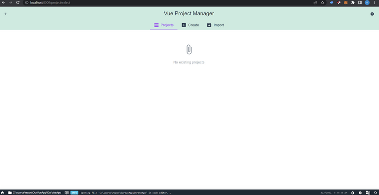
There are a few different ways to do this, I personally used the cli to create a new project selecting the features I wanted, Jest, Sass, Typescript, Eslint. I then replaced the dependencies and devDependencies in package.json with those from the cli generated project and updated the script section with a serve option and updated the dev and build scripts. You can view the diff here. Next you need to install all the new packages. Once installed run vue add typescript and vue add eslint. This will go through the configuration steps and re-add these packages generating configuration files tsconfig.json and .eslintrc. I won't tell you what options to pick for linting as this all comes down to personal preferences, however I selected standard with prettier. Now that we have things configured we can run vue ui. This will open the cli gui for managing projects, when it loads it should show the Vue project manager with no projects.
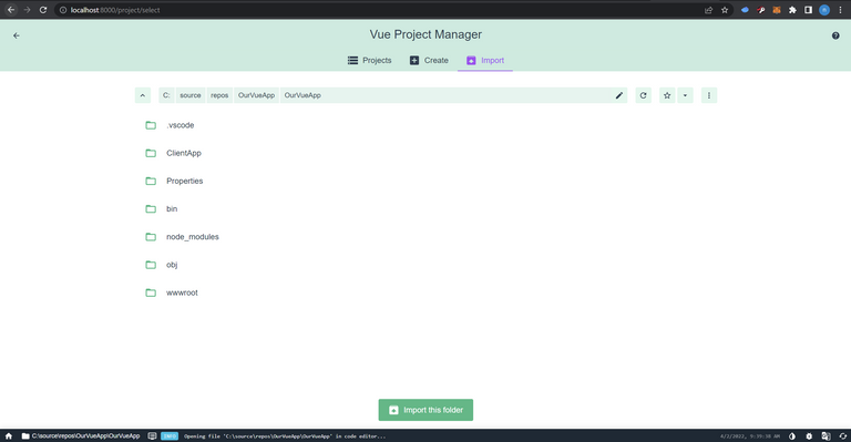
Go ahead and press import, by default it should start in the folder you ran the npm ui command from so should be as simple as selecting import on the next page.
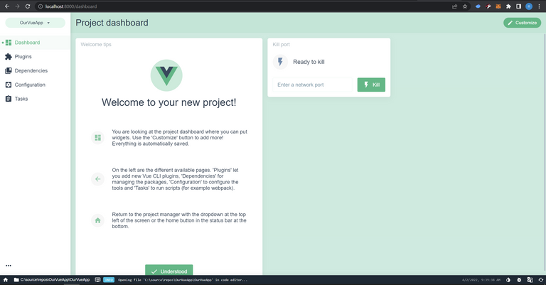
Once imported the project dashboard should load. Here you can add plugins, change linter configurations, run the projects scripts and do other things to manage your project with the cli.
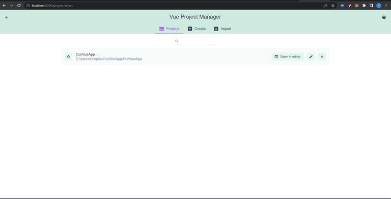
Now if you want to see all the Vue projects you can use the dropdown and select Vue Project Manager to go back to a list of all your Vue projects, it should show the project like the following. Note your path will differ than mine.
Now that we have the cli added to our project we can delete our webpack.config.js and add a new configuration file vue.config.js. This new config file is how Vue allows you to tap into its inner configuration for your project. Since were not using the standard project structure of a root directory with configuration files and the application in a src folder we need to make some changes so the cli knows how to build our project. We also need to tell the cli where to output our files so that we can continue to serve the application with our .NET host. If you don't want to host in .NET you can skip this as things should just work for you out of the box.
The output location is the simpler change, to update it we just need to set the outputDir of the object we export from the config file.
module.exports = {
  outputDir: path.resolve(__dirname, "./wwwroot"),
};
Well that was super simple. The changes for our entry point and where our template file live are a little more complex and make use of the chainWebpack option of the vue.config.js configuration object. The first thing we need to do is clear the app entry point and add our own, pointing to ./ClientApp/main.ts and secondly we need to tap into the html plugin setting the path to ./ClientApp/publis/index.html. Below is our configuration file and you can see that its pretty simple just looks complex.
const path = require("path");

const appbasePath = "./ClientApp/";

const contextPath = path.resolve(__dirname, appbasePath);
const appOutputPath = "./wwwroot/";

module.exports = {
  outputDir: path.resolve(__dirname, appOutputPath),
  chainWebpack: (config) => {
    config.entry("app").clear();
    config.entry("app").add(contextPath + "/main.ts");

    config.plugin("html").tap((args) => {
      args[0].template = path.resolve(
        __dirname,
        appbasePath + "/public/index.html"
      );
      return args;
    });
  },
};
ESlint
So what is ESlint and why do we want to use it? Well ESlint is a static analysis tool that helps you find code issues and enforce style/code formatting rules. By using it we can ensure that anyone who contributes code to our project must use the same code style ensuring consistency leading to a cleaner code base. Cleaner code bases lead to easier maintainability and the expandability of the code.
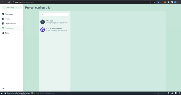
I don't want to go deep into this topic as everyone has their own preferences for which linter rules they like but will show you how to configure and change it using the vue-cli ui. If your viewing your project you can click on the Configuration option in the left menu and it should load the configuration screen and you should see Vue Cli and ESLint Configuration options.
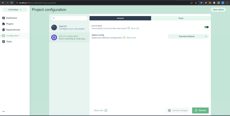
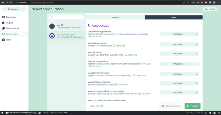
Go ahead and click on the ESLint configuration and that should bring up a view that has two tabs, General and Rules. The general tab is open by default and you should see two options, the first a toggle for lint on save and the second a drop down for what config to load. Here you can change between the essentials, recommended and strongly recommended. Think of these as how strong you want the linter to be. If you switch over to the Rules tab there are a lot of different rules and you can toggle them off or set them to be warnings or errors giving you a fully customizable linting experience.
I suggest playing around with a configuration and seeing how many errors/warnings you get and then tuning the ruleset to match your needs.
Moving On
Now that we have all the configuration changes done and added eslint we can run a few different commands. The first being npm run lint, this will lint our code and show us all the warnings and errors. The second new command we can run and the one we will be making use of from now on for development is npm run serve this will kick off the development server as well as put the build into watch mode. In this mode you will also see linter errors and warnings as you change code so be sure to keep an eye on it and keep your code clean. In addition two existing commands you can use npm run dev if your using visual studio to host and launch the site or npm run build to generate the production build, have been updated to work with the vue-cli.
Routing
So last time we left off with a very basic App.vue that had all of our sites content and had no way to show anything else other than adding more to this 'home page'. Routing, via vue-router@4, the official routing package from the Vue team, allows us to add routing and pages to our application. Vue-router provides us with two components to use in our application to handle navigation as well as displaying the current routes content. These are the <router-link> and <router-view>. In addition we will need to create a router which involves creating a history mode cache and defining routes.
<router-link>
So just like anchor tags a router link allows for navigation, in fact when you look at the generated html a router link is nothing but an anchor tag wrapped in a component. So why do we want to use one? Well there are a few reasons, the first and largest being that the router link works with the routers history mode storing state, using a plain anchor tag you don't, secondly router link has some build in logic and applies some very useful css classes that we can take advantage of ourselves, .router-link-active and .router-link-exact-active. Router links expose a couple of props and a slot for customization so you can use the default that is an anchor tag or customize them to your heats content. We will only make use of the to prop and put our links labels into the slot.
<router-view>
The router view is how vue-router handles displaying content based on the current route or 'page'. Just like router links the router view has some props and a slot. We won't make use of either of the props but we will be taking advantage of the slot to do two different things, the first is to provide a transition effect when the page changes and the second is to use the new <Suspense> component to provide a loading fall back state when we have a route whos component has asynchronous data to load.
Creating the Router
So to keep things organized were going to create a new folder in ClientApp named router. In this folder were going to add our implementation in a file named index.ts. We use this convention of folder/index.js as it simplifies our imports, we can just say import router from '@/router' instead of having to specify the file under the folder. NOTE: this is a great convention when you have a lot of different files breaking down an implementation but only need to include one file.
To get started we need to import two methods and two types from vue-router. We want to import the functions createRouter and createWebHistory and the types RouterOptions and RouteRecordRaw. The createRouter method will create our instance of a router while createWebHistory will setup all the history caching. We will use RouterOptions to define the options as our history mode and routes and the routes will be a collection of RouteRecordRaw. The skeleton for this will look like the following code block.
import {
  createRouter,
  createWebHistory,
  RouterOptions,
  RouteRecordRaw,
} from "vue-router";

const routes: RouteRecordRaw[] = [];

const routerOptions: RouterOptions = {
  history: createWebHistory(),
  routes,
};

const router = createRouter(routerOptions);

export default router;
You can see we imported our functions and types, defined an empty collection of the type RouteRecordRaw. We then used this empty collection as the routes property of the RouterOptions and used createWebHistory to initialize our history. We then create the router with createRouter and export it so we can use it in our application. So thats all pretty simple, all we need to do now is define some routes.
A RouteRecordRaw has good bit of properties but the basics we will need are name, path, and component. The name allows us to do navigation by route name through code but is also a good way to just organize routes. The path is the address of the page in the site so your home page would be at /, an about page at /about and so on. These should always start with a / as the path is appended to the address by the router. Lastly we use the component property which defines which Vue component should be displayed when this route is the active route.
For todays article were going to add two routes, a Home and About route. These will use the paths we mentioned above of / and /about. To do this we will also be adding two new components, HomePage.vue and AboutPage.vue. So go ahead and add a views folder inside of ClientApp and add HomePage.vue and AboutPage.vue. Don't worry about creating content for these yet as we will be doing that as our next step. Great so now that we have the files defined we can go ahead and create the routes. So instead of importing and using the components straight up were going to take advantage of dynamic or async components in our router so that routes are only loaded on demand and are not part of the main application bundle. To do async loading you use a arrow function, or for our C# developrs a lambda function, in the component definition where the arrow function imports the component. This should look like the following code block.
const routes: RouteRecordRaw[] = [
  {
    name: "Home",
    path: "/",
    component: () => import("../views/HomePage.vue"),
  },
  {
    name: "About",
    path: "/about",
    component: () => import("../views/AboutPage.vue"),
  },
];
Updating App.vue with <router-view>
So now that we have our routes defined we need to some way to be able to display them. To do so we are going to refactor our App.vue removing any 'page' specific content and adding in a <router-view>. We have already set things up in a nice clean layout that this should be very simple. We have a div with id page-content currently with the #page-content applying some basic padding from the top so our content displays below the navigation bar so this is a great place to delete everything and replace it. A simple implementation would make our App.vue template look like the following.
<template>
  <div id="app-component" class="container-fluid">
    <navbar alignment="right">
      <template #content>
        <p style="color:white;">Navigation</p>
      </template>
    </navbar>
    <div class="row" id="page-content">
      <router-view>
      </router-view>
    </div>
  </div>
</template>
As you can see this would be sufficient enough to call it done but were going to go a step above and beyond a basic implementation here and add support for <transition> and <suspense>! <transition> is nothing new, it allows us to use css classes to define an animation to play. This animation is triggered by the change in state of a components visibility, so using v-if/v-show or changing a route in the case of <router-view>. Were going to make use of the open source animation library Animate.css by updating our template to include a link to their cdn so we don't have to bundle it and can just start using it.
In addition were going to use a new Component that was added to Vue 3 the <suspense>. A suspense is a way to use fallback content, think loaders when content is ready or in case of an error, an error component. Suspense works with async components, those that use async setup with the composition api and watch for the promises to be resolved or an error to be thrown. To accomplish this and show content a <suspense> provides two slots, the default and the fallback. The default is the content you want displayed while the fallback is the loading state or error state. I have to say <suspense> is experimental and subject to change so just keep a heads up.
So how do we make use of both <transition> and <suspense> with our <router-view>? Its pretty simple, were going to take advantage of the router views slot to add a transition. Any content we wrap with a transition such as the displayed component, in this case a suspense, will trigger the transition animation. We will use the slot props of the router views slot to get access to the Component and current route. Our updated App.vue template will look like the following code block.
<template>
  <div id="app-component" class="container-fluid">
    <navbar alignment="right">
      <template #content>
        <p style="color:white;">Navigation</p>
      </template>
    </navbar>
    <div class="row" id="page-content">
      <router-view v-slot="{ Component, route }">
        <transition
          appear
          enter-active-class="animated fadeIn"
          :key="route.path"
        >
          <suspense>
            <template #default>
              <component :is="Component" :key="route.path" />
            </template>
            <template #fallback>
              <div class="mt-5 pt-5">Loading....</div>
            </template>
          </suspense>
        </transition>
      </router-view>
    </div>
  </div>
</template>
Adding Home and About pages
So now that we have our routes defined and we told the router where to find our 'pages' and updated our App.vue to container a <router-view> lets go ahead and define both of the components for our routes.
Home
We are going to start with our home page and were going to create it as an asynchronous component so we can demonstrate the suspense is working. To do so were going to import axios, a helper library for doing http operations and make a call to Splinterlands to get our last 50 battles.
To start off were going to just create a simple layout using bootstrap with a container a row and a centered column using offsets. In this column we will display the results. This should look like the following code block.
<template>
  <div class="container-fluid" id="home-page">
    <div class="row">
      <div class="offset-md-3 col-12 col-md-6 text-center">
        <p>{{ JSON.stringify(data) }}</p>
      </div>
    </div>
  </div>
</template>

<script lang="ts">
import { defineComponent } from "vue";
import axios, { AxiosResponse } from "axios";

export default defineComponent({
  async setup() {
    const dataFetch = async () : Promise<AxiosResponse> => {
      return await axios.get(
        "https://api2.splinterlands.com/battle/history?player=farpetrad"
      );
    };
    const data = (await dataFetch()).data;

    return { data };
  },
});
</script>

</script>
So above you can see we used the defineComponent method of Vue to create our component, we defined setup as async indicating that this is an asynchronous component, we defined a async helper function and called it awaiting its return of data and then stringify it and display it. Now this is not safe code, there is no error handling or protection and I would not do this in production but since I'm just trying to demonstrate the suspense working its okay.
About
For the about page were going to just create a simple component with a template and no script. I will leave the page up to you to fully implement. Since its just a simple template we can easily reuse the same bootstrap layout for the page and call it a day. This should look like the following code block.
<template>
  <div class="container-fluid" id="about-page">
    <div class="row">
      <div class="offset-md-3 col-12 col-md-6">
        <h1>About</h1>
      </div>
    </div>
  </div>
</template>
Creating a Navlink around <router-link> with Bootstraps .nav-item
Well now that we have all of our pages and routes defined we need a way to change between them. To do so were going to add a simple component that completes our Bootstrap navigation items and takes advantage of both <router-link> for internal links and anchor tags for external links. The first thing we need to do is define a type for our components props. We want to be able to pass an object to our links that defines a label and a link so we will use the following.
type NavItemProps = {
    label: string;
    href: string;
};

export default NavItemProps;
So now that we have a strongly typed type for our props we can define the template for our component. We will need to create a computed to check if the link is internal or external so we can use v-if/v-else to use a router link or anchor tag. Our template should look like the following code block.
<template>
  <div class="nav-item" id="nav-item">
    <router-link v-if="isInternalLink" :to="link.href">
      {{ link.label }}
    </router-link>
    <a v-else :href="link.href">{{ link.label }}</a>
  </div>
</template>
Here you can see we make use of Bootstraps .nav-item class and wrap a router link or anchor depending on the results of the computed isInternalLink. Really when the component is rendered to the browser there will be no difference other than how the vue-router handles the history, internal links generate history while external do not.
So now that we have our template we need to create the script for our component. Since were using strongly typed props were going to have to import the type PropType from Vue as well as use defineComponent so that the setup function can infer the type without us having to type it (trust me its a messy type this is easier and cleaner looking). In addition we will import the NavItemProps type we defined and use it in addition to the PropType. The first thing we will do is define our component and give it a props and setup method that accepts the props so the shell should look like the following code block.
<script lang="ts">
import { PropType, defineComponent, computed } from "vue";
import NavItemProps from "@/types/NavItemProps";

export default defineComponent({
  props: {
  },
  setup(props) {
  },
});
</script>
We already decided our prop was going to be named link in our template so were going to define a link object using the PropType and NavItemProps. We want it to be required and a default isn't important but we will setup a arrow function to return an empty NavItemProps type object. Now that we have defined our link prop we can update our script to import computed from Vue and in the setup define a computed that returns a boolean named isInternalLink. The implementation for this is simple, it is a link that has a href and that href contains http, we could be more specific and say it starts with http but this is okay since we will control the data. Our final script should look like the following code block.
<script lang="ts">
import { PropType, defineComponent, computed } from "vue";
import NavItemProps from "@/types/NavItemProps";

export default defineComponent({
  props: {
    link: {
      type: Object as PropType<NavItemProps>,
      required: true,
      default: (): NavItemProps => {
        return {
          label: "",
          href: "",
        };
      },
    },
  },
  setup(props) {
    const isInternalLink = computed<boolean>((): boolean => {
      if (props.link.href.length && props.link.href.includes("http"))
        return false;
      return true;
    });

    return { isInternalLink };
  },
});
</script>
Whoa hold on a second, I thought you said the prop was a PropType or NavItemProps. I did and it is. The typescript compiler is odd here and won't let you just say PropType<NavItemProps> instead you must cast an Object to that type. So we have a little extra typing but it still doesn't look too ugly, not like decorators. In addition you can see we strongly typed the computed and we return it from setup so it can be used in the template.
Now we could be done here and use these links but they wont match in with the dark navigation bar and white text so we need to do a little styling. You can see in our template that we start with a class and id of nav-item this is so we can add some custom stlying that becomes more specific than Bootstrap. To make things even fancier were going to add a hover state, take advantage of the <router-link>'s .router-link-active class and a fancy little css under line animation. Our styling should look like the following code block.
<style lang="scss">
#nav-item {
  &.nav-item {
    padding-left: 1vw;
    padding-right: 1vw;

    a {
      text-decoration: none;
      color: #fff;
      font-weight: normal;
      display: inline-block;
      position: relative;

      &:hover {
        font-weight: bold;
      }

      &:after {
        content: "";
        position: absolute;
        width: 100%;
        transform: scaleX(0);
        height: 2px;
        bottom: 0;
        left: 0;
        background-color: #fff;
        transform-origin: bottom center;
        transition: transform 0.15s ease-out;
      }

      &:hover:after {
        transform: scaleX(1);
        transform-origin: bottom center;
      }

      &.router-link-active {
        font-weight: bolder;
      }
    }
  }
}
</style>
Adding links to the home page
Now that we have a component for navigation items we need to update our App.vue. We need to import our new NavItemText.vue component and use a v-for over some NavItemProps to display them. Our updated App.vue will look like the following code block.
<template>
  <div id="app-component" class="container-fluid">
    <navbar alignment="left">
      <template #content>
        <nav-item-text
          v-for="(item, index) in navItems"
          :key="index"
          :link="item"
        >
        </nav-item-text>
      </template>
    </navbar>
    <div class="row" id="page-content">
      <router-view v-slot="{ Component, route }">
        <transition
          appear
          enter-active-class="animated fadeIn"
          :key="route.path"
        >
          <suspense>
            <template #default>
              <component :is="Component" :key="route.path" />
            </template>
            <template #fallback>
              <div class="mt-5 pt-5">Loading....</div>
            </template>
          </suspense>
        </transition>
      </router-view>
    </div>
  </div>
</template>

<script setup lang="ts">
import Navbar from "./components/Navbar.vue";
import NavItemText from "./components/NavItemText.vue";
import NavItemTextProps from "@/types/NavItemProps";

const navItems: NavItemTextProps[] = [
  { href: "/", label: "Home" },
  { href: "/about", label: "About" },
];
</script>

<style lang="scss">
#app-component {
  #page-content {
    padding-top: 84px;
  }
}
</style>
Above you can see that we updated our navbars content slot and added the new <nav-item-text> components passing them each a NavItemProps object that is defined in our <script setup lang="ts">.
Wrapping Up
So wrapping up we have added a lot to our solution and now we have a full skeleton template for creating an application! We have an application with a responsive navigation bar, links and the ability to create content and pages. Moving on were going to create a stats site using some of the Splinterlands apis. These are not documented but you can find some information on this Github page. We will also add the ability to log in to the site using the Hive Keychain.
I've updated and added tests for each new component for you to look through but decided to not go over them. I will point out that any component that uses an async setup needs to be loaded through a suspense to be tested. I'm not sure if this will always be the case but it is documented in their github repo. As always feel free to ask questions or ping me on discord, can find me on a lot of hive servers, or github.
Disclaimer
All screenshots taken in Visual Studio community edition, VS Code or in Chrome on GitHub or the Vue cli UI. Visual Studio is copyright Microsoft. Chrome is copyright Google. Github copyright Github Inc.