Python For Data Analysis Insights On Ontario Sunshine List 2020 - Employees On 100K+ Salary
Hi there. In this post I display my findings in this personal/hobbyist data analysis project on Ontario's Sunshine List for the year 2020.
In my province of Ontario in Canada, there is a list called the Sunshine List. This list features employees in the public sector (tax-funded) who are paid $100, 000 CAD or more in the previous calendar year. You can find more information here.
I use jupyterNotebook in Python. Screenshots are from my own work.

Sections
- The Dataset
- Dataset Cleaning
- Exploratory Data Analysis
- Top Employees By Salary
- Salary Distribution
- Top Earning Professors
The Dataset
You can find the Ontario Sunshine List 2020 data from the Ontario government website. The .csv file can be loaded into Python with the use of the pandas library for data analysis.
They also have two other formats in the form of a JSON file and as a .ods Spreadsheet file.
import pandas as pd
import matplotlib.pyplot as plt
import seaborn as sns

sunshine_df = pd.read_csv("https://files.ontario.ca/pssd/2020/tbs-pssd-compendium-en-2020.csv")
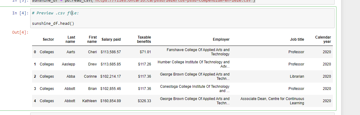
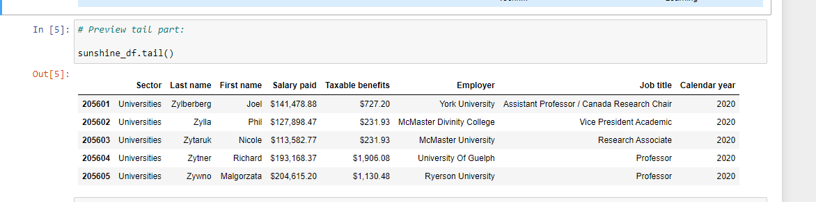
I use sunshine_df.head() and sunshine_df.tail() to preview the data to get a sense of what the rows, columns and data values look like.
For checking data types, there is sunshine_df.info(). Taxable benefits and salary paid columns are non-null objects. These will be converted into numeric/float types in the Dataset Cleaning section.
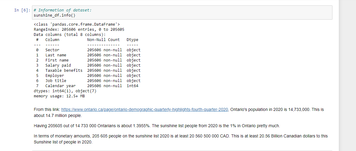
There are 205,606 people on the Ontario Sunshine List for 2020. All of these people make 100000 CAD or more in annual salary. Ontario's population in 2020 was 14,733,000. This 205,605 out of 14,733,000 is about 1.3955%. From the public sector, these people on the list are like the 1% I suppose.
Dataset Cleaning
The Salary paid and Taxable benefits columns are not numeric columns. You can't convert them into numeric columns right away as they have dollar signs at the front and a comma in the Salary paid column. Numeric columns are needed for sorting and for computing averages or other statistical measures.
I use .replace() with regex = True to remove dollar signs and commas.
# Change data type of salary paid and taxable benefits to numeric:
# Replace dollar sign first: https://stackoverflow.com/questions/43096522/remove-dollar-sign-from-entire-python-pandas-dataframe
sunshine_df[["Salary paid", "Taxable benefits"]] = sunshine_df[["Salary paid", "Taxable benefits"]].replace({'\$':''},
                                                                                                            regex = True)

# Remove comma.

sunshine_df[["Salary paid", "Taxable benefits"]] = sunshine_df[["Salary paid", "Taxable benefits"]].replace({'\,':''},
                                                                                                            regex = True)
sunshine_df[["Salary paid", "Taxable benefits"]] = sunshine_df[["Salary paid", "Taxable benefits"]].apply(pd.to_numeric)
As a check you can use sunshine_df.info(). The Salary paid and Taxable benefits columns should have float64 as the Dtype (output not shown).

Exploratory Data Analysis
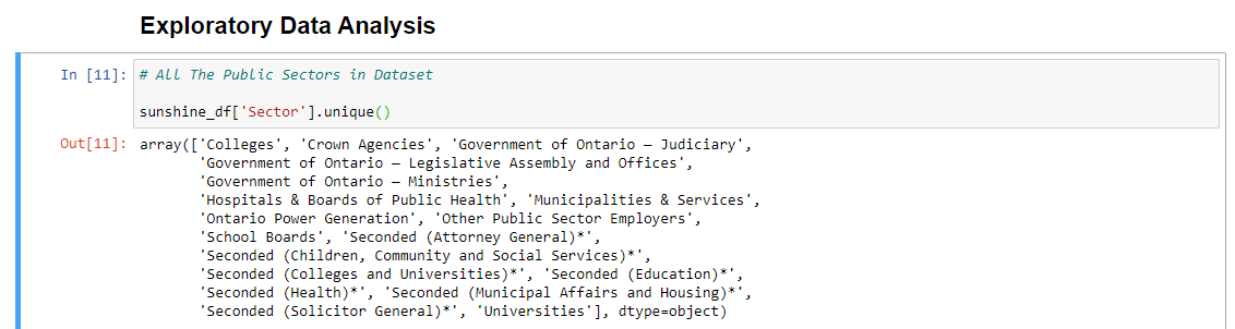
This section in Exploratory Data Analysis is just me going through the Sector & job title categories in the dataset. I also obtain some counts to get an idea of what the most frequent sectors and job titles are in the Sunshine List 2020.
Sunshine List Sectors
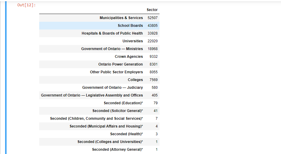
Sector Counts
To obtain counts, use .value_counts() on the column of the dataframe. I put the value counts into a dataframe for better viewing.
# Counts of Different Sectors:

sector_counts = pd.DataFrame(sunshine_df['Sector'].value_counts())

sector_counts
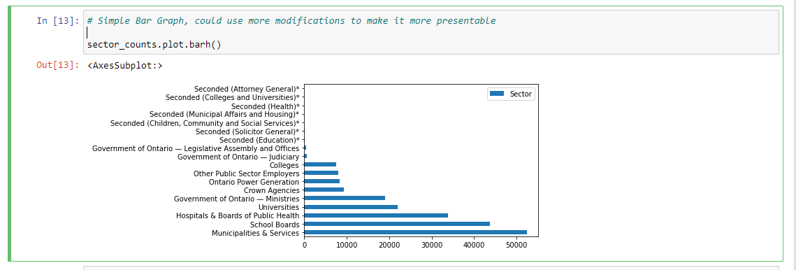
I have also made a horizontal bar graph as another visual. Normally I would add more labels and a title to a bar chart but I did not here.
# Simple Bar Graph, could use more modifications to make it more presentable

sector_counts.plot.barh()
Job Title
Like with the sector column, I take a look at the Job Title column.
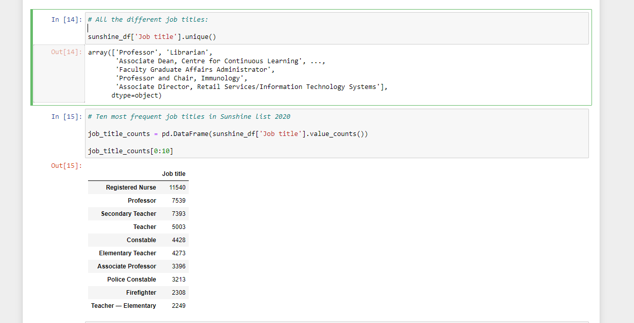
This output does not give all the unique job titles in the dataset. It lists a subset. We have Professor (university or college), Librarian, Associate Dean, Professor and Chair, Imunnology. It is pretty much the leadership roles.
Job title counts are obtained with the use of .value_counts() on the Job title column of the sunshine dataframe object.
From the results, a lot of the most popular job titles on the Sunshine List 2020 in Ontario are in the education sector and in healthcare. To my surprise, Registered Nurse is #1. Teachers and professors make quite a bit of money too. I do wonder how long the teachers on the Sunshine list have been teaching for. That is one area the can be explored more.
Constables and firefighters are quite popular too on the Sunshine List.
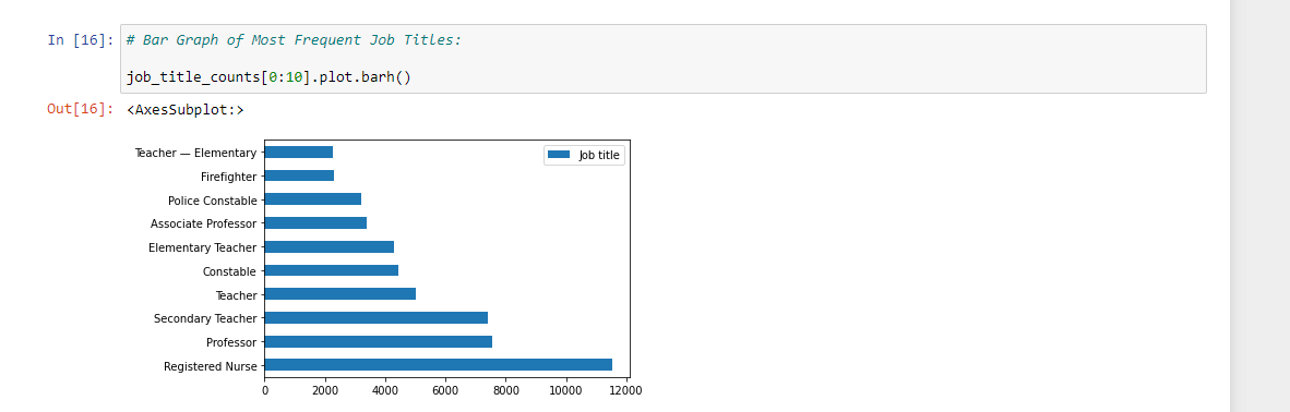
I also plot the job title counts with a horizontal bar graph.
Most Frequent Employers In Sunshine List 2020
There is also the most frequent employers on the Sunshine List that I want to explore. Here are the top 15 Employers with the most employees on the Sunshine list 2020.
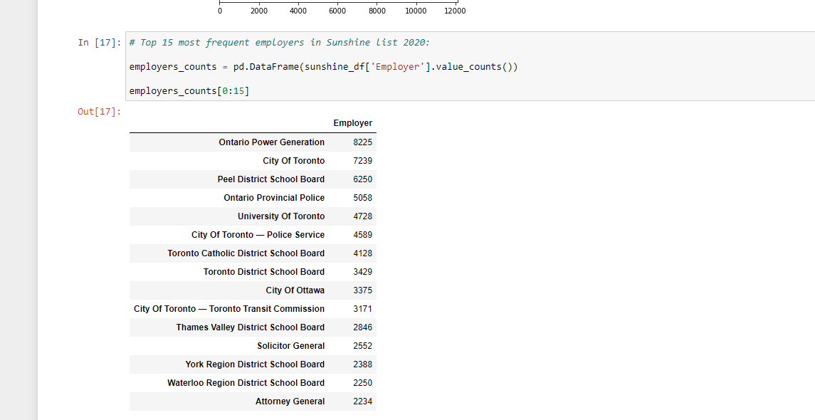
Ontario Power Generation is number one in the list. It is a Crown corporation which is owned by the Government of Ontario with its headquarters in Toronto. This corporation is responsible for more than half of the electricity generation in Ontario, Canada. They deal with nuclear, hydropower along with biomass, gas and solar.
School boards are quite popular too along with the Toronto based employers.
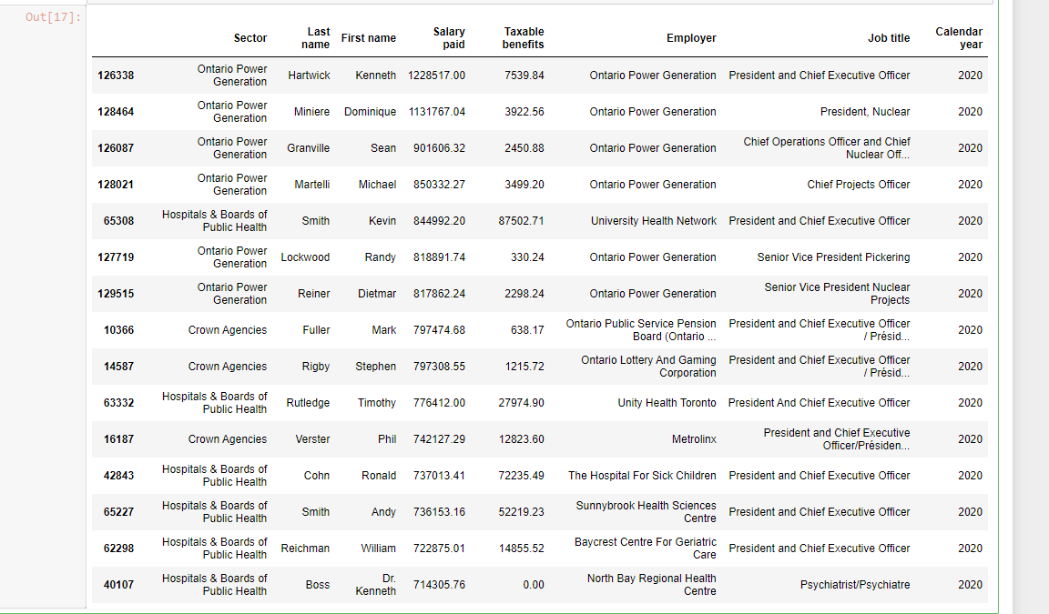
Top Employees By Salary
The main thing I wanted to look at from this dataset is the top earning employees by salary. Do set ascending = False with .sort_values() to obtain salaries from highest to lowest.
# Top 15 Public Sector Employees By Salary

sunshine_df.sort_values(by = 'Salary paid', ascending = False).head(n = 15)
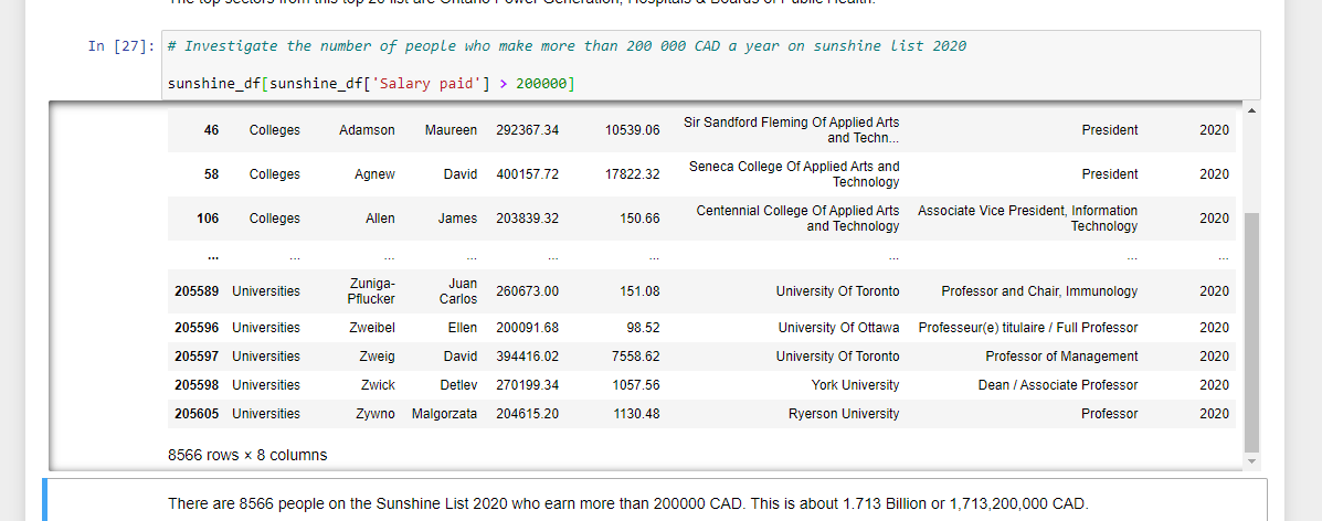
You could also filter the salaries with a condition. In this code chunk, I have the salaries above 200,000 CAD.
# Investigate the number of people who make more than 200 000 CAD a year on sunshine list 2020

sunshine_df[sunshine_df['Salary paid'] > 200000]
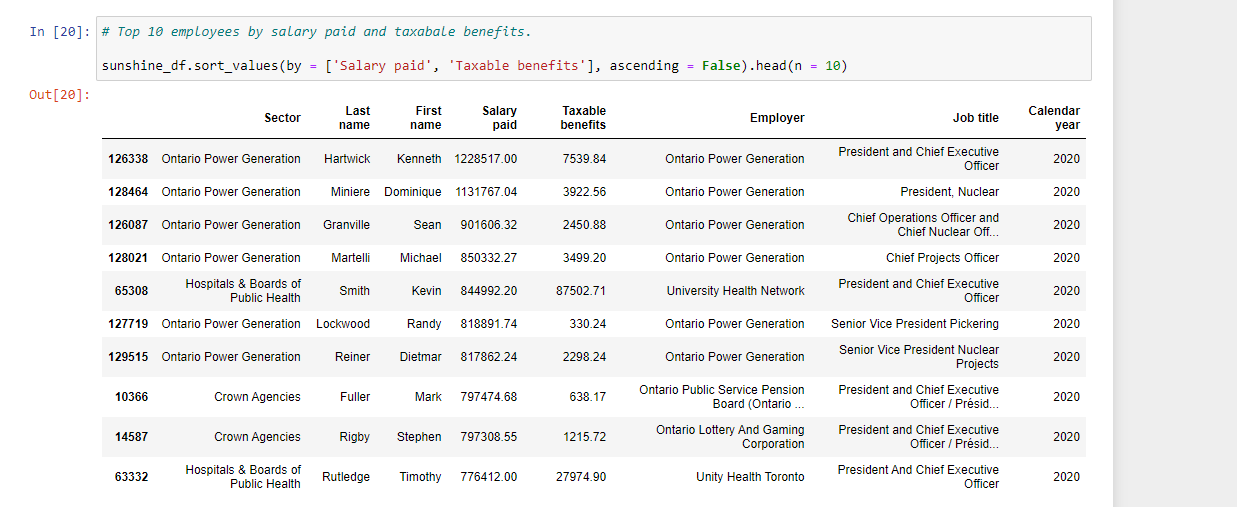
For the top earning employees, you can sort by Salary paid and by taxable benefits.
# Top 10 employees by salary paid and taxabale benefits.

sunshine_df.sort_values(by = ['Salary paid', 'Taxable benefits'], ascending = False).head(n = 10)
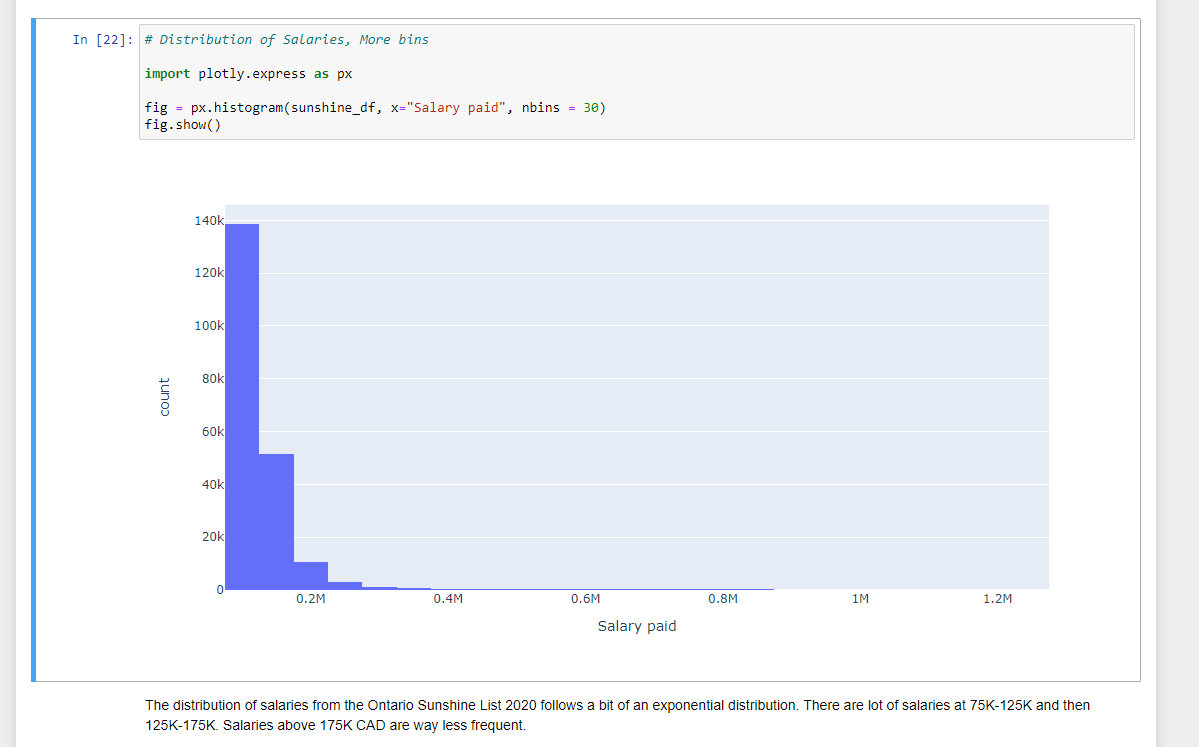
Salary Distribution
As another small thing, I added a histogram of the distribution of salaries for the incomes on the Sunshine List. I had to import plotly.express. The distribution of the salaries in the Sunshine List 2020 follows an exponential distribution. There are more people who are just above 100K annual salary than those who earn more than 125K CAD.
Top Earning Professors
One area I was interested in looking into was the salaries of Professors. It is not difficult to create a filtered dataset from the sunshine list dataset where the job title is just Professor.
# Create filtered dataset for professors

profs_df = sunshine_df[sunshine_df['Job title'] == 'Professor']
I obtain the top earning professors and the bottom earning professors on the Sunshine List.
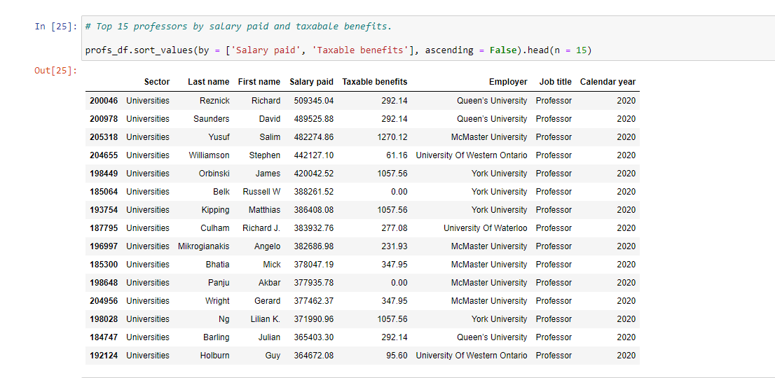
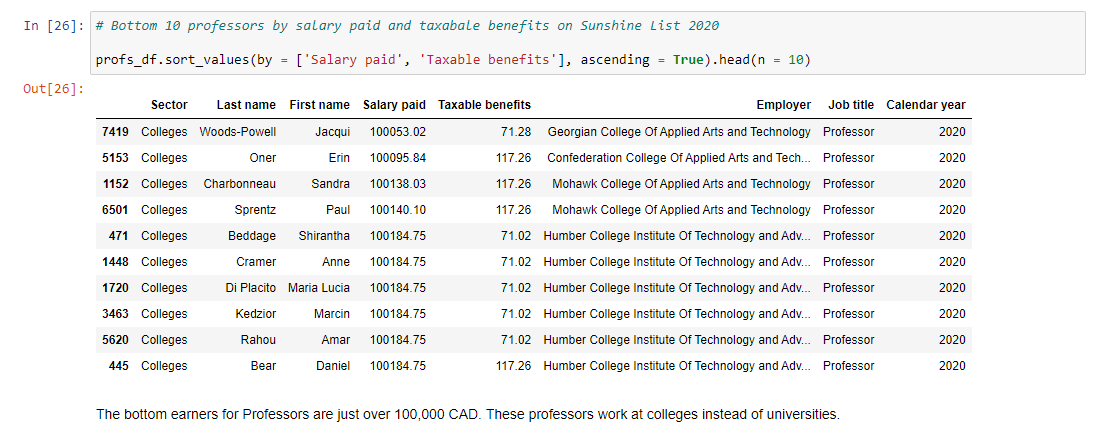
The top earning professors are from universities while the bottom earning professors are teaching at colleges. Being at the bottom of the Sunshine List is not that bad as being on the list means you earn more than 100,000 CAD annually while working in the public sector. Most people would love to earn 6 figures in the province.
Being on the Sunshine list does not guarantee that you can buy an affordable house. The average house price in Toronto is just over 1 million dollars in Canadian dollars as of December 2021. Earning above 100,000 CAD annually does make it easier to buy a house though.

This is nice @dkmathstats, Weldone 🤝. I also use python with Django for backend development.