R Language - How to Create Animated Chart using ggPlot
In this post, we take a look at How to Create Animated Chart using GGPlot. Previously in my post, I covered the Lollipop Chart using R Language.
The previous package was good for some of the time series based plots. I covered that with both dygraphs package and also the fmsb package. Both of them can draw some good charts and it is kind of fun to plot some of these.
I am using RStudio IDE for this charts. I know you can use other tools from like say Jetbrain or even few other R specific IDEs that are out there. You can use them and it would be reasonable to try them for the specific chart usage.
I have created a video to give you an overview on How to Create Animated Chart using GGPlot. You should give this one a try.
So let's take a look at the animated charts and the libraries that we would be using for plotting the same.
First thing we would be needing is the two declaration for the ggplot library.
install.packages("ggplot2")
library("ggplot2")
library(plotly)
and that would look something like this.
I'll be taking a look at the simple animated plot in the ggplot. Now we will be also using the gapminder library.
library(gapminder)
Now that we have the library part covered up we can go ahead with the sample data which would be plotting the scatter plot.
df <- data.frame(
x = c(1,2,3,4),
y = c(1,2,3,4),
f = c(1,2,3,4)
)
Once we have the data then next part comes to the plot.
p <- ggplot(gapminder, aes(gdpPercap, lifeExp, color = continent)) +
geom_point(aes(size = pop, frame = year, ids = country)) +
scale_x_log10()
ggplotly(p)
You would be seeing the screen something like this where you can click on the button and then that would give you an idea on plotting the animated charts movements.
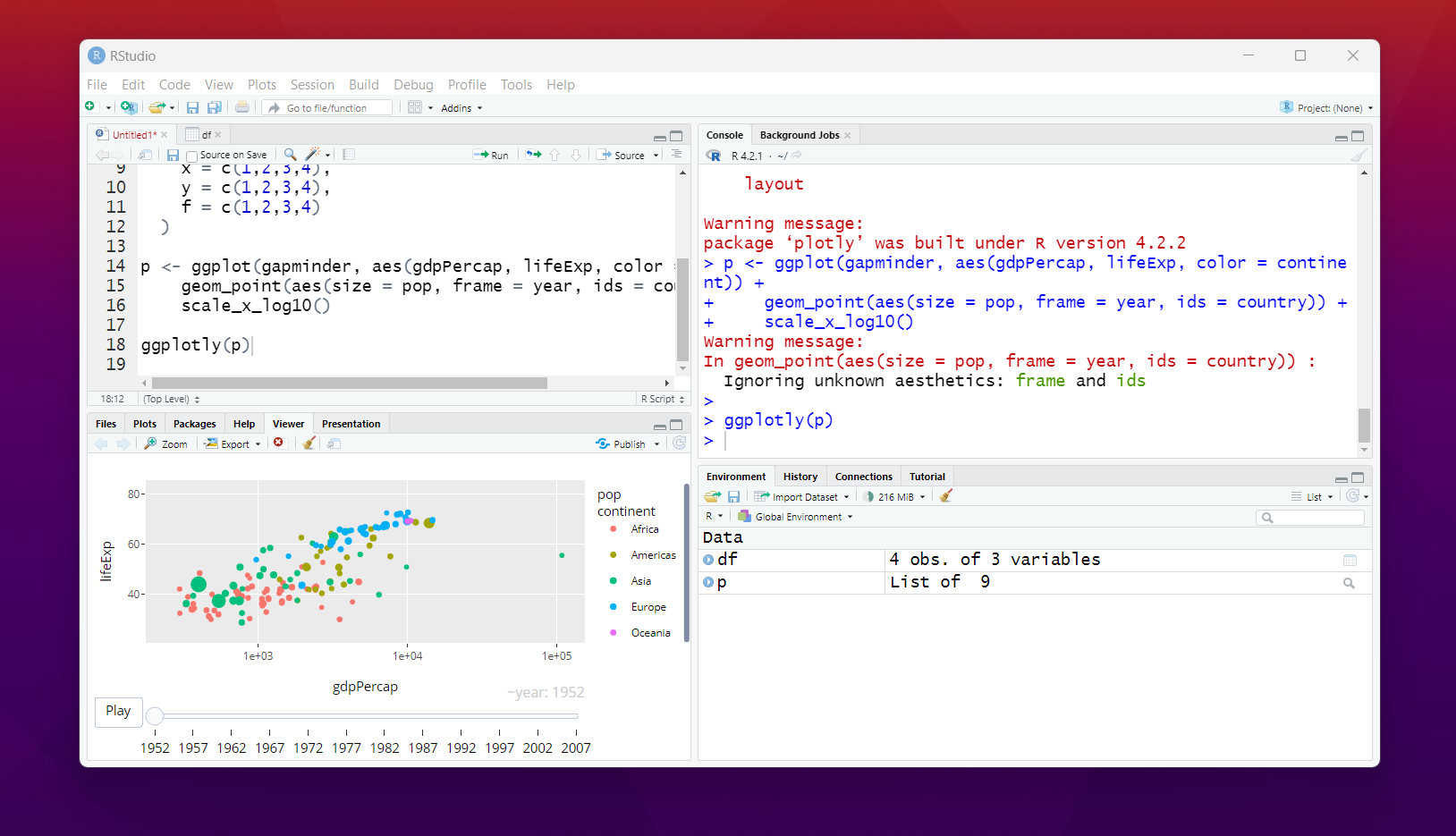
Here in the plot tab all you have to do is press the play button. And that would move the points in the scatter plot. And it would give you an idea on how the animated chart works. You can from this point onwards even try other charts if you want.
Some of those charts would give you an idea on how the plotting works and it would be something lot fun to try around as you build things. More the longer dataset and something time series related would be pretty much cool to use and also show yourself how it work.
Here we have used the ggplot and plotly to do this. If you can find other commercial libraries that allow you to do this and you can implement them in your work that would be well and good. Just make sure to try some of these as well.
Animated charts are fun but not all the dataset are meant for that. More of time based, popular based and something where you see successive changes that's where you need them. Some people have to understand how the animated charts would work for the ggplot.
So far these are some of the tutorials I made with the ggplot and more are going to be there. It may take some time for me to cover all the R analytics based tutorials. Soon, I would have to create some of the charts for the python too. I hope that day comes as well.
If you happen to like this content, do give me feedback over there and that would help me improve my efforts in near future.
@tipu curate
Upvoted 👌 (Mana: 30/50) Liquid rewards.
Thanks for your contribution to the STEMsocial community. Feel free to join us on discord to get to know the rest of us!
Please consider delegating to the @stemsocial account (85% of the curation rewards are returned).
You may also include @stemsocial as a beneficiary of the rewards of this post to get a stronger support.
Congratulations your publication has been chosen among the best of the day.
KEEP CREATING GOOD CONTENT.