R Language - How to Create Lollipop Chart using ggplot2
In this post, we take a look at How to Create Lollipop Chart using ggplot2 in R language. Previously we covered some of the packages in R - dygraphs.
This package was very important from the standpoint of the time series. And so I thought it's time for us to start plotting the various types of the charts out there so as to make use of the packages that we explained previously in some of the tutorials.
Another thing is that I am using the RStudio IDE. You can use any other editor if you want. You can also use the Visual Studio Code with the R notebook functionality of the Jupyter. That would also help you for plotting.
I have created a video to give you an overview on How to Create Lollipop Chart using ggplot2. You should give this one a try.
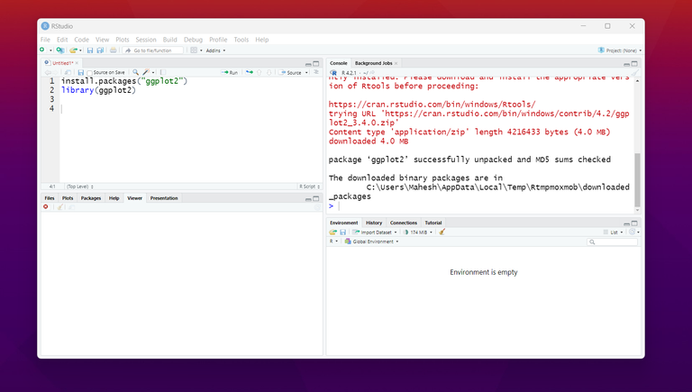
Let's start by first downloading and installing the package - ggplot2. This should give you a direction for drawing various types of the plots and charts.
And we will also start using the ggplot2 library.
install.packages("ggplot2")
library("ggplot2")
and that would look something like this.
Now that we have managed to get the ggplot2, we also need some form of the test data. That would give us an idea on how to use that data for plotting on the lollipop chart.
set.seed(1)
df <- data.frame(x = LETTERS[1:10],
y = sample(20:35, 10, replace = TRUE))
Once we have this data we can decide to plot the chart. It would put up various sort of the points on the chart.
ggplot(df, aes(x = x, y = y)) +
geom_segment(aes(x = x, xend = x, y = 0, yend = y)) +
geom_point()
This should plot the chart like this.
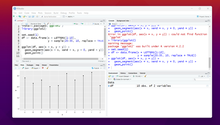
That is it. You now have that lollipop chart based on the data that we have given. Now if you are into more of customization to this. Here are some of the ideas for you to plot the further with custom values.
You can use the horizontal chart of this and you can also add the values at the tip of the bars. You can also change the colors too. Apart from that you can do various other customization to grid and all.
So it depends on what you wish to do. Based on the data that you feed to the chart things would be lot different too. I have learned that it can be pretty cool to make use of the lollipop chart.
I hope that you are enjoying some of my R language and data science tutorials. I hope that some of my coverage on this topic would be helpful to you.
I found the lollipop chart to be pretty cool to draw on using plotly and ggplot2. And another good option would be that you can do the same with python but I have not covered that part as of yet.
I hope to cover more tutorials in upcoming times. Some of the time that would means that I have to think of various customization options but in general that is not something I have sorted out. PowerBI is definitely on the cards in coming times.
If you happen to like this content, do give me feedback over there and that would help me improve my efforts in near future.
Thanks for your contribution to the STEMsocial community. Feel free to join us on discord to get to know the rest of us!
Please consider delegating to the @stemsocial account (85% of the curation rewards are returned).
You may also include @stemsocial as a beneficiary of the rewards of this post to get a stronger support.
Your publication has been voted by Edu-venezuela. Your post will carry over to other curation projects for more voting support. Keep up the good wok!
Gracias por el dato