How to Create a Progress Chart in Excel
Last week, I posted an update on my 2022 Challenge. One of the things I showed in that post is a progress chart of where my tokens are with regard to the targets I want to achieve about two years from now. In this post that you’re reading, I will be sharing with you how to do such progress chart in Excel. As you may have noticed, the tutorials that I share are the ones that I personally use, or have used in my computing processes. I have shared before how to print a non-printable PDF and the last tutorial I posted is how to use an Android app on your Windows PC using an emulator.
The following tutorial, as you can see is something that I am currently using, and I hope it can also be useful to others. Aside from monitoring STEEM tokens, it may be used for weight loss monitoring, investments, savings, and any target that has a goal which can be expressed numerically.
Let’s now proceed to the details. For the purpose of this tutorial, I will be using my 2022 Challenge progress chart as the actual example. I am using Excel 2016 version so the screenshot may not exactly the same if you are using an earlier version of Excel.
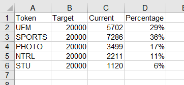
Prepare your Excel table with your data. I put the target, current, and percentage column in that particular order.
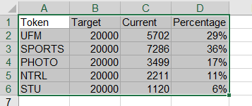
Select all the cells in the table.
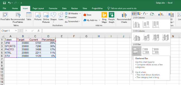
In the Menu Bar, click Insert, then on the Ribbon, select the 2D Bar=>Clustered Bar option.
The following chart will be generated.

Change the title of your chart by clicking on the title and typing the new title.
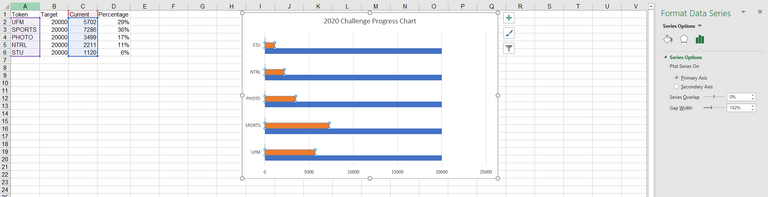
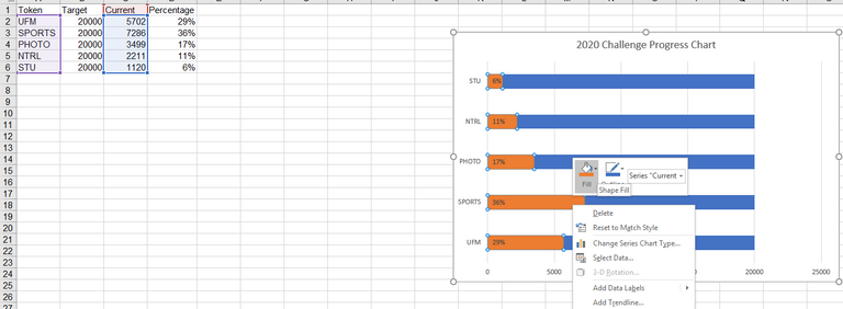
Select one of the bars. You should be selecting the PERCENTAGE column. As you can see, the selected column is the CURRENT column (this is normal as it is difficult to select the PERCENTAGE column right away as its numbers is very small, hence the bar is almost not visible).
Press TAB key until the PERCENTAGE column is selected.
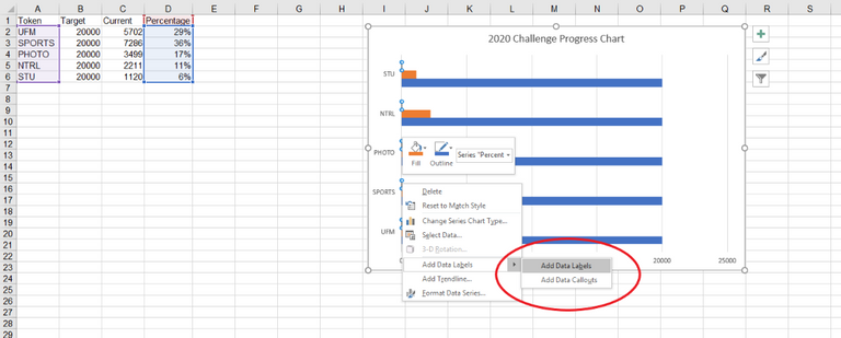
Right click and select Add Data Labels.
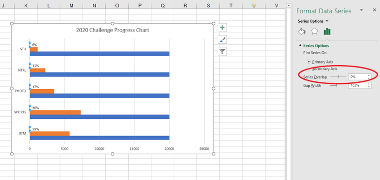
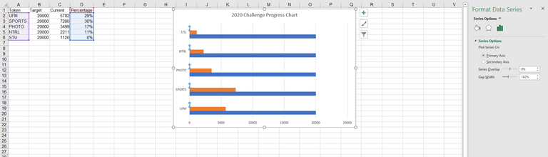
The percentage labels should now appear on your chart. Now, on the menu on the right, update the Series Overlap to 100%.
All the bars will now show as a single bar. You can format the current and target bar with your preferred colors by right clicking on them and using the Fill button.
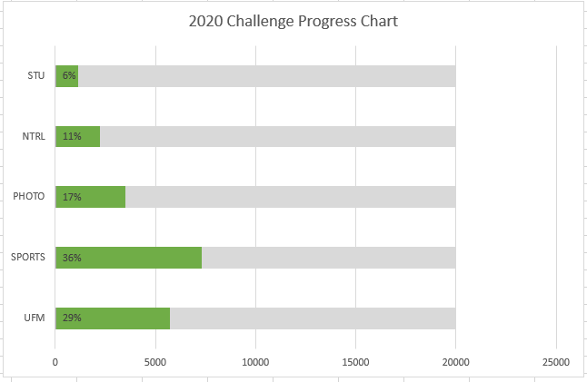
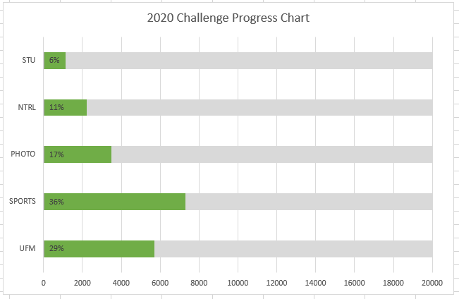
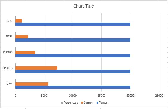
Your chart should look this way. As you can see, Excel automatically assigned the largest number of the chart label to 25000.
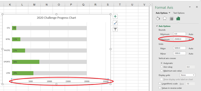
To further tidy up the chart, I just want to show 20000 as it is my target number. Just select the labels below the chart, another menu option will appear on the right side. On the Bounds=>Maximum, update it to 20000.
You’ll have the final table.
There you have it folks. I hope you enjoyed the tutorial and you find is something useful.
Feel free to leave your feedback by commenting below.
Note: All products, brands, and trademarks are properties of their respective owners.
A Little About Me
Please feel free to follow my account if you like my post.

This post is upvoted by @dblog.supporter.
Visit https://dblog.io now! This is a tribe for all bloggers on Steem blockchain.