On the unreliability of early in-flight fatality-rate and demographics for COVID19
Today I want to look at the dangers of interpreting and drawing conclusions from emerging #covid19 data. I'm no expert on viruses or infectious disease, and this post isn't about this. This post is about basic mathematical realities that come with the unusual properties of exponential waves. Properties, that judging from many of the (usually very smart) people on Nutrition Twitter, seem to be unfamiliar to many people posting on the subject.
Let me stress that people making the claims I'll be discussing here are not idiots, they just, like most of us, aren't used to using exponential math on a day-to-day basis, and as such might not be optimally alert when it comes to noticing that their interpretations of the data collide with fundamental properties of comparing and doing calculations with emergent time-delayed exponential curves.
The danger though, and one that concerns me a lot, is that by failing here, some really smart people, knowledgeable on subjects like nutrition and CVD, that have been posting and retweeting such assesments, might undermine their credibility in regard to the subject of nutrition related health and cardiovascular health. And these happen to be exactly those people whose credibility we need so desperately as pushback against the morality driven plant-based anti-science that threatens to undo decades of progress in nutrition and nutrition related medical science at this moment.
So lets start, and lets hope these and other influencers on Nutrition Twitter and beyond take note.
We won't be using Pandas for this post, just numpy this time. Numpy and matplotlib.
import numpy as np
%matplotlib inline
import matplotlib.pyplot as plt
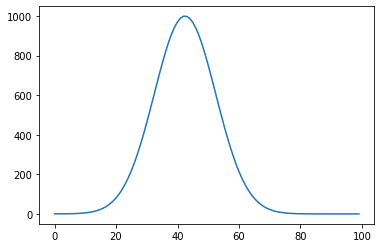
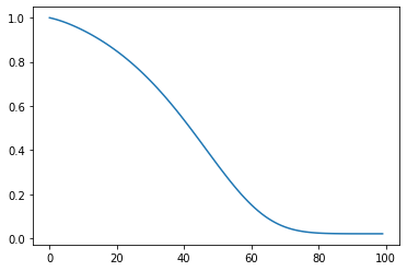
Lets start with a simple exponential curve. This might not be the exact curve that is most suitable to model infection disease spread, but it is close enough for our purpose to illustrate the effects of time delay differences on such curves.
timeline_infections = np.linspace(-3,4, num=100)
infections = 1000 * np.exp(-(timeline_infections*timeline_infections))
plt.plot(infections)
plt.show()
Scenario 1: inferring fatality rate too early.
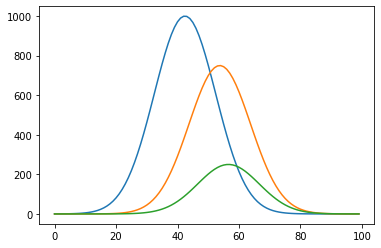
Now lets add two more curves, and let's think of these other two curves as time delayed effects flowing causally from the first curve. We have the initial infection as common cause of both antibodies in the blood of the (formerly or still) infected, and of deaths. In this example, the deaths curve comes in at just a slight lag from the antibodies curve.
timeline_antibodies = np.linspace(-3.8, 3.2, num=100)
timeline_deaths = np.linspace(-4, 3, num=100)
antibodies = 750 * np.exp(-(timeline_antibodies*timeline_antibodies))
deaths = 250 * np.exp(-(timeline_deaths*timeline_deaths))
plt.plot(infections)
plt.plot(antibodies)
plt.plot(deaths)
plt.show()
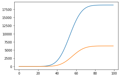
These are rates, and what is measured are commutative numbers, so lets transform.
total_antibodies = np.cumsum(antibodies)
total_deaths = np.cumsum(deaths)
plt.plot(total_antibodies)
plt.plot(total_deaths)
plt.show()
Now we come to the interesting part. We know from our simple model that we created ourselves, that about 25% of people infected with our fictitious virus end up dying. But look what happens to these numbers if we try to calculate the fatality rate in mid-flight.
fatality = total_deaths/(total_deaths + total_antibodies)
plt.plot(fatality)
plt.show()
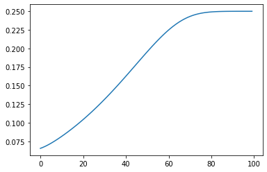
A bit hard to see, so lets plot our mortality rate with this curve and let's scale both curves a bit.
fatality = total_deaths/(total_deaths + total_antibodies)
plt.plot(4*fatality)
plt.plot(deaths/250)
plt.show()
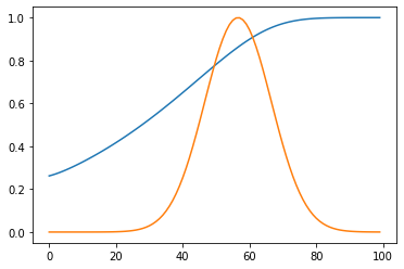
We see, with just a tiny bit of lag between the two time-delayed effects, the in-flight calculations are already off by a factor of two to four when done in the exponential growth part of the curve. More lag or steeper curves because of fast local spread, and this effect becomes larger and larger.
So lesson number one:
Don't do mid-flight calculation of fatality rate, you WILL underestimate fatality, and have little insight of just how much without EXACT timing metrics.
Scenario 2: Inferring demographic info too early.
This scenario, mathematically is almost exactly the same as the first one, with a subtle difference.
If you throw 100 random untrained people into the sea, halfway between Calais and Dover, many of these 100 people will drown before they reach the shore. If you look one week after you dropped these people in, you will probably find maybe even a dozen, maybe more, made it to the shore, and you could gather some useful demographics from those numbers.
But what if you looked after 20 minutes. Think these demographics would look anywhere close to the demographics after one week?
Demographics like age group and health status might affect not just the under the curve area of the subgroups, they are also very much likely to affect the lag between cause (being thrown dead center into the Strait of Dover) and effect (drowning).
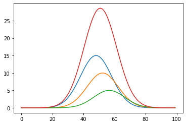
Lets look at three equally represented age groups. Young people with a mean age of 25 years, middle age, with a mean age of 50 years, and elderly with a mean age of 75 years.
Lets say half of the people that will eventually die are elderly, and one sixth young. Let's also say that the lag between cause and effect is slightly shorter for the elderly and slightly longer for the young.
elderly_age = 75
middle_age_age = 50
young_age = 25
elderly_mortality = 15
middle_age_mortality = 10
young_mortality = 5
timeline_elderly = np.linspace(-3.4, 3.6, num=100)
timeline_middle_age = np.linspace(-3.7, 3.3, num=100)
timeline_young = np.linspace(-4, 3, num=100)
rate_elderly = elderly_mortality * np.exp(-(timeline_elderly*timeline_elderly))
rate_middle_age = middle_age_mortality  * np.exp(-(timeline_middle_age*timeline_middle_age))
rate_young = young_mortality  * np.exp(-(timeline_young*timeline_young))
rate_all = rate_elderly + rate_middle_age + rate_young
plt.plot(rate_elderly)
plt.plot(rate_middle_age)
plt.plot(rate_young)
plt.plot(rate_all)
plt.show()
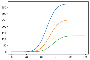
Again, like before, lets look at the cumulative numbers.
elderly = rate_elderly.cumsum()
middle_age = rate_middle_age.cumsum()
young = rate_young.cumsum()
plt.plot(elderly)
plt.plot(middle_age)
plt.plot(young)
plt.show()
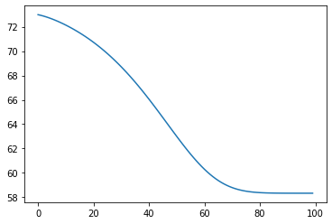
Now we see what happens if we try to calculate the average age of the people who died in flight.
mean_age = (elderly * elderly_age + middle_age * middle_age_age + young * young_age)/(elderly + middle_age + young)
plt.plot(mean_age)
plt.show()
Again we normalize to see how this looks with our original curves.
plt.plot((mean_age-58)/15)
#plt.show(rate_all)
plt.show()
Like before, lets add the mortality curve.
plt.plot(rate_all/2+58)
plt.plot(mean_age)
plt.show()
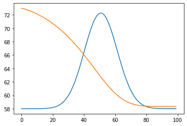
I think, like for the previous example, this example shows that even a small lag between two demographics sub groups causes the mortality in the lagging groups to be greatly underestimated when calculations are don in mid flight.
And that if the lagging groups like in this example are the young, that any in flight age mean or median will lay significantly higher than the eventual real number.
Like before, without hard and certain numbers of lad difference between the two common cause effects, any estimation of the size of the overestimation of these numbers will be wild speculation.
So lesson number two:
Don't do mid-flight demographic metrics, you WILL underestimate lagging sub-groups, and have little insight of just how much without EXACT timing metrics.
I should have know that there is a thing like "Nutrition Twitter". :D
Twitter has a special universe for everybody.
Exponential numbers are just not part of our daily lives. That makes it so hard to grasp for most.
Thanks, verry well explained. Rehived.
This is why sometimes statistics does not help at all. It helps to understand why you should not rely on it at all (of course for tracking its fine but interpretation is dangerous). For global cascading effects (not even Tschernobyl is globally cascading) the lack of hindsight evidence should encourage non-naive precaution.
As you showed, statistics as a tracking tool gives false confidence of control and control-fallacies lead to systemic ruin - the worst case. But I bet that they will not learn a bit. They will introduce GMO on a global base. They will vaccine with one pharmacon on the global base ("hey 5% uncertainty is nothing, lets do it"), they will probably even do geo-engineering but they are f**cking concerned about nuclear power plants which only have very local effects in the worst case.