RE: COVID19: Austria Will FORCE Vaccinate The Population From 2022! Despite Data Not Justifying It.
You are viewing a single comment's thread:
Most excellent analysis. I'm afraid that we're preaching to the choir here, but it's still a blessing to have the situation rolled out in a clear, concise format.
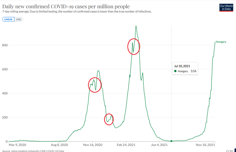
I will however point out a mild (as I see it) inconsistency. You mention that the Austrian wave is already going down, but in the following UK graph we see that waves don't always behave as we'd like them to.
This is of course, putting aside the fact that it's highly suspicious what a covid case and/or death really is, like you said.
Just as anexample I found by randomly clicking countries:
0
0
0.000
Yes, you are right, I intended to point that out more but in the end I left the text a little unclear, I'll update it.
I am curious if they will pull it... mandatory is total nazi, but as said, gay western men raised in feminism... learned submission behaviors... useless... at least the guys in many places, don't take this bullshit... no. if you don't understand the no, you simply die. not complicated, no graph needed, sometimes, there isn't even a warning. no.