Biological Statistics 3
In this post, we discussed statistics as being made up of two branches - descriptive and inferential statistics. In today's post, we will be discussing what descriptive statistics entails. Tag along!

What is descriptive statistics?
Descriptive statistics is a branch of statistics that that summarizes the information obtained from a sampled population. In other words, it deals with the summarizing of data obtained from a research with the description of basic features of the data. The summary of data are of two types:
- Quantitative summary
- Visual summary
Quantitative summary simply summarizes a large data into a single indicator. A good example is the student’s grade point average or the cumulative grade point average. It gives an indication of the overall performance of students from a list of courses the student must have taken. Another example is the percentage or frequency which indicates the proportion of a particular variate from a variable.
The visual summary gives a visual trend of a sample data at a glance. Examples include the bar chart, histogram, pie chart, line graphs, etc.
Distribution Table
The distribution table is a summary of the number of times individual variates appear within a variable. A typical distribution table will contain a list of all the numbers within a single variable data set – usually in ascending or descending order - and the number of times they appear. More specifically, such table is referred to as the frequency distribution table.
To exemplify how a frequency distribution table is constructed, consider the following list of number of leaves found in 40 plants of the same species in a particular field:
06 10 05 09 05 09 09 10 08 09 09 09 05 08 05 09 08 09 07 08 07 09 06 08 09 07 08 08 09 05 08 08 06 07 05 06 10 08 06 07
At a glance, the data has no meaning until the variates are arranged in a form of table with their respective frequencies or any other descritptive statistical feature.
In order to construct a frequency distribution table for the data
- Create a two columns table, labelling the first column as ‘number of leaves’ and the second column as ‘frequency’.
- List out the all the numbers present in the data, starting from the smallest (or the biggest) without repetition on each row of the first column.
- Count the number of times each number on the list appeared and write the count against each number in the frequency column.
The initial table looks like below
| Number of leaves | Frequency |
|---|---|
| 5 | 6 |
| 6 | 5 |
| 7 | 5 |
| 8 | 10 |
| 9 | 11 |
| 10 | 3 |
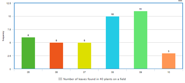
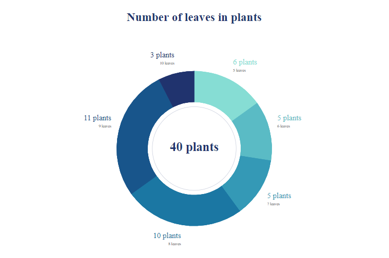
One can see that the table makes sense at a glance. Out of the 40 plants studied for their number of leaves, 6 had 5 leaves, 5 had 6 leaves, anothe 5 had 7 leaves, 10 had 8 leaves, 11 had 9 leaves, while only 3 plants had 10 leaves.
To further improve the distribution table and makes it more explanatory at a glance, a column of percentage can be added. The percentage of number of plants relative to the number of leaves they posses can be claculated such that:
percentage of plants with x number of leaves = frequency/total frequency x 100%
For example, the percentage of the sampled plants with 5 leaves can be calculated as:
Hence, the distribution table becomes
| Number of leaves | Frequency | Percentage |
|---|---|---|
| 5 | 6 | 15 |
| 6 | 5 | 12.5 |
| 7 | 5 | 12.5 |
| 8 | 10 | 25 |
| 9 | 11 | 27.5 |
| 10 | 3 | 7.5 |
The data of number of leaves on the 40 plants can also be represented visually using a bar chart, scattered plot, or even a pie chart. In order to present the data in a bar chart, choose a suitable scale to represent the frequencies on the Y-axis and a suitable width for the bars that will represent each number of leaves on the X-axis.Thereafter, plot the various number of leaves against their respective frequencies to arrive at the figure below.
In order to present the data in a pie chart, each of the percentage or frequency is converted into an angle out of the total angle in a circle, which is 360O. For example, 6 plants had 5 leaves, the angle it will form within the pie chart would be;
Once the angle each frequecy represents is calculated, the pie chart can then be drawn to scale using relevant instruments.
Biological statistics for dummies. That's what your articles title should be. Keep them coming
Thanks for your contribution to the STEMsocial community. Feel free to join us on discord to get to know the rest of us!
Please consider supporting our funding proposal, approving our witness (@stem.witness) or delegating to the @stemsocial account (for some ROI).
Please consider using the STEMsocial app app and including @stemsocial as a beneficiary to get a stronger support.
Congratulations @ummar! You have completed the following achievement on the Hive blockchain and have been rewarded with new badge(s) :
You can view your badges on your board and compare yourself to others in the Ranking
If you no longer want to receive notifications, reply to this comment with the word
STOP