Employing Artificial Intelligence for Scientific Visualization and the Betterment of Humanity Before it Turns on Us and Destroys Us
Imagine the following scenario. You're a dedicated student, practitioner, or researcher who diligently spends many hours pouring over data, analyzing them, making sense of the results, then writing detailed scientific reports. At some point, you'll need to come up with visualizations for publication and presentation. Through your visualizations, you will convey ideas, theories, hypotheses, experimental frameworks, variables, analyses, results, and so on. This is the moment when you explain to the world your work and what it means for society at large. The last thing you want is for people to end up confused in a morass of scientific jargon and unable to make heads or tails of your work. You want to present your best work.
Edward Tufte has discussed the elements of good design when it comes to presenting qualitative and quantitative data. Designing good scientific visuals is as much a science as it is an art. There's a reason why graphics and information design have become their own independent fields. They not only require extensive knowledge of artistic and aesthetic elements but also knowledge of things like the way the human nervous system processes visual information. Unfortunately, not all scientists and researchers have the means to hire graphic designers for their papers or presentations, so they adopt a do-it-yourself attitude that may or may not work. Is there a way to improve the process?
Other questions we can ask include, where do the ideas for great visualizations come from? How do you know if your work is any good? This topic is not discussed in Tufte's books. The source of creativity is one of those esoteric subjects that still eludes us. Oftentimes, a scientist working on a visualization will simply get inspiration from others in their field. Maybe they'll just feel their way around it like in the good old days when all you had was an overhead projector and no need for fancy illustrations. After all, a serious scientist doesn't have time to play with pretty pictures. Yet, a good visualization is more than just pretty pictures, it's an interface between humanity and the world of nature, as mediated by the researcher's work and understanding.
I recently came across the following Twitter post from Space.com
Hubble Space Telescope spots haunting glow surrounding the solar system https://t.co/4kQ97AOPdc pic.twitter.com/ibSG4Hi7pX
— SPACE.com (@SPACEdotcom) December 9, 2022
So, this got me thinking, could I recreate a diagram in Stable Diffusion 2 (SD2) that shows this haunting glow that surrounds our solar system? For those of you not familiar with Stable Diffusion, this AI-driven program allows you to create 'art'. I'm a beginner and have limited knowledge of the system, but I was able to install it and test it out in my machine. To generate an image, you need to prompt engineer, which is basically defining the parameters of your image to get the results you want. For example, I could tell it to generate a magical forest full of fairies and with a few additional parameters, I could generate different scenes based on this prompt. Now, it's one thing to generate an artistic scene, but creating a scientific illustration is quite another. There isn't as much room for 'artistic' creativity because the point is to convey information in a clear manner. There is also text and diagrams that need to be included. To the extent there's a narrative, the story needs to be clear, well organized, easily grasped, and aesthetically pleasing to motivate and facilitate understanding. So could I use SD2 to generate a scientific illustration based on that recent finding regarding the glowing cloud around our solar system?
I tried different parameters and different words in the prompt. I did not faithfully tracked the changes that I made because I wasn't planning to write a report, but since here I am doing just that, I will discuss what changes I thought made a key difference.
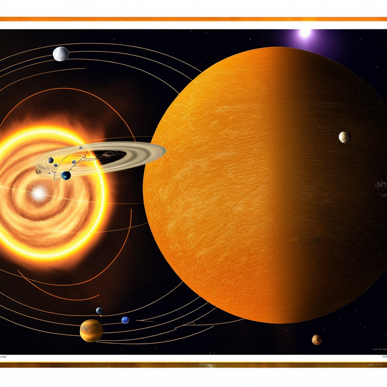
I began using this prompt: haunting glowing halo around the solar system, detailed scientific illustration
The prompt further contained all the usual cajoling of the AI to generate a detailed, ultrasharp, polished, etc image in this or that style with this type of lighting and so forth. I generated a total of 6 pieces, and here are the three I found most interesting.
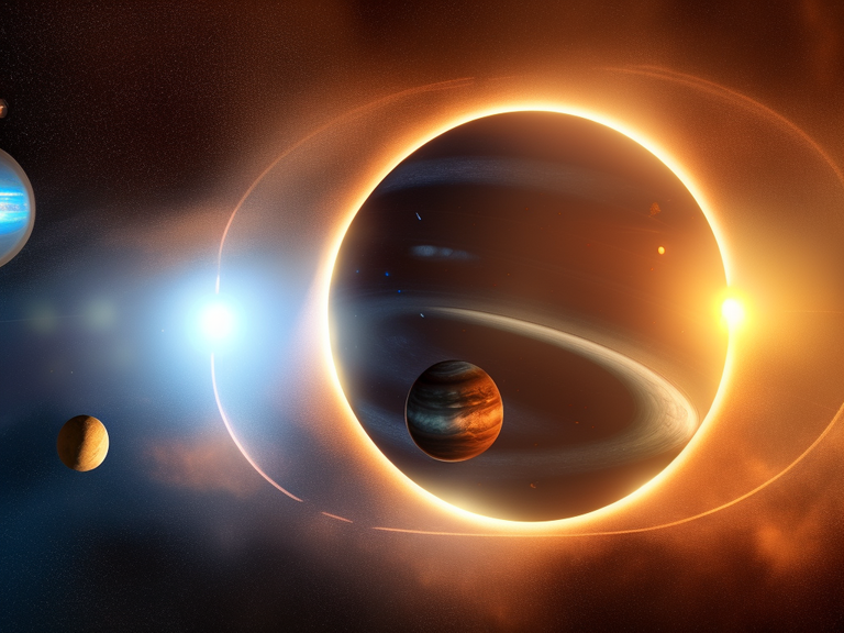
They are certainly much more exciting than a diagram and do contain a haunting glow, but it wasn't what I was looking for. So I adjusted the prompt to include the following words:
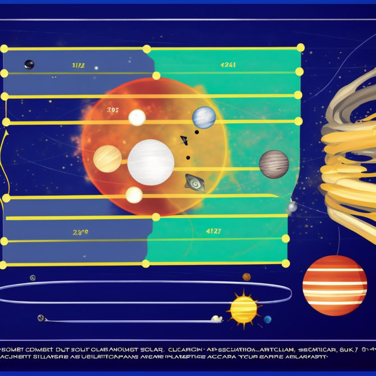
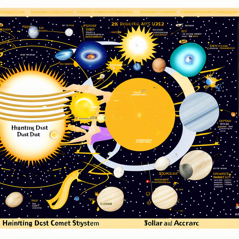
diagram of haunting comet dust cloud around the solar system, accurate scientific illustration of the sun and planets, draw orbits
The following are two of the six images generated.
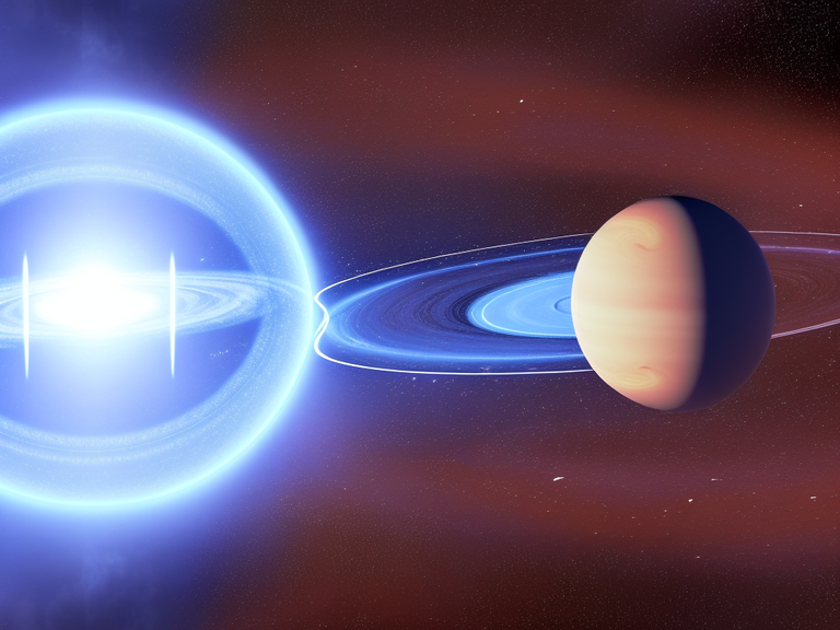
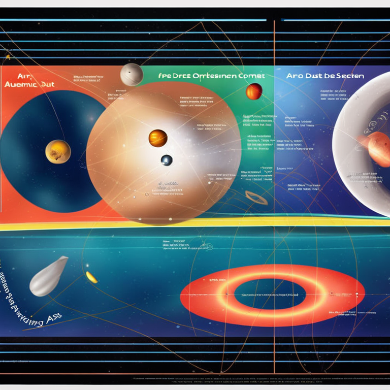
This was more like it. The images began looking more like a scientific visualization with the text and drawn orbits. It still had a habit of showing me a large close up image of the planets. So, I used another function called negative prompt, which refers to words or elements that you do not want to see in the generated image. I added close up of planets as a negative prompt and left everything else intact.
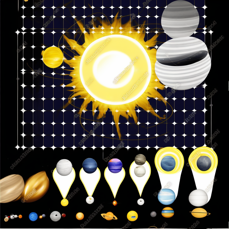
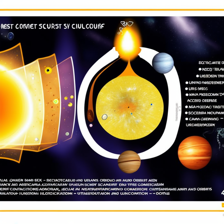
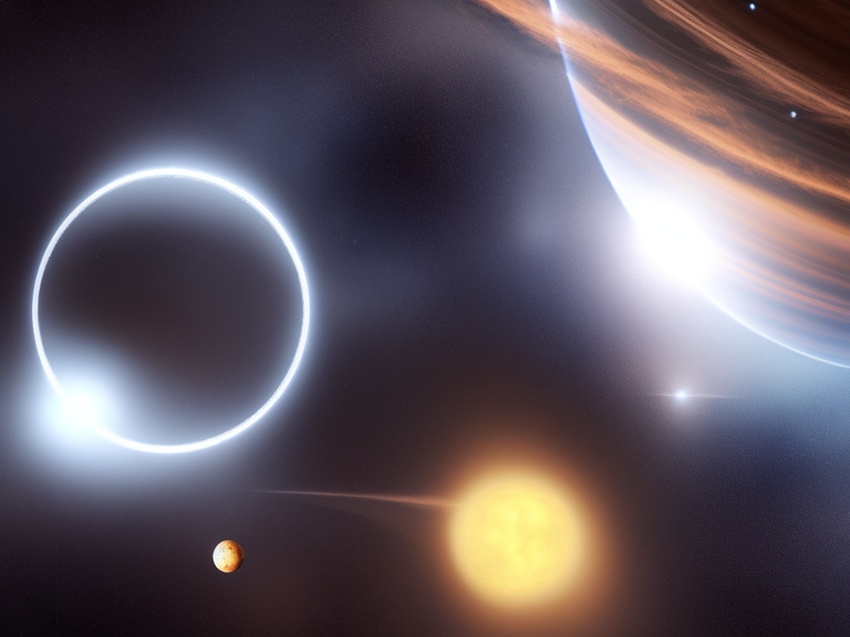
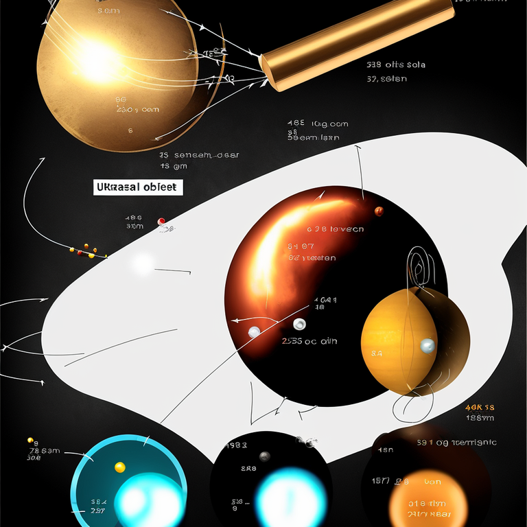
These diagrams look much more scientific. Naturally, the AI does not understand what I mean by a haunting comet dust cloud around the solar system, but the images are not too bad. I can see how I could use this tool to generate ideas for scientific reports and presentations. Will it ever get to the point when we can actually use a prompt based on real world data? Take a look at the following image generated in the preceding set:
Notice the words on the sun image. They appear to say: Haunting Dust. Along the bottom, we can make out what appears to say: haunting dust comet system. The AI has actually incorporated linguistic symbolic elements (words and phrases) into the image based on the prompt. It's not outside the realm of possibility that one day scientists will be able to just feed a research paper into the AI, and it will generate the visualization that most accurately and aesthetically reflects the findings.
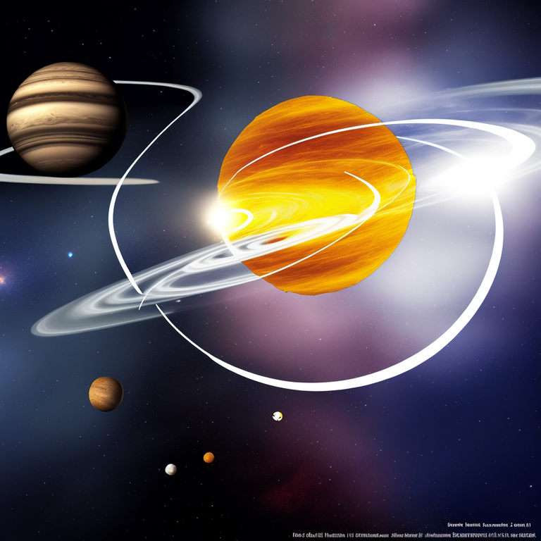
I further prompted the AI to use the English language and also increased the number of steps to generate the image. While it produced crisp text, the symbols were not recognizable as English.
I think this one is about the multiverse. Possibly maybe.
There's a lot of controversy surrounding AI Art at the moment, but this issue goes beyond art. Artificial intelligence will touch many aspects of our lives. It already has in many ways. Will it lead to humanity's demise? Probably. But in the meantime, we can use it to cheerfully make ourselves smarter, and just maybe we'll outwit whatever evil sentient intelligence is generated by the ghost in the machine.

Images generated in Stable Diffusion by @litguru
Very interesting talk about how to repesent planets
!1UP
Thank you! It was very interesting and fun playing with the images.
You have received a 1UP from @gwajnberg!
@stem-curator
And they will bring !PIZZA 🍕.
Learn more about our delegation service to earn daily rewards. Join the Cartel on Discord.
I gifted $PIZZA slices here:
@curation-cartel(4/20) tipped @litguru (x1)
Learn more at https://hive.pizza!
Dear @litguru,
Your support for the current HiveBuzz proposal (#199) is much appreciated but the proposal will expire soon!
May we ask you to review and support the new proposal so our team can continue its work?
You can support the new proposal (#248) on Peakd, Ecency, Hive.blog or using HiveSigner.
Thank you!
Thanks for your contribution to the STEMsocial community. Feel free to join us on discord to get to know the rest of us!
Please consider delegating to the @stemsocial account (85% of the curation rewards are returned).
You may also include @stemsocial as a beneficiary of the rewards of this post to get a stronger support.
Thank you!
I don't think so. This was an interesting exercise and I really need to get that program. Looks like fun. But I think belief in the power of AI has almost become an ideology. I'm not denying it, but I think those scientists who work most closely with it have the greatest faith in it. It is their kingdom. They are the high priests of AI. And I'm not impressed with Elon Musk's assessment. I think he lacks a normal emotional response to life and people. I think he is comfortable with AI and that is why he believes in its ascendancy.
Of course, what do I know?
Great points. I don't think AI will lead to our demise (yet), but it will lead to our mutation into a new species (which technically is our demise but nevermind semantics :) The more I interact with AIs, the more I see them as the species that will replace us eventually. At least humanity will not be able to survive without it. It won't be a grand plot by a mad evil genius that do us in, it will be good old natural selection thanks to the accumulation of mutations in the AI and in the last of us. People recoil at the idea of humanity transforming into something else, as if we're just a static unit of the evolutionary process. Like all other species, humanity is just a transitory state. No species has remained unaltered in the history of life. I actually consider myself a type of amphibian who has mutated to survive the info-oceans of the electronic net. My brain simply requires a good dose of photons daily the way early amphibians required a good dose of oxygen by the seashore. There are inflection points in the history of a species, transition areas driven by bio-genetic mutations like lungs, backbones, arms & legs, stereoscopic vision, brain size, etc. These developments were not approved by committee, politicians, government bureaucracies, activists, or the six o'clock news. The old wisdom still stands. When it's time to mutate, it's gonna mutate whether we're for or against mutations.
Thank you for you insightful comment!
I thought of Blade Runner 2049. When AI learns to breed with us--then it's all over😆
Let's just say things are going to get spicy 😇
Now checking it against my database of known compromised or unsafe domains.. you'll see another reply if it's in there.
If not, it's likely safe to open.[Read about the risks].
{Current avg shortened links in Hive posts/comments: 69.8/h}
_ Vote for our WITNESS to support this FREE service!
Around 1997, at work, I handled press lists that contained certain data that we received from an office. I transferred the database data into Excel. As a result, the Excel spreadsheet contained many columns that we didn't need for our work and I activated Excel's "record button", which recorded my changes to the original import from the database. Whenever I received a new press distribution list with all the unnecessary data and I activated the recording with my individual manual steps, I then watched the machine delete the unnecessary table columns and I ended up working only with the data I needed for my work. It was great not to have to do this stupid work myself and instead to see the machine do it at super speed. Since this programme did not work in the background but in the foreground, the deleting of the columns was something I could watch on the screen.
I could then visualise the cleansed table on Excel using the graphic functions. At that time, this was available as a curve diagram or as a pie chart in various designs. In other words, I could have the computer calculate a graphical representation from the boring table with table rows and table columns. I can imagine that the possibilities today are much more sophisticated and your playfulness with the programme shows this. Of course, the AI can only come up with the images it already finds on the web. What it doesn't find, it won't be able to show. Which doesn't seem to matter, of course, given the abundance of photographic and artistic material on the web. I wonder if it will send a request to all those who have not copyrighted their work. LOL
Nevertheless, I am a friend of the human being who does not need to transform himself into another being, because I think that in the present organic body, the man still has a lot of potential that he can exploit, he just does not always know it or succeed. Fortunately, I am firmly convinced that if that were the case, I would no longer experience it. I neither exaggerate my joy at progress, nor do I mourn the past excessively. "Humanity" is too big a subject for me anyway, just like "the earth". On the other hand, I love the details and would actually be interested in an application that could spit out my body measurements in 3d in seconds and draw and print a cut according to my ideas.
Like this: Computer, take my measurements and print out a trouser cut with a high waist, a box pleat in the middle of each front trouser cut and trouser legs that taper out tightly. Including inside pockets and a four-centimetre waistband. Add all seam allowances in each case.
I often have design ideas in my head but can't visualise or draw them, but could describe them and then see them suggested by an AI to make further corrections. Of course, this would all be much faster if I were a professional designer and could draw. Then I could save myself all this. On the other hand, most and my best ideas came to me while doing it myself. When I had unravelled second-hand fabrics and then the different parts were lying in front of me and I was thinking about what to do with them.
Great anecdote on how things have changed technologically in the past couple of decades. Even technology from the past five years is quickly becoming dated as development accelerates.
The copyright issue is still up in the air. Some companies are going to let artists opt out of getting their work included in the training sets. Personally, I think we should throw everything into the AI blender, copyrighted or not. We're in a wild wild frontier of creative output, and this is the time to boldly start generating ideas. Shoot first and ask questions later. 🤠
You could also share those measurements with us, so we can create our own AI version of @erh.germany to have outrageous conversations with based on data mined from information available online. That'd be incredible! ;)
I have many ideas swirling in my head too and oftentimes they're not clear. I'm finding that generating images helps me narrow those ideas and synthesize them better. I often write pieces of narrative with no clear plot, and now that I'm revisiting those pieces and generating AI images for them, I find that with the AI output, I'm able to think about how the narrative should unfold more easily than using pure imagination. The AI is like an imagination machination that makes salient that which is nebulous in the mind. It's incredible, and I'm excited for what lies ahead.
Thank you for visiting!
LOL, I wouldn't have expected you asking first. :D
Better not ;)
I see. I am not there though. There are so many movies out there that I often get inspired by those, how they are presented, the pictures, land- and cityscapes, characters etc. Also, books give me that kind of move and motivation. Or blogs, for that matter. Though I understand what you are talking about. I may try it one day and see if it gets me going in the same way :)