Data, Networks, Blockchain, NFTs And Science
Over the past couple of weeks I showed you different ways of illustrating data and I think you agree with me that data illustration a very fascinating field. Basically it is the field where science meets art and the scientist becomes an artist, a digital artist.
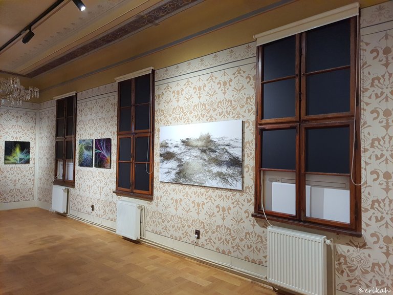
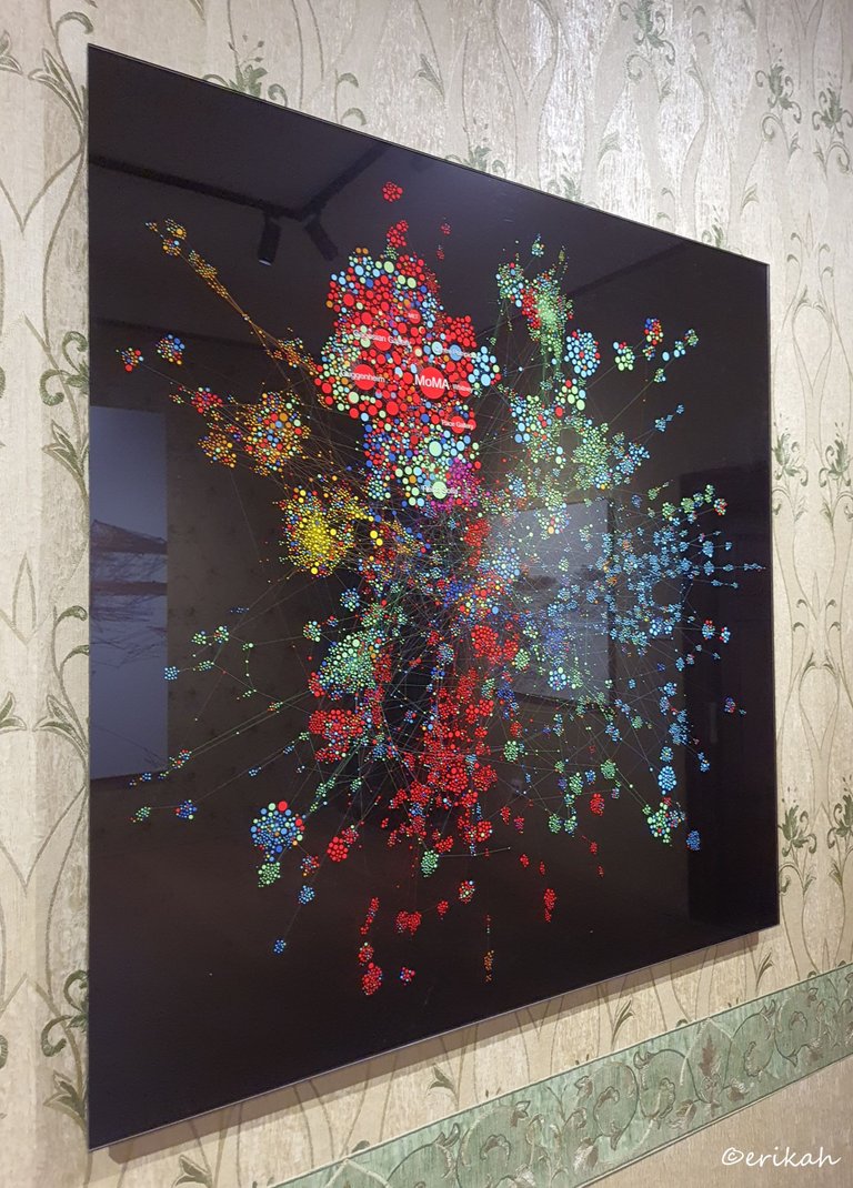
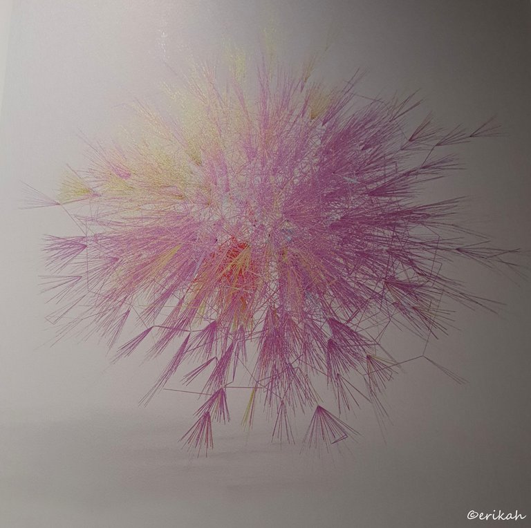
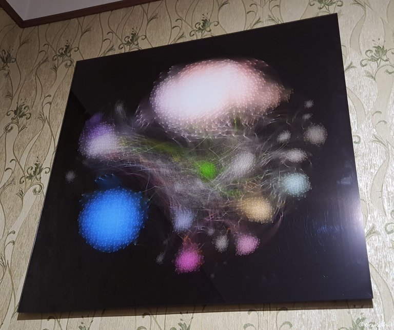
This photo above shows how different data illustration can be. The colorful works are digital works, the other is printed on paper, but it's still digitally created.
It reminds me of a game we used to play as kids, with colorful pins, or matches but it's more than that. It's about connecting the dots and creating a network.
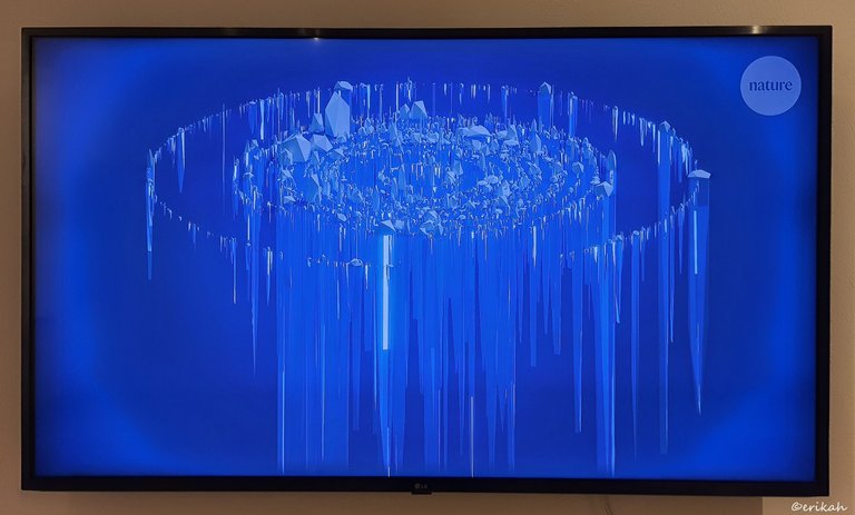
This looks even more interesting, like sprinkling different color of paint on a black board. The problem is, in real life you can't spread paint like that, unless you're using some kind of sprinkling device that is able to spread multiple colors and create extremely tiny drops.
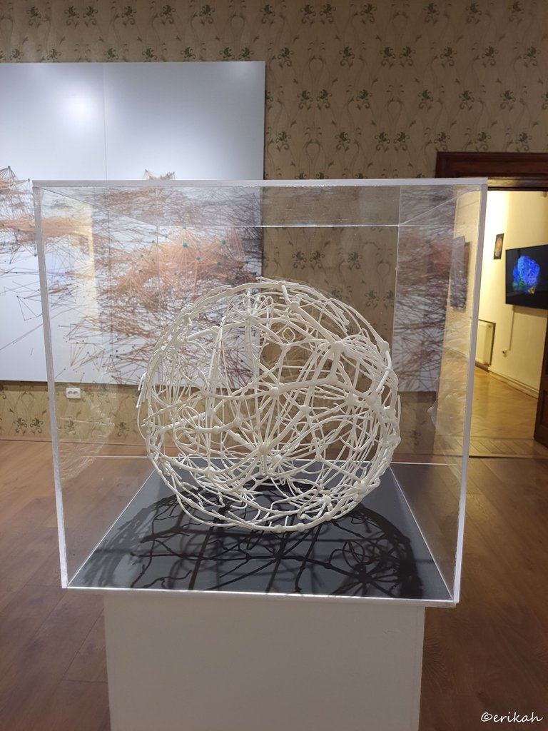
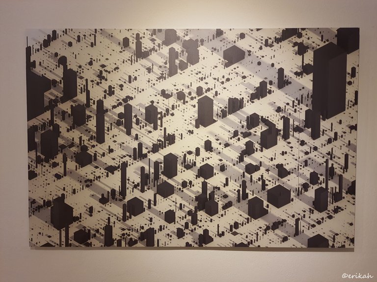
3D print.
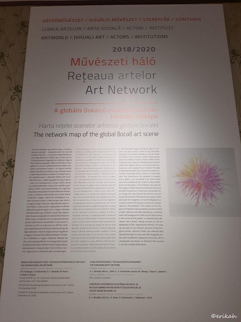
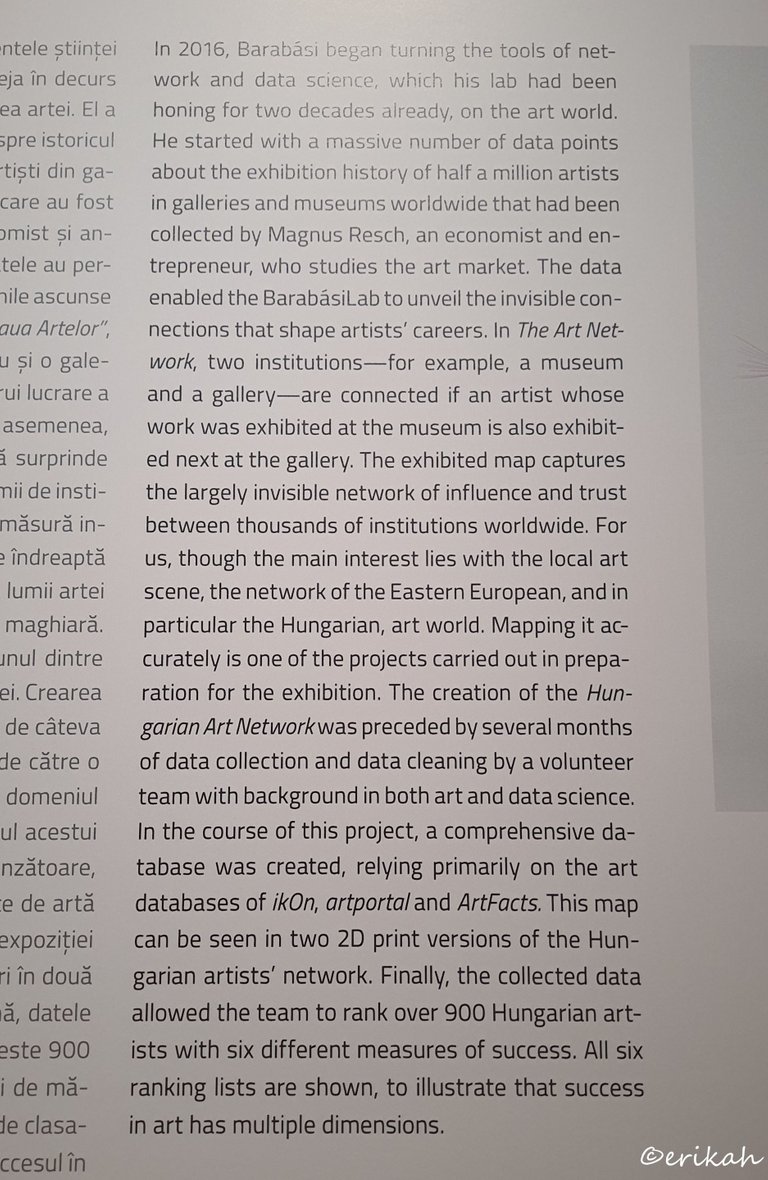
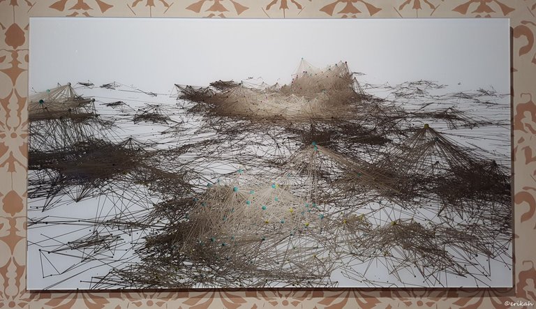
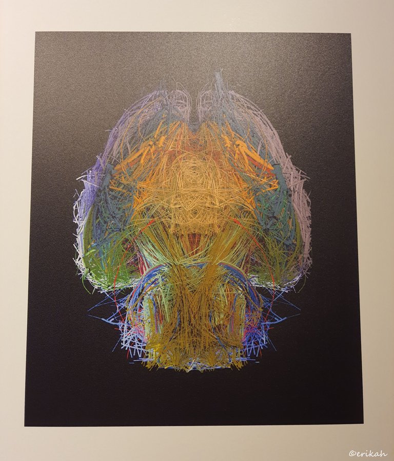
I took a closer photo for you to be able to read what it is about and I think after reading the text above, you agree with me that what the scientists at Barabási Lab did is a genius work.
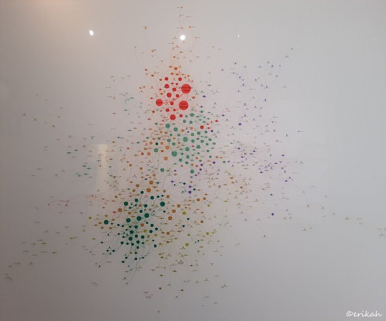
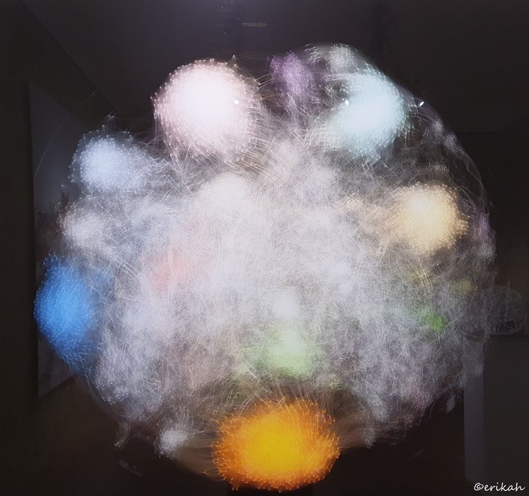
What you see here is the Hungarian Art Network, over 900 artists with 6 different measures of success. Those red dots, the big ones most likely mark the most successful artists.
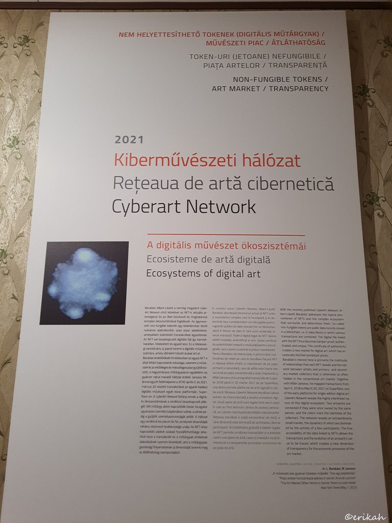
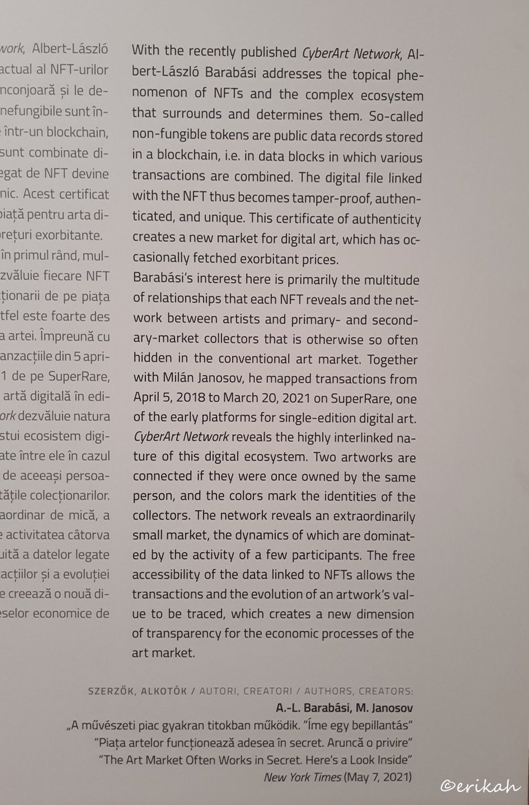
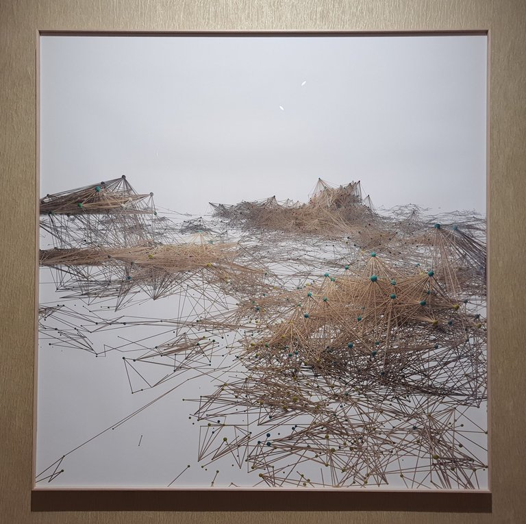
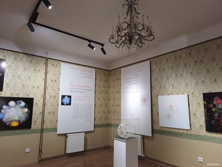
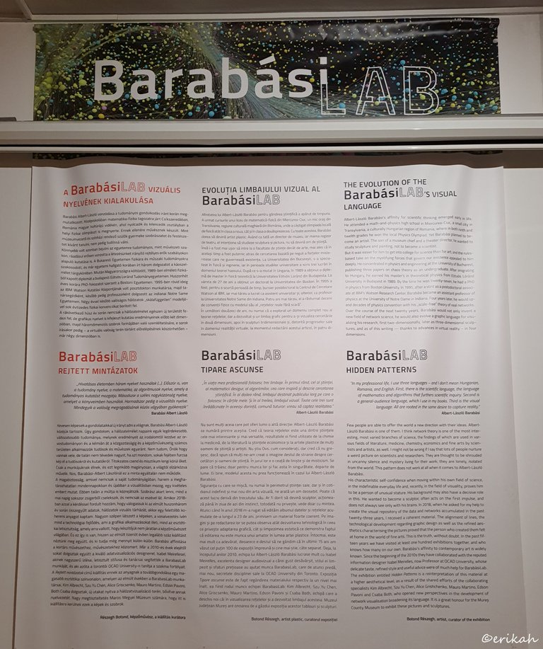
And here we are, talking about Cyberart Network, ecosystems of digital art, NFTs, blockchain and data linked to NFTs.
Now imagine if this team would be hired to illustrate data on Hive. Let's say token distribution, wallet transactions, unique users and so on. The data is there, it's public, retrievable, and any dev that worth its salt can extract what these guys would need for the project. Obviously we wouldn't get there as no one would pay for such a project, but it would be exciting to see how they would present our data and what they could create out of it.
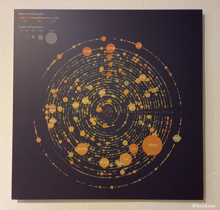
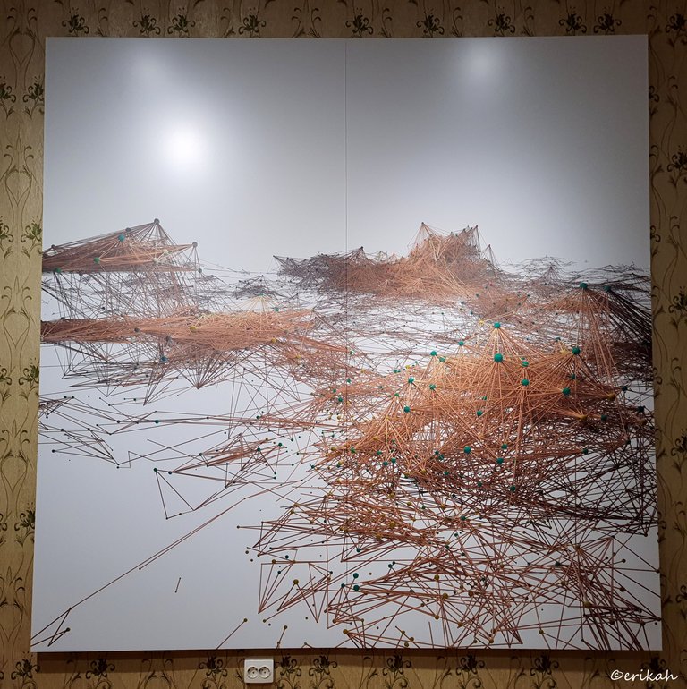
This one was another cool one, that illustrates the number of publications (of the magazine) from 1960 to 2001.
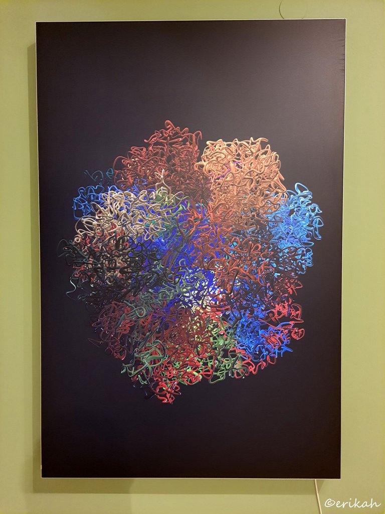
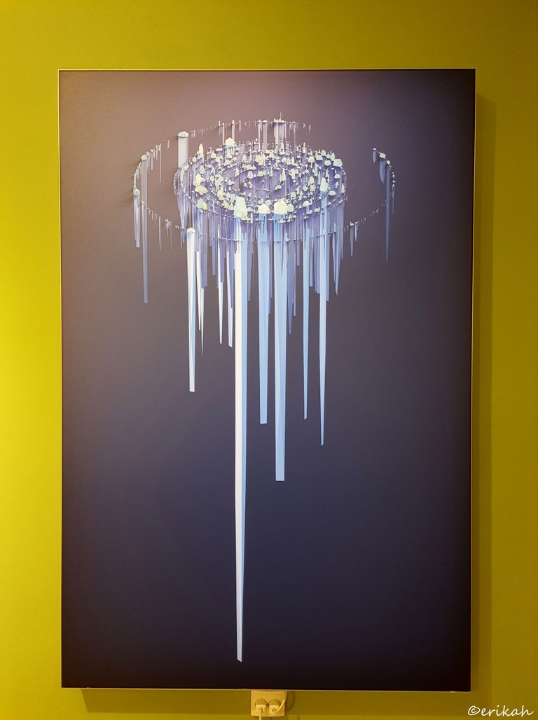
What is this? Looks like granny's yarn bag rearranged by the cat, but it's not.
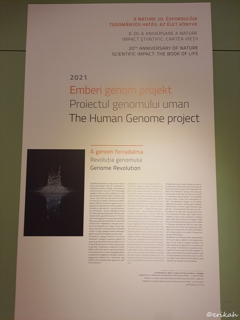
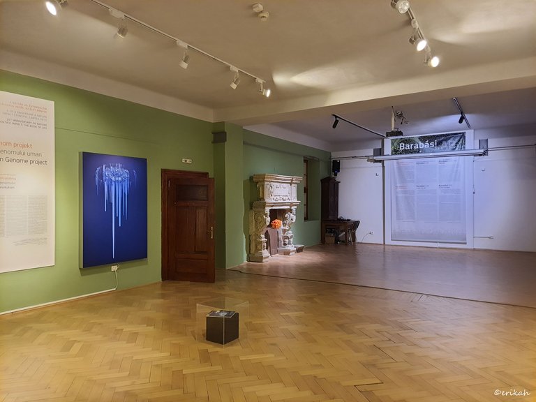
The Human Genome project? Genome Revolution? I'm sure you don't understand anything, but don't worry, neither do I 😂
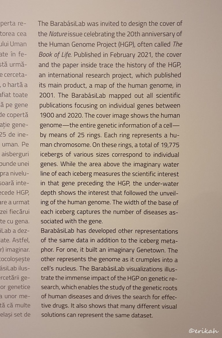
The secret is revealed here.
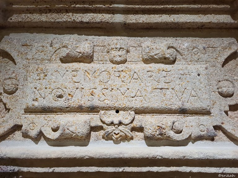
This stone is not part of the exhibition, it is the patrimony of the museum and was found during the archeological excavations. It's quite old but I could not find a date engraved on it. Even if it is one, it's not visible.
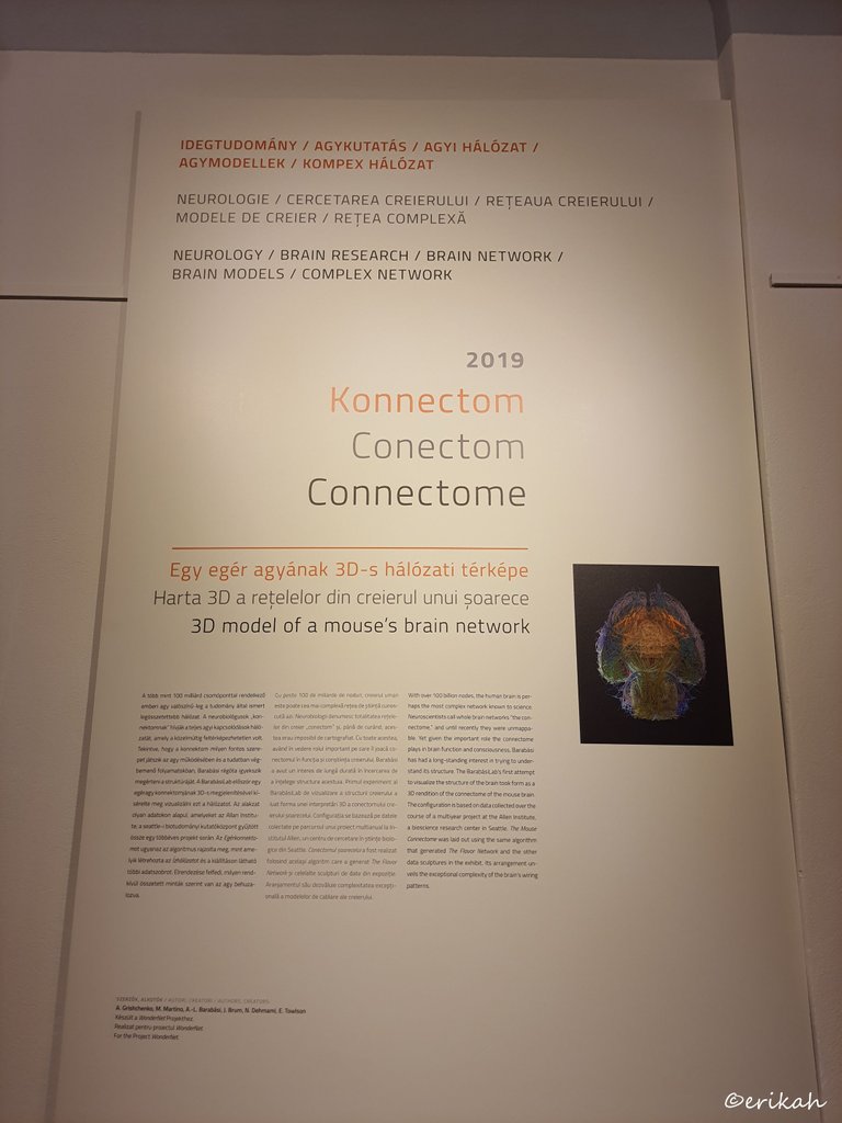
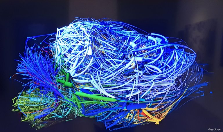
Now this is interesting as it represents the 3D model of a mouse's brain network.
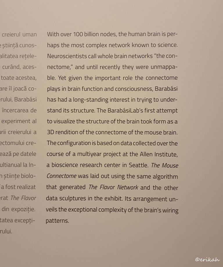
If this is how the mouse's brain network looks like, imagine how the human bran network would look like with its over 100 billion nodes.
After visiting the exhibition I was wondering how data illustration will look like in 10 years. Would be shocking to know today.

If you're a newbie, you may want to check out these guides:
- Communities Explained - Newbie Guide
- Cross Posting And Reposting Explained, Using PeakD
- Hive Is Not For Me
- How To Pump Your Reputation Fast - Newbie Guide
- Tips And Tricks & Useful Hive Tools For Newbies
- More Useful Tools On Hive - Newbie Guide
- Community List And Why It Is Important To Post In The Right Community
- Witnesses And Proposals Explained - Newbie Guide
- To Stake, Or Not To Stake - Newbie Guide
- Tags And Tagging - Newbie Guide
- Newbie Expectations And Reality

This is mind blowing. These joining of dots is truly insane.
It is indeed, I agree.
@tipu curate
Upvoted 👌 (Mana: 14/54) Liquid rewards.
Thank you!
Wow, this is really amazing. The world is really evolving because who would have thought that scientists would be able to come up with something this amazing.
I almost got confused until I got to the human genome project aspect. This is like some really great stuff.
You are right, science is evolving and with that, everything else too. It is amazing what these people did and imagine what will be possible in 10 years.
The world would obviously be a much better place in years to come!😅
Wow... Really impressive, especially those works based on the neural network of a mouse brain!... Yes, it's so great to see art based on science... You're right, it's possible that in 10 years what we see will jaw dropped... A great article with excellent photos as usual and also a magazine-like structure!... Thanks for sharing @erikah friend.
!BBH
!PIZZA
!discovery 37
That mouse brain illustration is indeed interesting and unique as well. I hope I will be able to look back in 10 years and read this post again, while being aware of those times developments :) Would be a cool thing to do :)
This post was shared and voted inside the discord by the curators team of discovery-it
Join our Community and follow our Curation Trail
Discovery-it is also a Witness, vote for us here
Delegate to us for passive income. Check our 80% fee-back Program
$PIZZA slices delivered:
@jlinaresp(5/10) tipped @erikah
https://twitter.com/jalp21/status/1659321719948038144
#POSH
This is awesome, that’s really good work from the scientists, thanks for sharing with us
It is indeed, good work and interesting too.
Congratulations @erikah! You have completed the following achievement on the Hive blockchain And have been rewarded with New badge(s)
Your next target is to reach 82000 upvotes.
You can view your badges on your board and compare yourself to others in the Ranking
If you no longer want to receive notifications, reply to this comment with the word
STOPTo support your work, I also upvoted your post!
Check out our last posts: