"PATATRAK" | The creation of a new LOGO
All Rights Reserved.
All the images contained in this post are taken, created and/or modified by me. All the contents in this post are copyright-protected. All the uses of the contents - and their derivatives -, except for the spread without modifications through social media channels, are strictly prohibited without the explicit consent of the author.
This is not an advertisement-goal post.

In the last few days, I created again a new logo for an hypothetical business, following the path of a periodical initiative with which I decided to share the steps of the creation process of the corresponding logo. You find the summary of the steps in the paragraphs below. In some ones of the posts in this periodical initiative, you can find the phrase "Join LOGOBAKERY": if you want to know more, you can CLICK ON THIS LINK. Summarizing, Logobakery is an initiative with which I create simple logos for initial and non-professional use, which can then be purchased in case a hypothetical customer wants to do it.
Starting and... Patatrak!
This time I started thinking of a funny name, an onomatopoeic term that in the Italian language indicates the sound of a ruinous fall or that in a more imaginative way alludes to the total collapse of something, to a nice big mess: "Patatrak". In my case, I created a graphic version by associating the name with an emergency transport company. I could create a graphic variant called “Patatruck”, more suitable for a transport service; in the post, instead, I will show the initial version with the simple onomatopoeic element.
But let's go in order.
Meanwhile, I opened the graphics suite I use, the open-source Inkscape (you find more information on the official website, CLICKING HERE). I pinned the name “Patatrak” to a blank page, using a neutral and casual typeface.
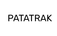
I wanted to create a writing a little different from the usual edgy logos of transport companies, so I decided to use the writing in the image above as a base pillar, but creating outlines with more rounded shapes that give more body to the name. I wanted him a little fatter, in fact. And here is the initial result.
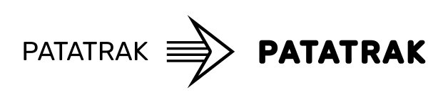
Ok, the writing was there. Simple and effective. So I switched to a graphic element that I wanted to insert. What, you ask yourself? Find out for yourself by looking at the picture.
Yep, that's a banana. I decided to use a banana, which however was not good as it was. The logo would have had few colors, so I had to recreate a more schematic version of banana with at most 3 or 4 shades of different colors, no more. To do this, I created a series of circles and ellipses overlaying on the image. Here's what I'm talking about:
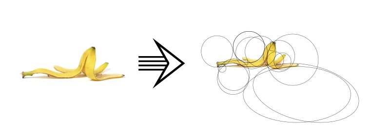
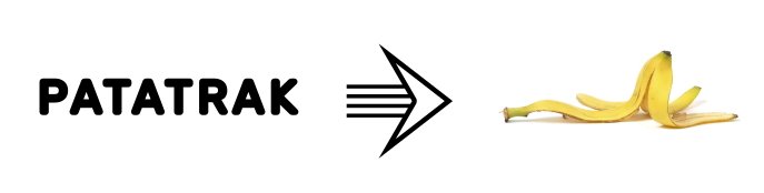
With this technique, adding a background rectangle and breaking it into many small parts, I obtained more regular outlines for my representation of banana. How was this possible? Each of the intersections of the circles and ellipses you saw above has become one of the small parts I was telling you about; by then deleting the ones I didn't need and recoloring the rest, it was possible to obtain what you can see below.
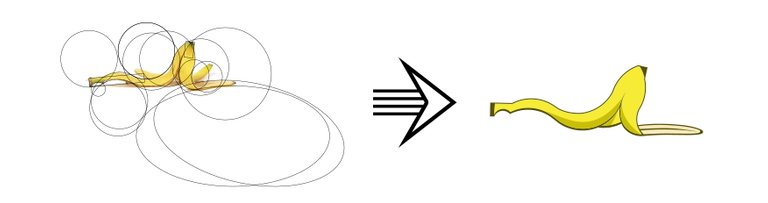
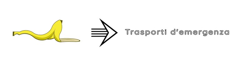
Fulfilled? A cartoon banana, that's it. Then I moved on to the descriptive writing of my logo, the one that explains the type of activity carried out by this hypothetical business. Instead of creating a solid text, I used an outline type font; simply, outlines of letters with an empty interior or another color. Here is my first result.
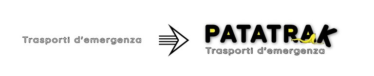
And finally... finally, it's time to mix the elements. In addition to the description placed under the name Patatrak, I added the banana between its letters, with the aim of representing the idea of a "tumble". For the same reason, I changed the orientation of the final K letter, I hope I get you the idea. Finally, I added some parts that should have been neutral but which I decided to fill with the same color as the banana. The result:
And we're done!
The logo was conceived to have very playful and informal tones, certainly not similar to the more sober and neutral transport sector logos found on the web or along the roads of the country where I live in. What do you think, could it be useful for a transport company?

Once again, I repeat: the name does not follow any existing subject, nor does it refer to anything real. In these initiatives, I propose combinations that are often paradoxical, in strong contrast to each other, or with ironic tones. I emphasize: the terms used are not meant to be offensive in any way.
I hope I left you a smile or some ideas. I give you an appointment for a next episode that I will publish in the coming weeks. Said this...
https://twitter.com/EveryWork1/status/1533076266043203586
The rewards earned on this comment will go directly to the people(@davidesimoncini) sharing the post on Twitter as long as they are registered with @poshtoken. Sign up at https://hiveposh.com.
Thats a quite an impressive tutorial for the logo. It is not much my area but still can be used by lots of people.
!1UP
Thank you very much, for stopping and reading, and for your appreciation :) !BEER !PIZZA !WINE
Congratulations, @davidesimoncini You Successfully Shared 0.200 WINEX With @gwajnberg.
You Earned 0.200 WINEX As Curation Reward.
You Utilized 2/2 Successful Calls.
Contact Us : WINEX Token Discord Channel
WINEX Current Market Price : 0.201
Swap Your Hive <=> Swap.Hive With Industry Lowest Fee (0.1%) : Click This Link
Read Latest Updates Or Contact Us
You have received a 1UP from @gwajnberg!
@stem-curator, @neoxag-curator, @pal-curatorAnd they will bring !PIZZA 🍕
Learn more about our delegation service to earn daily rewards. Join the family on Discord.
PIZZA Holders sent $PIZZA tips in this post's comments:
@davidesimoncini(3/5) tipped @gwajnberg (x1)
You can now send $PIZZA tips in Discord via tip.cc!