Design Lifehack.
Designing has so vivid areas to cover which can't be explained into one field. Everything around is designed, from buildings to clothes and more.
The above picture covers every aspect which I am going to unfold here. It will be very interesting to relate. By the way This picture is from Kashmir(Also called heaven on earth) in India.
Colour Schematics
To begin with, Colour is a very common and weary topic to discuss about, But not if you understand how logically colour schematics works.
There is a colour wheel and it's complimentary, analogous, monochromatic etc schemes helps a lot if picking colour for interior or clothes or anything. The picture above depicts the vivid hues and tones of Blue and orange also they are complimentary colours according to colour wheel.
If one lacks at what color combination must suit the said space or design, there's a tip, If you want to seek new colour combination then there are several sites which offer them, but there are two legit and by far best sites
ADOBE PALLETE and COLORHUNT PALLETE
They offer royalty free palate and you can chose from various options.
Also I would like to highlight some of my favourite colour combinations, It might help designers here and people belonging to other field as well for designing ppts, fashion and stuff.
Designing has so vivid areas to cover which can't be explained into one field. Everything around is designed, from buildings to clothes and more.
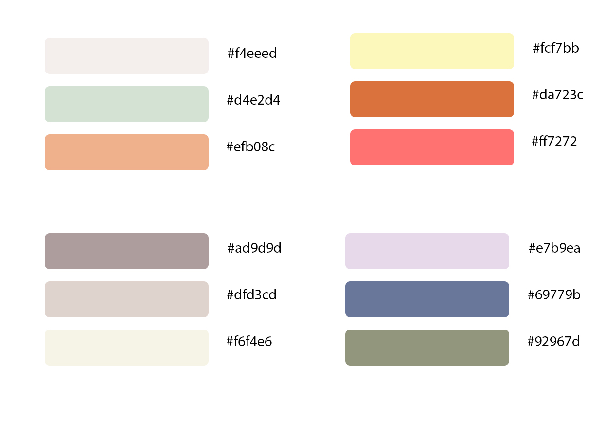
This is my selected few, the colour code is mentioned on the side of each. If you aren't aware of adobe's world then let me brief, These are the colour codes we can use to get the exact colour. Any person can type the code on google and it will show you the exact one. So, use them for fashion, office presentations and more.
Typography
Typography constitute of enormous things. The regular font bar in softwares are set of very common typefaces. To stand out in your design, be it Conceptual sheets, mood boards, portfolio's sheets, drawing seal and for people belonging to other fields of work, The presentations, letters, cards etc Typography plays an important role.
If it's not the regular one, and some different style will immediately be eye-catching. So, in order to stand out and unique then avoid cliché fonts used by majority of people.
One can download the free set of fonts from various sites on internet but I would recommend-
GOOGLE FONTS
But, there are numerous typography designers who have their career dedicated to fonts so, there are some premium fonts sites which I would like to recommend and those aren't free and they are genuinely worthy.
FONTS BY HOEFLER & CO
BNICKS
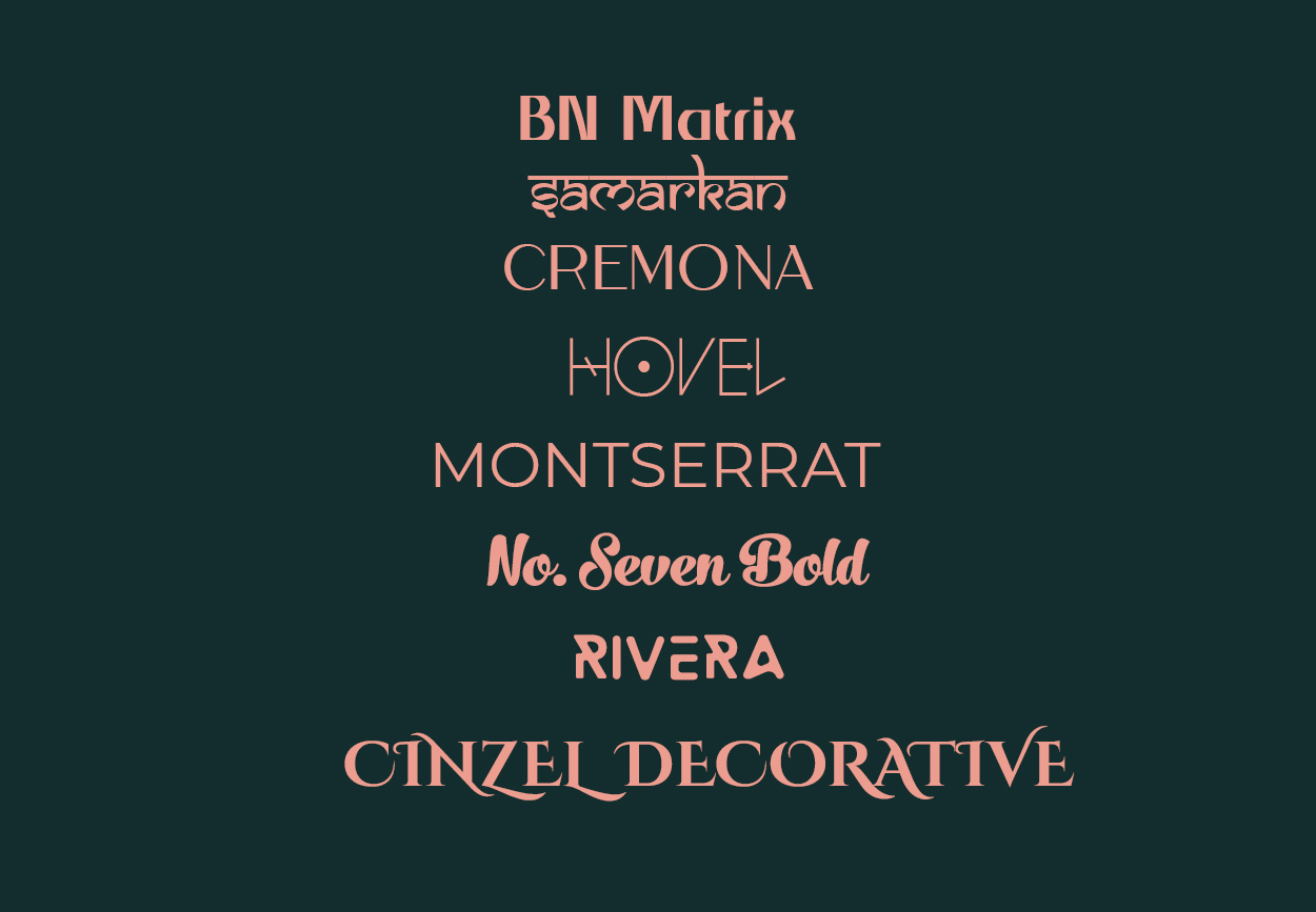
These are bunch of my favourites with their name and style, you might like any one of them and if you are thinking of using it so here's the process of installation-
Download your purchased or free typography (It will be a zip file)
After opening that file, extract the font to any specific folder.
Open the file, and do not get confused there will be a huge install tab n the top menu bar, install them
Now use this font in any adobe or Microsoft softwares.
Please note that respecting artist's work is important, always use free of cost only if the designer has set them for free use otherwise purchase the work.
Principles
There are certain architecture and design principles which can be applied to various things. let's get into few of them-
The first one is Balance
Simply scroll back to the first picture, one can easily notice balance but in asymmetrical form. Similarly applying balance whether symmetrical or asymmetrical to your photography, designs, planning, structures or even presentation defines ones organised behaviour.
To continue let me jump into Perspective Proportion
The one point, two point and more points perspective proportions takes the sight into a single rhythm.
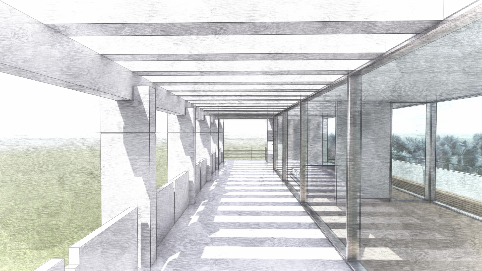
That's one point perspective. There is invisible single point right at the centre of this digital sketch of corridor, This is the example of how one can create dimensional sketches through a perspective knowledge.
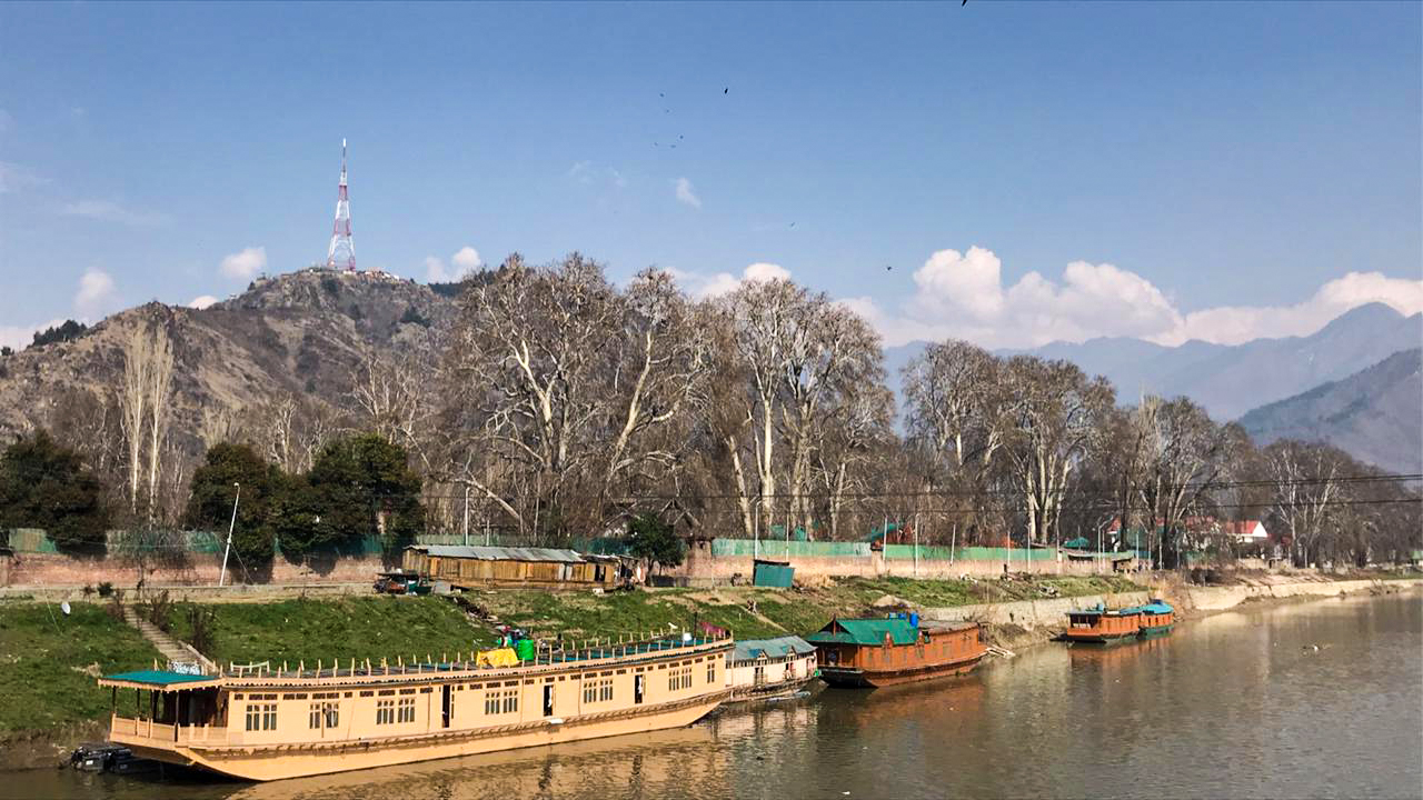
This is a photographic example. This picture displays an invisible perspective to the extreme right. It just takes your sight in a sync towards right where the water is flowing. Through the knowledge of perspective these wonderful pictures and more can be created.
The last but not the least one is a picture of tennis court in my city, Since I and my brother loves to play tennis, I often play in his academy. So yesterday I captured this picture, It unveils the majestic city's skyline behind and this open clay court in front. I am sensing harmony and contrast in the below mentioned picture, what are your perspective of this particular one?
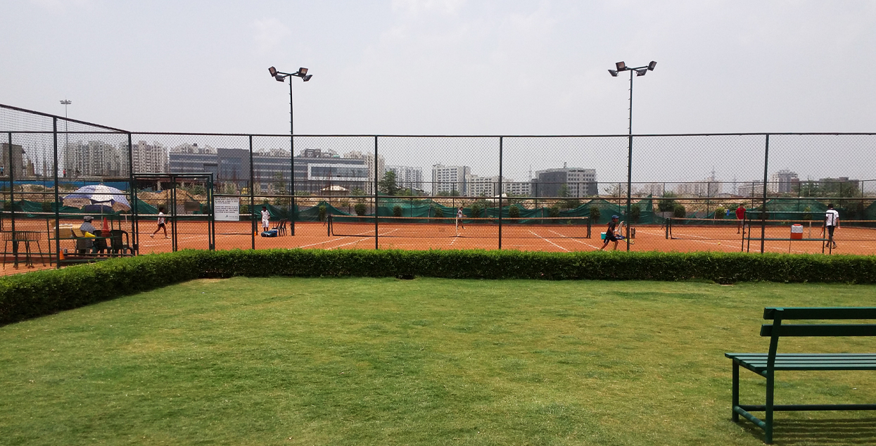
The pictures mentioned above are mine.
https://twitter.com/sahiba99453890/status/1370446069620899842
Congratulations @sahiba-rana! You have completed the following achievement on the Hive blockchain and have been rewarded with new badge(s) :
Your next target is to reach 500 upvotes.
You can view your badges on your board and compare yourself to others in the Ranking
If you no longer want to receive notifications, reply to this comment with the word
STOPThese are fun and creative sites to explore. I also downloaded Montserrat font. It's amazing that there's a lot of psychology that goes into selecting a font for a specific purpose and a font that matches the designer's personality.
I attended a conference where a furniture designer discussed that she had to go through a lot of research into creating the right font for her brand. For her typography, she went for all small caps because she wanted her designs to be approachable. I don't know if the graphic designers see it the same way but her talks about the importance of typography made me see fonts in a new light.
For a brand these things matters a lot. Sometimes we see things differently after listening to other's perspective.
For me, past year's lockdown bought so many different perspective to different skills. never knew that so much of psychology goes into designing such things.
Thankyou for your kind words :)
I believe it is necessary for any new company to first create the color palette even before they start business. It not only helps in your logos, stationary and website but also works while designing the office furniture. Same with fonts. I must say its a basic guidance but it was necessary. You have written it very well.
Thanks a ton for appreciating:) and I totally agree from your perspective.
Hello @sahiba-rana, these are excellent design tips and advice
The Architecture+Design Community is an Active Member of the OCD Communities Incubation Program
Thanks a lot @aplusd
The colour palettes collection is wonderful, great post buddy!
Thanks a lot @praditya
Typography is one of my favorite things to play with, it's fun. I am going to check all the links you have shared and will use them in near future. I had a personal color pallete book provided by my office so this time I am going to check these out...
Oh that would be great, do check them out probability it can turn out to be useful to you.
Thanks for your kind words @priyanarc
I couldn't agree for more. Everything that we use or saw in our surrounding is designed. It may a cup or a hair clip . It is perfectly design for its purpose whether for functionality or aesthetics. I love the digital sketch. The shadows define well the space it represent.
Indeed! There are a plethora of critically important factors (color, typography, principles, etc.) you have to take note of when engaged with architecture and design. At times, it simply gets overwhelming, right @sahiba-rana? There are just too many things to think about. Nevertheless, regardless of the many elements to be considered in creating works for these industries, it's crucial to produce results that enhance our lives for the better as well as deliver satisfying experiences for the end-users. Beautiful post!
Absolutely! It is critical, but as you said delivering satisfying experiences for the end-users is what we work for.
I thought about creating a post on this subject as maybe it would turn out helpful to someone in their work and stuff.
Thank you @storiesoferne for appreciation.
Have a joyful weekend :)
This is really creative, I bow to the brain behind this design. Is there any other link to get font online
Hello @mayorkeys, First of all thank you for your kind words, appreciated:)
As far as links are concerned for typography, I have mentioned three very legitimate sites out of bunch of hundreds of websites easily available.
BNICKS is quite different he is a designer, also he sets some typography for free for limited period of time, I followed him on Instagram and get his recent updates. You can check his work.
Also GOOGLE FONTS and FONTS BY HOEFLER & CO are the only legitimate website I could suggest you.
Have a lovely weekend :)
Looking to revolutionize your kitchen's look? Discover the ultimate design lifehack at https://remodelestate.com/blog/kitchen-makeover! Transform your culinary space into a haven of style and functionality with innovative tips and tricks. From clever storage solutions to trendy design ideas, this resource offers insights to revamp your kitchen effortlessly. Don't settle for ordinary when you can elevate your kitchen's aesthetic and functionality. Explore the possibilities and unlock the secrets to a stunning kitchen makeover today!
Posted using STEMGeeks