Grocery store's design influences us to buy more.
Our grocery stores are all manipulating us. Our uncanny experience of dashing into the local grocery buy a few items but end up with a bulging cartload of unintended purchases. Supermarkets make us do it, and not our fault. Or at least they certainly try. The design of grocery stores from the entrance to exits enables us compulsively buy what we never intended to. Every feature of the grocery store, from floor plans to shelf layout and lighting, is designed to trick us into spending more. Even the ladies in aprons that offer free sausages on sticks are part of the game plan.
Once we enter a grocery shop, it is generally difficult to exit. The one-way entry door is a common feature in supermarkets that eludes us to traverse to the store, with its tempting displays of buyable, to reach the exit point. In such a way, they influenced us to buy more. The produce aisle is the first supermarket feature we will undoubtedly meet after passing through the one-way front door. They placed and designed it to give us a sensory illusion. It may be the colors, smell, and texture of the product that makes us feel happy and hungry.
The designer working with our senses
Our senses bypass our rationality. Designers exploit such weakness, and design space significantly influenced us to be compulsive. The open space design of the supermarket allows a better flow of sound and noise in the place. It is intentionally caused they want to disrupt our rationality by hearing irritating sounds like air conditioners, trolleys, and noisy kids.
It is a psychological trick that disrupts our rationality in the grocery. The sounds make us nervous and wanting to leave the supermarket in a hurry. As a result, we began to shop emotionally and compulsively. In another play with acoustics, they purposely placed speakers that play mellow and slow-paced music to slow down our pace by easing the irritating sound, which we walk 12% slower and spend up to 38% more money. Stores that play music have an increase in sales.
The designs of supermarkets often include no windows or vicinity to skylights because they want the shoppers devoid of external time cues. Shoppers often spend a lot of time in the supermarket due to losing time, and we often hard-pressed to find a clock in the supermarket. The rationale behind it is they want us to stay longer, which results in buying more merchandise than we plan to.
(source)
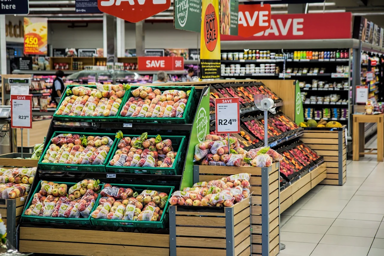
Designers play with our perception of colors. It is the hue of a product or a collection of colors that have an emotional impact. We knew that colors have distinct associations that influenced people to get moving. Grocery stores placed vibrant fruits and vegetables near the entrance to attract us as soon as we get into the store. The natural images, fresh aromas, and brilliant colors elicit us to be cheerful and in a pleasant mental state.
It is a harsh reality that the produce department is more stage set than garden and kitchen. The designers strategically placed the lighting to make the fruits and vegetables seem their brightest and the finest. It plays well to our visual perception. The freshwater sprayed to the produce bins is all for show. Though it gives false fresh looks on fruits and vegetables, the water serves no practical use, except aesthetics. It is another scheme to play with our visual perception.
(source)
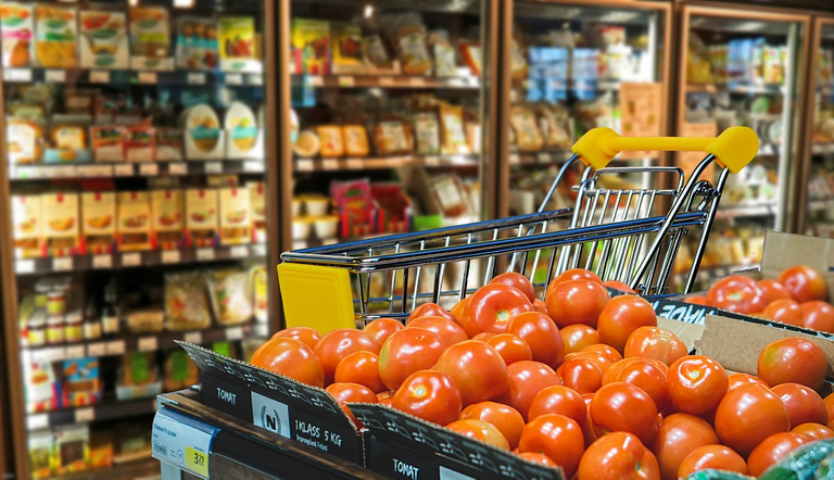
The vegetables and fruits spoil faster when we constantly spray them with water. Besides the produce, the supermarket has a larger grocery cart to encourage the customers to fill it. When we buy the same amount of food on our planned grocery list, it will appear minimum and empty in a shopping cart. The big shopping cart influenced us to have additional purchases. Large shopping carts boost our likelihood of purchasing more, which was the rationale behind its introduction in 1937 by grocery-store owner Sylvan Goldman.
Designers strategically placed bakeries and flower shops at the entrance. They also take much effort into our olfactory experience of the space to the same degree as our visual perception. Flowers and freshly baked products smell good that improves our mood and activates our salivary glands. As a result, it makes us more susceptible to impulsive purchases. It gives us a good impression that space has a friendly environment and spending a lot of time is worth it.
The free tasting both are there for a reason. Grocery stores placed them around the stores to trigger our taste buds to want more food because they give us a feeling of hungry, aside from showing us new products. Designers designed grocery stores so that it plays with all of our senses rather than visual play. The design influences us to touch things, which may cause more purchases. That means they designed stores that unconsciously encourage us to pick up stuff, and it's not just random shelves either.
(source)
Shelves are a psychological trap.
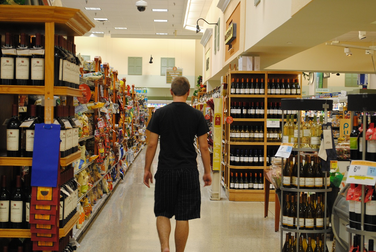
Shelves in grocery stores are a psychological trap. They designed the placement of items that expensive items are at eye level so that we spend more. Generic brands are on lower shelves or top of shelves. Besides, designers consider the demography of products. Kid's food like candies and sweets are at the kid's eye level, and the packaging design takes into account. Certain items, such as cereal and coffee, require customers to pick between several brands. They positioned these items away from heavy traffic so that customers have time to take a break and think about it.
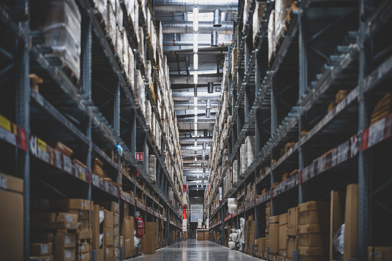
The layout of our grocery stores is constantly changing. They moved shelves so that we need to discover where the product that we want to buy. In the process, you spend a lot more time strolling around the grocery, which results in more purchases. More time to browse implies more opportunities to persuade you to buy more products.
Eggs, milk, read, and other essential goods are at the far back of the shop, which requires us to trek through the entire shop to get to them. In the process, it exposes us to more items on the way. Similarly, necessities and popular purchases are situated in the middle of aisles, luring you deeper into the store. Again, the reason behind all of these delaying tactics is the longer we remain in the store, the more goods we'll see, and the more stuff we see, the more we'll purchase.
(source)
Conclusion: The design influences us to buy more
Designers planned every aspect of the grocery shop, from the floor layouts to the shelf arrangement and lighting, to deceive us into spending more money. The design makes it difficult for us to leave a grocery store without spending after we entered it. The one-way entry door is a popular feature in supermarkets that entices us to enter the store, with its alluring displays of buyable items, to reach the departure point. It might be the product's colors, scent, and texture that make us pleased and hungry.
Designers exploit our weaknesses, and design space significantly influenced us to be compulsive. The open space design of the supermarket allows a better flow of sound and noise in the place. Stores that play music have an increase in sales. The designers strategically placed the lighting to make the fruits and vegetables seem their brightest and the finest. The design influences us to touch things, which may cause more purchases. Grocery stores placed them around the stores to trigger our taste buds to want more food.
Designers place expensive items at eye level so that we spend more. Similarly, they place popular purchases in the middle to lure us deeper into the store. The longer we remain in the store, the more goods we'll see, and the more stuff we see, the more we'll purchase, say the designers.
Readings
- Surviving the Sneaky Psychology of Supermarkets
- The Psychology of Supermarkets
- The hidden ways that architecture affects how you feel
- The evolution of grocery retail architecture and customer experience since 1960
- The Psychology of Interior Design, Part 2: Retail Store Layouts
- The Psychology of Retail Store Interior Design, Part 1: Color
- Does Architecture Influence the Price Image and Intention to Shop in a Retail Store?
- Supermarket savvy: An analysis of psychological exploitation within grocery stores
- Supermarket psychology: how shops convince you to spend
I go with a list and only buy what is on that list. I only use the small grocery cart and only bring 2 small grocery bags.
I also do that. I do groceries with a list so that I will not have unnecessary expenses. !PIZZA
@offgridlife! I sent you a slice of $PIZZA on behalf of @juecoree.
Learn more about $PIZZA Token at hive.pizza
From now on, will on look above and below when I get to the shelves part. 🤣
I never knew this!
That will save you some cash if you don't really into brands. The branded products are always on the middle. I always do it when I went to groceries.
This is so cool! We were just discussing with my family the other day about how Mr. DIY stores have this effect you mentioned. Mr. DIY has cheap items that you don't even need but because it's cheap, you pick that item up and without realizing it, you're at the cash register with a basket full of these items and poof - there goes your 2000 pesos.
Grocery store people are clever. We need to be more clever than them!
We should be clever that the grocery store people. I also have similar experience in Mr. DIY store. LOL! when we thought that we save because of the cheap prices, we never realize that we spend more as we pay in the counters. !LUV
Your post has obviously "spilled the beans" about one of the best-kept secrets of architects and designers. Psychological tricks used as subtle weapons to lure more clients and customers have been incorporated not only in the design industry but also in other fields like marketing, sales, food, fashion, etc. since time immemorial. In your experience, which part of the supermarket or grocery store would be the most tempting for you to buy from and why?
Oops. I spoiled it. I think a lot of people already knew this. That is why we need to go to the stores with a list. I agree that psychology has been cleverly applied to each industry to leverage business.
From grocery stores, I was tempted more on the discounted items at the entrance. Often, I end up buying not on my usual grocery list (which I spend more than needed). Also, the food stalls at the entrance. The smell is really inviting. That is why I do groceries after lunch or breakfast so that I am full and will not be tempted. !PIZZA
@storiesoferne! I sent you a slice of $PIZZA on behalf of @juecoree.
Learn more about $PIZZA Token at hive.pizza
Great feedback, and thanks for this insightful post!
I agree with what Erne said. There's a lot of concept planning and thought processes that go into triggering the psychological impulses of consumers in retail design. IKEA is a great example for me of a difficult place to leave empty-handed. If I don't buy any home accessories, you'd probably find me in the cafeteria enjoying Swedish meatballs or their breakfast lol.