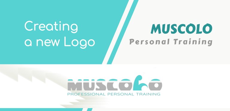
"MUSCOLO" | The creation of a new LOGO
THIS is the ENGLISH TRANSLATION of the ORIGINAL POST in ITALIAN.
All rights reserved.
All the images contained in this post are taken, created and/or modified by me. All the contents in this post are copyright-protected. All the uses of the contents - and their derivatives -, except for the spread without modifications through social media channels, are strictly prohibited without the explicit consent of the author.
This is not an advertisement-goal post.
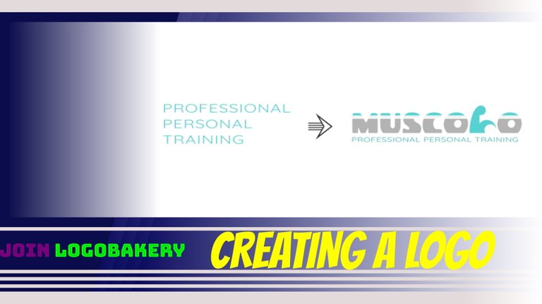
In recent days, I went back to creating a logo for a hypothetical activity. Today I decide to share the main steps that led me to the result on the cover. In the same initial image, you find the caption "Join LOGOBAKERY": for those wishing to learn more, you can find the post with more info CLICKING ON THIS LINK. In short, Logobakery is an initiative with which I create simple logos for initial and non-professional use, which can then be purchased in case a hypothetical customer wants to do so.
New Logo: MUSCOLO
This time I started with the name of a hypothetical activity: "Muscle". I then decided to place it in a specific context. In this case, the personal training sector.
I created a sketch of the logo idea: fairly legible writing with a figurative element within the writing itself; an element that can also have the appearance of a letter. Combined with this, a second portion of the logo - a completely textual portion - which can function as a simple description.
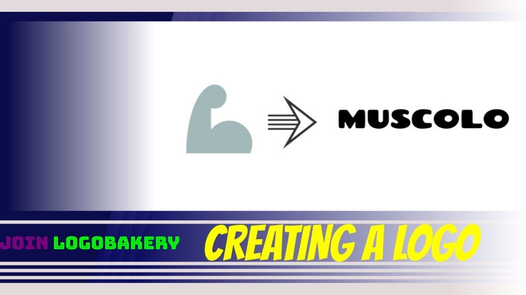
I chose the main goal: to create a figurative element that somehow recalls an arm that includes biceps, something that users of emoticons are used to seeing on messaging platforms. Therefore, I created a first very simple sketch. Thanks to the decomposition into several shapes, I converted it into a drawing with more geometric lines. You can see this step in the image below.
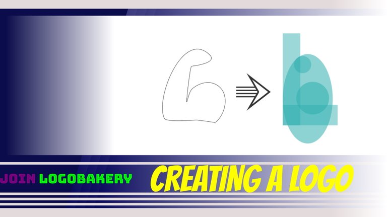
On the graphical interface where I create elements in vector format, I arranged the shapes as I wanted and dissected them into many elements. I then started to delete what I didn't need and to join everything else, giving birth to a very hinted outline of the arm.
After that, I moved on to the textual portion of the name: I used a font (the file that allows you to install the typeface, something that we can indicate as the style of reproduction of letters, numbers, or other characters) that is quite round and casual, not very symmetrical but quite regular, both in terms of form and comprehensibility.
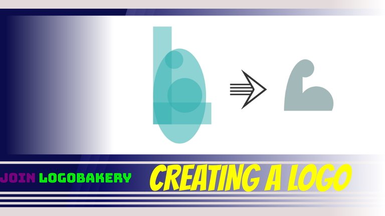
At this point, I put my idea into practice: I removed the letter "L" from the written muscle and replaced it with the figurative element created previously. This arm sketch was not too far from the outline of an L letter.
Secondly, I broke the writing in the upper part thanks to two horizontal lines of the same size. You can see these steps in the image below.
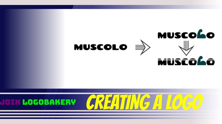
And then I moved towards the end, going to make some pieces of the letters smaller (those between the highest portion and the lowest portion). A little longer was the search for the correct colors: a vague red-greyish and a soft color halfway between green and turquoise. I also reworked the figurative element similar to an arm, making it a little more in line with the shapes of the writing.
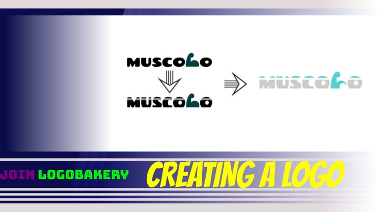
The next step was the creation of the descriptive writing, with a fairly regular and geometric font, with angular vertices.
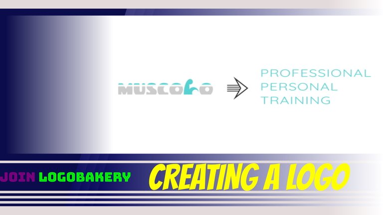
After arranging it on a single horizontal line, I placed the long descriptive text under the name of the project.
To make everything nicer, I created a kind of business card background or digital banner - of which I leave you a preview.

Job done!
Et voilà, once again a not particularly complex result. The name doesn't refer to any existing subject, nor does it refer to anything real. The names used do not want to be offensive in any way: I emphasize this because in these initiatives I often propose paradoxical combinations, in strong contrast to each other, or with ironic tones.
I hope I left you a smile or some ideas. I give you an appointment for a next episode that I will publish in the coming weeks. I've already created a handful of other logos that I'll reveal to you along the way. Said this, ...
https://twitter.com/EveryWork1/status/1526914886734839808
The rewards earned on this comment will go directly to the person sharing the post on Twitter as long as they are registered with @poshtoken. Sign up at https://hiveposh.com.