How to Easily Validate Forms with Yup and Formik

It is often said that if there is a framework or a library that makes your work easier, then use it. It is mainly the reason we code with React instead of Vanilla Javascript, or Tailwind Css/Bootstrap instead of just plain Css. These solutions exist to make things easy for us and that is the whole point of everything.
Validating forms, for example, can be done starting with using the Html "required" property to Vanilla Js, to Ajax. it really depends on how complex you want it to get. I have tried it in many ways and I found this bit easier, using Yup and Formik.
Yup is a Js schema builder for parsing values and validating subsequently, it can be very simple, or broad but then it makes the code cleaner and simpler. While Formik on the other hand, basically defines how we handle forms and errors. We will be using these two packages in this short tutorial.
We are going to run these three commands in our project directory.
Npx create-react-app .
Npm i yup formik --save
The first command creates a react app in our current directory, you can replace the period at the end and replace with your specified project directory. The second command installs yup and formik, they could be written in separate command but it's faster, writing it that way.
After that is done, we are going to create the structure for our page and setup three form inputs with a Submit button. I am going to install a framework called Tailwind Css, it kind of helps me style faster. This is optional for you. You may decide to style with the standard css and you will still be good to go. I am going to go ahead and install this command for tailwind
npm i -D tailwindcss
npm tailwindcss init
Along with some other settings that can be found in their documentation here.
PS: This is not a tutorial about tailwind css so I will provide little explanation in regards to that.
We have our project ready to go. I am going to define our webpage structure like so.
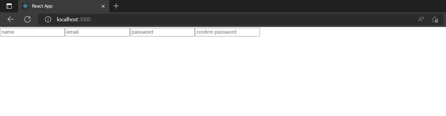
<div>
<form>
<input type="text" placeholder='Username'/>
<input type="email" placeholder='email'/>
<input type="text" placeholder='password'/>
<input type="text" placeholder='confirm password'/>
<button type="submit" name="submit" value="submit">Submit</button>
</form>
</div>
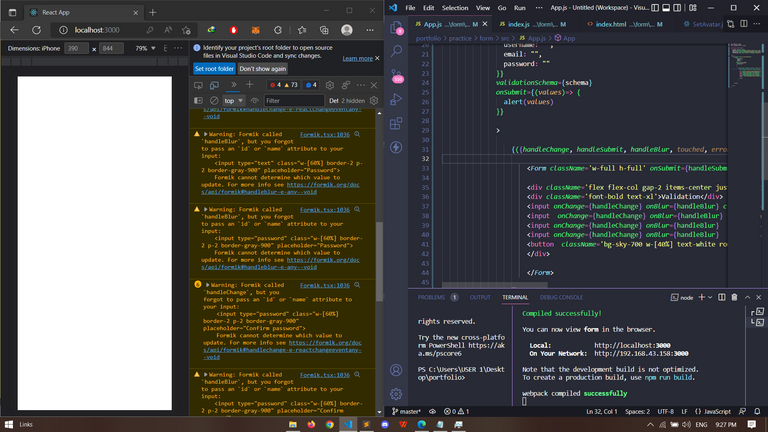
And style it up a bit
<div className='w-screen h-screen bg-blue-100'>
<form className='w-full h-full'>
<div className='flex flex-col gap-2 items-center justify-center h-full'>
<div className='font-bold text-xl'>Validation</div>
<input className='w-[60%] border-2 p-2 border-gray-900' type="text" placeholder='Username'/>
<input type="email" className='w-[60%] border-2 p-2 border-gray-900' placeholder='Email'/>
<input type="text" className='w-[60%] border-2 p-2 border-gray-900' placeholder='Password'/>
<input type="text" className='w-[60%] border-2 p-2 border-gray-900' placeholder='Confirm password'/>
<button className='bg-sky-700 w-[40%] text-white rounded-md p-2 font-bold' type="submit" name="submit" value="submit">Submit</button>
</div>
</form>
</div>
Ignore the ugly markup, just for the tutorial. We can now go ahead and import the Yup and Formik modules like so
import * as yup from "yup";
import { Formik, Form } from 'formik';
We can go ahead and implement yup straight away. I earlier mentioned that yup enables us to define our form inputs and the logic to it. We have the Name, Email, Password and Confirm Password. We are going to pass those to our yup schema, specify the kind of validation we want for each field.
Right now, we know all the input fields are required, we know the email field should contain a valid email field, we should also define a minimum password length and make sure it tallies with the 'confirm password' field.
let schema = yup.object().shape({
    username: yup.string().required("A username is required").min(3, "Too short"),
    email: yup.string().required("Email is required").email("Invalid email type"),
    password: yup.string().required("Password is required").min(6, "Too weak"),
    confirm: yup.string().required("").oneOf([yup.ref('password'), null], "Password does not match")


  })
We have defined the whole validation schema here.
The syntax is pretty much clear. At this point we can start utilizing our Formik. We are going to wrap our form tag with the component and also replace the form tag with the
we imported likeimport React from 'react'
import * as yup from "yup";
import { Formik, Form } from 'formik';
export default function App() {
let schema = yup.object().shape({
username: yup.string().required("A username is required").min(3, "Too short"),
email: yup.string().required("Email is required").email("Invalid email type"),
password: yup.string().required("Password is required").min(6, "Too weak"),
confirm: yup.string().required("").oneOf([yup.ref('password'), null], "Password does not match")
})
return (
<div className='w-screen h-screen bg-blue-100'>
<Formik>
<Form className='w-full h-full'>
<div className='flex flex-col gap-2 items-center justify-center h-full'>
<div className='font-bold text-xl'>Validation</div>
<input className='w-[60%] border-2 p-2 border-gray-900' type="text" placeholder='Name'/>
<input type="email" className='w-[60%] border-2 p-2 border-gray-900' placeholder='Email'/>
<input type="text" className='w-[60%] border-2 p-2 border-gray-900' placeholder='Password'/>
<input type="text" className='w-[60%] border-2 p-2 border-gray-900' placeholder='Confirm password'/>
<button className='bg-sky-700 w-[40%] text-white rounded-md p-2 font-bold' type="submit" name="submit" value="submit">Submit</button>
</div>
</Form>
</Formik>
</div>
)
}
The good thing about Formik is that it helps us handle things such as onChange, Onsubmit and others without having to create separate functions for these. The important properties we are going to focus on are;
validationschema: We are going to reference the schema that contains our validation logic. In this case, the the yup schema we created earlier as 'schema'
initialValues: Initial values of our input properties.
onChange: Works as the onChange function you would traditionally create would work. Helps Formik keep track of the values
in your inputs. Formik has its own handleChange function.
onBlur: Helps Formik to know if an Input has been touched or not. This helps to display errors only if an input has been touched.
Formik also has its own handleBlur function.
onSubmit: Works with the handleSubmit function that submits the values to Formik.
touched: A boolean that can be either true or false depending if an input has been touched.
errors: An object of all the errors returned from our validation schema.
We are going to destructure these properties from formik so that we can use it with our inputs. To do this, we need to pass the initialValues, validationSchema
to our Formik tag like;
<Formik
             initialValues={{
               username: "",
               email: "",
               password: ""
             }}
             validationSchema={schema}


             >
Then we destructure the aforementioned properties with a function that will return our Form like;
<Formik
             initialValues={{
               username: "",
               email: "",
               password: ""
             }}
             validationSchema={schema}


             >

                 {({handleChange, handleSubmit, handleBlur, touched, errors})=> (

                     <Form className='w-full h-full' >

                     <div className='flex flex-col gap-2 items-center justify-center h-full'>
                     <div className='font-bold text-xl'>Validation</div>
                     <input className='w-[60%] border-2 p-2 border-gray-900' type="text"  placeholder='Name'/>
                     <input type="email" className='w-[60%] border-2 p-2 border-gray-900' placeholder='Email'/>
                     <input type="text" className='w-[60%] border-2 p-2 border-gray-900'  placeholder='Password'/>
                     <input type="text" className='w-[60%] border-2 p-2 border-gray-900' placeholder='Confirm password'/>
                     <button className='bg-sky-700 w-[40%] text-white rounded-md p-2 font-bold' type="submit" name="submit" value="submit">Submit</button>
                     </div>

                     </Form>

                 )

                 }

       </Formik>
We can call our onSubmit={handleSubmit} on the Form tag, the onChange={handleChange} on each individual inputs and onBlur={handleBlur}.
Then we pass an onSubmit to our Formik tag with a function that alert the values just to be sure we are on the right track.
<Formik
              initialValues={{
                username: "",
                email: "",
                password: "",
confirm: "",
              }}
              validationSchema={schema}
              onSubmit={(values)=> {
                alert(values)
              }}

              >

                  {({handleChange, handleSubmit, handleBlur, touched, errors})=> (

                      <Form className='w-full h-full' onSubmit={handleSubmit}>

                      <div className='flex flex-col gap-2 items-center justify-center h-full'>
                      <div className='font-bold text-xl'>Validation</div>
                      <input onChange={handleChange} onBlur={handleBlur} className='w-[60%] border-2 p-2 border-gray-900' type="text"  placeholder='Name'/>
                      <input  onChange={handleChange} onBlur={handleBlur} type="email" className='w-[60%] border-2 p-2 border-gray-900' placeholder='Email'/>
                      <input onChange={handleChange} onBlur={handleBlur}  type="password" className='w-[60%] border-2 p-2 border-gray-900'  placeholder='Password'/>
                      <input onChange={handleChange} onBlur={handleBlur}  type="password" className='w-[60%] border-2 p-2 border-gray-900' placeholder='Confirm password'/>
                      <button  className='bg-sky-700 w-[40%] text-white rounded-md p-2 font-bold' type="submit" name="submit" value="submit">Submit</button>
                      </div>

                      </Form>

                  )

                  }

        </Formik>
Unfortunately, we encounter an error. It is due to the fact that we forgot to pass the name attribute to our inputs. Very Important. Also, set password type to password
instead of text. The names of the inputs need to match the names in our initialValues.
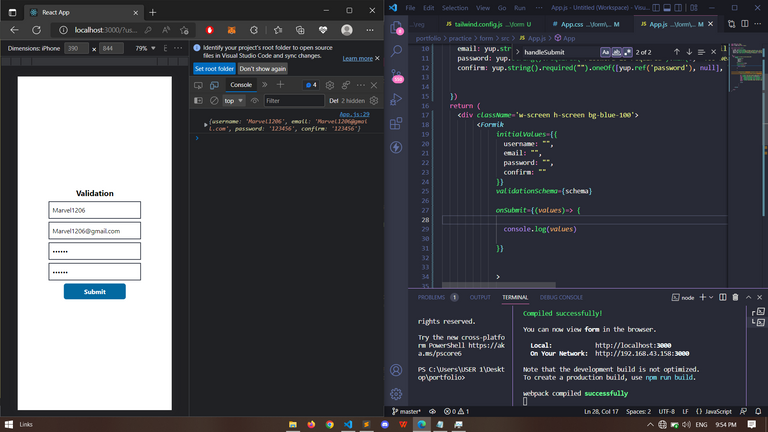
Now it works, We can already define whatever we want to do with our values on successfull validation but how about letting the user know which input field they have filled incorrectly? We can do this by creating a little div below each of our inputs that checks if the input has been touched before displaying the errors.inputname. {touched && touched.username && errors.username}
<Form className='w-full h-full' onSubmit={handleSubmit}>

                     <div className='flex flex-col gap-2 items-center justify-center h-full'>
                     <div className='font-bold text-xl'>Validation</div>
                     <input onChange={handleChange} onBlur={handleBlur}  name="username" className='w-[60%] border-2 p-2 border-gray-900' type="text"  placeholder='Name'/>
                     <div className='text-red-500 text-[10px]'>
                     {touched && touched.email &&errors.username}
                    </div>
                     <input   onChange={handleChange} onBlur={handleBlur}  name='email' type="email" className='w-[60%] border-2 p-2 border-gray-900' placeholder='Email'/>
                     <div className='text-red-500 text-[10px]'>
                     {touched && touched.email &&errors.email}
                    </div>
                     <input  onChange={handleChange} onBlur={handleBlur} name='password'  type="password" className='w-[60%] border-2 p-2 border-gray-900'  placeholder='Password'/>
                     <div className='text-red-500 text-[10px]'>
                     {touched && touched.email &&errors.password}
                    </div>
                     <input  onChange={handleChange} onBlur={handleBlur} name='confirm' type="password" className='w-[60%] border-2 p-2 border-gray-900' placeholder='Confirm password'/>
                     <div className='text-red-500 text-[10px]'>
                     {touched && touched.email &&errors.confirm}
                    </div>
                     <button  className='bg-sky-700 w-[40%] text-white rounded-md p-2 font-bold' type="submit" value="submit">Submit</button>
                     </div>

                     </Form>
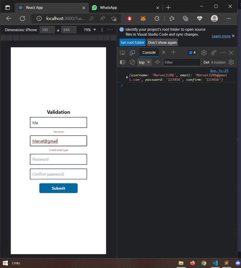
And just like that we have created a standard but basic validated form. Of course, it can get more complex than this but that is totally up to you. Their documentation here can help with all you need. Also, worthy to note that the button will not submit if the user clicks when the errors object is not empty.
PS: Links to these modules have been provided in text. Cover photo was designed on Canva and all other images are screenshots by me.
Follow for more♥️
https://twitter.com/marvelstalwart/status/1577420783428698113
The rewards earned on this comment will go directly to the people sharing the post on Twitter as long as they are registered with @poshtoken. Sign up at https://hiveposh.com.
Thanks for your contribution to the STEMsocial community. Feel free to join us on discord to get to know the rest of us!
Please consider delegating to the @stemsocial account (85% of the curation rewards are returned).
You may also include @stemsocial as a beneficiary of the rewards of this post to get a stronger support.