Taking a look at CSS flexbox and its features

Flexbox is one of the first things that excited me about CSS, I instantly love it the first time I came across it while learning CSS and it’s my go-to system when I want a simple layout in my project or if I want to easily arrange elements without having to use things like position or translate. Flexbox is useful when you want a one-dimensional layout; which means you can only use the layout in either horizontal or vertical modes and I will explain more as we jump into the features and examples.
Flexbox features
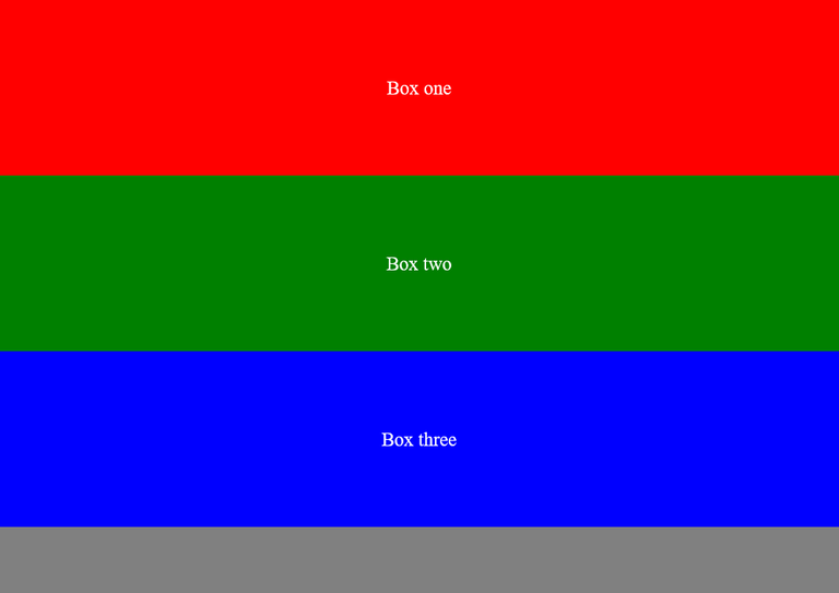
<body class="container">
  <div class="box one">Box one</div>
  <div class="box two">Box two</div>
  <div class="box three">Box three</div>
</body>
For the sake of this article, I have created a simple webpage that’s made up of just 3 divs contained in the body element with a class of container, that’s going to be our flex container. The three divs all have a general class called box which will be used to give them all a general styling, and they also have unique classes: one, two, and three which will be used for unique styling. This is what the CSS looks like:
.box {
  background-color: grey;
  width: 100%;
  padding-block: 4em;
  color: white;
  font-size: 2.2rem;
  text-align: center;
}

.one {
  background-color: red;
}

.two {
  background-color: green;
}

.three {
  background-color: blue;
}
And this is the result:
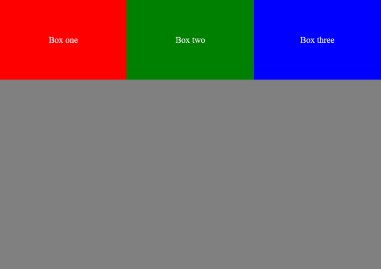
Display flex
.container {
  display: flex;
}
To get started with flex, the first thing we have to do is to set the display property of the container to flex and in this case, the container is the body element. The direct children of the container will become flex items, which means the 3 divs that are the direct children of the body element are now flex items. Immediately we set display: flex on the container, the children are automatically arranged in a row (horizontally) which is the default.
Flex-direction
.container {
  display: flex;
  flex-direction: column;
}
If you want the items to be arranged vertically, you can make use of the flex-direction property. This property takes 4 values: row, column, row-reverse, and column-reverse. Row is the default and you have seen what it looks like above, while column will arrange the items vertically, which will just bring us back to where we started from before applying display: flex. Row-reverse is similar to row but from the name, you should have an idea of what it does; it simply reverses the order in which the items appear.
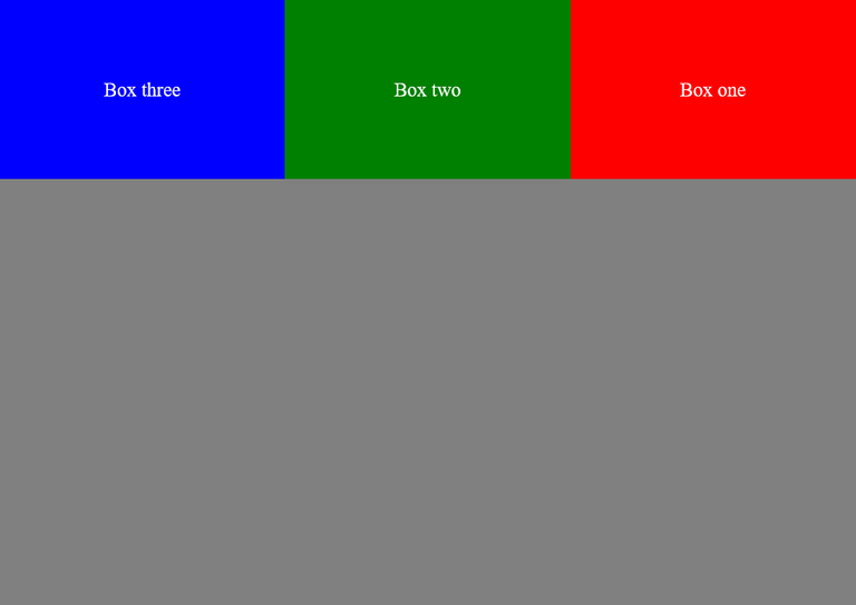
Now, instead of the box being arranged in the order: one, two, and three, it has now been reversed. Column-reverse does the same thing: the elements are arranged vertically but in reverse order, starting from three. Most of the time, the main reason I use flexbox is to arrange elements in a row, so I typically don’t use the flex-direction property. The only times I use that property is if I only want to use flexbox to center an element without changing the layout or if I want to change the layout of a page to column when it is on a smaller screen using media queries.
Flex-wrap
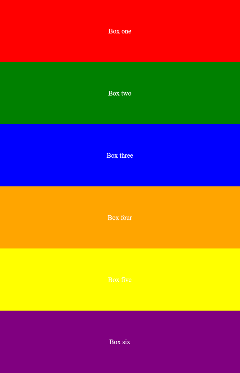
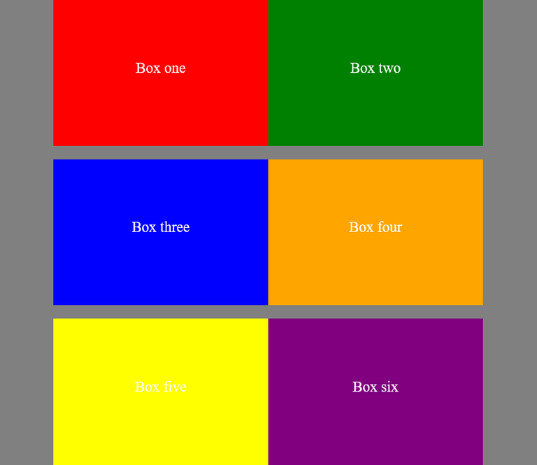
To demonstrate how this works, I will add three more divs to our html and also give them different colors. As default, the flex items in a container won’t wrap to the next line if there is no space to accommodate all of them, they will have to shrink to create space for each other and something like this can override the width you set on each of the items
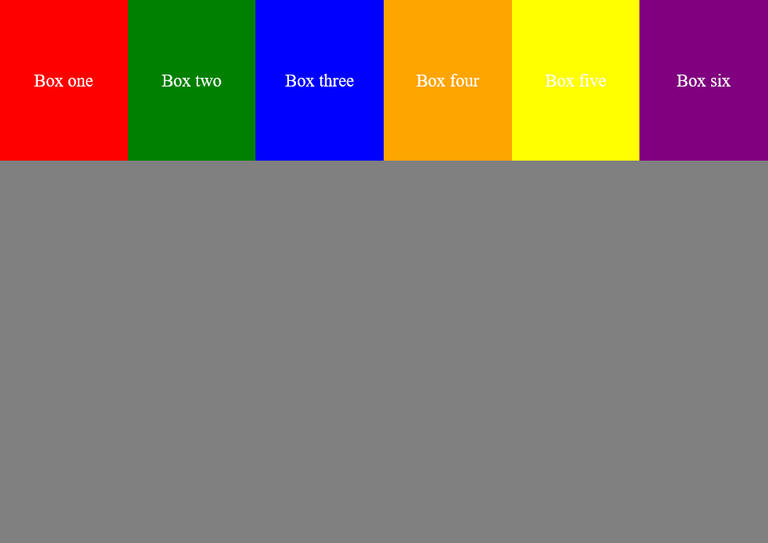
I set a width of 100% on each of those boxes which means they have to take up the full width of their parent’s container but as you can see from the picture above, that isn’t happening, they have all shrunk down to ensure all the flex items fit into one row. But as soon as I apply flex-wrap: wrap to the container, see what happens
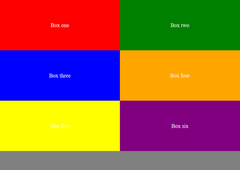
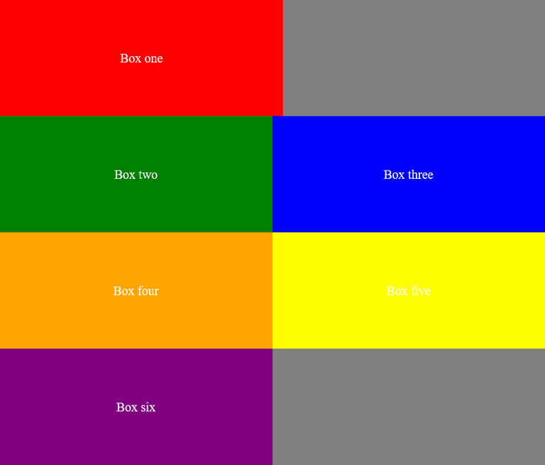
They have all been forced to take 100% of the parent’s container and they have ended up being arranged vertically, even though they were supposed to be arranged in a row. But to see how the flex-wrap property truly works, let’s set the width of each box to just 50% (half of the parent’s container).
Looks good, right? What happened is that each of those items now takes just 50% of the container and since we have set the flex-wrap property to wrap, two items can now stay in a row (50% + 50% = 100%), while the others will keep wrapping and creating new rows. Let’s assume the width of the container (in this case it depends on the viewport width) is 1000px and since each box’s width is set to 50%, it means each box is now 500px, so we can easily fit two boxes in a single row. If there’s a slight addition to the size of the box; maybe you used 52% on one of the boxes or you added a margin, that particular box will be the only one on that row
Note: The flex-wrap property accepts another value which is wrap-reverse. This simply reverses the order in which the items wrap to the next rows.
Justify-content
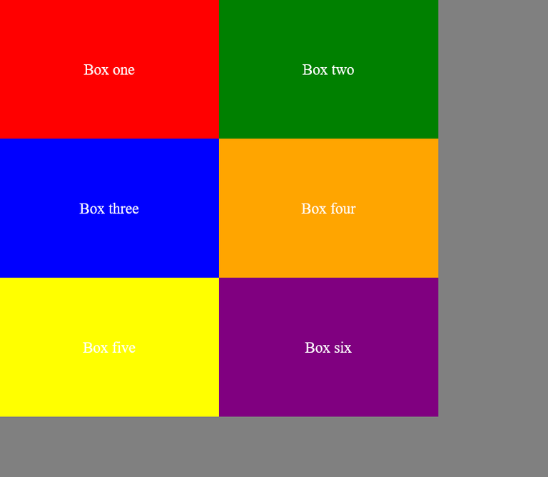
This is one of the most used features of flex-box because it can be used to simply position an element (you can use it to place that annoying div in the center of your page!). To demonstrate how this works, I will change the width of all the boxes to 40% while still using flex-wrap: wrap. This is what it looks like:
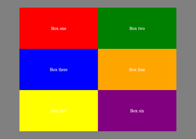
The justify-content property takes 6 values: flex-start, flex-end, center, space-around, space-between, and space-evenly. The default is flex-start and that’s what you’re seeing in the above picture. Flex-end is the opposite of flex-start; all the items will be on the right side instead of the left. I will only show how justify-content: center looks like
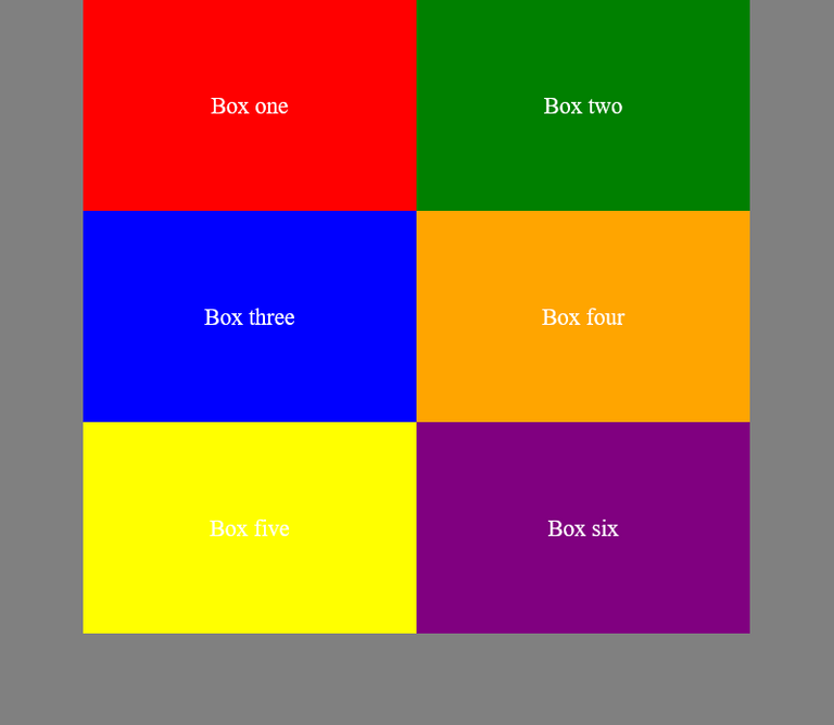
All the items are now in the center of the container. As for the other values, you can experiment with each of them to see how they work, but they are almost similar.
Align-content
Where justify-content can be used to position items of a flex container horizontally, the align-content property is used to position flex items vertically. Similar to its counterpart, it also has 6 values but there’s an additional one called stretch which simply stretches the items to take up all the available height space of the parent’s container and this is the default. If we simply apply align-content: center to the container, it won’t do anything and that’s because to use this property, we must define a height on the container. So, this is what the code now looks like:
.container {
  display: flex;
  flex-wrap: wrap;
  justify-content: center;
  align-content: center;
  min-height: 100vh;
}
So, just by applying a min-height to the container, the align-content property can now work properly and this is the result:
Align-self
This property is used on the individual items for aligning them vertically. To show how this works, I will remove the justify-content and align-content properties I added to the container, so we are left with this:
Now let’s apply align-self: flex-start to the first box
.one {
  background-color: red;
  align-self: flex-start;
}
The default alignment for all flex items is stretch but after applying this flex-start to the first box, it will align the box to the top of the container
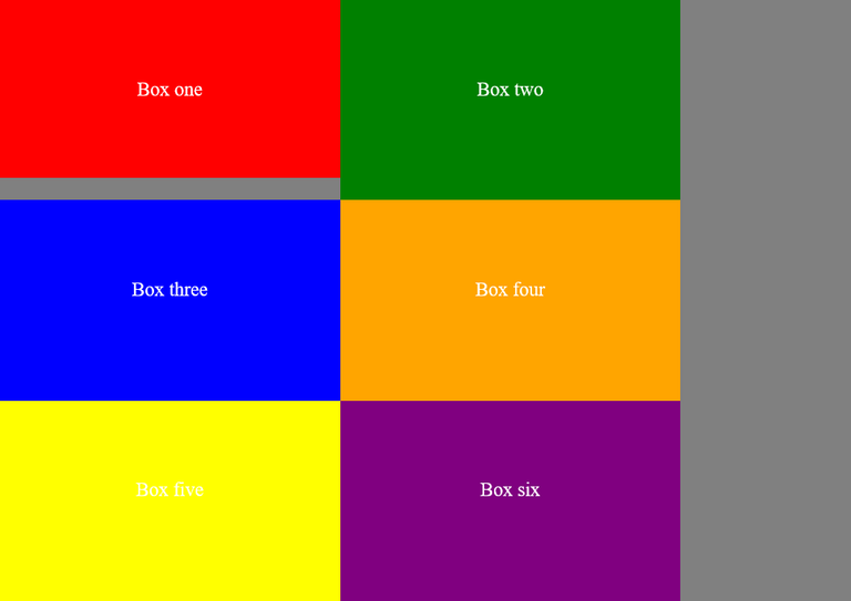
Every other thing is still stretched but the first box has been given its own specific alignment. Other values that can be used for this property are flex-end, center, baseline, and auto
Gap
This wasn’t originally part of flexbox, I initially used it to create margins between grid items but I discovered one day that it also works in flexbox. Gap simply creates an inside margin between flex items, but do take note that this can add to the size of the flex items.
.container {
  display: flex;
  flex-wrap: wrap;
  justify-content: center;
  min-height: 100vh;
  gap: 2rem;
}
Result:
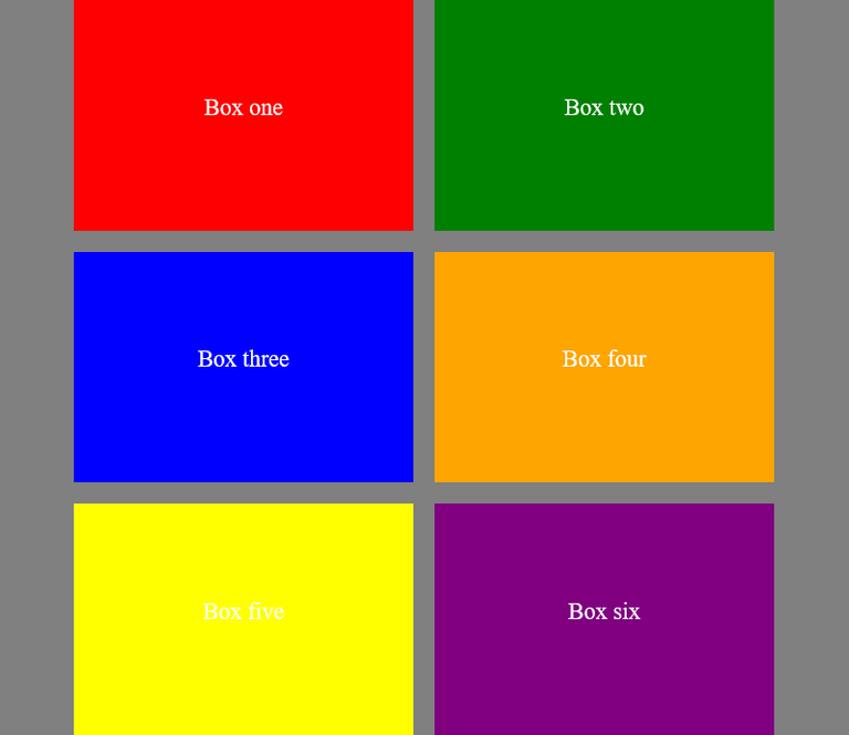
This creates a 2rem wide gap between the rows and columns of the flexbox. We can decide to give different values to the row and column gaps, or we can specify a gap for either only the rows or columns by doing something like this gap: 2rem 0. The first value is for the rows, while the second value is for the columns. This means the rows will be separated by a gap of 2rem while the columns won’t have any gaps (zero).
Conclusion
There are still some other properties of flexbox that I didn’t mention (things like flex-basis, flex-shrink, and flex-grow) and that’s because I hardly use them, they are only needed in special situations but if you want to know more about them, then check this article on csstricks. Flexbox is a very fun and powerful tool to use and it might be complicated at first but being able to learn it can be a very useful resource and can make your web development journey much easier.
Thanks for reading

Connect with me on:
Twitter: @kushyzeena
Readcash: @kushyzee
Edited with Canva
Thanks for your contribution to the STEMsocial community. Feel free to join us on discord to get to know the rest of us!
Please consider delegating to the @stemsocial account (85% of the curation rewards are returned).
You may also include @stemsocial as a beneficiary of the rewards of this post to get a stronger support.
Thank you for sharing this post on HIVE!
Your content got selected by our fellow curator tibfox & you received a little thank you upvote from our non-profit curation initiative. Your post will be featured in one of our recurring curation compilations which is aiming to offer you a stage to widen your audience within the DIY scene of Hive.
Next time make sure to post / cross-post your creation within the DIYHub community on HIVE and you will receive a higher upvote!
Stay creative & hive on!
CSS is always challenging for me for sure this well help everyone a lot

!1UP
I am glad you find it helpful. Thanks for visiting 😊
You have received a 1UP from @gwajnberg!
@stem-curator, @vyb-curator, @pob-curator, @neoxag-curator, @pal-curator
And they will bring !PIZZA 🍕.
Learn more about our delegation service to earn daily rewards. Join the Cartel on Discord.
This is a very detailed tutorial, you explained flexbox so well and you made it look so fun. I've not really mastered flexbox but I'd love to use this method to practice once again.
Thanks for sharing bro!❤️
I totally love flexbox because of how easy it is to use in making simple layouts, I believe you can master it with enough practice. Thanks for stopping by
Yeah more practice is just what I need.
You're very welcome bro!
I gifted $PIZZA slices here:
@curation-cartel(7/20) tipped @kushyzee (x1)
Learn more at https://hive.pizza!
Flexbox is cool and all. But, you should do a write-up on CSS Grid. I think CSS Grid is way more powerful and exciting than Flexbox. Don't get me wrong, Flexbox still has its use-cases, but grid is superior for a lot of things that Flexbox can't do without Javascript.
Yeah totally, grid is more powerful and it's mostly used in complex layouts but just like you said, they both have their use cases. I also thought of doing a write-up on grids and I will probably do that later this week. Thanks for your wonderful contribution
Dear @kushyzee,
May I ask you to review and support the new proposal (https://peakd.com/me/proposals/240) so I can continue to improve and maintain this service?
You can support the new proposal (#240) on Peakd, Ecency, Hive.blog or using HiveSigner.
Thank you!
I have supported it 😊
Thank you for your support @kushyzee, really appreciate it! 👍