HTML CSS Product Slider
Hey there guys , how have you been i am sure you have been doing well so have i , well i will like to share a front-end desiugn component which is mostly on every webpage that you visit it called A SLider . For now we will be creating a slider with just HTML and CSS for the simplicity then maybe some other time we can create a slide show like this one
so let get started with our first step which is to design the SLider , we use Adobe Illustratopr to design the slider here is the design using adobe illustrator :
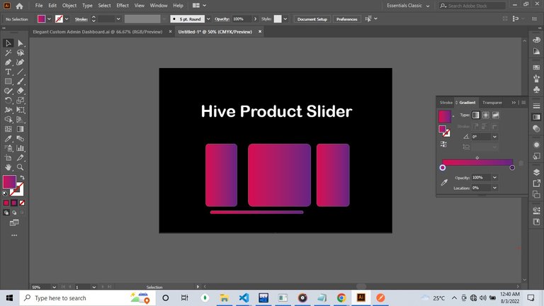
Now in the design we use a different font , but in the monospace this is due to the fact that i didnt have the font used in the design installed ofcourse i could link the fonts in using awesomefonts but just because....
so the first step towards coding it is to use VScode as the editor i do plan to use Atom IDE in future videos so here is the HTML :
<html>
    <head>

    </head>
<body>
<div class="slider">
    <h1> Hive Product Slider </h1>
<div class="slides">
    <div class="slide-1">  </div>
    <div class="slide-1">  </div>
    <div class="slide-1">  </div>
    <div class="slide-1">  </div>
    <div class="slide-1">  </div>
    <div class="slide-1">  </div>
    <div class="slide-1">  </div>
    <div class="slide-1">  </div>
</div>
</div>
</body>
</html>
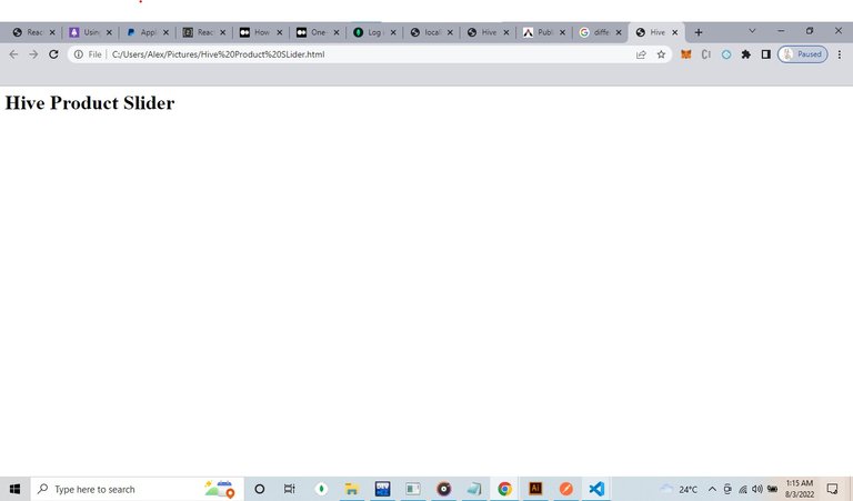
so in the Html Code we First create a parent element which is the slider the ,main outer container for the slider the followed by some other div elements note that the div elements are later turned to inline-block difference between inline-block and block elements are that An inline-block element is placed as an inline element but it behaves as a block element. while A block element has some whitespace above and below it and does not tolerate any HTML elements next to it . so we placed the div withing the slides as inline-block .
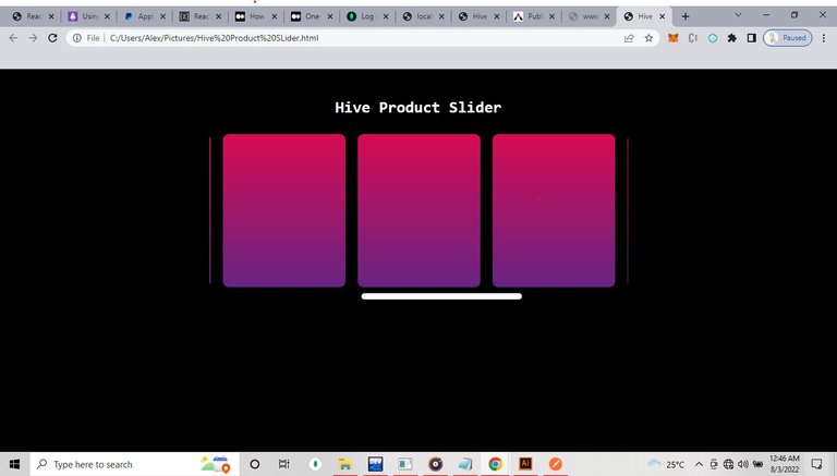
Here is the Output :
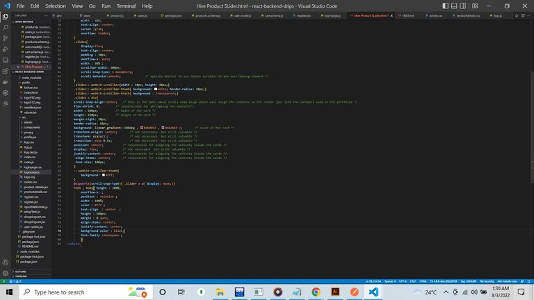
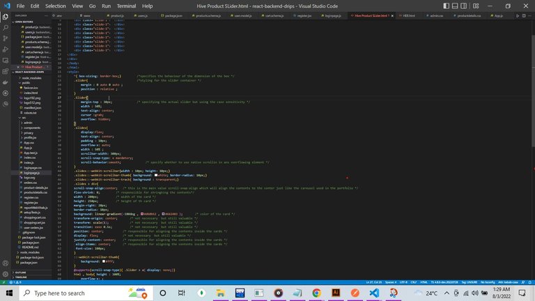
Now Here is the CSS :
    *{ box-sizing: border-box;}         /*specifies the behaviour of the dimension of the box */
    .slider{                            /*styling for the slider container */
        margin : 0 auto 0 auto ;
        position : relative ;
    }
    .Slider{
        margin-top : 30px;              /* specifying the actual slider but using the case sensitivity */
        width : 50%;
        text-align: center;
        cursor :grab;
        overflow: hidden;
    }
    .slides{
        display:flex;
        text-align: center;
        padding : 10px;
        overflow-x: auto;
        width : 50%
        scrollbar-width: 300px;
        scroll-snap-type: x mandatory;
        scroll-behavior:smooth;              /* specify whether to use native scrollin in ans overflowing element */
    }
    .slides::-webkit-scrollbar{width : 10px; height: 10px;}
    .slides::-webkit-scrollbar-thumb{ background: white; border-radius: 10px;}
    .slides::-webkit-scrollbar-track{ background : transparent;}
    .slides > div{
    scroll-snap-align:center;   /* this is the main value scroll-snap-align which will align the contents to the center just like the carousel used in the portfolio */
    flex-shrink: 0;         /* responsiible for shringking the contents*/
    width : 200px;          /* width of the card */
    height: 250px;          /* height of th card */
    margin-right: 20px;
    border-radius: 10px;
    background: linear-gradient(-180deg , #d60b52 , #662483 );       /* color of the card */
    transform-origin: center;       /* not necessary  but still valuable */
    transform: scale(1);            /* not necessary  but still valuable */
    transition: ease 0.5s;          /* not necessary  but still valuable */
    position: center;           /* responsible for aligning the contents inside the cards */
    display: flex;              /* not necessary  but still valuable */
    justify-content: center;    /* responsible for aligning the contents inside the cards */
     align-items: center;       /* responsible for aligning the contents inside the cards */
     font-size: 100px;
    }
    ::-webkit-scrollbar-thumb{
        background: #fff;
    }
    @supports(scroll-snap-type){ .Slider > a{ display: none;}}
    html , body{ height : 100%;
        overflow-x: ;
        position : relative ;
        width : 100%;
        color : #fff ;
        text-align  : center  ;
        height : 500px;
        margin : 0 auto;
        align-items: center;
        justify-content: center;
        background-color : black;
        font-family :monospace ;
        }
.slides is set to flex to make its contents to be responsive to any changes now the main concept behind the slider is the overflow-y : scroll is just like a basic page but instead of the page having full height or width you simply set it to an element and you make all the element within the element to be independent relative to their container ...
the scrollbar styles syntax are built in css3 styles for scrollbar .
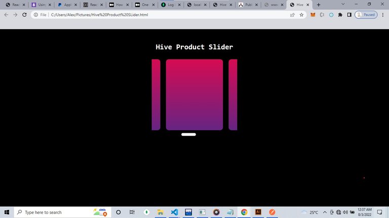
Here is the View After adding the css :
and here is the full code
<html>
    <head>

    </head>
<body>
<div class="slider">
    <h1> Hive Product Slider </h1>
<div class="slides">
    <div class="slide-1">  </div>
    <div class="slide-1">  </div>
    <div class="slide-1">  </div>
    <div class="slide-1">  </div>
    <div class="slide-1">  </div>
    <div class="slide-1">  </div>
    <div class="slide-1">  </div>
    <div class="slide-1">  </div>
</div>
</div>
</body>
</html>
<style>
    *{ box-sizing: border-box;}         /*specifies the behaviour of the dimension of the box */
    .slider{                            /*styling for the slider container */
        margin : 0 auto 0 auto ;
        position : relative ;
    }
    .Slider{
        margin-top : 30px;              /* specifying the actual slider but using the case sensitivity */
        width : 50%;
        text-align: center;
        cursor :grab;
        overflow: hidden;
    }
    .slides{
        display:flex;
        text-align: center;
        padding : 10px;
        overflow-x: auto;
        width : 50%
        scrollbar-width: 300px;
        scroll-snap-type: x mandatory;
        scroll-behavior:smooth;              /* specify whether to use native scrollin in ans overflowing element */
    }
    .slides::-webkit-scrollbar{width : 10px; height: 10px;}
    .slides::-webkit-scrollbar-thumb{ background: white; border-radius: 10px;}
    .slides::-webkit-scrollbar-track{ background : transparent;}
    .slides > div{
    scroll-snap-align:center;   /* this is the main value scroll-snap-align which will align the contents to the center just like the carousel used in the portfolio */
    flex-shrink: 0;         /* responsiible for shringking the contents*/
    width : 200px;          /* width of the card */
    height: 250px;          /* height of th card */
    margin-right: 20px;
    border-radius: 10px;
    background: linear-gradient(-180deg , #d60b52 , #662483 );       /* color of the card */
    transform-origin: center;       /* not necessary  but still valuable */
    transform: scale(1);            /* not necessary  but still valuable */
    transition: ease 0.5s;          /* not necessary  but still valuable */
    position: center;           /* responsible for aligning the contents inside the cards */
    display: flex;              /* not necessary  but still valuable */
    justify-content: center;    /* responsible for aligning the contents inside the cards */
     align-items: center;       /* responsible for aligning the contents inside the cards */
     font-size: 100px;
    }
    ::-webkit-scrollbar-thumb{
        background: #fff;
    }
    @supports(scroll-snap-type){ .Slider > a{ display: none;}}
    html , body{ height : 100%;
        overflow-x: ;
        position : relative ;
        width : 100%;
        color : #fff ;
        text-align  : center  ;
        height : 500px;
        margin : 0 auto;
        align-items: center;
        justify-content: center;
        background-color : black;
        font-family :monospace ;
        }
</style>
thanks a lot for reading it up to this level i really appreciate your time and effort . Happy Coding . Alexander (fox lead)

Thanks for your contribution to the STEMsocial community. Feel free to join us on discord to get to know the rest of us!
Please consider delegating to the @stemsocial account (85% of the curation rewards are returned).
You may also include @stemsocial as a beneficiary of the rewards of this post to get a stronger support.
CSS is something that I still need to improve!!
thanks for sharing it
!1UP
Click this banner to join "The Cartel" discord server to know more.
We all do man , Anytime
You have received a 1UP from @gwajnberg!
@stem-curator
And they will bring !PIZZA 🍕.
Learn more about our delegation service to earn daily rewards. Join the Cartel on Discord.