Kraken Crypto Data Into R
Hello. In this post, I cover the topic of loading crypto data from the Kraken exchange into the R programming language.
The data is extracted from Crypto Download.
The full post can be found here. Plots in that link are interactive while the plots in this post are just pictures.

Topics
- Importing Kraken Crypto Data Into R
- Some Data Cleaning
- Price Charts With The Relative Strength Indicator (RSI)
- A Price Chart Function In Code
Importing Kraken Crypto Data Into R
To start I load these libraries into R:
# Reset global variables
rm(list = ls())

#Import libraries
library(jsonlite)
library(glue)
library(anytime)
library(dplyr)
library(plotly)
If you need to install a package into R or RStudio use the command install.packages(<pkg_name>).
To import Kraken crypto data, use this code chunk.
#### Working with data without writing the data:

crypto_pair <- "BTCUSD"

url = glue("https://api.kraken.com/0/public/OHLC?pair={crypto_pair}&interval=1440")

mydata <- fromJSON(url)

df <- as.data.frame(mydata['result'])
The number 1440 represents the number of minutes in a time frame. As there are 1440 minutes in a day, we obtain daily data for the BTCUSD pair.

Some Data Cleaning
The obtained data from Kraken is not perfect. With the following code, I change column names, the misc column is removed, the columns are changed to numeric columns, a USD_Volume is created and a date column is created based on the unix Epoch timestamps.
# Rename columns and remove misc Column

columnNames <- c('unix', 'open', 'high', 'low', 'close', 'vwap', 'volume', 'tradecount', 'misc')

colnames(df) <- columnNames

df <- subset(df, select=-c(misc))

# Convert to numeric columns:
df[, c(1:7)] <- sapply(df[, c(1:7)], as.numeric)

# Create Volume column where volume = close price * Volume
df$USD_Volume <- with(df, df$volume * df$close)

# Unix Epoch timestamp into UTC timezone:
df$date <- anytime(df$unix, asUTC = TRUE)
Creating A Column of RSI Values
The Relative Strength Indicator (RSI) is a common indicator for traders. A RSI value over 70 signals that an asset is overbought and a RSI value below 30 something that is oversold.
In R, RSI values can be created with the use of the TTR package. Do make sure that this package is installed. The TTR package contains many financial technical indicators and tools for investors and traders.
# Add RSI column based on closing prices:
# RSI(price, n = num_periods for MAvg, maType)
# Overbought/oversold (over 70/below 30)

df$rsi <- TTR::RSI(df$close, n = 14)

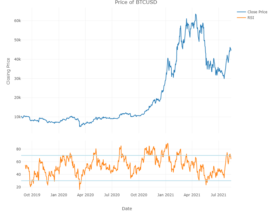
Price Charts With The Relative Strength Indicator (RSI)
This project & post is similar to the Coinbase one. This time around I have add the RSI indicator. It is two plots in one!
I do not want to show all the details with the plot_ly code for the graph. There is a bit involved.
The top plot is for the price of BTCUSD and the bottom plot is for the RSI values.
Two lightblue lines represent the RSI values of 30 (bottom line) and 70 (top line).
Using subplot() is needed to obtain these two plots in one.
### Plotly plots: closing prices and Volume:
# Reference: https://quantnomad.com/2019/04/22/example-of-candlestick-chart-in-r-using-plotly/

# Line Chart
plot1 <- df %>% plot_ly(x = ~date, y = ~close, type = 'scatter', mode = 'lines', name = 'Close Price')

# RSI - Relative Strength Index on Closing Price:
plot2 <- df %>% plot_ly(x = ~date, y = ~rsi, type = 'scatter', mode = 'lines', name = 'RSI') %>%
            add_lines(x = ~date, y = 30,
                      line = list(color = "lightblue", width = 2),
                      showlegend = FALSE) %>%
            add_lines(x = ~date, y = 70,
                      line = list(color = "lightblue", width = 2),
                      showlegend = FALSE)

#Subplots:
subplot(plot1, plot2, nrows = 2, shareX = TRUE, heights = c(0.7, 0.3)) %>%
  layout(title = paste0("Price of ", crypto_pair),
         xaxis = list(title = "\n Date"),
         yaxis = list(title = "Closing Price \n"),
         autosize = TRUE,
         width = 900, height = 700)
A Price Chart Function In Code
The above steps can be all put together into a function. Users can input their crypto trading pair, a timeframe of either hourly, daily or weekly and a number of days for the RSI timeframe.
### Creating It As A Function:

produce_crypto_chart <- function(crypto_pair, timeframe = 'daily', rsi_timeframe = 14) {

  if (timeframe == "hourly"){
    granularity = 60
  } else if (timeframe == "daily"){
    granularity = 1440
  } else if (timeframe == "weekly") {
    granularity = 1440 * 7
  } else {
    print("Please enter one of hourly, daily or weekly for the timeframe.")
  }

  # Obtain data with URL:
  url = glue("https://api.kraken.com/0/public/OHLC?pair={crypto_pair}&interval={granularity}")

  columnNames <- c('unix', 'open', 'high', 'low', 'close', 'vwap', 'volume', 'tradecount', 'misc')

  mydata <- fromJSON(url)
  df <- as.data.frame(mydata['result'])

  # Rename columns and remove misc Column
  colnames(df) <- columnNames
  df <- subset(df, select=-c(misc))

  # Convert to numeric columns:
  df[, c(1:7)] <- sapply(df[, c(1:7)], as.numeric)

  # Create Volume column where volume = close price * Volume
  df$USD_Volume <- with(df, df$volume * df$close)

  # Unix Epoch timestamp into UTC timezone:
  df$date <- anytime(df$unix, asUTC = TRUE)

  # Add RSI column based on closing prices:
  # RSI(price, n = num_periods for MAvg, maType)
  # Overbought/oversold (over 70/below 30)

  df$rsi <- TTR::RSI(df$close, rsi_timeframe)

  ### Plotly plots: closing prices and Volume:
  # Reference: https://quantnomad.com/2019/04/22/example-of-candlestick-chart-in-r-using-plotly/

  # Line Chart
  plot1 <- df %>% plot_ly(x = ~date, y = ~close, type = 'scatter', mode = 'lines', name = 'Close Price')

  # RSI - Relative Strength Index on Closing Price:
  plot2 <- df %>% plot_ly(x = ~date, y = ~rsi, type = 'scatter', mode = 'lines', name = 'RSI') %>%
    add_lines(x = ~date, y = 30,
              line = list(color = "lightblue", width = 2),
              showlegend = FALSE) %>%
    add_lines(x = ~date, y = 70,
              line = list(color = "lightblue", width = 2),
              showlegend = FALSE)

  #Subplots:
  crypto_plot <- subplot(plot1, plot2, nrows = 2, shareX = TRUE, heights = c(0.7, 0.3)) %>%
                        layout(title = paste0("Price of ", crypto_pair),
                               xaxis = list(title = "\n Date"),
                               yaxis = list(title = "Closing Price \n"),
                               autosize = TRUE, width = 900, height = 600)

  return(crypto_plot)
}
Function Calls
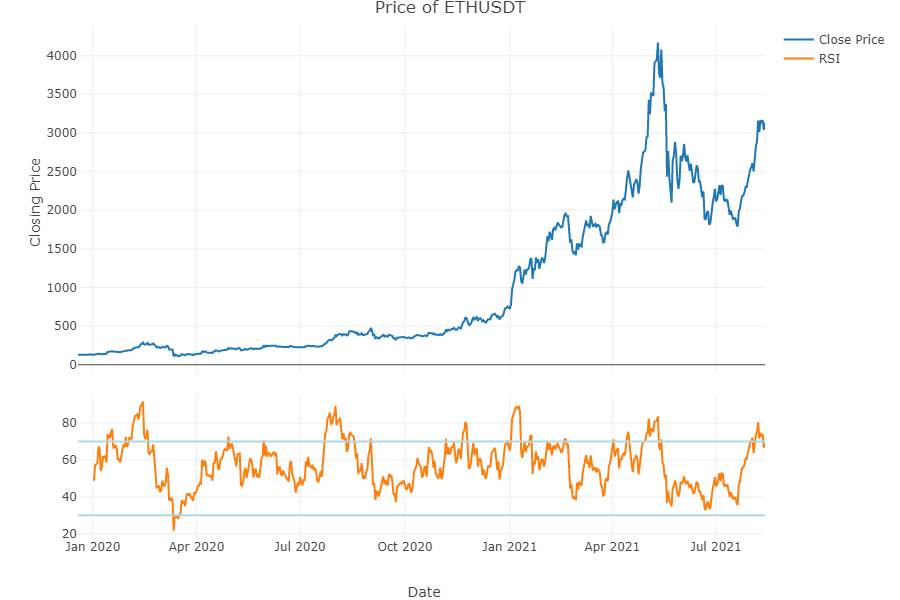
ETHUSDT - Ethereum Priced in Tether
# Function Call #1 - Ethereum priced in Tether (USDT)

produce_crypto_chart(crypto_pair = "ETHUSDT", timeframe = 'daily', rsi_timeframe = 14)
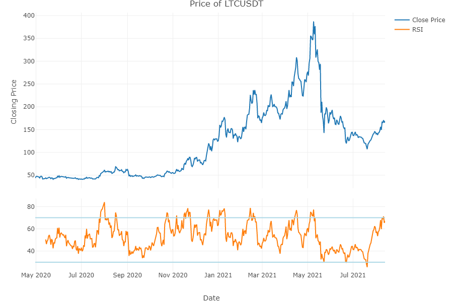
LTCUSDT - Litecoin Priced in Tether
# Function Call #2 - Litecoin priced in USDT

produce_crypto_chart(crypto_pair = "LTCUSDT", timeframe = 'daily', rsi_timeframe = 14)
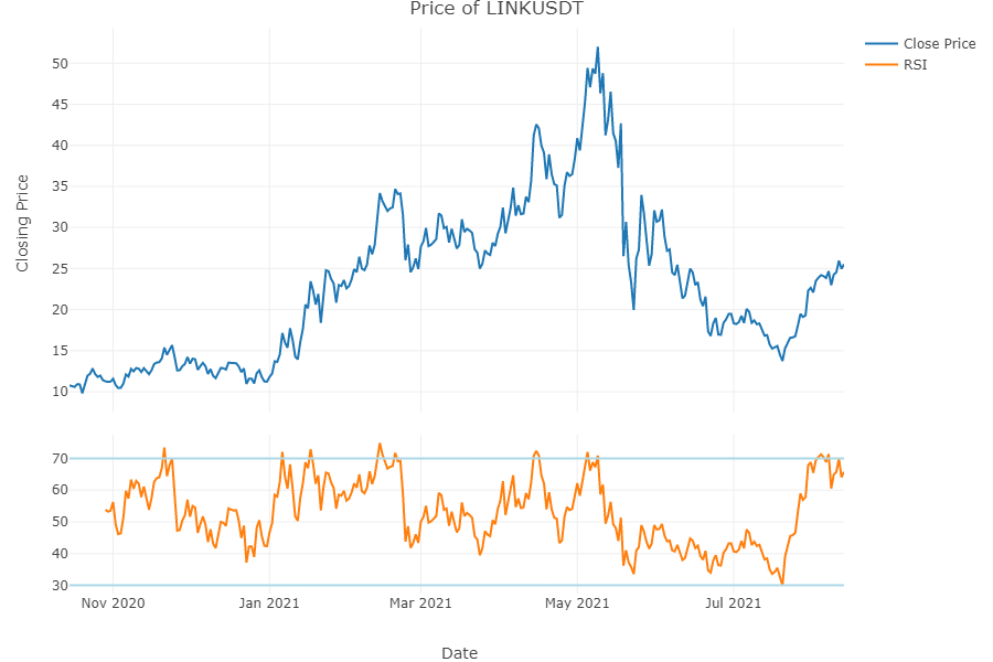
LINKUSDT - Chainlink Priced In Tether
# Function Call #3 - LINK priced in USDT

produce_crypto_chart(crypto_pair = "LINKUSDT", timeframe = 'daily', rsi_timeframe = 14)
