How to fix Plotly Python putting a bar chart in front of trace lines.
I'm posting this in case it helps anyone else. It caused me 4 hours of horrible frustration.
I'm trying draw a quite hideously over complicated set of graphs which I've cobbled together in truly apocalyptically bad spaghetti code in Python. But it kinda works.
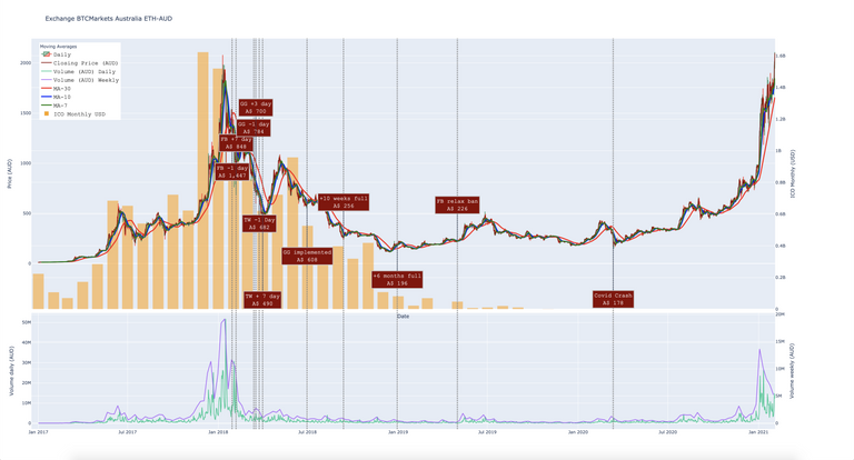
And then I added a bar graph that I needed to go behind the lines. This is what happened.
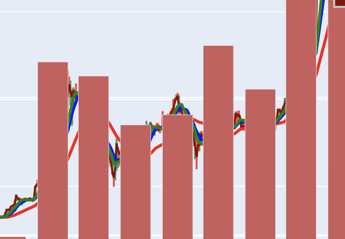
One day I'll share more of the full graphs, suffice it to say they're being prepared for our next #CryptoClassAction court date in March.
This particular graph has two subplots one above the other with 4 y-axis, 2 on each subplot.
I reduced my problem to a much simpler example:
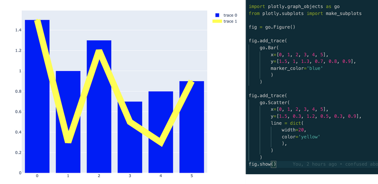
The code for which looks like this:
import plotly.graph_objects as go
from plotly.subplots import make_subplots

fig = go.Figure()

fig.add_trace(
    go.Bar(
        x=[0, 1, 2, 3, 4, 5],
        y=[1.5, 1, 1.3, 0.7, 0.8, 0.9],
        marker_color='blue'
        )
    )

fig.add_trace(
    go.Scatter(
        x=[0, 1, 2, 3, 4, 5],
        y=[1.5, 0.3, 1.2, 0.5, 0.3, 0.9],
        line = dict(
            width=20,
            color='yellow'
            ),
        )
    )
fig.show()
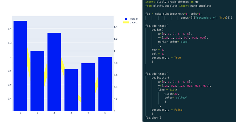
So far so good. Then I converted this to a plot with subplots and separate y-axis and mimicked what I did with my complex plot: I ADDED the bar graph and created a secondary y-axis for it. Here's the graph I got and the code:
import plotly.graph_objects as go
from plotly.subplots import make_subplots

# fig = go.Figure()
fig = make_subplots(rows=1, cols=1,
                      specs=[[{"secondary_y": True}]])

fig.add_trace(
    go.Bar(
        x=[0, 1, 2, 3, 4, 5],
        y=[1.5, 1, 1.3, 0.7, 0.8, 0.9],
        marker_color='blue'
        ),
    row = 1,
    col = 1,
    secondary_y = True
    )


fig.add_trace(
    go.Scatter(
        x=[0, 1, 2, 3, 4, 5],
        y=[1.5, 0.3, 1.2, 0.5, 0.3, 0.9],
        line = dict(
            width=20,
            color='yellow'
            ),
        ),
    secondary_y = False
    )
fig.show()
And immediately I got the idea... the only thing I needed to do was switch over the secondary_y axis. For some reason I can't figure out in the Plotly system, secondary_y axes items always overwrite the primary. Here's the final graph and the code.
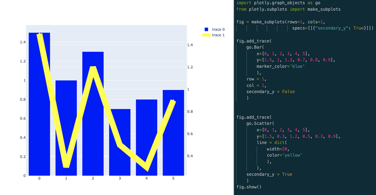
All I had to do was flip the bar graph onto the first y-axis and the lines onto the secondary y-axis. I've done that now on my main graph and voila... it worked.
This isn't a finished product yet, it needs a fair bit of work, but here's the current draft.
You should be able to play with the interactive HTML version at this link.
Thanks for looking and I hope this helps someone one day!
Amazing work preparing all these charts for the #cryptoclassaction.
It is much appreciated.
Congratulations @brianoflondon! You have completed the following achievement on the Hive blockchain and have been rewarded with new badge(s) :
You can view your badges on your board and compare yourself to others in the Ranking
If you no longer want to receive notifications, reply to this comment with the word
STOPCheck out the last post from @hivebuzz:
I've always wanted to get started in making charts, and thing might just give me a reason to start.