Programming My Own Trading Chart - Part 4
Progress is being made. It is starting to look like a trade chart. It's amazing how a few details can make an impact.
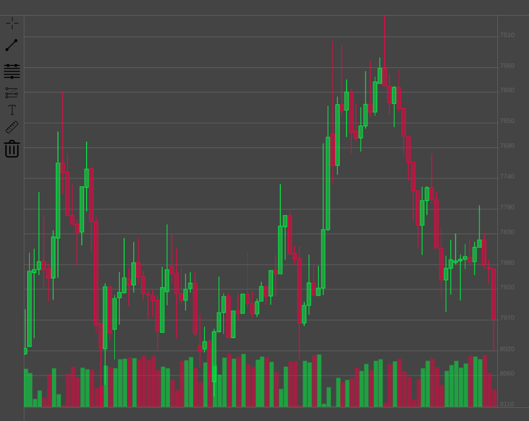
The x (time) and y (price) axes are not straight forward because of multiple conditions that modify their gradations.
I started with the y axis because it was the "easier" of the two. This is the first draft and by no means final. However, having a working draft in place gave me some data to work with to start to generate the chart grid.
There are many interlocking parts to building a chart like this, which dictate the order in which things have to be developed due to their dependencies.
Once I have the fundamentals in place, I then move on to interesting features.
Posted Using LeoFinance Beta
0
0
0.000
Dear @leoplaw, we need your help!
The Hivebuzz proposal already got an important support from the community. However, it lost its funding few days ago and only needs a few more HP to get funded again.
May we ask you to support it so our team can continue its work this year?
You can do it on Peakd, ecency, Hive.blog or using HiveSigner.
https://peakd.com/me/proposals/199
Your support would be really helpful and you could make the difference! Thank you!