Simple Line Plots For Bitcoin's Price & Marketcap In Python
Hi there. In this technology & programming post, I showcase a line plot for Bitcoin's price and marketcap in Python.

Setup & Obtaining Data
Start with importing pandas and plotly packages.
# Import packages:

import pandas as pd
import plotly.express as px
import plotly.graph_objects as go
For importing historical data, I used Coincodex.com for Bitcoin price and marketcap data. From the link with screenshot below you can select the time period for the data. Afterwards you can download the data by clicking on the Export button.
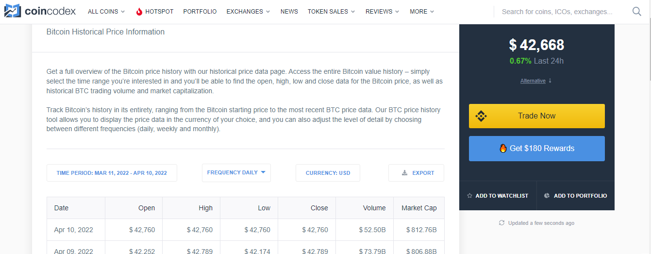
Do make sure that the .csv file is in a folder that Python or jupyterNotebook recognizes when it comes to reading in the .csv file from pandas.
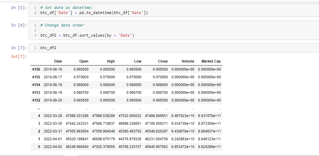
# Bitcoin historical price from coincodex.com
# Date from Aug 16, 2010 to April 3, 2022 Setting

btc_df = pd.read_csv('bitcoin_2010-8-16_2022-4-3.csv')
Once the .csv file is loaded, we need to set the Date column into a datetime column.
# Set date as datetime:
btc_df['Date'] = pd.to_datetime(btc_df['Date'])
Changing the date order to ascending order (past to most recent) is needed such that the line plots are in the right order with dates and prices/marketcaps.
# Change date order

btc_df2 = btc_df.sort_values(by = 'Date')
Line Plots In Python & Plotly
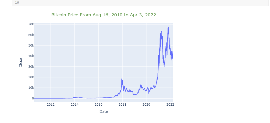
You could use matplotlib and seaborn libraries for data visualization. This time I use plotly.
The line plot figure can made with px.line(). After that the layout can be updated to include a title with its placement and colour. I use fig.show("png") to make it work in my Github but you can remove it if you want to see prices with mouse hovering on the graph.
fig = px.line(btc_df2, x='Date', y="Close")

fig.update_layout(
    title={
        'text': 'Bitcoin Price From Aug 16, 2010 to Apr 3, 2022',
        'y':0.95,
        'x':0.5,
        'xanchor': 'center',
        'yanchor': 'top'},
    title_font_color = '#60974A'
)

# Save as png static image, cant do interactivity in github.
fig.show("png")
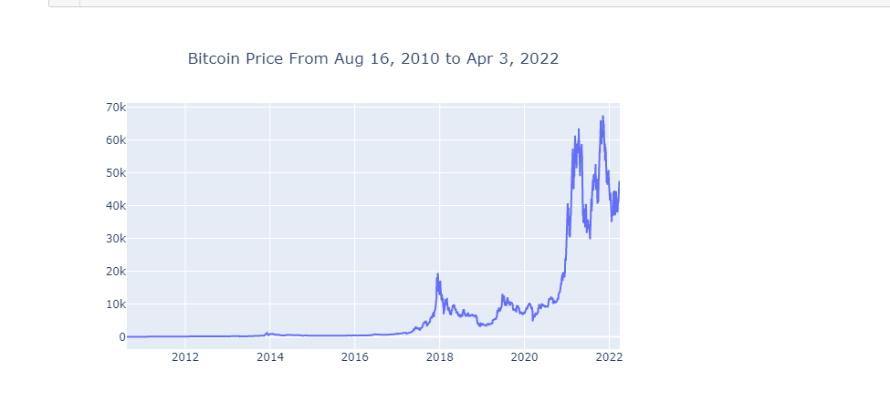
Instead of px.line() you could use go.Figure() with go.Scatter() with the data instead. The update_layout() part is the same and so is the plot.
# Another way

fig = go.Figure(data=go.Scatter(x=btc_df2['Date'],
                                y= btc_df2['Close']))

fig.update_layout(
    title={
        'text': 'Bitcoin Price From Aug 16, 2010 to Apr 3, 2022',
        'y':0.9,
        'x':0.5,
        'xanchor': 'center',
        'yanchor': 'top'}
)
fig.show("png")
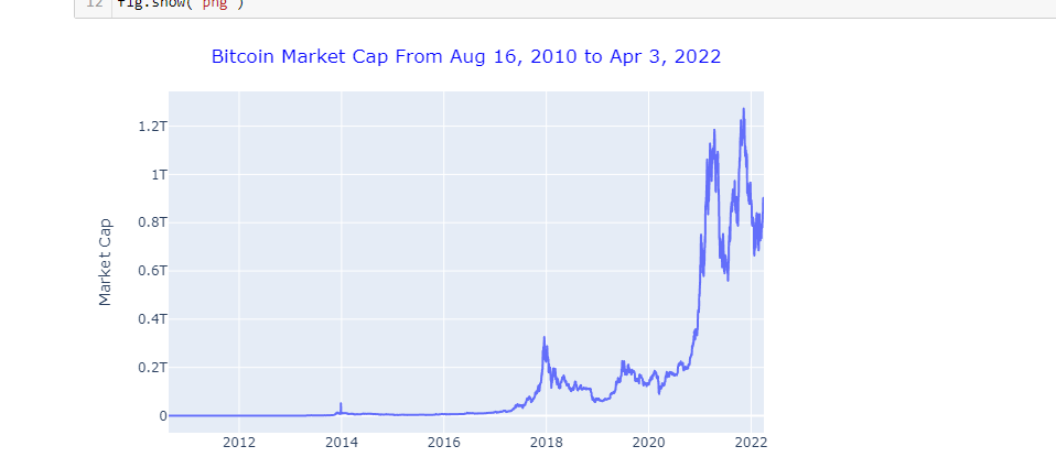
Marketcap Of Bitcoin
The plot for the marketcap of Bitcoin is not much different than the plot for the BTC price. Instead of y = "Close", use y = "Market Cap".
fig = px.line(btc_df2, x='Date', y="Market Cap")

fig.update_layout(
    title={
        'text': 'Bitcoin Market Cap From Aug 16, 2010 to Apr 3, 2022',
        'y':0.95,
        'x':0.5,
        'xanchor': 'center',
        'yanchor': 'top'},
    title_font_color = 'blue'
)
fig.show("png")
Posted with STEMGeeks