Regression Lines In Python & Seaborn
Hi there. In this post, I cover plotting regression lines or line of best fits to scatter plots in Python with matplotlib and seaborn.

Topics
- The Dataset
- Seaborn's regplot In Python
- lmPlot In Python's Seaborn
The Dataset
The dataset that I use here is from the website https://github.com/mwaskom/seaborn-data. This dataset can also be obtained with the use of the seaborn library in Python. As I do prefer to load .csv files from the web I provide the link to this dataset in the code.
Start with loading pandas, matplotlib.pyplot and seaborn into Python or jupyterNotebook.
import pandas as pd
import matplotlib.pyplot as plt
import seaborn as sns
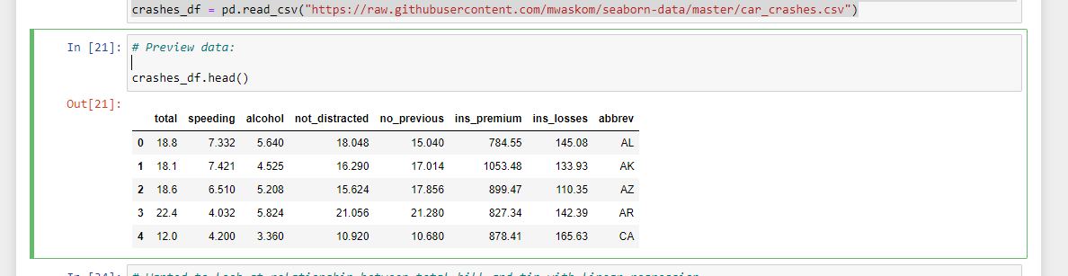
The .csv dataset is loaded with the use of .read_csv() from pandas.
# Load data on car crashes:
# Seaborn Data source: https://github.com/mwaskom/seaborn-data

crashes_df = pd.read_csv("https://raw.githubusercontent.com/mwaskom/seaborn-data/master/car_crashes.csv")
The data can be viewed with crashes_df.head().
lmPlot In Python's Seaborn
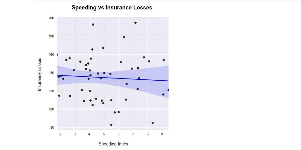
One of the ways to display a scatter plot with a line of best fit is with the use seaborn's lmplot. The more technical phrase for a line of best fit is a regression line.
I want to see the relationship between speeding versus insurance losses in this dataset. With sns.lmplot(), you need to specify the columns being used from the given data. I set the scatter plot point colours to be black and the line colour to be blue. Labels & a title are added on with matplotlib.
# Wanted to look at relationship between total_bill and tip with linear regression.
# Lmplot method:

sns.lmplot(x = 'speeding', y = 'ins_losses', data = crashes_df,
           height = 6,
           scatter_kws = {'color': 'black'}, # color for the points
           line_kws = {'color': 'blue'})

# Add labels:
plt.xlabel("\n Speeding Index")
plt.ylabel("Insurance Losses\n")
plt.title("Speeding vs Insurance Losses \n", fontsize = 18, weight = "bold", color = 'black')
plt.show()
Seaborn's regplot In Python
The second way of having a regression line in seaborn is with sns.regplot(). The code is not much different than with lmplot(). Instead of height I set the figure size.
# Same regression but with seaborn regplot:

sns.set(rc = {'figure.figsize': (8,6)}) # Change plot size
sns.regplot(x = 'speeding', y = 'ins_losses', data = crashes_df,
           scatter_kws = {'color': 'black'}, # color for the points
           line_kws = {'color': 'blue'})

# Add labels:
plt.xlabel("\n Speeding Index", fontsize = 14)
plt.ylabel("Insurance Losses\n", fontsize = 14)
plt.title("Speeding vs Insurance Losses \n", fontsize = 18, weight = "bold", color = 'black')
plt.show()
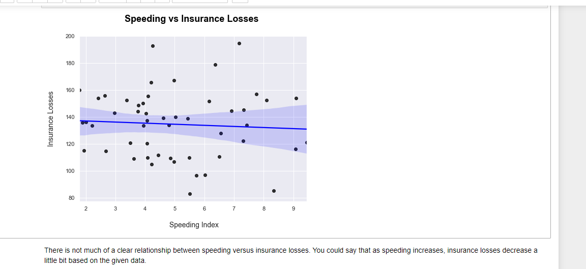
From both regression plots there is not much of a clear relationship with speeding versus insurance losses. You could say that as speeding increases, insurance losses decrease a little bit given the data and sample size. Other variables in the dataset should be investigated.

Posted with STEMGeeks