Introduction To Two Way Tables
Hi there. In this statistics/math/data management post, I provide an introduction to two way tables. This topic can be good for those in middle school, high school or for those in an introductory data management or statistics course.

Topics
- Bar Graphs For Counts
- Basic Two Way Tables
- Adding More Rows & Columns To Two Way Tables
Bar Graphs For Counts
Before getting into two way tables, I think it is a good idea to review bar graphs for counts.
A simple bar graph is an elegant and nice way to display counts for categories. Examples of bar graphs include counts for favourite colours in a classroom, voting results between two candidates in a country, counts of people who like Nintendo, Microsoft or Sony as their favourite console company and more.
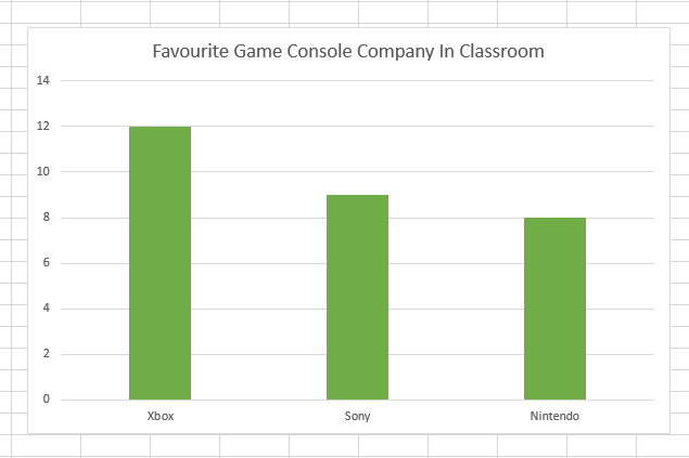
Do keep in mind that the bottom row is for categorical variables. Categorical variables do not contain numbers. For the above example, the options for the bottom are Nintendo, Microsoft or Sony as console choices from the classroom survey.
Basic Two Way Tables
With a regular bar graph, we have observed counts for one variable. For two way tables, we have counts between two categorical variables.
A basic two way table has two categories where each category has two items and displays counts.
Example One
| Class A | Class B | |
|---|---|---|
| Male | 12 | 14 |
| Female | 15 | 14 |
On a more technical and statistical level, you can run a log-linear model to examine association and patterns between two categorical variables. There is also the chi-square test for independence for two way tables to determine if the two categorical variables are independent or not. These concepts are not covered here. You can click on the links for more information.
Example Two - Calculate Proportions
In this example, I show another two way table along with computing totals and proportions.
| Class A | Class B | |
|---|---|---|
| Plays A Sport | 10 | 11 |
| Does Not Play A Sport | 16 | 14 |
I can add another column and another row for totals. Here are the total amounts:
- overall total for the number of students who do play a sport
- an overall total for students not playing a sport
- an overall total for Class A Students
- an overall total for Class B Students
- a grand total from all students surveyed
| Class A | Class B | Total | |
|---|---|---|---|
| Plays A Sport | 10 | 11 | 21 |
| Does Not Play A Sport | 15 | 14 | 29 |
| Total | 25 | 25 | 50 |
With this extended table, we can answer these questions.
a) How many students from Class A play a sport?
b) How many students do not play a sport from both classes?
c) What is the percentage of students that do play a sport from both classes?
d) From class B, what is the percentage for those who do play a sport?
e) What is the number of students who are not from class B and do play a sport?
Solutions
a) 10
b) 15 + 14 = 29
c) 21 out of 50 which is 42%
d) There are 25 students from class B. Eleven out of 25 do play a sport. This is 11/25 = 44%
e) The keyword and means that both conditions must be satisfied. Not from class B means class A. You want the number of students from Class A who do play a sport. This is 10 out of 50 which is 20%.
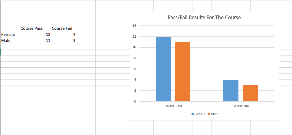
Example Three With An Included Bar Graph
In this third example, I include a bar graph (Excel screenshot) to show how you can display results from a two way table.
| Female | Male | |
|---|---|---|
| Course Pass | 12 | 11 |
| Course Fail | 4 | 3 |
Adding More Rows & Columns To Two Way Tables
What if the two categories in a two way table have more items/choices? We can add more rows and columns to show that there are more items in each category.
Example One - Favourite Colours
The results are based on fake and made-up school survey for favourite colour.
| Black | White | Red | Green | Blue | Purple | Pink | Yellow | |
|---|---|---|---|---|---|---|---|---|
| Female | 8 | 11 | 5 | 7 | 11 | 8 | 14 | 5 |
| Male | 14 | 4 | 2 | 10 | 5 | 2 | 1 | 7 |
With this table, there are more columns compared to the 2x2 two way table.
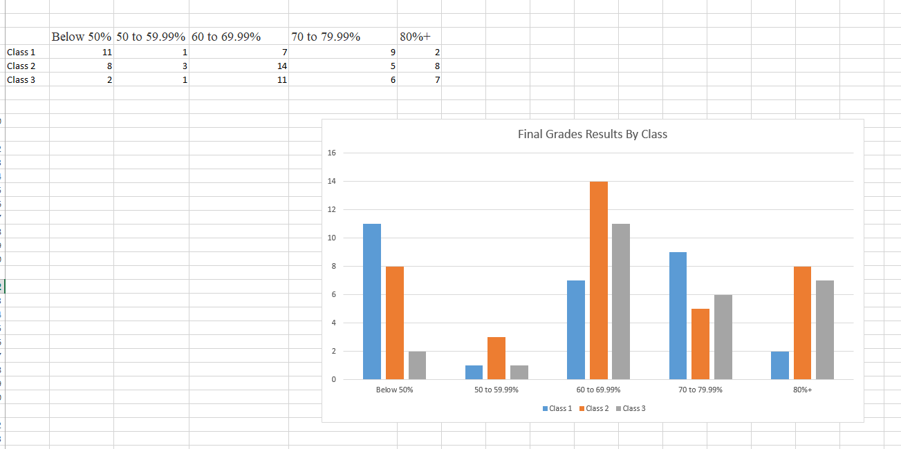
Example Two - More Rows & Columns
This second example deals with counts associated with final grade scores from three different classes in a subject.
| Final Grade | Class 1 | Class 2 | Class 3 |
|---|---|---|---|
| 80% and above Grade | 2 | 8 | 7 |
| 70 to 79.99% | 9 | 5 | 6 |
| 60 to 69.99% | 7 | 14 | 11 |
| 50 to 59.99% | 1 | 3 | 1 |
| Below 50% | 11 | 8 | 2 |
With more rows and columns, finding information is trickier as a larger table is hard on the eyes. You can still find key information with an expanded table. As an example the total number of people with a final grade below 50% is 21 students (11 + 8 + 2).
As mentioned in Example one in Basic Two Way Tables, you can run a chi-square test for independence for two way tables. This is for determining if two categorical variables are independent (not related) or not.
I have included an Excel screenshot for a bar graph visual for this table.
Posted with STEMGeeks
Good explanation of bar graph "A simple bar graph is an elegant and nice way to display counts for categories".
Thank you very much. Sometimes things just flow nicely when I draft these posts (offline).