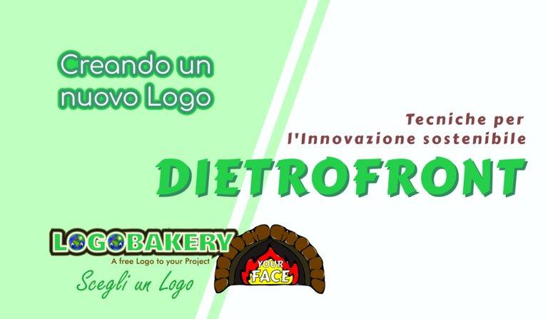
"DIETROFRONT" | The creation of a new LOGO - La creazione di un nuovo Logo [ITA-ENG]
All Rights Reserved.
All the images contained in this post are taken, created and/or modified by me. All the contents in this post are copyright-protected. All the uses of the contents - and their derivatives -, except for the spread without modifications through social media channels, are strictly prohibited without the explicit consent of the author.
This is not an advertisement-goal post.
In the last few days, I created again a new logo for a hypothetical business, following the path of a periodical initiative with which I decided to share the steps of the creation process of the corresponding logo. You find the summary of the steps in the paragraphs below. In some ones of the posts in this periodical initiative, you can find the phrase "Join LOGOBAKERY": if you want to know more, you can CLICK ON THIS LINK. Summarizing, Logobakery is an initiative with which I create simple logos for initial and non-professional use, which can then be purchased in case a hypothetical customer wants to do it.
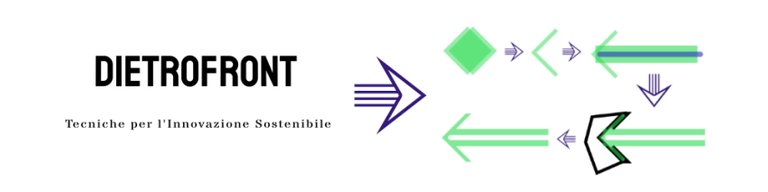
The name: Dietrofront
This time I thought of something for an activity based generically on techniques for sustainable innovation, a field that can encompass a lot or nothing. The name is once again humorous, thinking of something that is opposed to progress, innovation, the indisputable moving on of things and time. It is in this perspective that my choice fell on the term "Dietrofront" (translating in English, something like “turn around” or “about-face”).
So, first I opened the vector graphics suite I use, the open-source Inkscape (you can find more information on the official website, CLICKING HERE) and I transcribed the name using various fonts, that are different types of typefaces (imagine them as the "styles" with which the letters are traced). I then found a fairly regular one that falls under sans serif fonts, a font that has few frills at the ends.
Then I combined to it a writing in a slightly more particular font that described the activity.
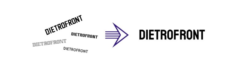
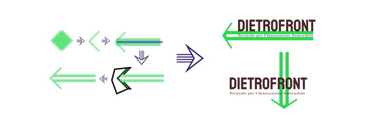
After these two basic elements, I started creating a pictogram. In my case, I came up with a slightly more sophisticated layout for an arrow with rounded corners. In the image below, you can see the steps: I got various elements by adding and removing shapes from a basic pattern, slowly sculpting the final shape.
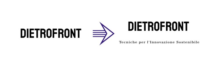
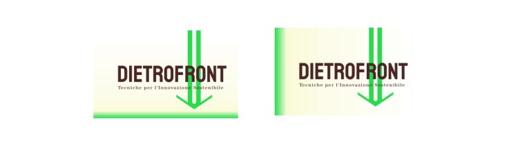
Finally, I coupled the pictogram with the other elements, declining them into two variants. In both, the arrow is placed in the opposite direction to the direction considered "in progress": either downward, or in the opposite direction to the direction of reading the name "Dietrofront".
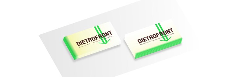
To start giving an example, I combined the creation of a possible business card. I created a first basic scheme:

and then I added some background colors that made it more appealing.
The last image is a very simple and schematic 3D example of a small stack of business cards in two different variations.
Even again, we're to the end!
Even this time, the name “Dietrofront” doesn't follow any existing subject, nor does it refer to anything real. In these initiatives, I propose combinations that are often paradoxical, in strong contrast to each others, or with ironic tones. I emphasize: the terms used are not meant to be offensive in any way.
I hope I left you a smile or some ideas. I give you an appointment for a next episode that I will publish in the coming weeks. Said this...
Goodbye and to the next post!
Tutti i diritti riservati.
Tutti i contenuti all'interno di questo post sono protetti da diritto d'autore. Tutti gli usi dei contenuti - e dei loro derivati -, fatta eccezione la diffusione senza modifiche attraverso canali social media, sono strettamente proibite senza esplicito consenso dell'autore.
Questo non è, di per sé, un post con finalità promozionale.
Nei giorni scorsi sono tornato a creare un logo per un'ipotetica attività, seguendo le tracce di un'iniziativa periodica con la quale ho deciso di condividere passo per passo il processo di creazione del corrispondente logo. Trovi il sommario dei passaggi nei paragrafi che seguono. In alcuni dei post di questa mia iniziativa periodica puoi anche trovare la dicitura “Join LOGOBAKERY”: se volessi approfondire il significato di questa espressione, puoi trovare il post con maggiori informazioni CLICCANDO SU QUESTO LINK. In breve, Logobakery è un'iniziativa in cui realizzo dei semplici loghi per un uso iniziale e non professionale, e che possono poi essere acquistati nel caso un ipotetico cliente voglia farlo.
Il nome: Dietrofront
Questa volta ho pensato a qualcosa per un'attività basata genericamente su tecniche per l'innovazione sostenibile, un campo che potrebbe racchiudere molto o nulla. Il nome è ancora una volta dai toni umoristici, pensando a qualche parola che si contrapponesse all'idea di progresso, d'innovazione, al procedere incontrastato delle cose e del tempo. È in questa prospettiva che la mia scelta è ricaduta sul termine “Dietrofront”.
Ecco, per prima cosa ho aperto la suite di grafica vettoriale che utilizzo, l'open-source Inkscape (puoi trovare più informazioni sul sito ufficiale, CLICCANDO QUI) e ho trascritto il nome usando vari font, cioè diverse tipologie di caratteri tipografici (immaginiamoli come gli “stili” con cui vengono tracciate le lettere). Ne ho quindi trovato uno abbastanza regolare che rientra nei caratteri sans serif, un tipo di carattere che ha pochi fronzoli alle estremità.
Ho poi abbinato una scritta con un font un po' più particolare che descrivesse l'attività.
Dopo questi due elementi basilari, ho iniziato a creare un pittogramma da inserire. Nel mio caso, ho ideato un layout un poco più ricercato per una freccia dai vertici arrotondati. Nell'immagine qui sotto puoi vedere i passaggi: ho ottenuto le varie aste aggiungendo e rimuovendo forme da uno schema di base, andando pian piano a scolpire la forma finale.
Infine ho accoppiato il pittogramma con gli altri elementi, declinandoli in due varianti. In entrambe, la freccia è posta in direzione opposta al verso ritenuto “in progredire”: o verso il basso, oppure in senso opposto al senso di lettura del nome “Dietrofront”.
Per iniziare a dare un esempio, ho abbinato la creazione di un eventuale biglietto da visita. Ho creato un primo schema di base:
e ho poi aggiunto delle colorazioni di sfondo che lo rendessero più accattivante.
L'ultima immagine è un esempio 3D molto semplice e schematico di una piccola pila di biglietti da visita in due diverse varianti.
Finito anche per oggi!
Anche in questo caso il nome “Dietrofront” non ricalca nessun soggetto esistente, né si riferisce ad alcunché di reale. In queste mie iniziative propongo abbinamenti spesso e volentieri paradossali, in forte contrasto tra loro, oppure dai toni ironici. Lo sottolineo: i termini usati non vogliono essere offensivi in alcun modo, ne ledere i diritti di alcuno.
Spero di averti lasciato un sorriso o qualche spunto. Ti do appuntamento a un prossimo episodio che pubblicherò nelle future settimane. Ho già creato una manciata di altri loghi che ti svelerò strada facendo. Detto questo...
https://twitter.com/EveryWork1/status/1552674036185972741
The rewards earned on this comment will go directly to the people( @davidesimoncini ) sharing the post on Twitter as long as they are registered with @poshtoken. Sign up at https://hiveposh.com.
@tipu curate
Upvoted 👌 (Mana: 31/41) Liquid rewards.
Grazie 😁