Visualise HIVE in a 3d World!
Today I would like to show you the results of my little gimmick, which made it possible to display community posts in 3d.
In my project "Hive Discover", I analyse posts with the help of an AI and classify them into 46 individual categories. In the normal programme flow, the results would then be compared with those that a user has voted for and an interest-based feed would be created. You can try out this feature under "Explore" on my website: https://beta.hive-discover.tech
Vectors
Now, for the following gimmick, I have interpreted the AI results as vectors. A vector is a kind of directional information which, compared to a point, does not describe a position, but rather the way there. The following illustration should make it easier to understand:
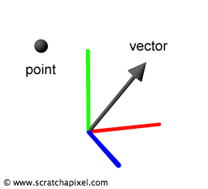
To make the following problem understandable, we now need to look at the components of a vector. In the figure above, the vector has 3 components: An X, a Y and a Z value. Thus we have a direction in a 3-dimensional space, which we as humans can easily imagine and represent.
But now I don't have 3 individual values, but 46. Since we can't imagine this in our brain in any way, I had to carry out a dimensional reduction with the help of the following algorithm.
Principal component analysis (PCA)
With the help of this analysis, one can easily transform multi-dimensional vectors into low-dimensional ones (2d or 3d). It is important to ensure that as little information as possible disappears. In other words, we try to represent similar vectors closely in the lower dimensions and thus retain the differences. If you want a detailed explanation of the algorithm, you can find it on this Wikipedia page.
Recap
So now I could create a 3d vector from pure human-written text that describes the content of a post. Posts that report on the same topics should therefore be close to each other.
Visualisation
In order to be able to display many 3D vectors clearly, you do not draw all directions in a 3-dimensional coordinate system, but only add a point at the end. It then looks as if you had only worked with points throughout, but this would not have worked.
On the axes you will not read X, Y or Z as labels, but "comp-1" for example. Don't let this confuse you, because it goes by the components (short: "comp") and the first component would then be the X-axis.
Only pictures of relevant/interesting situations have been uploaded. If you are interested in another picture, please feel free to ask for it in the comments.
Communities
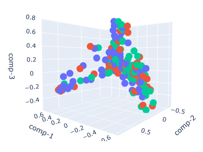
First, I started by randomly selecting posts from my database that were published in one of these communities: Food, HiveDev, Photography, Splinterlands, Gaming, Travel. To keep it clear, only 100 posts were chosen and then visualised through the process described above.


Observations
- You can see that when you look at all the communities, there is a lot of overlap.
- The Food, HiveDev and Photography communities are quite different in terms of content (which should be obvious). You can clearly delineate individual areas. The same applies to Food, HiveDev and Travel.
- The contents in Photography and Travel are close to each other and overlap. This may be due to the fact that travel posts usually have photography content as well.
- The food and travel communities sometimes overlap. But there are also clearly separable parts. The reason for overlap is probably travellers reporting on local food.
- The Splinterlands and gaming communities clearly overlap, although the gaming content is more scattered because people also write about games other than Splinterlands.
Front ends
Secondly, I analysed different front ends. I randomly selected 75 posts from each of these front ends: peakd, hive.blog, ecency, 3speak, actifit, leofinance, dBuzz, spintertalk.


Observations
- From general front ends like peakd, hive.blog and ecency, any content is published
- Actifit and Leofinance users post about different topics. However, sometimes Leofinance posts overlap, as they can also be about sports. The same is true for posts from Travelfeed and dBuzz as well as Leofinance, with a few dBuzz/Leofinance posts about travel
Improving the reprentation
Since the visualisation of the results is subject to my AI, that would be the right approach to improve. But because good results are already calculated in the current execution of the AI and a larger scaled training only for a slightly increased accuracy would blow up my entire server resources, an improvement in this respect is currently out of the question.
Summary and essence of it all
So you can clearly see that people post about a wide variety of topics on HIVE and that specialised front ends are also available for this. Therefore, the results of my work were nice to see…
I hope you enjoyed my work and that it wasn't too mathematical for you!
Have a nice day - Christopher
Wow, this is an interesting tool for analysis. I assure you this is very useful in the area of marketing and content reach evaluation. Good job my friend.
!1UP
You have received a 1UP from @latino.romano!
@stem-curatorAnd they will bring !PIZZA 🍕
Learn more about our delegation service to earn daily rewards. Join the family on Discord.
Das ist ein Test
wonderful day
I like it
hey ho
test5678
great
i think to
567