A Couple of Observations About Climate Change
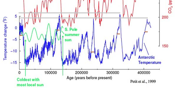
What you see before you is an image of the graphical representation of the Vostok Ice Core data. I wanted to pull the data and create my own graph, but surprisingly the data has disappeared from its historical repository, and the archived copy has also disappeared. However, viewing images from papers written on the topic is possible.
Being able to visualize data helps to generate hypotheses that could open further areas of research and discussion. For instance, I added two lines in gray. Most people agree that temperatures peak every 100,000 years. However, looking at the gray lines, there may be an additional 200,000-year cycle where temperatures peak higher. During the previous cycle, the temperatures were higher than the present. The current maximum temperature is more like the 200k and 400k maximum temperatures.
Additionally, I marked using brown lines 9000 years after the peak temperatures. Compared to previous cycles, the current temperature is within a range of a couple of degrees in similarity. The one significant difference is the 200k cycle, which was -10 degrees C lower. I must assume that such a temperature difference would put it into the heart of a glaciation. Is it possible that instead of looking at high CO2 levels as a problem, it has actually been a solution?