R Language - How to Use Plotly Package
In this post, we take a look at how to use Plotly Package in R. This is one of the powerful and popular package among the people of data science. It is used for the data visualization. It can make it easy for you to collect data and visualize it in various graphs, charts and plots.
Plotly is a very popular package that is available for both - Python and R. You may find that it's easy to draw plots and the Enterprise edition allows even more granular control over the data and visualization.
This package makes it easy to create the interactive charts. So for those who want to make the chart that has sliders or the option to create animated charts, that is also possible using the package.
I have created a video to give you an overview on how to use the Plotly Package for the data science work. You should give this one a try.
If you want to learn through visual means the above linked video should be of help. However if you want to try out the written instruction and to get the brief idea of the package, you may want to try out the below small tutorial.
Install the Package
First thing that we do most of the tutorial is install the package. So in order to install the plotly package try the command below.
install.packages("plotly")
library(plotly)
It should something like this in your R studio IDE. If that is what you are using to create your project in the R language.
After you install the package the next thing is we have to come up with the data set. That is going to be helping us to plot the chart. Right, so we have this data.
data = data.frame(x = c(5,10,15,20,25,30,35,40), y = c(2,5,6,8,1,9,5,3))
Now that we have library and the data, we have to also make sure to draw the plots like say line plots using the Plotly package.
figure_1 <- plot_ly(data, x = ~x, y = ~y, type = 'scatter', mode = 'lines')
figure_1
The plot seems like easy to spot in the plot tab of the RStudio which would look like something below. I am sure you would love the plot output.
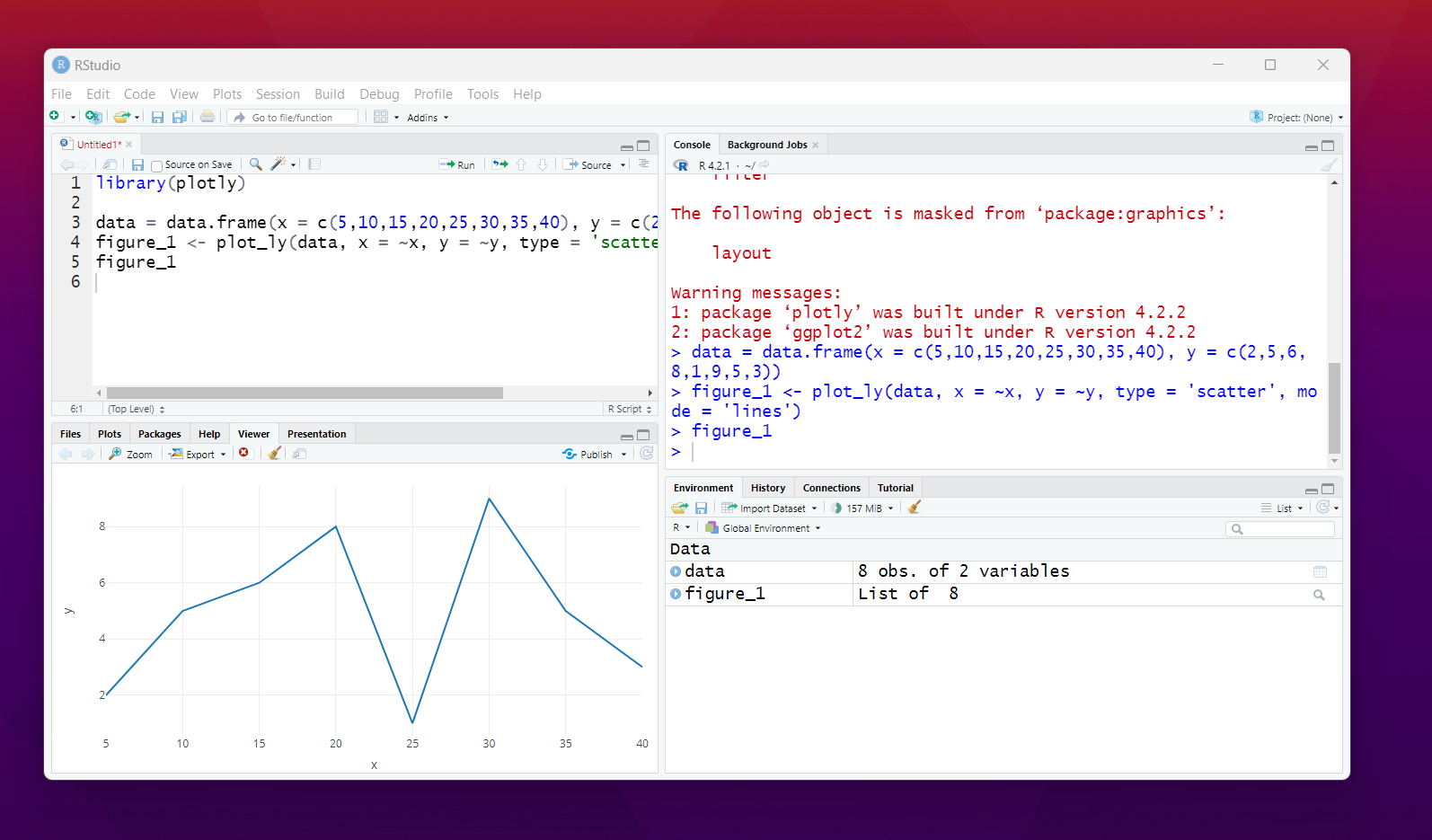
That's it. You now have basic plots through the plotly. You can create various types of the charts in the R. And the data creation and also passing to the plot functions is also easy and can be done. I personally prefer the Plotly and ggplot2 package.
I have been creating a lot of content on the data visualization each week. And posting them during the Friday morning (IST) time. You may want to create notification for the channel if you want to get the content in this topic.
Now upto next 6 months, I am going to be releasing the plots and the charts specific tutorials each week. So it'd be cool to cover some of that in the channel. Apart from that I am also going to cover the Power BI related tutorials in upcoming chapters.
I have plans to do the Python based visualization too. But considering the 2023 given to entire R based tutorials, I suppose 2024 I'd be getting the Python based visualization. It'd take a bit more time to make the content so hopefully I get enough power by the lord to work on this.
I hope that you are enjoying some of my R language and data science tutorials. I hope that some of my coverage on this topic would be helpful to you.
If you happen to like this content, do give me feedback over there and that would help me improve my efforts in near future.
I think that plotly is also available in other programming languages, it is very cool

!1UP
You have received a 1UP from @gwajnberg!
@stem-curator, @vyb-curator, @cent-curator
And they will bring !PIZZA 🍕.
Learn more about our delegation service to earn daily rewards. Join the Cartel on Discord.
I gifted $PIZZA slices here:
@curation-cartel(1/20) tipped @devpress (x1)
Send $PIZZA tips in Discord via tip.cc!
Thanks for your contribution to the STEMsocial community. Feel free to join us on discord to get to know the rest of us!
Please consider delegating to the @stemsocial account (85% of the curation rewards are returned).
You may also include @stemsocial as a beneficiary of the rewards of this post to get a stronger support.