R Language - How to Create Waffle Chart in R
In this post, we take a look at How to Create Waffle Chart in R. This type of chart is popular among the developers. In fact github uses this in the commit and daily update type of the chart too. You would be finding this chart in the profiles of github users.
Previously we checked out how to make use of the venn diagram in R. In that case we made use of the ggplot2 library. And there are other options for you to try out when it comes to the diagram. And also it was pretty cool to make use of the venn diagram for the data like that.
We are going to make use of the waffle chart here and for this we are going to be using the RStudio. Once this is used you can think of the plotting easily and everything is possible to be run from one single interface. So make sure to use the RStudio IDE here.
I have created a video to give you an overview on How to Create Waffle Chart in R. You should give this one a try.
Let's firs try out the install of the two libraries - waffle and devtools. You can install them and check out if they don't throw any errors so try the below commands in RStudio.
install.packages("devtools")
install_github("hrbrmstr/waffle")
and once you install you would have to use the libraries.
library(devtools)
library(waffle)
You would have setup like this below.
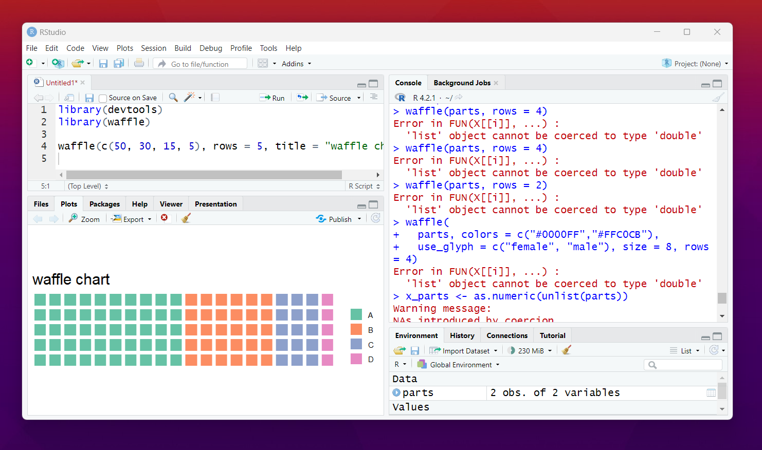
Now we need a sample data. Data that we want to be plotting on the waffle.
waffle(c(50, 30, 15, 5), rows = 5, title = "waffle chart")
You data should look something like this. and now we have to plot this with simple calling of the function waffle.
That's it. You have learned how to create a waffle chart. You can now proceed ahead by adding the color to the waffle chart. You can also add the variety of data changes like with different data set would plot the different waffle.
More you customize the more you can find variations in the final output. I think there is also option with the plotly and ggplot2. As you know I have used very simple data but you can extend this with more complex data of your choice. That would make viewing data lot easier.
You can work with 3 or more variables and also make use of the color gradients here. That would be another changes that would be something you can try out. I realized how the waffle can be easier to use when it comes to the design of the chart and also how the overall design works.
Now that we have done some of the plots. I have to also try out some really good other tutorial with the different plots which have not covered earlier. I am going to be covering the Power BI in the August and onwards schedule. I have done some database specific tutorials and which may appear later year.
Now the thing is I have to think of the good datasets worth discussing. Like I covered the iris dataset worth checking out. I think some of the libraries and the plots would be worth using when you try out according to the datasets. So that work would be worth checking out through examples and tutorial there.
If you happen to like this content, do give me feedback over there and that would help me improve my efforts in near future.
Thanks for your contribution to the STEMsocial community. Feel free to join us on discord to get to know the rest of us!
Please consider delegating to the @stemsocial account (85% of the curation rewards are returned).
You may also include @stemsocial as a beneficiary of the rewards of this post to get a stronger support.