R Language - How to Create Spine Plot in R
In this post, we take a look at How to Create Spine Plot in R. For this tutorial, I wish to use the base package and not rely on anything specific from external or 3rd party package.
Previously I posted about the Radar Chart in R. This is not much used chart so there was not much depth to the same. Instead I made sure to show the basics and also the configuration. So from that point you can take things ahead on your own.
Now for this tutorial, I realized that it's better to use the existing data sets. And you can use them for drawing the spine plot. It's pretty cool to see how that can be easily viewed. Some of the time you can use the dataset from your own data source but make sure to filter the same.
I have created a video to give you an overview on How to Create Spine Plot in R. You should give this one a try.
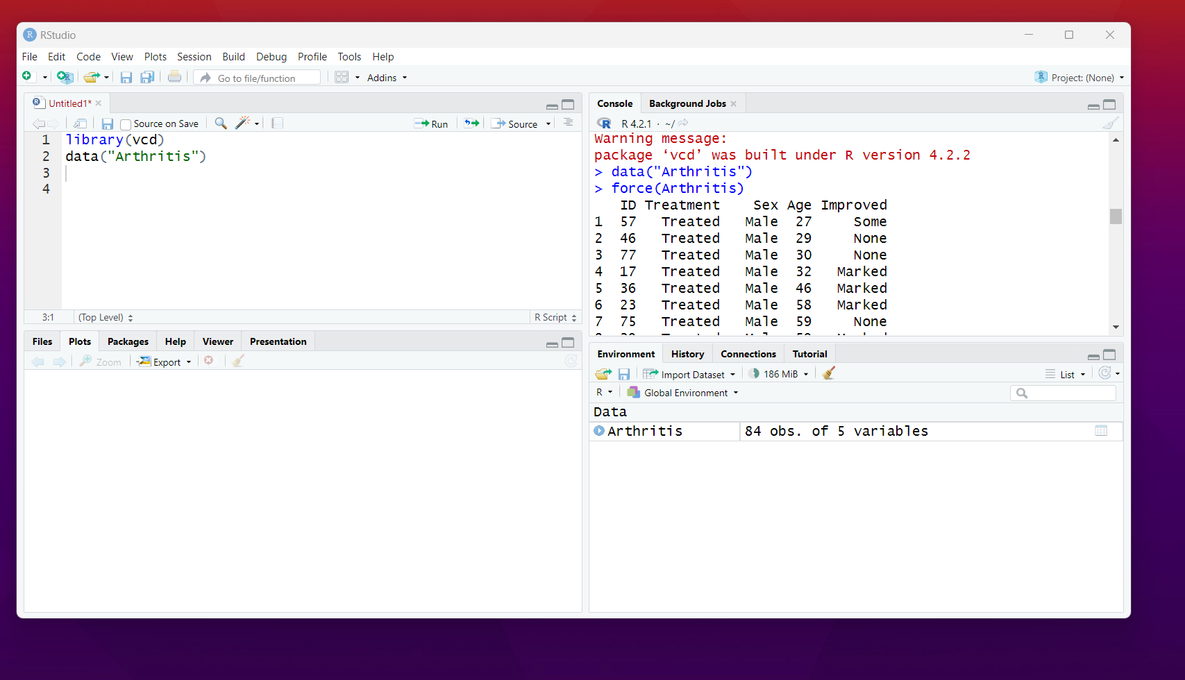
Let's take a look at our RStudio. And we are going to be adding the packages required for the Spine. And for this we are also going to be making use of the vcd package. And then using the arthritis dataset for this.
library(vcd)
data("Arthritis")
You can even check the data in the set. And you can get the data in the print there. Which would make things easier for you to view the data.
Now we will make use of the data for plotting the spineplot. For this you can use the code below.
library(vcd)
data("Arthritis")
head(Arthritis)
(spine(Improved ~ Treatment, data = Arthritis))
If you run the code you would be getting the chart that looks something like this.
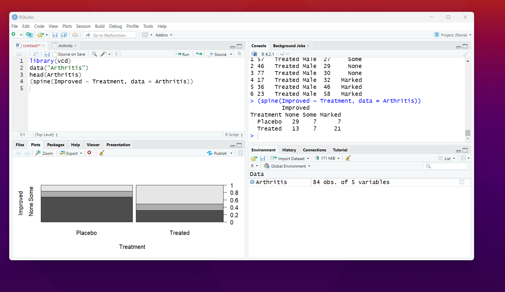
As you can say that the plot has the spine like design. That color code that breaks the color of the spine and it looks like a block would be the thing that you would watch over there. And that is what is in the output. You would also find a good result from that code if you tweak some.
Now that you have learned some of these packages. You can go ahead and try this on your own. There are things like this you can do. Like say colors, font, height and the things would be a good thing. So you can check the same by experimenting the code.
One more thing to explain. I have these data science tutorials set that would be scheduled on youtube channel upto April 2024. So I need more options for myself to make more videos and that would be a good direction to design the tables. If you have suggestion on covering the packages in R and Python do let me know.
I would be covering some of the tools like Minitab, SPSS and few other types of the tutorials. But for now it seems like some of the options that I have with them are kind of limited as there are not many projects out for me. But let's hope I find something by the end of this year.
If you happen to like this content, do give me feedback over there and that would help me improve my efforts in near future.
Thanks for your contribution to the STEMsocial community. Feel free to join us on discord to get to know the rest of us!
Please consider delegating to the @stemsocial account (85% of the curation rewards are returned).
You may also include @stemsocial as a beneficiary of the rewards of this post to get a stronger support.
Congratulations @devpress! You have completed the following achievement on the Hive blockchain And have been rewarded with New badge(s)
Your next target is to reach 700 replies.
You can view your badges on your board and compare yourself to others in the Ranking
If you no longer want to receive notifications, reply to this comment with the word
STOPCheck out our last posts:
Support the HiveBuzz project. Vote for our proposal!
Your publication has been voted by Edu-venezuela. Your post will carry over to other curation projects for more voting support. Keep up the good wok!