R Language - How to Create Dendrogram in R
In this post, we take a look at How to Create dendrogram in R. This would be a good use case for those who want to create the charts specific to the use case in the planned data like politics, health and others.
Previously I covered the pheatmap chart in R. That chart was pretty cool and the common for the Github like progress in the chart. Also the use case was common among the people who wanted to plot simple ideas into the chart.
I am making use of the RStudio IDE for the development of such charts. And for anyone who wants to try out the charts in the dendrogram type would find the proper use case with large and also the specific datasets that you can try.
I have created a video to give you an overview on How to Create Dendrogram in R. You should give this one a try.
For this tutorial we are going to make a stat package. And we are going to be making use of hclust function. And the data would be USArrest. This is a package that would be a good dataset for our use case. So let's first work on that part.
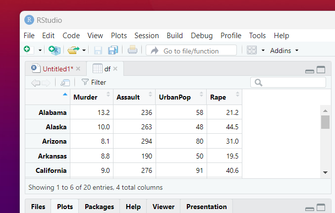
head(USArrests)
And now we will be making use of the USArrests package for creating a data frame.
df <- USArrests[1:20, ]
Next thing would be making the package from the stat in the library statement.
require(stats)
Let's first create the distance matrix.
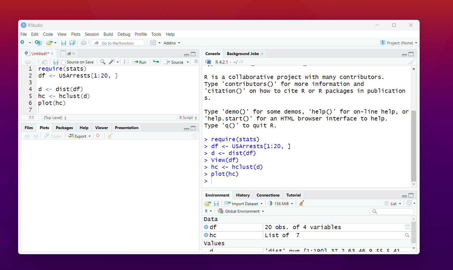
d <- dist(df)
next part would be creating the hierarchical cluster.
hc <- hclust(d)
Finally plot the dendrogram.
plot(hc)
You would have the plot that looks like below image.
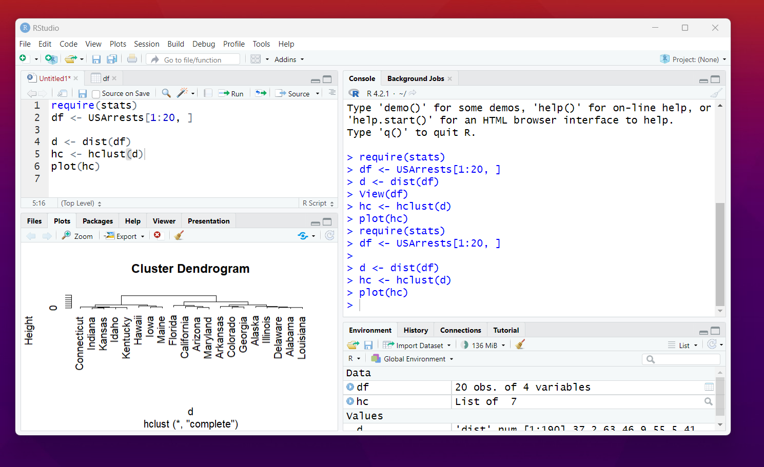
That's it. You now have the dendrogram ready. As you can see here you would have the simple data from the dataset that we used. Which is USArrest. You can use any other data and that would be a good option for you.
Another option is you can also use the political data and the species or the biology related data for plotting your various dataset. So that would be a good use case for you. And it would be lot easier for you to plot things as well.
If you have tried both pheatmap and the dendrogram as two plots. It would be a good use case for you to try some dataset which are complex and have the relationships like more sub groups etc. That would be easier to plot with these two type of the libraries.
I have created few more tutorials in the same series and then I'd be shifting gears towards the ggplot. That library and the plotly is what I am trying out these days. So more videos covering the same part would be in the cards. Let's see where things move from here.
For those who are not aware of some of my data science tutorials. You may want to check the channel and also the playlist where I have new content. I am sure you would love the series on data, automation and other topics.
If you happen to like this content, do give me feedback over there and that would help me improve my efforts in near future.