R Language - How to Create Beeswarm Plot in R
In this post, we take a look at How to Create Beeswarm Plot in R. This plot is often used for the datasets like population, health, weather and also some of the specific data that needs to be viewed in a particular way.
Previously I covered the plot named - Voronoi Plot in R. It was one of those coolest plot. And I am sure those who managed to plot it through my tutorial found it worth using in their use case. Same is the case with today's tutorial you can explore on your own once I explain.
Make sure to download the RStudio as it would be easy for you to set things up with the plotting and the data. It seems like a good option for anyone who wants to do that in the context of the simple data that can be used with immediate plot visible in same window.
I have created a video to give you an overview on How to Create Beeswarm Plot in R. You should give this one a try.
Let's start first.
We are going to be making use of the beeswarm library. And this library is being used for plotting the variety of plots through the beeswarm. You can even manage some changes in data and the features and you would get the plot changed with color and the distribution.
So here's the declaration.
install.packages("beeswarm")
library(beeswarm)
So once you do that you would have screen like this where you would be ready to add the data into the code that we have here.
Now let's talk about the data. So we make use of the seed and then use the random normal data into the x variable. And we are going to be feeding that to the function.
set.seed(1995)
x <- rnorm(300)
Now that we have the data, next thing we have to check is the beeswarm function.
beeswarm(x)
Look at the map below so that you would get the idea of how the plot can be viewed here.
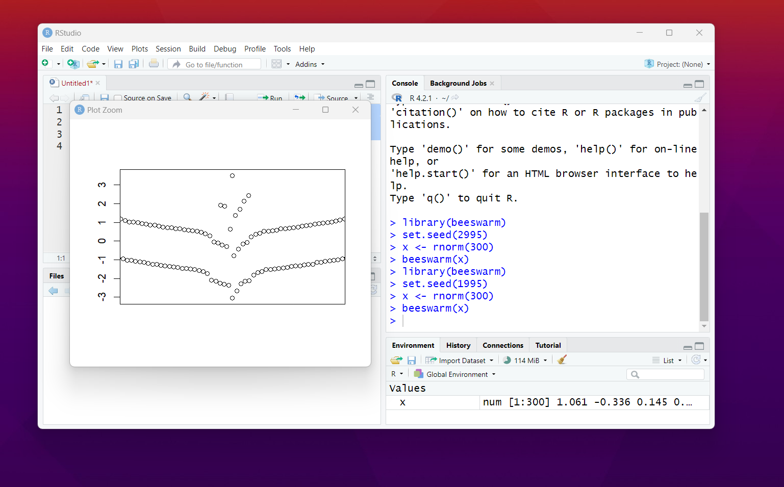
That's it. We have managed to add the code and we have plotted the beeswarm plot. So that would give you initial push for the plot. And now you can go ahead with the variety of the changes in the variables so you can go ahead with the values.
You can change the color, symbol and the size of the plot. You can change the variables for the same and that would help you plot the things and get them started as well. So some of the time that too needs to be watched around as well. e.g. check the function below for the same.
beeswarm(x, col = 2, pch = 18,cex = 1.5)
Now there are some of the things you can do more like changing the orientation to vertical and the horizontal. So that would give you an idea of how the things can be managed. Though it would not be that easy but if you manage to edit the code the right way things would be super easy to handle for anyone.
This is one of the plot series that I am continuing. The sad part is that my videos are getting the less views. I wish you guys share my videos to Whatsapp and the Telegram as that can help me get more views. I would appreciate your small gesture in that case. I hope to get this tutorial series to as many people as possible.
If you have any request for the tutorial in the data science series, do let me know in the comments. I would love to know about the same and then I am going to make sure to make some content specific in that regard. It would help a lot in getting the views too.
If you happen to like this content, do give me feedback over there and that would help me improve my efforts in near future.
Thanks for your contribution to the STEMsocial community. Feel free to join us on discord to get to know the rest of us!
Please consider delegating to the @stemsocial account (85% of the curation rewards are returned).
You may also include @stemsocial as a beneficiary of the rewards of this post to get a stronger support.
Congratulations your publication has been chosen among the best of the day.
KEEP CREATING GOOD CONTENT.