Excel fun: Charts!
Hi fellow Steemians and Excel enthusiasts,
Today I'm posting about some more Excel fun I've been having. It's been a few months since I've got to explore different aspects of Excel but I am hopefully going to be doing more of that in the coming weeks and months. I've got a Tableau training coming up, so I'm pretty excited about that as well.
Excel Charts
Excel charts are a pretty cool way to show off some flare with the data you've painstakingly put together. I made an abridged version of it, but I think some of the same principles still apply. I was recently on the excel club website, Excel Club Learn & Earn and was excited to see some things in there that I could do and play around with. I plan on going into the more advanced ones in the coming weeks and posting my experiences!
Today's experiment was with some charts, specifically the Funnel Chart. I also messed around with a Pareto chart and a Line Graph.
My data
The data I've been working with quite a bit over the past few months is volume and turnaround time (TAT). In certain industries, in order to increase profits and satisfaction, you need to decrease the TAT for various things. Eventually I may go into the industry I work on, but I'm not too keen on sharing everything about my life online so I will just note that these are very important metrics to the area I work in.
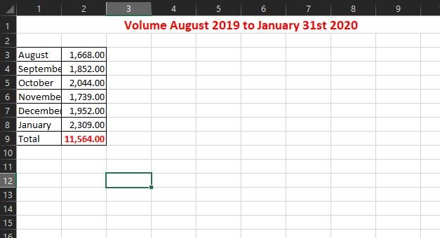
As you can see, the numbers aren't too small and they are grouped fairly close together so the charts I have been trying don't do much besides just being visual for the overall volume over the past few months.
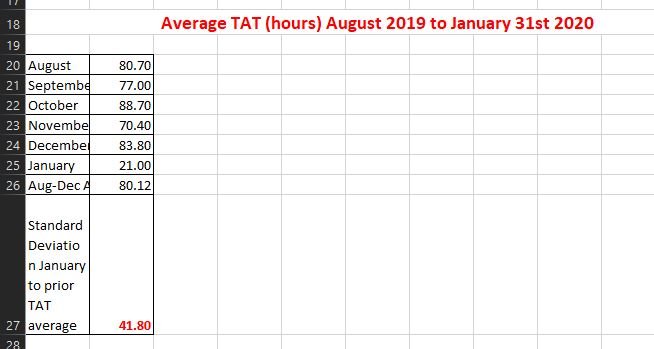
Where the Funnel chart really looks cool is with these types of numbers. The TAT for the space was an issue for a long time until there were some changes made recently and you can see the precipitous decline in it in January. That was cool to note, and they will appreciate the feedback. These types of things are one of the reasons I've come to like playing around with data and numbers, and probably why I got an A in statistics when I was at the university.
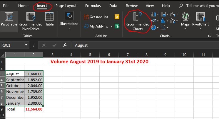
I've got my data highlighted and now I'm trying to determine what chart I want to use. I originally did the Funnel chart and a Pareto chart, but I didn't really like the Pareto chart since it didn't do anything for me visually so I ended up removing that. I also couldn't figure out exactly what that line going across it represented, so that was another point I didn't like much.
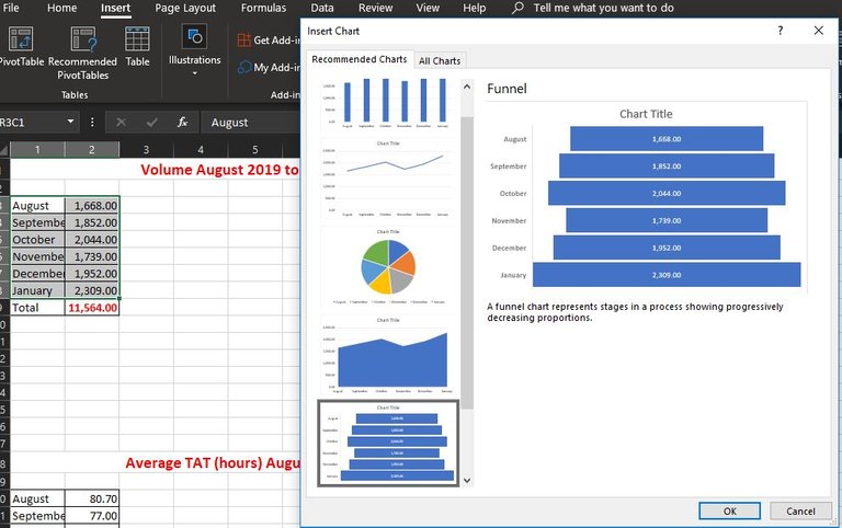
There's lots of options there, so I'm going with at least the Funnel Chart to start and an additional one after.
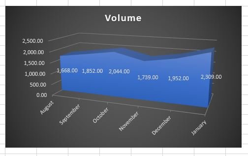
I settled on a cool chart I think, a 3-D stacked area. It represents the data better than other visualizations, I think.
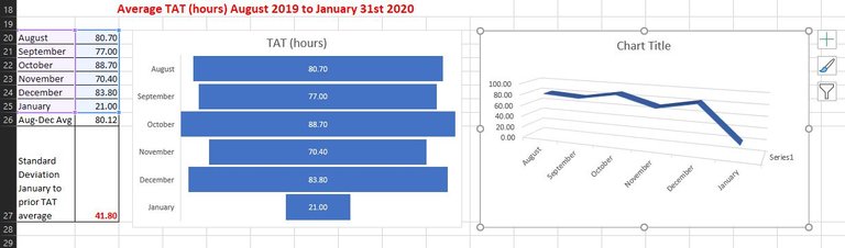
I think the marked decrease in TAT in January really benefits well with the Funnel Chart and the 3-D Line Graph visualized above.
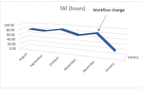
It was cool to add some jazz to the line graph that wouldn't fit well with another chart. I liked adding the line denoting that a workflow change happened on the 31st of December, to begin the 1st of January. With that you could see the precipitous decline in TAT that happened, given that December was the 2nd highest TAT in the dataset. I was messing around with the standard deviation units as well, trying to denote the big difference between the January new average and the average of the prior few months when averaged out. I don't know if it ended up working well but I have to read up on Std. Dev again, it's been a while since I did work with it.
Learning continues!
The beauty about Excel and other things is that you are almost always learning. It's such a complex and encompassing program that even the developers aren't masters in all of the areas I would imagine. Everyone has their own niche in the software and it's cool to find one for yourself. I think I've certainly found my niche that I will enjoy expanding upon in the power (no pun intended) of Power Query. Once I learned that, combined with pivot tables, my abilities have really gone up!
I had showed a colleague of mine, who is quite a bit older than me, the sheer beauty that is pivot tables and almost every time I see her, she thanks me numerous times. I felt bad one day when her and I were working on a non-related thing and she was showing me a few things in Excel she has to do in order to fuss out the data she needed and I told her that pivot tables, if she wants to learn, will totally change her life and they have. She said what used to take her hours of crunching and double checking to make sure she had it right, is finished in minutes with pivot tables once she formats the data. I really enjoyed teaching her it and I think, in my experience, one of the best ways to learn yourself is to try to teach it to someone else. Often, you learn a lot more in those times than you do on your own I've found.
What have you learned in Excel recently? I'd love to know, basic or advanced, it's all important! I think what I did was fairly basic but it wasn't something I did since I wasn't too concerned with presenting to others the data until recently when I finally had at least 6 months worth. I think my brief little presentation will hopefully go over well!
Since I plan to post often about Excel, I will start compiling a list of my Excel posts! I'm hoping I can post about these every Friday or every other Friday depending on my workload. I did this particular post in the "Learn and Earn" series on her Excel club website, there are some valuable things on there to learn! I'm excited to try the next one in the next few weeks.
I would also recommend checking out Paula's Excel club website, I personally have really enjoyed the things she posts on there! She is an Excel guru for sure! You can find it at: The Excel Club
Connect with me!
Did you enjoy this post or my other posts? Please consider following me for more! @cmplxty
Do you want to get paid, in crypto, for searching the internet? Try using and signing up for Presearch to earn some great crypto! I've currently got 585 PRE tokens, with a market value of $2.50. It doesn't sound like a lot but when you search using sites like Google you get paid $0! Join Presearch to break Google's stranglehold on the internet searches. If you'd like to sign up, use my referral link below and spread the word!
https://www.presearch.org/signup?rid=513043
Still using Steemit.com? Upgrade! Steempeak is a much better user-interface, gives loads more information at your fingertips and has some great developers behind it. Give it a try, go to www.steampeak.com and see how much easier it is. You just need to use Steem Connect, one of the most secure ways to log into other Steem frontends.


Shared on Twitter!
https://twitter.com/XtyCmpl/status/1228442009750396929?s=20
Nice post :)
Thanks! Excel is awesome.
Hi buddy
I found it hilarious to read the title of this post. Word "excel" and "fun" next to each other? hehehe :)
Dohhhhhh......Excel is fun, way fun, you just haven't found the right teacher yet :-)
It's me again @theexcelclub
I just realized that I never actually thanked you for your comment. Big thx.
ps.
I would need to ask you for little favour. Recently I've decided to join small contest called "Community of the week" and I desribed our project.hope hive/community. Would you mind helping me out and RESTEEM this post - just to get some extra exposure? Your valuable comment would be also appreciated.
Link to my post: on steemit or on steempeak
Thanks :)
Yours, Piotr
great post, although I am not a fan of 3d charts.
Thanks for the shout out. Im always learning new things about Excel, there is so much new stuff being released on excel 365 its hard to keep up
Thanks for checking it out! I’m not a fan of them either but I’m trying new things out, see what I like! Not my favorite but I think they could be useful depending on the scenario.