UI/UX Colour Rules.
Like many people, I started learning to code through YouTube videos and I code along. After a few months, I got my first gig, and it felt so good that I am getting paid for programming. After a while, I decided to further make my skill better, and I enrolled in a coding school around my city. I got all the things I needed to know about building front and back applications with React Js and Node Js. I started building, and I built a full-stack application as my project to earn me a certificate.
However, I lacked something. I did not know how to use colours properly when building a front-end app. There are some projects that the client will not provide the resources for a UI designer and as a developer, you may have to use your initiative to come up with something or probably hack projects that are similar to what you are working on and smartly use the UI. But whenever I do that, I mess up with the colours. However, after diligently checking on how to get better at this, I got a solution. Some months ago, I finished a project that everyone around me almost licked their screen because of the sleek colours and how it was being used. So, today I will share a little solution and how to make your colour selection better, more mature, neat and not distracting.
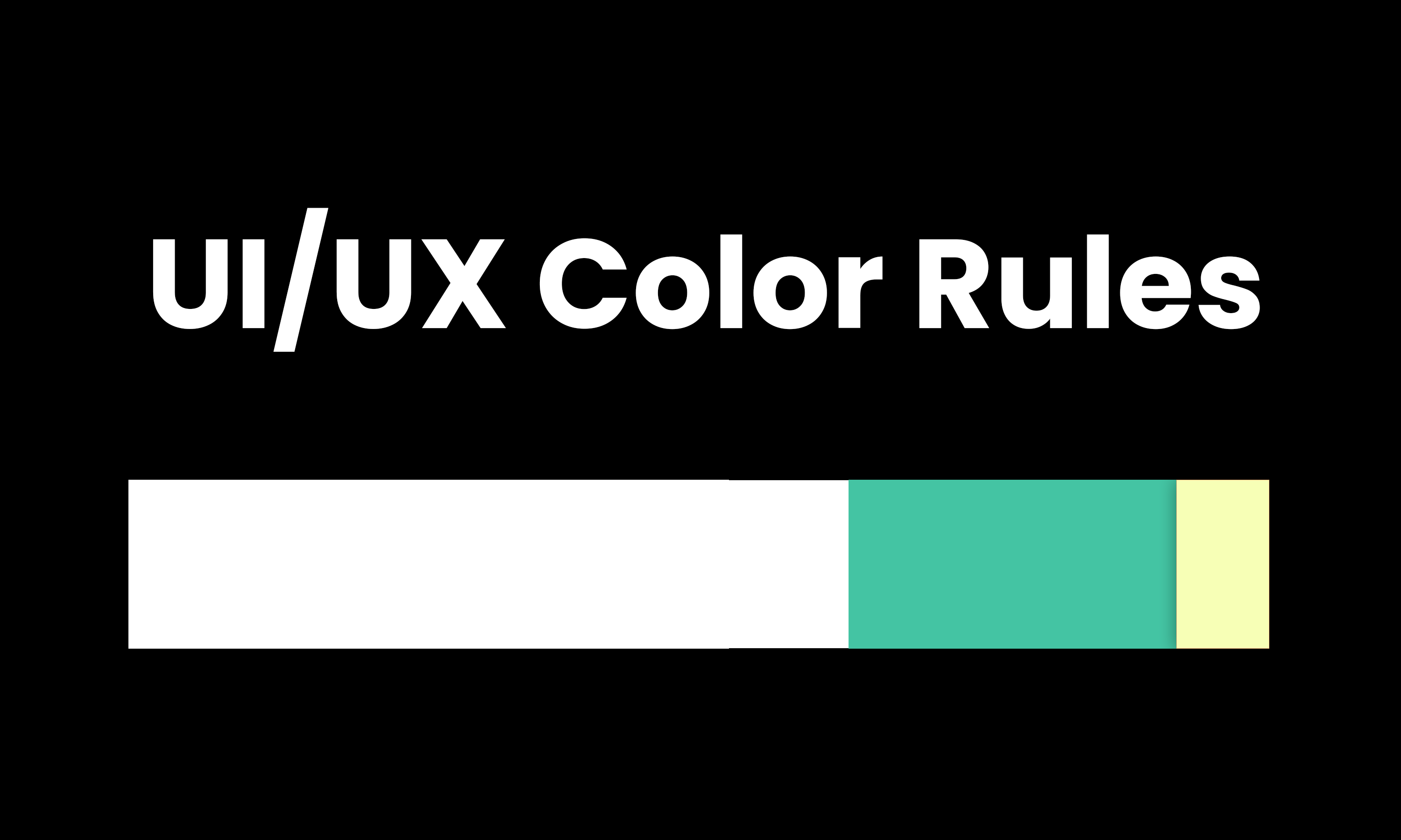
The 60, 30 and 10 colour rules
Simplicity is the best and the colour combination should be in the form of 60% base colour like the background, 30% primary colour (the brand colour) and call to action should be 10%. This way you will have a beautiful interface for your website. I will drop an example below.

60% of the base colour
30% of primary colour
10% of secondary colour.
I am tykee, I do dev things and write.
Posted Using LeoFinance Alpha
Color is a critical component that can influence user perception and responses. The 60-30-10 rule is indeed a helpful guideline, but it should be adapted according to the purpose and target audience of the interface.
Color accessibility, including appropriate contrast and consideration of different types of color blindness, is essential. In addition, while colors can provide immediate visual feedback, it is important to remember that color associations may vary between cultures.
I believe the effective use of color in UI/UX design is a careful balance between aesthetics, functionality, accessibility, and color psychology.
Thanks for the comprehensive feedback. I agree with the aspect of considering the targeted audience and the cultures.
Your post is an interesting one.
This is really interesting. I have thought of watching youtube courses about UI design since It compliments perfectly my two areas of interest which are copy and programming. I'll definitely give It a try after this.
I remember a trick I've learned from a copywriter I follow. It states that to keep the prospect's attention, you should change colors every now and then to keep novelty (As long as they are still the colors of the brand). I guess this would work more on landing pages or those where heavy amounts of text are introduced.
That being said, this is a great post. I would love to know about your experience with web programming/design. What languages do you use for the backend? I'm learning how to create functional websites through Flask for Python and MySQL databases.