Light bulb with CSS
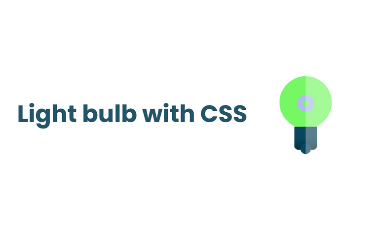
I just thought of creating something simple and fun with pure CSS and light build came to mind. It is primarily changing the color of the background when clicked and I simply used a checkbox so that I will not create any click event with Javascript. There are many ways to achieve this. Learning never ends in the tech and programming space and the most basic thing might be the problem you will encounter when building something big. So yeah, have fun.
HTML
<!DOCTYPE html>
<html lang="en">
<head>
    <meta charset="UTF-8">
    <meta http-equiv="X-UA-Compatible" content="IE=edge">
    <meta name="viewport" content="width=device-width, initial-scale=1.0">
    <link rel="stylesheet" href="style.css">
    <title>Bulb</title>
</head>
<body>
<input type="checkbox" id="light_bulb"/>
<label for="lightbulb"></label>
</div>
</body>
</html>
CSS
* {
  padding: 0;
  margin: 0;
  box-sizing: border-box;
}

input[type="checkbox"] {
appearance: none;
position: absolute;
display: block;
height: 250px;
width: 250px;
background-color: #d0d5f4;
transform: translate(-50%, -50%);
top: calc(50% - 50px);
left: 50%;
border-radius: 50%;
cursor: pointer;
}

input [type="checkbox"]:before{
  position: absolute;
  content: " ";
  height: 100px;
  width: 25px;
  background-color: #b4b9f1;
  bottom: 0;
  margin: auto;
  left: 0;
  right: 0;
}

input[type="checkbox"]:after {
  position: absolute;
  content: " ";
  height: 30px;
  width: 30px;
  border: 25px solid #b4b9f1;
  border-radius: 50%;
  margin: auto;
  left: 0;
  right: 0;
  bottom: 80px;
}

label {
  position: absolute;
  height: 110px;
  width: 110px;
  background-color: #08475e;
   border-radius: 0 0 20px 20px;
   transform: translate(-50%, -50%);
    left: 50%;
    top: calc(50% + 120px);
    background: linear-gradient(#08475e 50%, #05303d);
}


label:before {
  position: absolute;
  content: " ";
  height: 50px;
  width: 50px;
  background-color: #08475e;
  bottom: -20px;
  margin: auto;
  left: 0;
  right: 0;
  border-radius: 50%;
}

label:after {
  position: absolute;
  content: " ";
  height: 500px;
  width: 250px;
  background-color: rgba(255, 255, 255, 0.3);
  bottom: -50px;
  left: 55px;
}

input[type="checkbox"]:checked {
  background-color: #77f866;
}


input[type="checkbox"]:checked:before{
  background-color: #47f430;
}

input[type="checkbox"]:checked:after{
  border: 25pxx solid #47f430;
}
You can copy and dump the styles in .css file and play with it.
I am tykee, I do dev things and write.
0
0
0.000
0 comments