The front design of a Logistics company. HTML, CSS.
Hello everyone, its good to be back here after some circustances which has deprived me of coding due to sickness but now better to handle the system and i remembered the last time which i posted one of my work in the community, i saw a lot of comment which has given me a greater edge to read more on what i was suppose to know, i was told about positioning and i believe i have been able to get one or two things from it and with time i will understand it so well as i do more project about positioning.
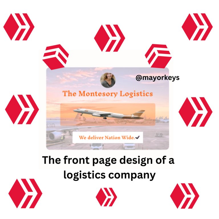
So today, i will be talking about my recent work which i did, and i see that no work is too cheap to ractice especially when you are just learning, so you will be able achieve the best when the hard times arises. The deisgn is just about advertsing a logistic company and how they deliver at their best, so all started with the html. linking it with my css link to make quick access to it.
<title>Logistics<title/>
<link rel="stylesheet" href="style.css/>
Moving on next to the body, for this design, the html doesnt have much of work in it but the delligence in the kind of work matters a lot, a little input error might actually cause all work to be scattered and also look so tiring, I will show the body now of which all the worl entails then i will now move to the main design which is the css then with time when the learnin expand, i will know more on the java script.
10. <body>
11. <div class="box">
12.  <p class="circle">
13. <img src="https;//via.placeholder.com/45x45"> </p>
14. <h3> The Montesory Logistics </h3>
15. <div class="Rectangle">
16. <image>img src="https;//via.placeholder.com/230x56"</image>
17. </div>
18. <div class="Rectangle white">
19. <h2> We deliver Nation Wide </h2>
20. </div>
Now that is just the little thing which the html coding entails and the main design where all work are directed towards is the css and let's check it out one after the other. For the first one which is the box, we added a background image of an airport to make it more attractive talking about logistics and all other features will be able to dwell on it.
box{
background-image: (https://via.placeholder.com/359x241);
width: 100%;
height: 100%;
position: relative;
border-radius: 10px;
overflow: hidden;
}
After the design with the box showing the image as the background, to make other features show on it, on has to reduce the transparency to ensure visibility and once that was done, i move on to the next one which is the cirle containing the image of the lady and you can check below for the css code
.circle{
width: 44.68px;
height: 44.68px;
left: 158px;
top: 15.54px;
position: absolute;
border-radius: 9px;
border: 1.27px  #ECD4D4 solid";
}
Moving on to the text part where this is showing the name of the logistics company, a better color has to be used so that the text can be seen well without straining the eyes, so made use of the orange color and the result came out so well on it.
h3{
left: 47px;
top: 52.15px;
position: absolute;
color:  #FF6006;
font-size: 19.08px;
font-family: Inknut Antiqua;
font-weight: 600;
word-wrap: break-word;
}
For orange rectangle another div was created and a little alpha was added which made it easy for the picture of the aeroplane to stay well and show well on it
.Rectangle {
width: 12.40px;
height: 9.35px;
left: 0px;
top: 0px;
position: absolute;
background: rgba(152, 79, 112, 0.06) 79%,  #984F70 96%)
border-radius: 5px;
}
For the image under the div class we added the image of aeroplane to fit in
image{
padding-left: 24px;
padding-right: 24px;
padding-top: 5px;
padding-bottom: 5px;
left: 41px;
top: 105px;
position: absolute;
overflow: hidden;
justify-content: center;
align-items: center; gap: 5px;
display: inline-flex;
width: 230px;
height: 56px
}
Now to the last part of the design which is beneath, having that white background and comprising of the text color which is giving credit to the work of the company,
h2{
width: 168px;
left: 96px;
top: 190px;
position: absolute;
color:  #FF6006;
font-size: 12px;
font-family: Inknut Antiqua;
font-weight: 600;
word-wrap: break-word;
}
So for the background on which the text is, the white one
.Rectangle white{
width: 206px;
height: 33.46px;
left: 77px;
top: 188.27px;
position: absolute;
background: white;
}
I know this is just a little out of what my bosses on here can do so i hope with time, i will be one of the professionals here too, with determination, i believe all will work well.
This is nice bro!! But in the future, when trying to build responsive layout, try as much as possible to reduce your use of positioning( positioning is usually used when u want a div content to overlap on another one)
I feel like you were trying to center your content...to do that you can make use of this (ignore the color and font style)👇👇
Okay bro. Thanks so much, i left a reply on your post about working together the last time maybe u didn't see it
Yeah sorry about that I didn't leave my discord name it's timix648 on discord.
Okay will send you a message
👍👍
Just like the first person said in his comment, I can see a lot of
display: absolutein your code and that's not a very good idea because of responsiveness. I'm guessing you're still new to frontend development, so you will learn more about creating responsive designs later on, where you can easily move and arrange items using simple properties like margins and width. But for now, this is good enough and you did a good job with the whole design 👍thanks so much for the comment, this is really giving me more motivation to do more