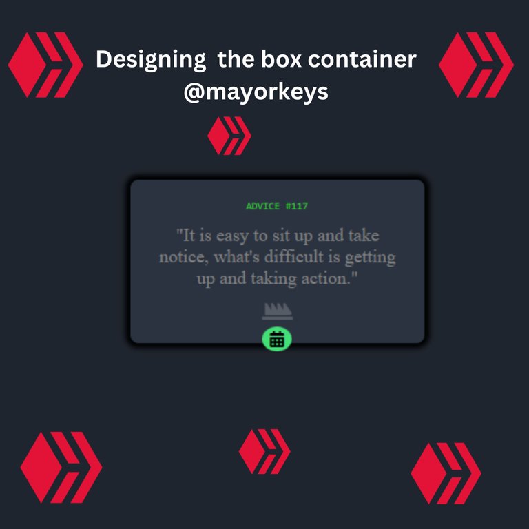
Designing a content filled container box Usinig HTML and CSS
Greetings to everyone in the community, top programmers and senior devs, it feels so good to be here sharing my ideas and my experience in HTML and CSS. actually, this is my first time of writing in the community and creating a post here. After going through a lot of challenges when preparing for the little project which was done, I started learning frontend not too long and I can say that the experience was so nice even though nothing comes so easily there have to be a lot of sacrifices along the line to become very successful in it.
During my learning when I started, I have been given a lot of ideas and advice to follow in order to be good and learn so fast and I think putting them into practice will really help me because that is a result which will give motivation to learner.
I was given a website in order to check out lots of tutorials that will hasten my learning just like w3schools and so on. Also, I was introduced to a website that is going to put me up for the greater tasks and this is the frontend mentor site which will set up a challenge for you and you will be able to submit and then see other's solutions afterward to compare with your code.
This made me also opt in to the challenge that I just submitted two days ago so I decided to share them here and see the view of others which i will also be opened to any form of corrections.
My first step was starting my HTML and code all what i would like to input and i gave it a title using challenge since i am doing one of the challenge in the frontend mentor site so for easy access
<title>Challenge</title>Since i will be using the CSS also, i added the link and code right after my title in the code which i used Vscode
<title>Challenge</title>
<link rel="stylesheet" href="style.css"/>
Moving on to the next one, due to the fact that I made use of Icon in my design so I needed to input the code, and to get my icon, I used the fontawesome website to get that. kits for various icons which will enable one to be able to add as many icons as you want was added in the head part using the script.
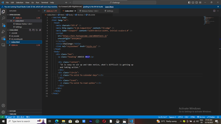
10.  <script src="https://kit.fontawesome.com/e0bb6f2e15.js" crossorigin="anonymous"</script>
11.  <title>Challenge</title>
12.  <link rel="stylesheet" href="style.css"/>
Now to the body which contains all the real information about what one will design, I had to create a having a class in it and since it is a box container which other information will be inside the box, I had to create all other div directly under the first div so all my CSS coding design will not give me much issue, created a div for the box and also each heading and followed by my main content then a div for a class of circle which directly under was the class icon where was able to add a different icon of my choice since I already added the kit link in the head of the HTML.
14.  <body>
15.   <div class="box">
16.    <p class="heading">ADVICE #117</p>
17.  <div class="content">
18.   "It is easy to sit up and take notice, what's difficult is getting up
19.   and taking action."
20.  </div>
21.  <div class="circle">
22.   <i class="fa-solid fa-calendar-days"></i>
23.  </div>
24.  <div class="icon2">
25.  <i class="fa-solid fa-road-spikes"></i>
26.    </div>
27.   </div>
28.  </body>
Now done with the HTML coding which I move on to CSS for the real design, In this css aspect one needs to be very cool because a single mistake can affect all previous code which will make the work very tiring, the first thing that I did was add screen size so it will be able to display in any form of view whether on the phone, laptop and so on. width which would have min and max width.
1. @media screen {
2.   min-width: 375px;
3. }
4. @media screen {
5.   max-width: 1440px;
6. }
I gave the body background color which is very important as that will decide how our design will look like and give it a display flex and also a align item option to be at the center
7.  body {
8.  background-color: hsl(217, 19%, 15%);
9.  display: flex;
10. justify-content: center;
11. align-items: center;
The design of the box itself will also need a background color, a shadow is added using the box-shadow and also the border-radius to make the edge curve and justify-content was needed to centralize it.
13.  .box {
14.   background-color: hsl(217, 19%, 21%);
15.   width: 18rem;
16.   height: 10rem;
17.   justify-content: center;
18.   border-radius: 8px;
19.   margin-top: 15rem;
20.   margin-bottom: 30%;
21.   box-shadow: 0px 0px 5px 5px;
after this, I started the design for the word using my class for easy access under my div.
23 .heading {
24. color: rgb(50, 200, 50);
25. font-size: 10px;
26. font-family: monospace;
27. text-align: center;
28. margin-top: 20px;
29. }
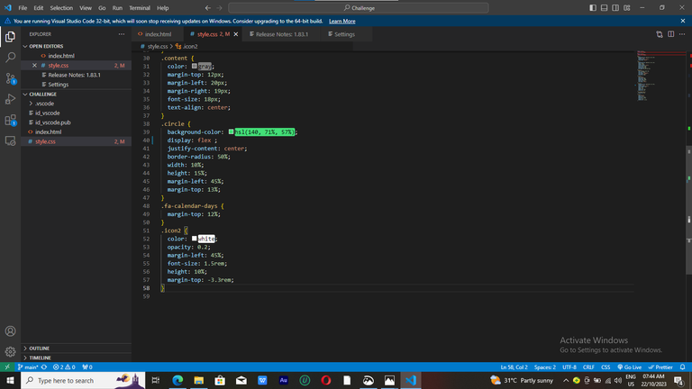
30 .content {
31. color: gray;
32. margin-top: 12px;
33. margin-left: 20px;
34. margin-right: 19px;
35. font-size: 18px;
36. text-align: center;
Design for the circle beneath and color was also added and margin for alignment was needed here.
38  .circle {
39  background-color: hsl(140, 71%, 57%);
40  display: flex ;
41. justify-content: center;
42. border-radius: 50%;
43. width: 10%;
44. height: 15%;
45. margin-left: 45%;
46. margin-top: 13%;
47. }
Now for the first icon which is directly under the div so a margin-top was used here to align it in the circle beneath.
48. .fa-calendar-days {
49. margin-top: 12%;
50. }
And finally, the second icon was added so this time around the color need to change so as to make it visible enough, a white color was added here.
51. .icon2 {
52. color: white;
53. opacity: 0.2;
54. margin-left: 45%;
55. font-size: 1.5rem;
56. height: 10%;
57. margin-top: -3.3rem;
58. }
Finishing this, I had to submit my challenge even though a lot of challenges arose during the process but I know as it continues with time, I will become more experienced in it.
This is the link https://www.frontendmentor.io/solutions/challenge-5aBh7vI4I3 to my submitted challenge for those who would like to check it out and also link https://challenge-ashen.vercel.app/ to the view if you don't want to check the screenshot.
Ohh nice I'm also still a beginner myself, and I believe constant practice will get us there!! Kudos for a job nicely done...the calendar photo, can be placed just like there's if you use positioning, so I will suggest that you read up on positioning too...kudos bro!!
The calendar, is it to position inside the circle well
Ohh no...I mean the whole green circle, to make it stay partially outside the box, u can use positioning.
Ohh okay. I think i was hearing about media query to show well on different phones and system
Yeah but i feel as a newbie you should first focus on learning how to recreate what you see, and when you are satisfied with your skills, you move over to making your design responsive on all devices.
Thanks so much. I will do that my boss🙇
You're welcome bro👊
Thanks for your contribution to the STEMsocial community. Feel free to join us on discord to get to know the rest of us!
Please consider delegating to the @stemsocial account (85% of the curation rewards are returned).
You may also include @stemsocial as a beneficiary of the rewards of this post to get a stronger support.
Great work! I want to do this kind of frontend challenge too, so thanks for your input and for sharing the link. How were you able to make a shareable link via vercel? I mean, is your vercel free?
The vercel is a free one and when you want to login on Vercel, you can login by using github, it wilp show create with github. So you have to create a github account..
Thanks! I already have a github account but I haven’t created a personal vercel account yet. I’ll make one soon! Thanks!
No problem