Color Perception in Architecture
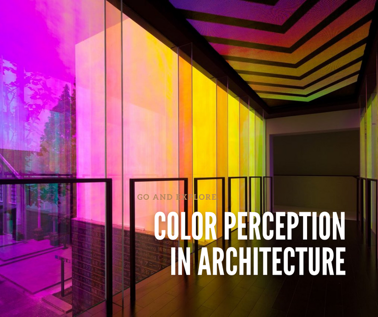
We regard color as an inherent component of our environment, reflects the living species of the natural environment and the habitat that we build. Colors played a significant role in human evolution, from cave dwellings to massive megacities. Colors have a psychological influence on how we perceive and objects or space. That is why color design is not limited to decorations on the architectural setting, but it helps set the mood of the living space.
We can say that color is a sense of experience. It is similar to our sensory perception. It can either be symbolic, associative or maybe emotional, which prove by recent studies. The designer used the colors to bring order and sanity to a living space to protects our psychological and physiological well-being. The designer must understand visual perception to invoke and processes a connection with color.
Our perception of color causes a slew of conscious and subconscious stimuli in our psycho-spatial interaction. The architectural objects applied with the right color give us a better experience of the space. We can get or experience the color sensation from shades of light that reflect through the material or shadows that define the depth of space. We can associate symbolism and even mysticism to colors that designers and artists expressed that it has multiple meanings, which could be cultural and historical.
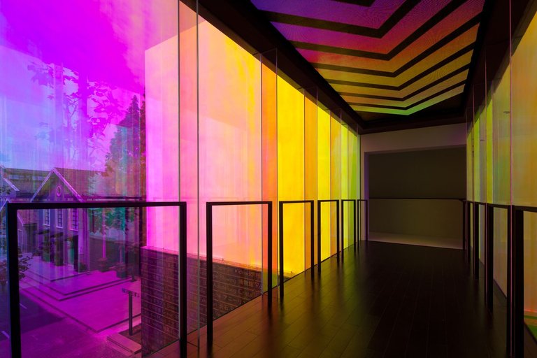
Design Wing, Coordination Asia.
Photo Credit: Archdaily
Colors and Our Brain and Eyes
Our brain processes visual information over 60,000 times faster than text, and 90% of the information received by the brain is visual. Colors are a vital element of how perceived visual information. That is why we use color psychology in marketing and branding. The psychological atmosphere or atmosphere that supports the operation of space influenced our perception of space by the impression of a hue and the message it communicates to us. For example, a classroom serves a different purpose than a hospital patient room. Color defines the boundary of how we can associate space with what it is.
Researchers said that monotony gives out weak environmental cues and overstimulating and confused messages to our brain. When we exposed ourselves to an understimulated environment, we could be restless and irritated. Besides, we experience excessive emotional response and perceptual abnormalities that caused us to have difficulty focusing. On the other hand, our breathing and pulse rate increase when we experience overstimulation. Besides, it may trigger muscular tension and mental lapses or medical repercussions such as cardiovascular disease and ulcer.
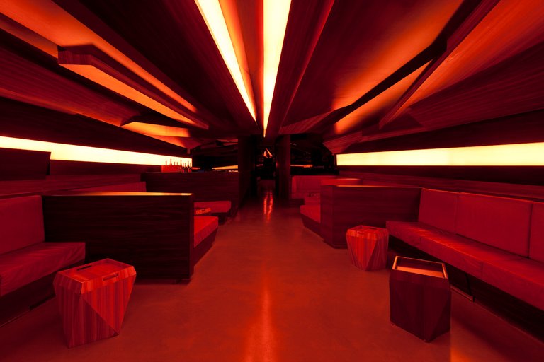
Edge by Muti Randolph + Marcelo Pontes + Zemel + Chalababi Arquitetos.
Photo Credit: Archdaily
Designers and architects who use intense color intensity and complex color harmonies and color patterns may have an overstimulated environment. In contrast, a design with weak color intensities and monochromatic harmony is an understimulated environment. Designers take into account the visual ergonomics and color. They design the space safeguarding our visual comfort. We need to understand the degree of illumination that our eyes can adapt to it. Designers must consider the luminous density that our floors, walls, and furniture reflect that is pleasing to our eyes. Our pupils dilate when there is a lower light reflectance while in reverse at higher reflectance.
Designers must carefully select materials for floors and the lighting of the space. The floor must have a 20% reflectance of the light while 25-40% for furniture and 40-60% for walls. At 60%, a yellow wall becomes a tan. When we raised our walls reflectance to 75%, we must proportionately adjust our furniture and floor reflectance to ensure good contrasts. The design rule is that white walls are not desirable and only ceilings with 80-90% reflectance.
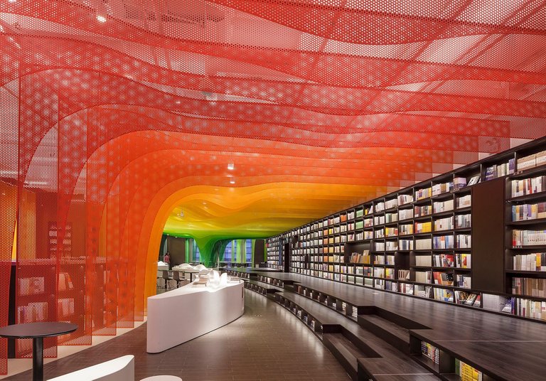
Petal Rainbow, Zhongshu Bookstore by Wutupia Lab.
Photo Credit: Archdaily
Perception of Color in Architecture
When we see an abstract painting or a photograph, it changes our mood. It is the same with how we perceive and experience color in a building or room. For example, blue light reduces our melatonin synthesis that is why we are awake even at night. Again, we can associate the feeling we get from each color due to symbolism and our lived experience. For example, we can associate the color red with frightening experiences due to its blood connection.
When we design living space with walls, floors, and neutral ceilings, we obtain diverse sensory experiences when we apply different colors to the surfaces. For example, we can create a sense of a lower space when we paint a darker hue to our ceiling or create a spatial illusion that space is shortening by applying color at the middle of the wall. However, we can perceive a stretch-out living space when we painted it on all walls.
When we painted only the lateral walls, we get to feel the environment appears to shrink. Space expands when we paint the center wall with the same color. We can create an illusion of the low height by painting it with darker tones at the observer's attention. Red can evoke passion, enthusiasm, or warmth, but it may also evoke dread or danger. Darker, maroon colors may appear sensuous and alluring, whereas bright, neon reds are welcoming and eye-catching. The accent of red may also be effective in directing people's attention to objects or aspects.
The architectural use of the color orange is unique and may produce peaceful, light, and welcoming environments, which less flashy than red areas, yet they are still bright and cheerful. On the other hand, yellow is dependably brilliant and bright. It suits well children's places such as daycares and kindergartens. It gives off a welcoming and whimsical experience.
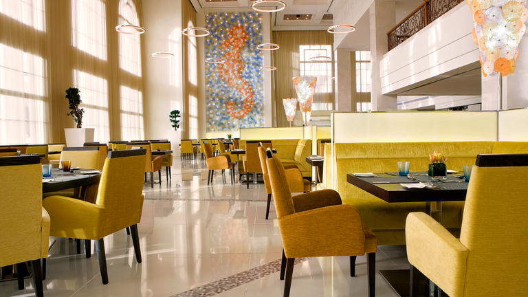
Blue Orange Restaurant, Dubai.
Photo Credit: The Westin Dubai
Red, orange, and yellow are food stimulants, which interior design in most restaurants used such colors. We can associate red with energy-dense, sugar-laden fruits or vegetables. When we see yellow, our brain secretes serotonin in anticipation of our food. Orange gives us a sensory perception of having a full table.
Green is an odd choice for architecture, which gives a peaceful vibe. When we utilized it incorrectly, yellow-green can appear weirdly clinical, especially when paired with white. Externally, we can sense sustainability and warmth from green walls and green roofs. Individual blue objects, such as columns or furnishings, are among the most prevalent applications in architecture, connoting the heavenly. Blue lights are among the effective architectural installation in outdoor spaces.
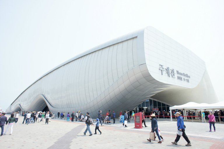
One Ocean, Thematic Pavilion.
Photo Credit: Archdaily
White walls are common in modern architecture, favorable to dramatic shadows and flat, clean facades on outside walls, while inside white walls can make people feel peaceful but attentive. White ceilings and walls also aid in the diffusion of light, making interior areas appear brighter. Black structures seem cool and modern. It may look rustic and isolated, but black metal detailing is generally elegant and futuristic.
We know that color has a huge emotional impact on both architectural interiors and exteriors. When architects and designers work with color, they carefully planned out the lighting, material, and design. Above all, colors do not exist without the presence of light. Hence each color has several emotions associated with it; we need a coherent and holistic design. It must not understimulate or overstimulate.
@tipu curate
Upvoted 👌 (Mana: 90/150) Liquid rewards.
Appreciate the support, @claudio83!
I guess this is why we all have our houses painted with the colors we like. In order to improve our mood and that of the living space.
Oops, now I understand why I am not always able to sleep whenever I visit a friend of mine whose house is painted blue. I usually thought it was because my body wasn't familiar with the place, but now I know it's the color, blue.
Someone told me once that the color yellow makes people hungry, and I was shocked because I had this place, I was learning ICT, and the entire office was painted yellow. My God! I am always terribly hungry. Once that person told me that theory, I understood why
Oh, this is exactly what I said above, it is no doubt that yellow is associated with food.
I hope that all architectures get to read this piece, it is educating , and I am sure, they will find it useful.
Our perception and sensory experience often plays a big role on how we lived our lives. As you have said, colors affects how you feel like at your friend house that makes you sleep well or the ICT room whom you felt being hungry. Colors indeed is not just decorations. By the way, I appreciate the kind words and your engagement to this article, @edystringz! Here is some !PIZZA and !LUV.
@edystringz! I sent you a slice of $PIZZA on behalf of @juecoree.
Learn more about $PIZZA Token at hive.pizza
Thank you @pizzabot
You're welcome
You have acknowledged all of that in your post, and I am glad I was here to learn all of them. Thank you
You are welcome
I am happy to share the information.
Hi @edystringz, you were just shared some LUV thanks to @juecoree. Holding 10 LUV in your wallet enables you to give up to 3 LUV per day, for free. See the LUV in your wallet at https://hive-engine.com or learn about LUV at https://peakd.com/@luvshares
Oh, thank you very much @luvshares. I appreciate
Hi @juecoree, during a color theory class, it was said that orange is the most seductive color. Although our eyes are immediately drawn to red, orange creates that form of stimulation. Hence warm colors are also associated with food which was why yellow tones were selected in the restaurant image of Westin in Dubai that you have featured above balanced by the cool tones on the artwork.
I very much agree with that. When I enter dining places and see green and other cool colors being used in strong doses, I couldn't help but shake my head. I know that green is associated with being healthy, perhaps a message being sent of the food being organically sourced but that could be reflected on the branding and not in the interior selection of materials used.
I am a fan of using white walls because it's such a flexible canvas to work with paired with warm tones of wood. What about you?
I couldn't agree more. Red, orange and yellow are the best colors to influence a person appetite. For That is why Jollibee are very appealing to the masses. The branding and their store interiors have accent walls of either red, orange, yellow or a combination. Besides, they always used furniture with such tones.
White is great. It is simple and flexible. I like the tones between black and white. It is minimalistic and I feel that it is a calm tone that may alludes a cozy environment. I also like the wood tones. It feels organic and natural. !PIZZA
@discoveringarni! I sent you a slice of $PIZZA on behalf of @juecoree.
Learn more about $PIZZA Token at hive.pizza
Oh wow Pizza! thank you @juecoree
Indeed! Chowking followed suit with Jollibee. The intriguing part is despite its branding color Mang Inasal managed to succeed. I guess just the sound of the word inasal makes us salivate at the thought of their delicious roasted chicken. Just talking about that makes me hungry now haha.
Thanks for sharing your interior preference. Minimalist design is definitely in my books as well. Happy Friday!
Congratulations @juecoree! You have completed the following achievement on the Hive blockchain and have been rewarded with new badge(s) :
Your next target is to reach 60000 upvotes.
You can view your badges on your board and compare yourself to others in the Ranking
If you no longer want to receive notifications, reply to this comment with the word
STOPCheck out the last post from @hivebuzz:
Support the HiveBuzz project. Vote for our proposal!
The subject is popping and bright, full of colors. The other day I was exploring a pantone book and noticed many interior spaces made using vivid colours had an interesting aspect to our senses.
This is an amazing post. Could not agree with you more on the perspective of every colour has different values and emotions attached to it.
Great post, looking forward to see more from you!
Remove your witness vote to https://peakd.com/@discovery-it they don't believe in freedom of speech, the believe in destroy people and believe in power.
Dear @juecoree ,
I read your interesting article.
What is your subject?
You are very interested in various fields, what is your major now? I am very interested in history, politics, economy, and culture.
I am in electrical engineering. I am interested in STEM, Arts, Design, Education, Social Issues, Heritage and Culture, and Philosophy.
Will you be an electrical engineer? You probably belong to the upper class in the Philippines. I studied theology, but because I was poor, I only completed my undergraduate studies.
I am an engineer, but I am not on the upper class.
I understand!
I remember Filipinos are more honest and gentler than Vietnamese and Chinese and other Southeast Asians.
In the Philippines, the gap between the rich and the poor was so great that individuals were good even though the crime rate was high.
I thought the royal families that rule the Philippines should rule the Filipinos fairly and generously.