Pandas #4: Plotting with Pandas and matplotlib / Pandas #4: Graficando con Pandas y matplotlib - Coding Basics #37
Plotting with Pandas
Shoutout to lincolnfrias on Stack Overflow

In this article you will find:
- Introduction
- How can we graph in Pandas?
- Scatter Plots
- Histograms
Hello everyone!
I apologize again for the absence of Coding Basics this week. My obligations at university have meant that publishing new content has been compromised. Enough crying though, now it's time to get started.
In previous editions of Pandas we have seen how to handle DataFrames and Series, how to clean data within them and some operations that we can use to predict information in Pandas.
However, a topic that has been escaping us and that demonstrates the potential of this library is the use of graphs to show the results of our queries.
This is why in this article we will see how we can use Pandas to display the data in our DataFrames in a presentable way and at the same time provide us with information that can help us on our journey.
How can we plot in Pandas?
Shoutout to Pandas - PyData
Although Pandas brings a function that we can use called plot():
import pandas as pd

df = pd.read_csv('1000Youtubers.csv')

df.plot()
This does not mean that it will automatically be displayed on our screen. This is why we must use other libraries to be able to display it.
This is why, if we want to visualize the graphs we make with Pandas, the most common option is to use a matplotlib submodule called pyplot, with which using a method called show(), which shows all the figures that are open (In this case our graph with plot()), to use it, we must install matplotlib.
We remember that to install a new library we go to our terminal (CMD, Powershell or Unix), and write in it:
>>> pip install [name of the library]
So to install matplotlib we only have to use pip install matplotlib. We wait the required time and we will have matplotlib. Now, to show our plot, we just need to import matplotlib.pyplot and use .show()
import pandas as pd
import matplotlib.pyplot as plt

df = pd.read_csv('1000Youtubers.csv')

df.plot()

plt.show()
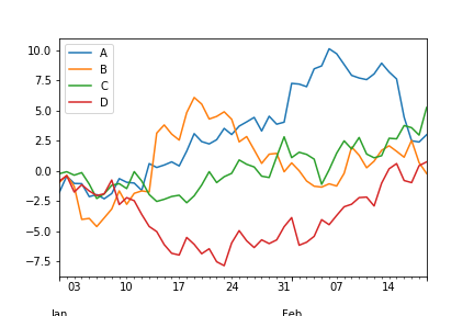
If we have a new version of Python and Matplotlib, graphs of the following type should appear with the information:
Now, this may not work for some people and a graph may never appear instead. If this happens, Jupyter Notebooks must be installed, an open source web interface that allows us to work with data analysis and Data Science in 12 different programs, and that by default will allow us to graph.
There are different ways to install Jupyter Notebooks on your system, the simplest of which is to install Anaconda, which is an Open-Source distribution of Python, which has a large number of pre-installed packages to work with, among which is Jupyter Notebooks. .
In the following chapters of Coding Basics we will see how to install these elements and work with them. For now, we'll stick to the simple.
Now that we can graph, we must know what type of graph is best for us and how we can use it to represent the correct information. Among the options for this, we have scatter plots and histograms.
Let's look at each one.
Scatter Plots
Shoutout to Data36
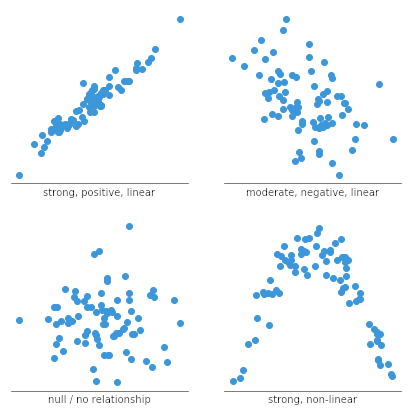
In a Previous Coding Basics article, we talked about the concept of correlation and how this is a measure to check the behavior of one variable with respect to the other.
That is, if we have a column with values of hours of exercise and another with calories burned, if we see that when the hours of exercise increase so do the calories burned, then we will have a positive correlation. Otherwise (If one increases, the other decreases), then it will be a negative correlation.
Now, we can determine how reliable a correlation is the closer it is to the numbers -1 and 1, the first being a perfect negative correlation and the second a perfect positive correlation. The closer a value is from one extreme to the other, the more certain we can say whether the second value increases or decreases in relation to the first.
However, if we have a correlation close to 0, this will mean that we cannot predict whether it increases or decreases compared to the other.
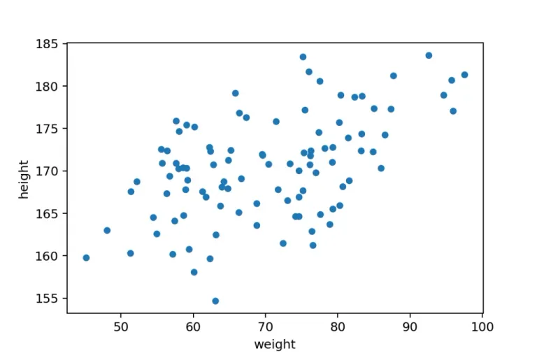
Once we know this, we can determine that it is a scatter plot.
Shoutout to Chartio
What allows us to make a scatter graph is to represent two variables of which we want to find the correlation, in a Cartesian plane (that is, in the x and y axes), connecting the values to each other by means of points and in the end allowing us to detect, According to the shape of the graph if we have a positive, negative or almost non-existent correlation.
For example, if we use our Professors example and add two columns, one for the number of boys and another for the number of girls:
   Assignment Day Classroom Professor Students Boys Girls
0 'Math' '2023/10/11' 'A-01' 'Mr Robinson' 30 15 15
1 'English' '2023/10/12' 'A-02' 'Mrs Gray' 60 30 30
2 'Spanish' '2023/10/12' 'A-02' 'Mrs Lopez' 50 25 25
We can see that every time the number of students increases, so does the number of boys and girls. If we want to show this in a scatter plot, we will have to take two of these columns (Students and Children, for example), and then apply plot().
However, when making these diagrams, we must specify the type of graph, which is why we must indicate parameters.
With kind, we establish the type of graph, which will be scatter in this case. With x we establish the independent variable or the one that goes on the x axis (that is, the one on which the other variable depends) and with y, we establish the dependent variable, which is placed on the y axis.
Since we know that the number of boys will depend on the number of students, we know that the independent variable is Students, while Boys is the dependent variable. So:
import pandas as pd
import matplotlib.pyplot as plt

df = pd.read_csv('Professors.csv')

df.plot(kind='scatter', x='Students', y='Boys')

plt.show()
And looking at the graph:
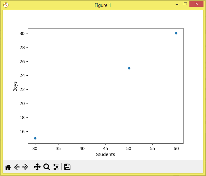
Here, we can notice that if we connect the dots, we will have a growing diagonal line or a graphical representation of the unit. What this means is that the correlation is 1 since the value of y increases every time x does so.
If it were a negative correlation, that is, the number of children decreased when the number of students increased, we would have a negative correlation and a diagonal line that goes to the negative y-axis.
If the correlation is close to 0, we see how there is no apparent shape that is formed between the points, so we cannot predict what will happen.
Histogram
Shoutout to Data36
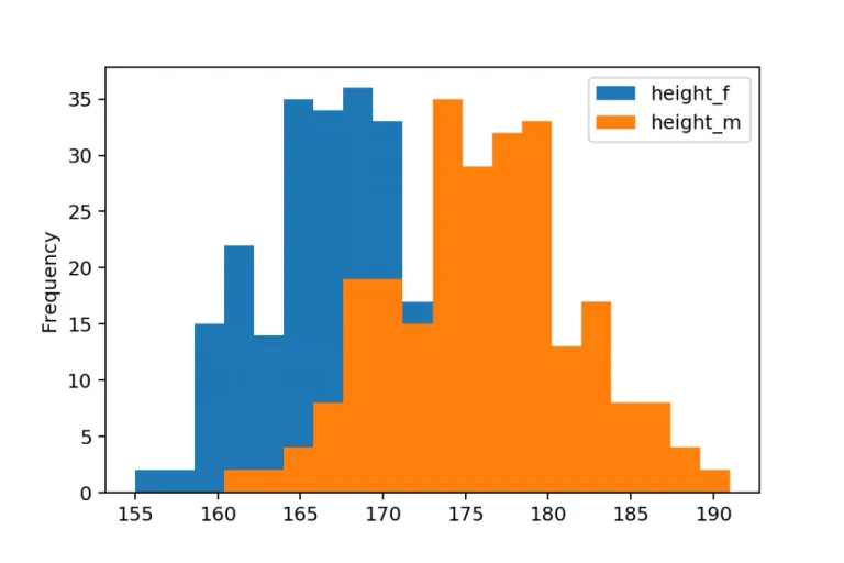
Another way in which we can represent information with pandas when graphing is through histograms. But what is a histogram?
A histogram is a graph that allows us to represent a variable in the form of bars, taking as parameters on the x axis the value of the variable and on the y axis, the frequency with which these values appear.
For example, if we have this week, a person fell asleep with the heart rate at 60BPM 3 days in a row while the other values ranged between 70 and 65, then we will have a histogram where 60BPM will be the highest bar, having a frequency of 3.
Now, making these histograms is simple. In the same way as when making a scatter diagram, we must use kind and specify the type of graph, where we will place hist. Additionally, we must select only one column of the DataFrame. For example, if we use the previous example and create a DataFrame for rest presses in a file called PPM.csv:
      Weekday Sleep_BPM
0 Monday 60
1 Tuesday 65
2 Wednesday 65
3 Thursday 60
4 Friday 60
5 Saturday 70
6 Sunday 70
Now, using the plot(kind='hist') on the Sleep_BPM column:
import pandas as pd
import matplotlib.pyplot as plt

df = pd.read_csv('PPM.csv')

df['Sleep_BPM'].plot(kind='hist')

plt.show()
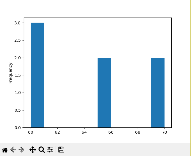
With which we will obtain the histogram with 60, the value of the highest frequency as the largest bar.
I hope this article has been helpful to you, showing you one of the features that makes Pandas so popular: being able to graph the data from its DataSets.
Now, I encourage you to put into practice the knowledge acquired, which we will use in future exercises to examine the behavior of our variables.
Until the next edition!

Graficando con Pandas
Shoutout to lincolnfrias on Stack Overflow
En este artículo encontrarás:
- Introducción
- ¿Cómo podemos graficar en Pandas?
- Gráficas de Dispersión
- Histogramas
¡Un saludo a todos!
De nuevo me disculpo por la ausencia de Coding Basics esta semana. Mis obligaciones en la universidad han hecho que la publicación de nuevo contenido se vea comprometida. Sin embargo, suficiente llanto, ahora es tiempo de empezar.
En las ediciones previas de Pandas hemos visto como manejar DataFrames y Series, como limpiar datos dentro de estas y algunas operaciones que podemos usar para predecir información en Pandas.
Sin embargo, un tema que nos ha estado escapando y que demuestra el potencial de esta librería es el uso de gráficas para poder mostrar el resultado de nuestras consultas.
Es por esto, que en este artículo veremos como podemos emplear Pandas para mostrar los datos de nuestros DataFrames en una forma presentable y que al mismo tiempo nos proporcione información que nos pueda ayudar en nuestro trayecto.
¿Cómo podemos graficar en Pandas?
Shoutout to Pandas - PyData
Si bien Pandas trae una función que podemos usar llamada plot():
import pandas as pd

df = pd.read_csv('1000Youtubers.csv')

df.plot()
Esto no significa que automáticamente se mostrará en nuestra pantalla. Es por esto, que debemos de usar otras librerías para poder mostrarla.
Es por esto, que si queremos visualizar las gráficas que hacemos con pandas, la opción más común viene siendo el uso de un submódulo de matplotlib llamado pyplot, con el que usando un método llamado show(), el cual muestra todas las figuras que estén abiertas (En este caso nuestra gráfica con plot()), para usarlo, debemos de instalar matplotlib.
Recordarmos que para instalar una nueva librería nos dirigimos a nuestra terminal (CMD, Powershell o Unix), y escribimos en esta:
>>> pip install [name of the library]
Por lo que para instalar matplotlib solo debemos usar pip install matplotlib. Esperamos el tiempo requerido y ya tendremos matplotlib. Ahora, para mostrar nuestra gráfica, solo tenemos que importar matplotlib.pyplot y usar .show()
import pandas as pd
import matplotlib.pyplot as plt

df = pd.read_csv('1000Youtubers.csv')

df.plot()

plt.show()
Si tenemos una versión nueva de Python y Matplotlib, deberían aparecer gráficas del siguiente tipo con la información:
Ahora bien, puede que esto no le funcione a algunas personas y que en su lugar una gráfica nunca aparezca. Si esto paso, se deberá de instalar Jupyter Notebooks, una interfaz web de código abierto que nos permite trabajar con análisis de datos y Data Science en 12 programas distintos, y que por defecto, nos permitirá graficar.
Existen distintas formas de instalar Jupyter Notebooks en tu sistema, la más sencilla de estas siendo el instalar Anaconda, que es una distribución Open-Source de Python, la cual tiene una gran cantidad de paquetes preinstalados para trabajar, entre los qu se encuentra Jupyter Notebooks.
En los siguientes capítulos de Coding Basics veremos como instalar estos elementos y trabajar con ellos. Por ahora, nos aferraremos a lo simple.
Ahora que podemos graficar, debemos de saber que tipo de gráfica nos conviene y como lo podemos usar para representar la información correcta. Entre las opciones para esto, tenemos las gráficas de dispersión y los histogramas.
Veamos cada uno.
Gráficas de Dispersión
Shoutout to Data36
En un artículo previo de Coding Basics, hablamos sobre el concepto de correlación y como esta es una medida para comprobar el comportamiento de una variable con respecto a la otra.
Es decir, si tenemos una columna con valores de horas de ejercio y otra con calorías quemadas, si vemos que cuando aumentan las horas de ejercicio también lo hacen las calorías quemadas, entonces tendremos una correlación positiva. En caso contrario (Si una aumenta, la otra reduce), entonces será una correlación negativa.
Ahora bien, podemos determinar que tan fiable es una correlación mientras más se acerca a los números -1 y 1, siendo el primero una correlación negativa perfecta y el segundo una correlación positiva perfecta. Mientras más cerca se encuentre un valor de un extremo a otro, podremos decir con más certeza si el segundo valor aumenta o disminuye en relación al primero.
Sin embargo, si tenemos una correlación cercana al 0, esto significará que no podemos predecir si se aumenta o se disminuye respecto a la otra.
Una vez que sabemos esto, podemos determinar que es una gráfica de dispersión.
Shoutout to Chartio
Lo que nos permite hacer una gráfica de dispersión es representar dos variables de las cuales queremos encontrar la correlación, en un plano cartesiano (Esto es, en los ejes x y y), conectando los valores entre si por medio de puntos y al final permitiéndonos detectar, de acuerdo a la forma de la gráfica si tenemos una correlación positiva, negativa o casi inexistente.
Por ejemplo, si usamos nuestro ejemplo de Professors y le agregamos dos columnas, uno para la cantidad de niños y otro para la cantidad de niñas:
  Assignment           Day Classroom      Professor  Students  Boys  Girls
0     'Math'  '2023/10/11'    'A-01'  'Mr Robinson'        30    15     15
1  'English'  '2023/10/12'    'A-02'     'Mrs Gray'        60    30     30
2  'Spanish'  '2023/10/12'    'A-02'    'Mrs Lopez'        50    25     25
Podemos ver que cada vez que aumenta el número de estudiantes, también lo hace el número de niños y de niñas. Si queremos mostrar esto en un diagrama de dispersión, tendremos que tomar dos de estas columnas (Estudiantes y Niños, por ejemplo), para luego aplicar el plot().
Sin embargo, a la hora de realizar estos diagramas, debemos especificar el tipo de gráfica, razón por la cual debemos de indicarle parámetros.
Con kind, establecemos el tipo de gráfica, que será scatter en este caso. Con x establecemos la variable independiente o la que va en el eje x (Es decir, aquella de la cual depende la otra variable) y con y, establecemos la variable dependiente, que se coloca en el eje y.
Ya que sabemos que el número de niños dependerá del número de estudiantes, sabemos que la variable independiente es Students, mientras que Boys es la dependiente. Así:
import pandas as pd
import matplotlib.pyplot as plt

df = pd.read_csv('Professors.csv')

df.plot(kind='scatter', x='Students', y='Boys')

plt.show()
Y observando la gráfica:
Aquí, podemos notar que si conectamos los puntos, tendremos una línea diagonal creciente o una representación gráfica de la unidad. Lo que quiere decir esto que la correlación es 1 ya que aumenta el valor de y cada vez que x lo hace.
En caso de ser una correlación negativa, es decir, que el número de niños disminuyera cuando aumenta el número de estudiantes, tendríamos una correlación negativa y una línea diagonal que se dirige al eje y negativo.
En caso de que la correlación este cercana a 0, vemos como no hay ninguna figura aparente que se forma entre los puntos, por lo cual no podemos predecir que pasará.
Histograma
Shoutout to Data36
Otra de las formas en las que podemos representar la información con pandas al graficar es por medio de histogramas. Pero, ¿Qué es un histograma?
Un histograma es una gráfica que nos permite representar una variable en forma de barras, tomando como parámetros en el eje x el valor de la variable y en el eje y, la frecuencia con la que aparecen estos valores.
Por ejemplo, si tenemos que esta semana, una persona se quedó dormida con las pulsaciones en 60BPM 3 días seguidos mientras que los otros valores oscilaban entre 70 y 65, entonces tendremos un histograma donde tendrá a los 60BPM como la barra más alta, teniendo una frecuencia de 3.
Ahora bien, el realizar estos histogramas es algo sencillo. De igual forma que al realizar un diagrama de dispersión, debemos de usar kind y especificar el tipo de gráfica, donde colocaremos hist. Además, debemos de seleccionar solo una columna del DataFrame. Por ejemplo, si usamos el ejemplo previo y creamos un DataFrame para las pulsaciones de descanso en un archivo llamado PPM.csv:
     Weekday  Sleep_BPM
0     Monday         60
1    Tuesday         65
2  Wednesday         65
3   Thursday         60
4     Friday         60
5   Saturday         70
6     Sunday         70
Ahora, usando el plot(kind='hist') en la columna de Sleep_BPM:
import pandas as pd
import matplotlib.pyplot as plt

df = pd.read_csv('PPM.csv')

df['Sleep_BPM'].plot(kind='hist')

plt.show()
Con lo que obtendremos el histograma con 60, el valor de la frecuencia más alta como la barra mayor.
Espero que este artículo te haya servido de ayuda, mostrándote una de las funcionalidades que hace tan popular a pandas: el poder graficar los datos de sus DataSets.
Ahora, te animo a poner en práctica los conocimientos adquiridos, los cuales usaremos en ejercicios futuros para examinar el comportamiento de nuestras variables.
¡Hasta la siguiente edición!
Thanks for your contribution to the STEMsocial community. Feel free to join us on discord to get to know the rest of us!
Please consider delegating to the @stemsocial account (85% of the curation rewards are returned).
You may also include @stemsocial as a beneficiary of the rewards of this post to get a stronger support.