Much Elusive Graphics Post
I have been quite busy the last couple weeks on college school work and has pushed me away from making posts. In addition to that includes my struggle to find something to write about that has some entertainment or use to it.
None the less, I chose to write about my journey to recreate a picture I had found online a while back. I am not very good at drawing, nor am I good at creating something from my head and putting it the way I want. Many times I will find a reference and re-create it or "mix" the original into the way I would've liked it in the first place. The picture I had found was online, and I cannot seem to find it anymore so I cannot link it but do know I did not make this right off of thought, and it was a flowing creek with mountains and a sunset behind it.
Before I started, there were some things I needed to keep in mind, which included the thought of what to do first. I could start anywhere, but I chose to do all of the main "shapes" so that I have a rough outline. Secondly I needed to have that source picture on a lower layer with low opacity so that I can see where lines needed to intersect and ultimately recreate everything. Third, I made sure to set specific amounts of time so that I did not rush anything and had multiple days to think about how to do things best.
Now that I had everything set up and my mind in the right place, I began tracing lines of the main shapes from the reference picture so that I can then put detail in proportion to everything else. I then used Illustrator's shape builder tool to separate each part into its own shape, such as the different mountains and the creek, etc. I had to be very careful at this step as every bump and edge needs to look natural and not pointy/rounded to the point of looking man-made.
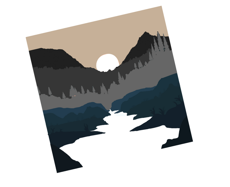
All WIP pictures are re-created after the fact for visual understanding. They will look bad and not original to my thought process
The next step to my thinking process was to get the coloring and texture onto the rocks and plants running along the creak. This step took quite a while as it needed to have diverse color ranges and the plants needed to look somewhat real with odd shapes. there was a lot of trial and error with this, zooming out and back in over and over to get the exact look that I was striving for. I had the reference but I only wanted to use a tiny bit of that to provide a general shape to go off of for the plants.
This seems a little backwards, but I went ahead to the sky in the background and made the perfect gradient as it sets the tone for everything else along with the tints of color to use on other things.
Continuing on, I moved to the mountains and began to separate them, as all four or so of them needed a different shade to show depth of how far away they all are. Surprisingly, this took quite a long time to make as every mountain had a ton of edges that made it hard to swiftly make work of.
I knew from the reference and my personal thoughts that the color needed to get darker the closer we are to the "camera", so that's what I did. I made quick colors to show the different mountains but they were not the final color that you will see.
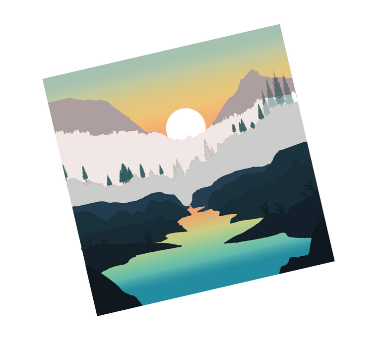
Furthermore, I added a sun and a gradient to the creek to show the reflection of the sunset. I am usually pretty good with suns and making them look glowing and such, so there was not too much struggle there. However, the creek gradient was bit of a pain trying to create a half-natural look as if this was a real picture and look visually appealing to everyone.
While I was on the small additions, I added clouds to add some depth to the sky and not look empty. I used the reference to make some decent clouds and added one gradient to them all, I think the different angles of the gradient add a ton to the overall tone of the sky.
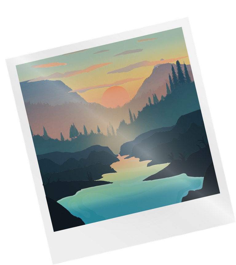
Everything was going pretty well, but I knew I still had one immense task that I was dreading about. The tree line. The darn tree line had me busted in ways of making it look good. After a couple fails, and hours of thought, I chose to take the reference and cut the pictures into my design. I then added some extra layers that multiply the color to add some color-depth and relatively resemble trees.
I eventually fixed it nicely, but my first effort towards the trees were to simply use the reference to make lines, then add color to it to make the 3D look. Unfortunately for me, it was not that simple, and my trees looked straight out of a five year old's drawing assignment at school.
After the trees, I had to add some complexity to the water, it had a nice gradient but did not look realistic at all. I messed around with hand brushes which worked well, but also used the pen tool to get some much desired curves. I got this frothy/ghosted effect by making all of those shapes an overlay in which will lighten or darken the color beneath it.
Final touches included some masks over the whole design to add a shine, and a white border like a polaroid picture. I also tilted the picture because I felt it added the aesthetic of a polaroid.
There are some other things I could describe but this post is getting very long and with minimal pictures so I will leave it there with my overview of what I did.
My original idea included a polaroid-feel with the creek turning into a waterfall off of the white edges, but my skill of using a pen-tool and mouse was really bad. I hope to come back and fully finish this but this is where it stands.

Congratulations @iikrypticsii! You have completed the following achievement on the Hive blockchain and have been rewarded with new badge(s) :
Your next target is to reach 2000 upvotes.
You can view your badges on your board and compare yourself to others in the Ranking
If you no longer want to receive notifications, reply to this comment with the word
STOPSupport the HiveBuzz project. Vote for our proposal!
Wow, that is pretty awesome! I think you did a really great job with this. I didn't understand all of it, but the end result kind of speaks for itself. Great post. I hope it gets the love it deserves from the community.
Thank you! I can completely understand that, I was partly in a rush from dinner plans and explaining my process of making something is really hard for me. However, I am glad that the end result kind of helped explain all the work that went into it.
Yeah, looks great!