R Programming - Crypto Prices Dashboard With Crypto Fear & Greed Index
Hi there. In this post, I would like to showcase a dashboard that I have built in the R programming language along with RShiny and with the flexdashboard package.
The link for the crypto prices dashboard is here
This dashboard project is something that I am proud of and do like. In the dashboard, I extract crypto prices from Coinbase and Kraken. There is also a section for the crypto fear and greed index.
The details and code are very technical in nature as it does use RShiny for dashboards. With that in mind, I do not display much code here. If interested you can find articles on using R's flexdashboard package here and here.

Topics
- Obtaining Crypto Price Data From Coinbase & Kraken
- The Interactive Sidebar For Inputs
- Price Charts In Plotly
- Crypto Fear & Greed Index
Obtaining Data From Coinbase & Kraken
The main resources I used were these two blog posts from Cryptodownload.com.
Link One: https://www.cryptodatadownload.com/blog/how-to-download-coinbase-price-data-R.html
Link Two: https://www.cryptodatadownload.com/blog/how-to-download-kraken-data-R.html
In both the two posts, they save the extracted data from the crypto exchange into a .csv file. I have modified the code the not save the data into a .csv file. The extracted data is used to produce plots in plotly for R based on user inputs.
The Interactive Sidebar For Inputs
Having interactive elements on a dashboard allows for users to choose what data they want. Outputs and plots change as you change inputs.
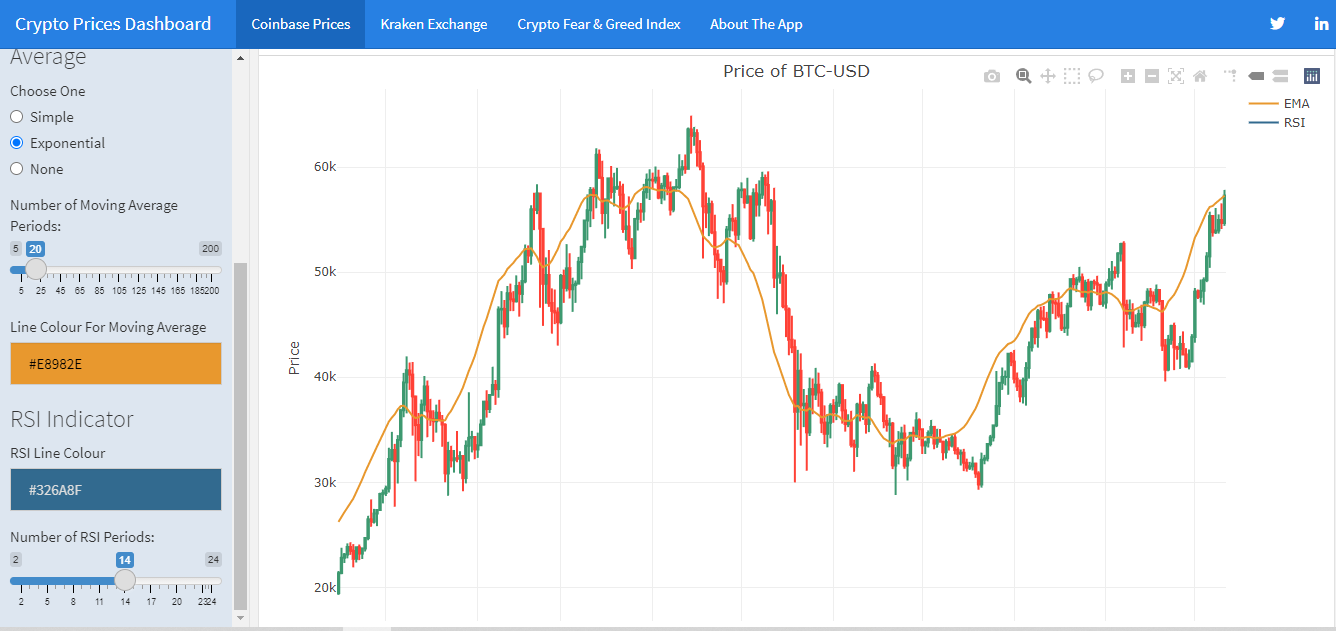
Choosing Crypto Pair
The top left area contains a dropdown list menu for choosing a crypto trading pair from either Coinbase or Kraken. The lists do vary depending on if the user is obtaining crypto data from Coinbase or Kraken.
I don't have all the crypto pairs from the exchanges but I do have fairly large selection. Popular cryptos are there along with a good amount of altcoins to choose from.
Select Timeframe
Users can select one of two timeframes for the crypto price data. The choices are hourly data or daily data.
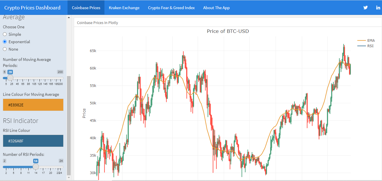
Select Moving Average
With the moving average, users can choose to have a simple moving average, an exponential moving average (default) or no moving average.
There is a colour picker for choosing the line colour for the moving average.
A slider is there for the user to customize the number of days for the moving average.
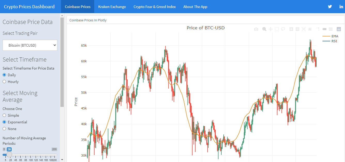
Relative Strength (RSI) Indicator
A second subplot is on the bottom below the crypto prices plot. This second subplot is for the Relative Strength Indicator (RSI). The RSI indicator can be used as a signal if something is oversold or overbought. RSI values above 70 indicates an asset being overbought and RSI values below 30 signals an underbought asset.
The RSI indicator is turned on by default. Users can change the line colour for the RSI as well as change the number of periods for the RSI with the slider.
Price Charts In Plotly
I had the option to have price charts in R's ggplot2. The thing was that there was no interactive features with ggplot2. It made sense to use plotly for R. (Plotly is also available for Python users.)
What is nice about plotly is that you can hover over the candles on the candlestick plot to see prices at a given point in time. I used subplots to have a main candlestick chart at the top with the Relative Strength Indicator (RSI) on the second bottom subplot. The main code reference was from this link.
From the bottom of the left side bar, the user can change the colour of the moving average curve/line for the candlestick chart. The RSI line colour can also be changed with the colour picker as well as change the number of RSI periods.
Crypto Fear & Greed Index
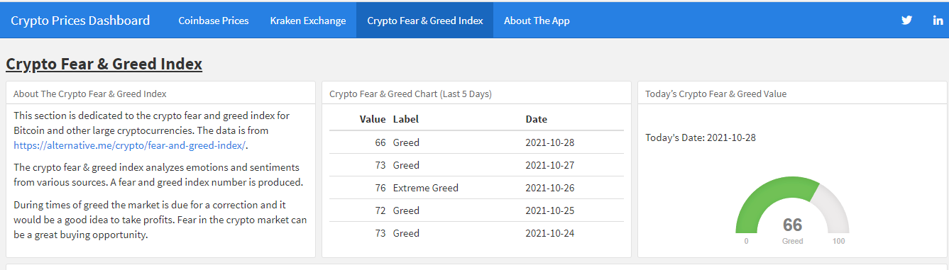
In a previous post I talked about importing crypto fear and greed index values into R (and I think Python as well). In this dashboard, I really want to add the crypto fear and greed index section here.
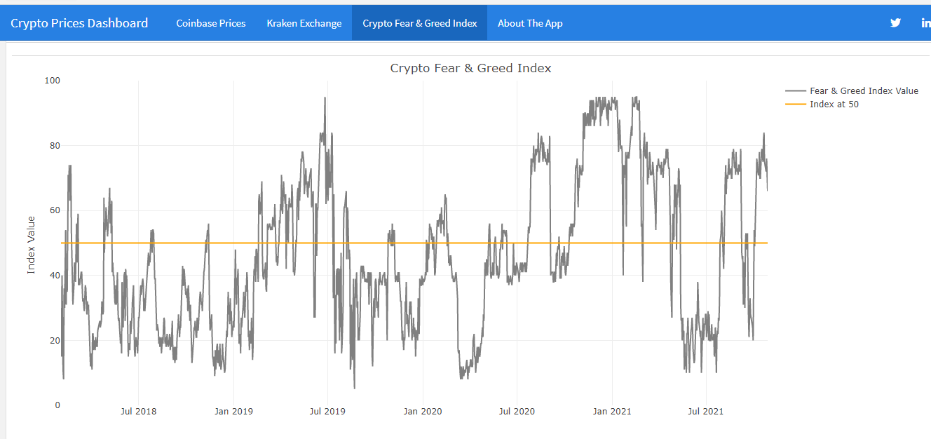
This Crypto Fear & Greed Index section features the latest crypto fear and greed index value in the form of a meter with colour. I have included in the top middle part a small table of index values for the last 5 days. On the bottom part, there is a large line plot for the crypto fear and greed index values over time. The timeframe is from around February 2018 to now (Oct 2021).
Posted with STEMGeeks