R Language - How to Create Stacked Area Plot in R
In this post, we take a look at How to Create Stacked Area Plot in R. I have used this type of the data it seems like a good fit for most of the population and the census type of the data to be drawn on the plot. So on that note we would be taking a look at things.
Previously I covered the Diverging Bar Plot in R. It was a good experience writing the content for specifically this type of the plot and also doing this in R was another thing that I wanted to do. I would love to try these things out with other datasets and new charts in both R and Python.
Make sure to download the RStudio IDE. As that IDE is free and also most of the code can be written on that. It would be a good option for you to try out the variety of charts and also the data science work is good with that IDE especially with R and Python.
I have created a video to give you an overview on How to Create Stacked Area Plot in R. You should give this one a try.
Lets start.
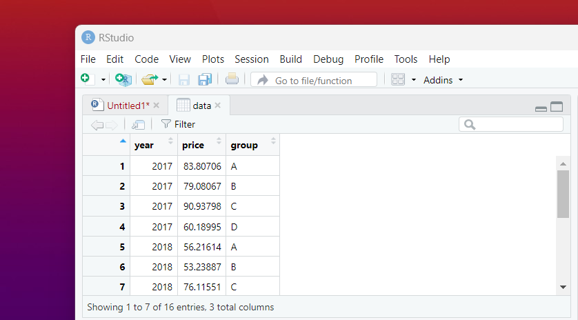
First we take a look at the data that we can build around the sample data below and from there onwards we are going to be building the chart from that.
Before that let's add some libraries.
library(ggplot2)
library(dplyr)
library(tidyverse)
And now we would be adding the sample data which is meant to be used for the chart.
group <- rep(c("A","B","C","D"),times=4)
year <- as.numeric(rep(seq(2017,2020),each=4))
price <- runif(16, 50, 100)
data <- data.frame(year, price, group)
You can even check it out in the data view.
After this we would be putting in our data to the ggplot to draw the plot.
ggplot(data, aes(x=year, y=price, fill=group)) + geom_area()
Now you can draw the plot. This would be a good option for you to draw the stacked area plot in R.
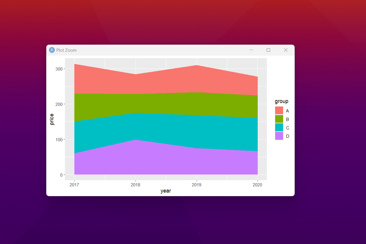
That is it. As you can see the stacked area plot are pretty cool to view. Some of the plots are also good for the content. Some of the time we have to learn to experiment by changing some values. So try some of the changes and see if you like the results.
I have few more tutorials on the lineup there. Like say waterfall chart and the geographic maps. Some of those maps are good for the variety of the data that you can plot around. I realize that for those who want to make things a bit easier to draw you can consider it.
Next month the PowerBI tutorials would be out. I am going to be covering that too. But for now, hopefully you would find this set of the tutorials useful. Do share with your friends. I would appreciate if you share the video on telegram and the Whatsapp.
I mentioned in my previous tutorials and also on variety of comments. If you like data science post, then you should subscribe to my channel. I have been posting a lot of interesting content for the data science and it has helped me for variety of the situations and I documented into the tutorials.
If you happen to like this content, do give me feedback over there and that would help me improve my efforts in near future.
Thanks for your contribution to the STEMsocial community. Feel free to join us on discord to get to know the rest of us!
Please consider delegating to the @stemsocial account (85% of the curation rewards are returned).
You may also include @stemsocial as a beneficiary of the rewards of this post to get a stronger support.
Definitivamente esta es una informacion valiosa que todos debemos conocer, pero sobre todo manejar en nuestro desenvolvimiento en la vida, es una forma muy sencilla de representar valores mediante graficas, gracias por explicarlo tan detalladamente.
Saludos @devpress
@tipu curate
Upvoted 👌 (Mana: 0/92) Liquid rewards.