R Language - How to Create Pie3D Chart in R
In this post, we take a look at How to Create Pie3D Chart in R. We are going to make use of the plotrix library. And there are other ways to do the same output too. Like say we can make use of the ggplot2 and the plotly too.
I have seen some of the plots with plotly that works well with the r language and python too. So you can explore those libraries too. Some of them are really good for the results that you seek with the same.I feel for those type of the visualization output you may want to try the similar libraries.
Previously I covered the calendar map. I am sure there are also some of the waffle style calendars that you can use. And also some of the really good output that you can develop using the same. Though I feel most of the charts in the R language are easy to be done and can be done for free and so no external paid libraries required.
You can use the RStudio from the Posit to draw the charts. I am sure you know how to download and use the RStudio because it's a good IDE and anyone with funds can make use of the same. Some of the charts and the tutorials covered in the past make use of the RStudio exclusively.
I have created a video to give you an overview on How to Create Pie3D Chart in R. You should give this one a try.
Let's first make use of the "plotrix" library. You can install that and then we can call for the same before we can move to the data that is required for our use case to plot the pie3D chart.
install.packages("plotrix")
library(plotrix)
Now let's think of a data, where we are going to be experimenting with the values.
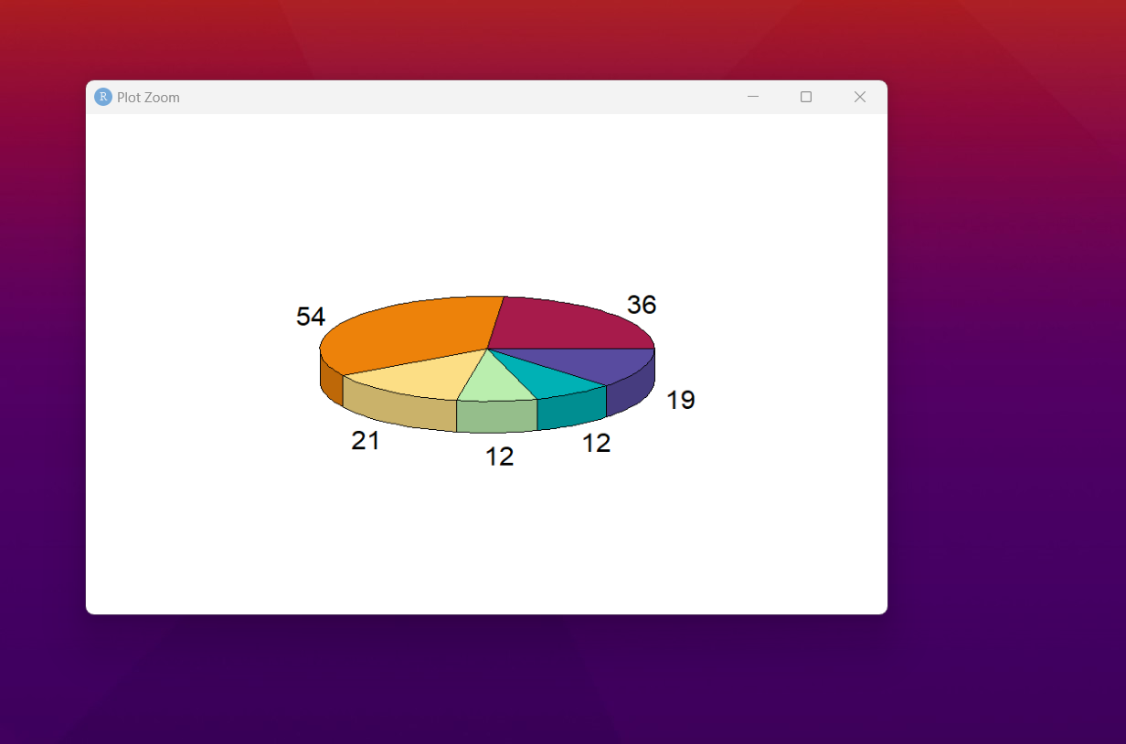
data<- c(36, 54, 21, 12, 12, 19)
As you can see we have like 6 values that we want to represent in the pi33D chart. So we will use it in the below function.
pie3D(data)
Now you can check the output below.
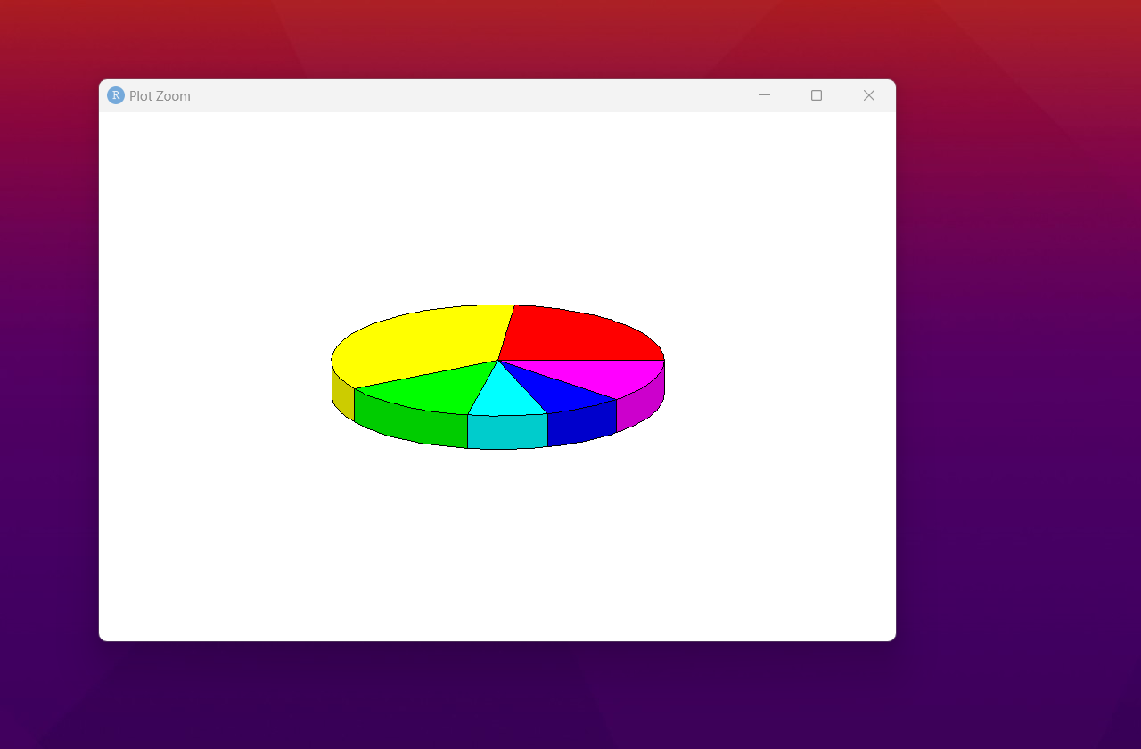
As you can see we have basic pie3D chart. We can experiment in this context have to try out some of the labels, colors and the changes that go around. So try the below code for the same.
pie3D(data,
col = hcl.colors(length(data), "Spectral"),
labels = data)
Now let's take a look at the changing output here. Some of the changes to the output would be super cool to view as well.
That's it. You may have to make more customization like labels and also variety of changes like changing the colors. Like say spectral was one of the variation of the colors in the pie3D chart. Some of the changes like those would be pretty good and easy to work with as well. It's cool to try those things out.
So now that we have learned how to create a pie3D chart using the plotrix. You can change the exercise and make something out of the dataset. Because let's accept the fact that we need some sort of a data for things to have some real and understandable value. Something we have to work around with as well.
Now that I am doing the tutorials in the R and Python. I am going to be covering a lot of Power BI tutorials too. Some of the tutorials that needs to be getting some decent hits. I need your help for the subscription on my channel. And also the views needs to be improved. If possible I would say you can share my videos with friends too.
If you happen to like this content, do give me feedback over there and that would help me improve my efforts in near future.
Thanks for your contribution to the STEMsocial community. Feel free to join us on discord to get to know the rest of us!
Please consider delegating to the @stemsocial account (85% of the curation rewards are returned).
You may also include @stemsocial as a beneficiary of the rewards of this post to get a stronger support.