R Language - How to Create Line Chart in R
In this post, we take a look at How to Create Line Chart in R. Previously I explained how to create Curve function in R. And that was one of the good tutorials that I covered last week. Also I managed to covered multiple other chart that you can check on my channel.
I am also posting the YouTube shorts on regular basis. So you may want to keep tab on the same. It's one of those good chart coverage in the YouTube Short that you would love watching for sure. Now if you have followed some of my previous tutorials then you'd learn new things along the way.
I am making use of the RStudio IDE in this type of the charts and the visualization. Some of that would be helping you. And if you manage to do those things the right way. It would be easier for you and some of those are worth going ahead with as well.
Let's take a look at the new curve function in this tutorial. And I have created a video to give you an overview on How to Create Line Chart in R. You should give this one a try.
Let's take a look at the libraries that you can use to create line chart. Considering we are making use of the base chart. I am sure you don't need to download anything.
So moving onto the next part we may need a dataset to work with. This would help you manage the data that we are about to plot on the chart.
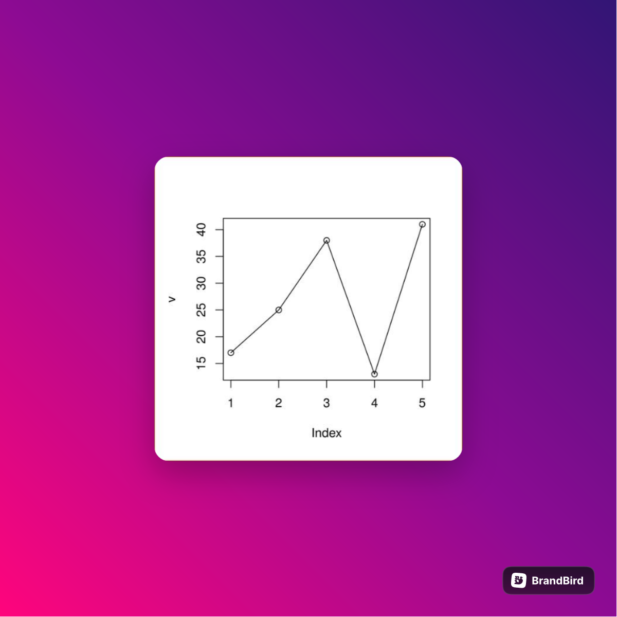
dt <- c(8,16,32, 48, 64)
Now you can check this data into the dataframe. Some of that would be easier to work with.
Now let's plot the data using the below code.
plot(dt, type = "o")
Once you do run this function that would run the query and also create a chart that you can use. Some of that would make things easier for you if you experiment with variety of data points.
That's it. This is just one of the way to represent the line chart. Notice we don't use any form of the external library. And you also have to understand what to use and not to use in case of the simple data. So your approach should be minimizing the reliance on the other external libraries.
I can also do this example with the help of the libraries like say plotly, ggplot2 etc. And that would help you with the plotting. Another way to experiment is making use of the external datasets from the kaggle. And that also helps a lot too. Some of that would be of a good choice for you to work with the datasets in general.
If you want to visualize your data and also make use of the base package, then example like this would be a good option for you. I am covering a lot of tutorials like this in my youtube shorts and also on the channel. So my suggestion is making use of that as a guidance. You can like, share subscribe to my channel if you like this content.
If you happen to like this content, do give me feedback over there and that would help me improve my efforts in near future.
Thanks for your contribution to the STEMsocial community. Feel free to join us on discord to get to know the rest of us!
Please consider delegating to the @stemsocial account (85% of the curation rewards are returned).
You may also include @stemsocial as a beneficiary of the rewards of this post to get a stronger support.
@tipu curate
Upvoted 👌 (Mana: 0/59) Liquid rewards.