Python Seaborn - How to Create Violin Plot in Python
In this post, we take a look at How to Create Violin Plot in Python in Seaborn. Previously we looked at how to create the swarm plot in Python. And now we would be looking t the violin plots which are kind of like box charts in a way. So here's new tutorial about creating the violin chart in python.
If you wish to show the quantitative data across one or more variables then you should consider making use of the Violin plot. You can also use the whisker or the box plot for doing this but it helps to make use of the violin plot. So let's take a look at it.
Before we go for the coding part. We have to make sure to setup the environment. Here we are making use of the python, jupyter notebook for plotting the chart. And that has worked out for us these days. You should consider making use of the jupyter notebook to plot within the book.
And I have created a video to give you an overview on How to Create Violin Plot in Python using Seaborn. You should give this below video a look.
First thing is to make sure to create the setup with the libraries and also check if the python is installed or not.
python --version
Next things setup all the essentials which would make it easy for us to run the code.
pip install numpy pandas jupyter seaborn matplotlib
Now in your browser make sure to check the jupyter notebook once we run the below command.
jupyter notebook
And now that we have the notebook interface open we can create the python3 notebook. And after that we would be making sure to check the "tips" database which would be used to test example here.
Now let's declare our seaborn library reference.
import seaborn
Next thing is making sure to add the whitegrid for our plot so that it gets viewed.
seaborn.set(style="whitegrid")
Next thing is making sure to load the dataset.
tips = seaborn.load_dataset("tips")
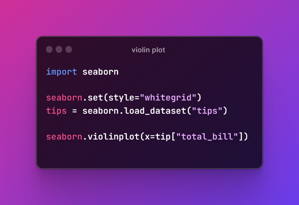
And finally make sure to do the plot of the content that we are adding to the total bill which would form the violin plot.
seaborn.violinplot(x=tips["total_bill"])
So overall the code should look like this.
import seaborn
seaborn.set(style="whitegrid")
tips = seaborn.load_dataset("tips")
seaborn.violinplot(x=tips["total_bill"])
Now you can check the below image for the reference.
Moving to the jupyter notebook and then executing the code and we can get the output that looks like the below code and plot.
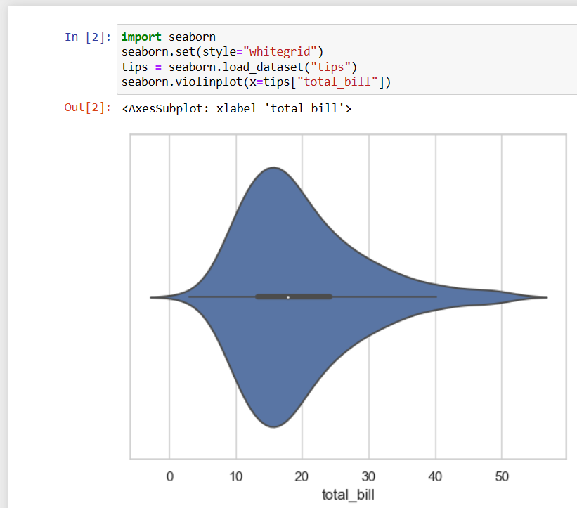
As you can see this plot is here like the above image. You may have to fix that tips and not tip. I got the wrong code there for the image. As it is a array of the variety of the variables that you would have to check there. And you can now here make sure to add and configuration there you can make use of for the violin plot.
First thing you can check out is my channel in the video. Make sure to like, share and subscribe there for the content. You would get the notification and also you can check out the playlist for the content. You would find the playlist video which you can make use of for the creation of the plot using the python and seaborn library.
If you happen to like this content, do give me feedback over there and that would help me improve my efforts in near future.
Congratulations @devpress! You have completed the following achievement on the Hive blockchain And have been rewarded with New badge(s)
You can view your badges on your board and compare yourself to others in the Ranking
If you no longer want to receive notifications, reply to this comment with the word
STOPCheck out our last posts:
Thanks for your contribution to the STEMsocial community. Feel free to join us on discord to get to know the rest of us!
Please consider delegating to the @stemsocial account (85% of the curation rewards are returned).
You may also include @stemsocial as a beneficiary of the rewards of this post to get a stronger support.