Python Seaborn - How to Create Line Plot in Python
In this post we look at How to Create Line Plot in Python. Previously we looked at the Histogram in Python Seaborn. So for this tutorial I am going to be covering the line plot and also finding out simple example for you to learn the line plot. If you want to check previous example of the histogram plot then you should check out the video link earlier.
Now where do you find the use case of the line plot? Which is pretty common plot and you can find it being used in most of the plots. Here I am going to be making use of the variety of the small data samples and turn that into the line plot. I can tell you from the experience that it is one of the simple charts and also the library being used here is the seaborn. You should definitely check it out so keep reading.
Make sure to install the python and then use the below commands for installing the jupyter notebook, seaborn and other libraries. You can also try out the notebooks from the paperspace as that would also give you some results and the plots as you can get any other place here. In short it's a good experience for anyone who wants to execute this on the cloud and the desktop. Either of the option is available for you.
And I have created a video to give you an overview on How to Create Line Plot in Python. You should give this below video a look.
First thing you should do is make sure to install python and then make sure to verify the python version.
python --version
next thing make sure to setup some of the libraries that you can use here.
pip install numpy, jupyter seaborn
Now make sure to run the jupyter notebook command so that you can have workspace to run the command and get the output.
jupyter notebook
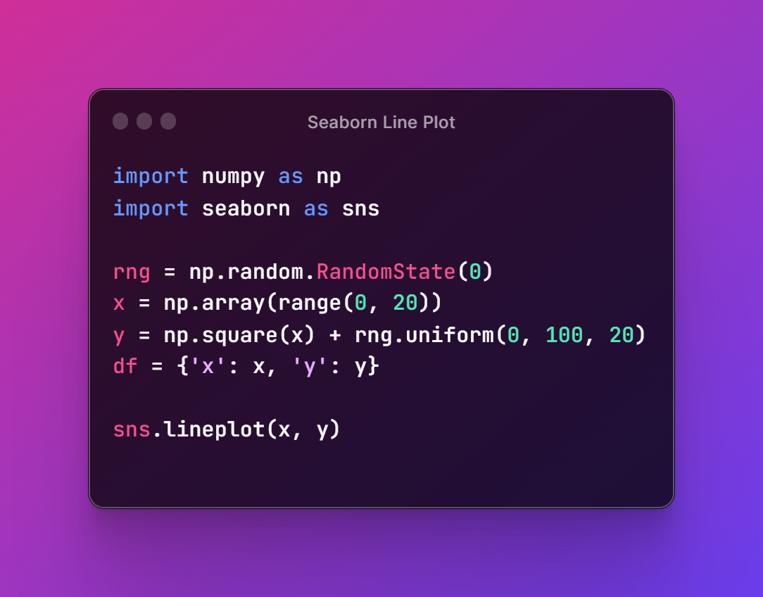
So here's the reference that you have to add up for the code.
import numpy as np
import seaborn as sns
now next part is making sure to add the sample data.
rng = np.random.RandomState(0)
x = np.array(range(0, 20))
y = np.square(x) + rng.uniform(0, 100, 20)
df = {'x': x, 'y': y}
so once you have the data you can then run the code for the display the plot.
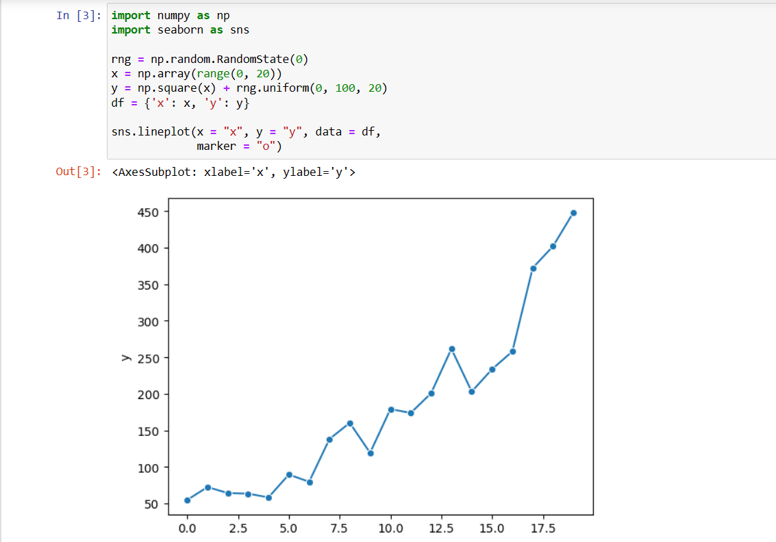
sns.lineplot(x = "x", y = "y", data = df)
Now you can have the below code for the reference. So I have this in the image format so that you can easily work with the image there.
Now next thing is that you have to run this code in your jupyter notebook and get the output. So below is the command for me on my desktop to run juputernotebook and then I am going to seeing the output when clicked the run button.
And that is all. You can now make sure changes and get different type of the output. Like say you want to have better data points being shown with the line plot you can do that also. And another thing is that you would want to show the line plots with the legend or some label changes. Yes you can do them too. Some of those changes would require a bit of effort on your side but all in all that would take some time and also some level of efforts for you to work with there as well.
I have made variety of the videos on the topic of the data science and the code specific to the plots. And if you consider the output here and also managed to get a good understanding of the data plots, then you should check out my videos. I suppose if you are into this type of the content then you should definitely follow my content and also like, share and subscribe. So this would be a good thing. I have learned from my experience that those who like share and subscribe my content would also get better jobs lol. I know it may sound funny but yeah a lot of people use my content for their prep work for jobs and the exams.
If you happen to like this content, do give me feedback over there and that would help me improve my efforts in near future.
Thanks for your contribution to the STEMsocial community. Feel free to join us on discord to get to know the rest of us!
Please consider delegating to the @stemsocial account (85% of the curation rewards are returned).
You may also include @stemsocial as a beneficiary of the rewards of this post to get a stronger support.
Congratulations @devpress! You have completed the following achievement on the Hive blockchain And have been rewarded with New badge(s)
You can view your badges on your board and compare yourself to others in the Ranking
If you no longer want to receive notifications, reply to this comment with the word
STOPCheck out our last posts: