Python Seaborn - How to Create Histogram in Python
In this post, we take a look at How to Create Histogram in Python. Previously I covered the post on matplotlib hexbin chart in Python. So that was one of the good chart that can turn out like a good replacement of the scatter plot. And overall a good chart for those who want to make use of the same chart with enough data to plot on. I'd recommend taking a look at that and now we look at the histogram plot using the seaborn.
Seaborn is another graphics library that we use similar to the matplotlib. And so for this we have started with the histogram. And as we move ahead we can also take a look at the line chart and the bar chart. So you can see that you can easily make use of the charts here using the python and the graphics library. And it can be pretty good if you ask me there as this library also has some really good use case as well.
You can take a look at the histogram plot in the python using the seaborn graphics library. This would give you an idea on how to make use of the simple data to be plotted there. So find the data set or follow along with me on that part too. I would show you some simple seed and the data that you can use for the content. Which would we be later plotting on the histogram as we plot there. It is worth checking out here if you have plans on making use of the seaborn graphics library for plotting and chart.
And I have created a video to give you an overview on How to Create Histogram in Python. You should give this below video a look.
Make sure to have the python installed on the windows system. And you can even verify the python installation using the command.
python --version
You can make use of the libraries that you can install and check out for the plotting.
pip install numpy, jupyter seaborn
Now that you have the jupyter notebook installed you have to open it in another tab. So you can use the command.
jupyter notebook
So here's the reference that you have to add up for the code.
import numpy as np
import seaborn as sns
and now we need to make use of the sample data.
rng = np.random.RandomState(0)
x = rng.normal(0, 1, size = 1000)
df = {'x': x}
and now we are trying to put on a plot here.
sns.histplot(x = "x", data = df)
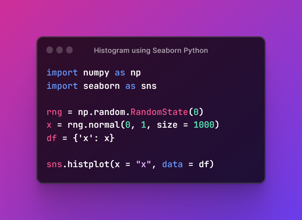
So the whole code could turn out like the below image that you can use for the reference.
Next thing we want to run this code so we are going to use the command here for the terminal.
python example.py
And you would be getting the plot below that looks like the the one shown.
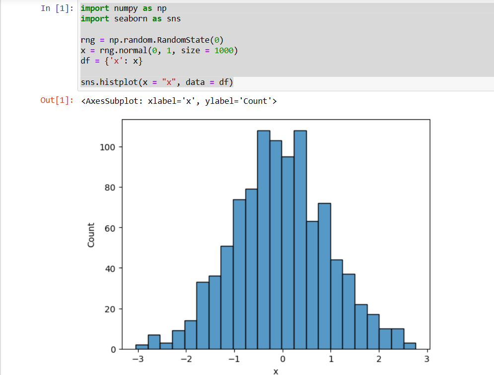
And that is it. Yo have drawn the histogram plot and using that too with the seaborn. You can now make use of the plot by group and also plot by the density too. You can make use of the vertical and the horizontal orientation of the plot too. You would be able to easily make use of the variety of changes in the configuration and see how that would turn out. You can also make sure to change the data. That would also do good for you. I would recommend you to check it out. It would be pretty cool for you to try out there.
I have done the series with the matplotlib till the last week and from this week there are seaborn library tutorial here. You can make use of the code here and also do check out the video tutorials of the youtube. So that you can easily follow along with the tutorials that we have here. I have done most of the plot based tutorials that you are going to love as well. Your like, share and subscription would help my channel grow and also each view that I get adds up on the revenue too.
If you happen to like this content, do give me feedback over there and that would help me improve my efforts in near future.
Thanks for your contribution to the STEMsocial community. Feel free to join us on discord to get to know the rest of us!
Please consider delegating to the @stemsocial account (85% of the curation rewards are returned).
You may also include @stemsocial as a beneficiary of the rewards of this post to get a stronger support.
Congratulations @devpress! You have completed the following achievement on the Hive blockchain And have been rewarded with New badge(s)
You can view your badges on your board and compare yourself to others in the Ranking
If you no longer want to receive notifications, reply to this comment with the word
STOPCheck out our last posts: