Python Matplotlib - How to Create Treemap Chart in Python
In this post, we look at How to Create Treemap Chart in Python. Previously we looked at Loliop Chart in Python using Matplotlib. It was one of those charts where you are dealing with specific points of the data. And turns out it could be helpful for some of the data points which can be meaningful for the charts. It'd be something you should explore with my other previous tutorials for you to find out.
For this tutorial I am making use of the visual studio code in the cloud. If you want you can also make use of the desktop setup. Like say visual studio code, python and matplotlib. So these are some of the interesting tools out there. Like say coder.com etc. And you can use them for setting things up. You'd be able to even host things up on the cloud using that approach. I think for those who have money they can find this fun and interesting to use for the most of the parts.
Another thing is that I assume that you have few libraries setup like say numpy, jupyter, matplotlib and few other things. I feel that you would be just good when you realize that there are some good things that one can do when they find the overall setup good in there. I kind of loved how the overall approach towards the matplotlib library has been in the data science world, I just hope to cover this with one tutorial at a time. So get to the results now.
And I have created a video to give you an overview on How to Create Treemap Chart in Python. You should give this one a try.
Let's first setup some of the libraries there. Which we would be making use of in the setup like say the libraries that we are about to make use of the same for creating our chart. So you shold start with the libraries here.
pip install numpy, jupyter matplotlib squarify pandas
Now once everything is installed you can take a look at the libraries and verify their version. So you can get an idea where things would be used and also you can make use of those things which would show you the version like below.
python --version
Now that we have our setup here, we can go ahead and check out some of our data and the libaries being references so that we can make use of things as well. So overall it would help you get things properly setup there.
values = [50, 25, 12, 6]
Now we are going to check out how to reference our things there. So that we would be making use of the libraries.
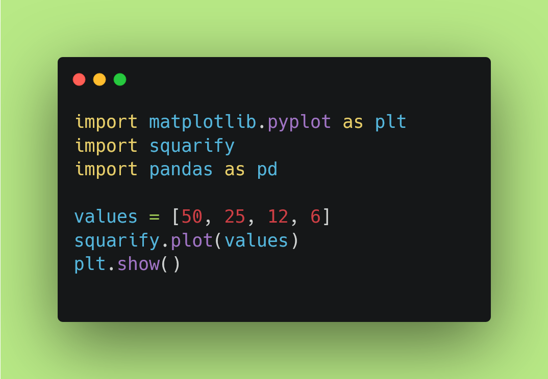
import matplotlib.pyplot as plt
import squarify
import pandas as pd
Now the next thing would be plotting all of our values as a form of the treemap. This would be basic for us to try this example. You can go even more deeper with changes in color, size, values and also the variety of the things that you can make use of for the overall work that we can do here.
import matplotlib.pyplot as plt
import squarify
import pandas as pd
values = [50, 25, 12, 6]
squarify.plot(values)
plt.show()
That's it. Now what I am going to do is show you the carbon image of the code written here which you can keep for the reference and that would be one of the way you can remember how to plot the treemap. It would also make it easier for you to work with the code there.
Now I want you to execute the code. For which you can try the command line option below.
python exmaple.py
I assume that you are making use of the example.py as a file name. Your file could be different there. so change the file name accordingly. And now you can push the enter button and you would have the chart that looks like the below image.
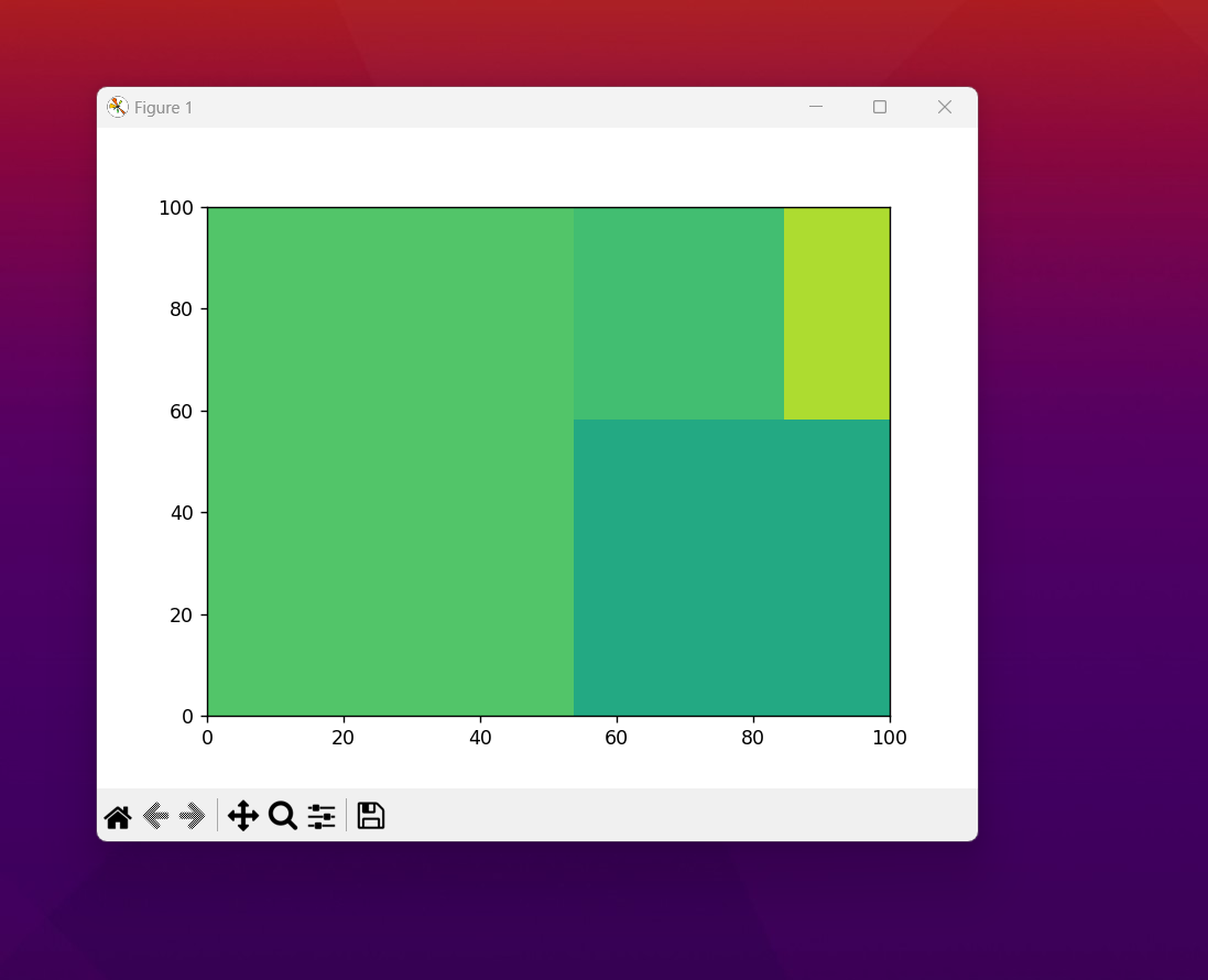
You have managed to get the first chart out. The next thing would be you can make use of the same for the plotting and also changing few values and the data would be giving the same. I suggest testing out the themes. You would learn that through googling matplotlib specific content.And another thing you can try out for the same is borders, colors and other that you can try out. Some of the really good changes that can work with the small changes in the code andyou would have totally different map.
Treemaps are handy for the analytics and the projects where you have specific set of the value showing for one big giant project. Like say you are collecting the data for the analhytics specific work and you are going to be there for the work specific variables this can be used for the overall display of the variables there. Like say you want to show the content which makes sense with the overall project. You can use it in such context. Like how much of the crops growth, you add the variables specific and they would show up there. It would all makes sense to read such data there.
I have more charts left and more content is meant to be posted.But it would take some time for me to put them out for you to try out. I guess if you have some free time, you should share my playlist of the content to the friends. And it would help me and the channel and this would bring some value to my revenue too.
I hope you like my content. You should definitely subscribe to my youtube channel. Some of the content here in the tutorial you can try out. I would love to know about some ofmy content getting the views enough for getting the most out of the content. It would make things easier for myself and also it would be pretty cool for me to get the content properly worked out in a way that it would reach more people. So make sure to share the content in the Whatsapp and Telegram. It would help this tutorial reach more people who wish to find value in it.
If you happen to like this content, do give me feedback over there and that would help me improve my efforts in near future.
Thanks for your contribution to the STEMsocial community. Feel free to join us on discord to get to know the rest of us!
Please consider delegating to the @stemsocial account (85% of the curation rewards are returned).
You may also include @stemsocial as a beneficiary of the rewards of this post to get a stronger support.
Congratulations @devpress! You have completed the following achievement on the Hive blockchain And have been rewarded with New badge(s)
You can view your badges on your board and compare yourself to others in the Ranking
If you no longer want to receive notifications, reply to this comment with the word
STOPCheck out our last posts: