Python Matplotlib - How to Create Scatter Plot in Python
In this post we discuss, How to Create Scatter Plot in Python. Previously here on the community post, I covered, How to create Bar plot in Python. You can check out the video post and also if you are interested I also made the R based tutorials on the bar plot and even on the scatter plot.
I am making use of the Python, Jupiter and the Visual studio for making the output. And also I am making use of the sample data that would be of use in such case for the plotting the simple plot out of such data. And another thing is that you can use the matplotlib, pyplot, plotly and other libraries for the visualization.
I assume you know how to install python. In your case if you happen to make use of the python on mac and the Linux that would be pretty easy but overall I feel that even on windows you can use the Vmware and that would work out.
Let's take a look at the new curve function in this tutorial. And I have created a video to give you an overview on How to Create Scatter Plot in Python. You should give this one a try.
So first thing is making sure to install the few things like Python and Jupiter.
You can also use the visual studio code and create the plots through terminal that too would work out. Meanwhile make sure to setup the python and other libraries.
pip install numpy, jupyter matplotlib
now check the python version along with other libraries too.
python --version
now next thing make sure to create the sample data for the x and y.
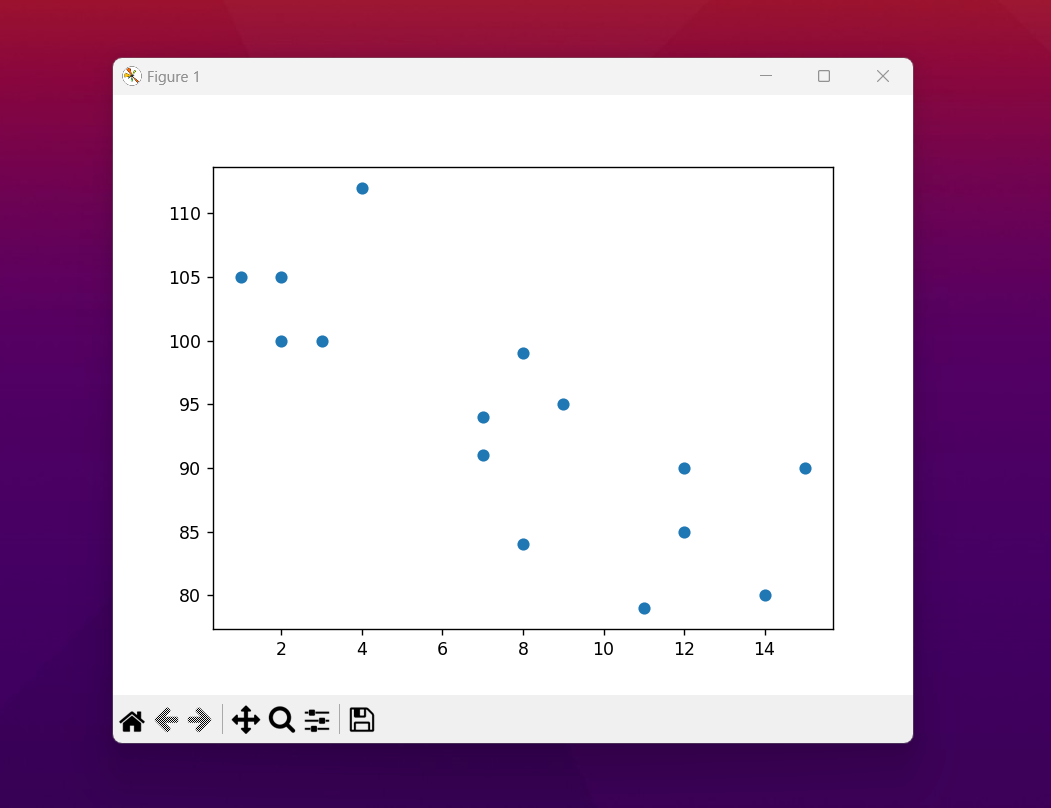
x = [2,2,8,1,15,8,12,9,7,3,11,4,7,14,12]
y = [100,105,84,105,90,99,90,95,94,100,79,112,91,80,85]
now we can create entire code that would be plotting the scatter plot here. So check the below code.
import matplotlib.pyplot as plt
import numpy as np
x = np.array([2,2,8,1,15,8,12,9,7,3,11,4,7,14,12])
y = np.array([100,105,84,105,90,99,90,95,94,100,79,112,91,80,85])
plt.scatter(x, y)
plt.show()
This should plot the scatter plot. I have generated the output for you to view. Make sure to double check if you can get the similar plot as well.
That's it. You have now learned how to create the scatter plot. And you can add multiple colors, variables change and additional variables and each of them could get their own color. And like this you can continue to build on the data too. So that would be a good option for you to build your output there.
I have completed the bar chart, and now the scatter plot. There are many other charts that you can follow up on and also you would be able to make use of the other outputs that you can get there. So there is a line chart and the pie chart there. So you have a good out put chart that you can find that there it would be a good option.
I have been covering a lot of data science tutorials and also some good amount of the visualization and the data manipulation tutorials that you can check out. It can be pretty cool for those who like simple tutorials and you would find this useful. I recommend making use of the share and the comment features on the videos as that would help the channel too.
If you happen to like this content, do give me feedback over there and that would help me improve my efforts in near future.
Thanks for your contribution to the STEMsocial community. Feel free to join us on discord to get to know the rest of us!
Please consider delegating to the @stemsocial account (85% of the curation rewards are returned).
You may also include @stemsocial as a beneficiary of the rewards of this post to get a stronger support.